Image source: wikiart.org
Introduction
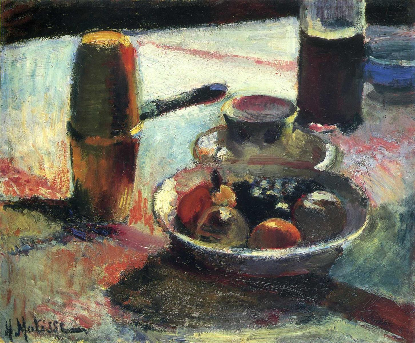
“Fruit and Coffee-Pot” belongs to a crucial chapter in Matisse’s development, when he moved from academic drawing and tonal description toward a language in which color organizes everything—form, light, depth, and mood. The motif is modest: a tabletop set with fruit, a coffee vessel, a bottle, and a cup. Yet the painting reads like an experiment conducted with confidence. The scene is built from interlocking planes of warm and cool, thick and thin, bright and dark. Edges appear where colors meet rather than where outlines have been drawn. The tablecloth is not a neutral backdrop; it is an active field that absorbs and redistributes color, catching reflections, carrying light, and linking disparate objects into a single climate.
Historical Context: Why 1898 Matters
In 1898 Matisse was recalibrating his palette under the influence of southern light and the examples of modern masters he studied avidly. A few years earlier his still lifes tended toward earthy browns and careful modeling. Here, the tonal scaffolding loosens, and color takes charge. The darks are chromatic—bottle green, plum, blue-black—rather than asphalt blacks. Whites are alive with neighboring tints. The brush moves with a new authority, laying broad passages that allow the ground to glow through while compressing thicker ridges where mass is needed. This shift does not abandon observation; it reorganizes it, turning observation into construction.
The Motif and Its Poise
The composition sets a ring of objects around the viewer’s implied vantage. Closest to us, the bowl sits on the right front quadrant, its rim a thick, light band that holds in a concentrate of color—burnt orange, olive, raw sienna, and a pool of near-black grapes. To the left, the coffee-pot rises like a column, its rounded lid catching a flare of lemon light. Behind the bowl, a cup on a saucer forms a pale island, echoed and steadied by the tall bottle at upper right. The knife’s handle points toward the pot and its dark blade crosses into the central illumination, performing as both object and directional stroke. Everything is tilted slightly toward us, so the tabletop behaves like a shallow stage where color-relations can act.
Composition: Circles, Cylinders, and Diagonals
Matisse organizes the surface through a conversation between curved volumes and oblique vectors. The bowl and the cup-saucer stack are rings within rings; the pot and bottle are cylinders; the knife and the cloth’s long color-striations are diagonals that animate the arrangement. These diagonals carry the eye in arcs—left foreground up across the pot’s highlight, through the knife’s blade, into the saucer’s ellipse, then down into the bowl’s dark fruit and back out along a rosy band in the cloth. The strategy keeps the picture from becoming static and replaces the old academic pyramid with a modern, circulating rhythm.
Color Architecture: Warm–Cool Intervals
Color is the architecture of the painting. Warm notes—the cinnamon shell of the pot, the oranges and russet pears, the brick-red reflections in the table—press forward. Cool fields—the blue-lilac passages of cloth, the bluish shadows along the bowl’s base, the inky violet of the wine—pull back. At strategic seams Matisse negotiates between these families with neutralized tints: creamy whites around the saucer, olive-grey along the pot’s lower band, pearly scrapes where reflected light touches metal. Because each object contains a range of temperatures within itself, the whole ensemble inhabits one atmosphere. The effect is not of colored things on a white cloth, but of a world in which light is colored and the cloth participates.
Light and Reflection Without Theatrics
The illumination feels diffuse, probably from a window off-frame. Matisse does not construct a dramatic spotlight; he lets temperature and value shifts carry the sense of light. The pot’s dome browses through lemon to cream as it turns; the bottle’s meniscus glows where liquid meets glass; the saucer’s rim brightens on the side that faces the unseen window; the bowl gathers and releases light along its thick lip. On the cloth, light is not blankness but a veil of slightly warm white that absorbs neighboring hues. The red stripe near the top edge bleeds into the surrounding ground, while cool blues pool near the bowl’s shadow, giving the optical impression of a polished, absorbent surface.
Brushwork as Description
Every zone has its own handwriting. The pot’s metal is written with firm, downward pulls and rounded swipes at the shoulder, hugging the cylinder. The bottle’s body is stacked with darker, vertical strokes that hold liquid depth. The cup and saucer are scumbled with soft, circular marks, their edges softened by the meeting of values rather than the cutting of a line. Fruit is rendered with fattier paint and short, circular touches that suggest weight and skin without anecdotal detail. The cloth is a field of variegated, lateral strokes—some dragged thin to let the ground breathe, others buttered thick so highlights ride the ridges. These decisions make surface perform substance: metal feels taut, glass reads dense and glossy, fruit looks ripe, the cloth catches light.
Drawing by Abutment
There is almost no hard contour in the picture. Forms appear where colors meet at calibrated values: the bowl’s lip is a pale band against the darker interior and cloth; the pot’s side stands out because a warm brown collides with a cooler blue; the knife’s blade emerges as a cool, dark strip against the cloth’s light. This “drawing by abutment” allows Matisse to edit form by warming or cooling a seam and keeps the entire surface under one illumination. It also encourages a viewer’s eye to move, since edges breathe rather than carve.
Space and Depth Without Linear Plotting
Depth in “Fruit and Coffee-Pot” is a sequence of chromatic steps rather than a demonstration of linear perspective. The nearest ground at bottom right—full of darker reds, cool blues, and thicker paint—pushes forward. The middle zone around the bowl turns paler and thinner, then the upper band near the bottle darkens and flattens slightly, creating a shallow shelf for the verticals to sit on. Overlaps supply cues: the knife crosses under the pot’s glow; the saucer sits before the bottle; the bowl touches the saucer’s plate. These relations convince without diagramming.
The Coffee-Pot as Pictorial Axis
Although the bowl of fruit initially seizes the eye, the coffee-pot quietly serves as the painting’s axis. Its height locks the left edge, and its reflective highlight sets the key for the entire light system. The pot’s color is complex: warm brown pushed toward amber by top-light, cooling to a greenish-bronze where the cloth’s blue reflects, then deepening to umber in the shadowed lower half. This chromatic modulation turns the cylinder without cross-hatching and proves the canvas’s central thesis: that color alone can articulate volume.
The Bowl of Fruit: Concentrate of Color
The bowl acts like a reservoir, holding saturations that echo outward into softer tints. Oranges and pears anchor the warm range; a cluster of near-black grapes delivers the darkest dark; small creamy flecks—perhaps light bouncing off grapes—fizz against the interior like tiny constellations. The lip’s thick, light band is not merely a highlight; it is a structural device that keeps the mass from collapsing and cues the viewer to the bowl’s tilt. The interior greys are specially tuned, greened by reflection from the cloth on one side and warmed by fruit on the other, an elegant demonstration of relational painting.
The Bottle and the Cup: Quiet Counterweights
At the upper right, the wine bottle provides a chromatic dark that anchors the composition without deadening it. Within the dark, cool and warm tones argue: plum-red liquid glows against greenish glass; a pale ring catches on the bottle’s shoulder; a pinkish reflection from the cloth lifts the base. The cup and saucer, painted in muted creams and lilacs, are a necessary rest for the eye, a pause before reentering the bowl’s chroma. They also bridge the high values of the cloth and the mid-tones of fruit, acting as a hinge in the value scheme.
The Tablecloth as Active Ground
Far from a passive surface, the cloth is the painting’s atmosphere. Matisse inflects it with streaks of rose, blue, and pale jade, so each object appears to leak color into its support. This reciprocity—object coloring cloth, cloth coloring object—knits the scene. The long pink bar near the top edge pulls the whole ensemble sideways, countering the verticality of pot and bottle. Where the cloth approaches shadow, paint grows denser and cooler; where it faces the imaginary window, it thins and warms. The cloth therefore carries both spatial function and emotional tone, expressing warmth, light, and the buzz of a lived interior.
Materiality and the Warm Ground
A warm undertone hums beneath thin passages, especially around the cloth’s paler scrapes and along the bowl’s base. This undertone acts as connective tissue, keeping cools from turning chalky and reminding the eye that the image is a painted object. Matisse lets this ground show through strategically to simulate reflected warmth. The sensation is familiar to anyone who has set a table by daylight: even in shade, a little heat seems to remain in the linens and wood.
Dialogues With Influences: Cézanne, Gauguin, and the Nabis
The painting converses with contemporaries while retaining Matisse’s temperament. From Cézanne comes the notion that volume is built from adjacent color patches rather than enclosed by outline—the pot, bowl, and bottle all turn by the meeting of planes. From Gauguin one hears a call to saturate color and simplify shape, especially in the broad, unbroken fields of cloth and the decisive rims. From the Nabis (Bonnard and Vuillard), Matisse borrows the intimacy of domestic still life and the sense that a tabletop can be as vast as a landscape of sensations. Yet where those artists often dissolve form into decorative pattern, Matisse keeps a lucid scaffold: verticals, circles, and diagonals that steady the color.
Anticipating Fauvism
“Fruit and Coffee-Pot” contains the grammar that will later flare into Fauvism. Shadows are chromatic, not brown. Whites are inflected, not dead. Edges arise from color meetings, not from black contours. A handful of large shapes organize many small incidents. Increase the saturation—push the cloth’s blues toward cerulean, the oranges toward cadmium, the pot toward raw amber—and the composition would hold. Boldness arrives safely when the scaffold is this exact.
Sensation and Mood
Beyond objects, the painting conveys a lived sensation: the hum of late morning or late afternoon, when light is strong but has softened enough to let colors mingle. The scale of the pot and bowl implies a table set between work and leisure—coffee brewed, fruit gathered, a bottle opened or waiting. Without narrating, the still life suggests a rhythm of domestic time. The thick paint and visible strokes create a tactile invitation; one can almost feel the cool rim of the bowl, the slickness of glass, the nap of linen.
How to Look Slowly
Let your eye enter from the bottom right corner where the cloth turns cool, then climb the lip of the bowl and sink into the grapes’ pool of darkness. Step across to the saucer’s pale ellipse and sense how its “whites” are tinged by nearby colors. Follow the blade of the knife to the coffee-pot’s highlight and watch the metal’s temperature shift as it turns. Drift upward to the bottle, where the liquid’s maroon and the glass’s green negotiate a single dark. Finally, soften your gaze until the still life resolves into three commanding fields—warm left (pot), light center (cloth and saucer), and saturated right (bowl and bottle)—and feel how the diagonals bind them.
Conservation and Surface Reading
Even in reproduction, the canvas shows a range of thicknesses that correspond to Matisse’s decisions about substance. Ridges on the pot and bowl catch literal light; scumbled zones in the cloth reveal weave; thin scrapes around the saucer register as quick, corrective touches. These material variations are part of the image, not incidental studio traces. They broadcast the painter’s sequence of choices and invite us to read the surface as carefully as we read the scene.
Place Within Matisse’s Oeuvre
Alongside the Corsican landscapes and Toulouse interiors of the same year, this still life demonstrates that Matisse’s new grammar of color works at any scale and subject. The clarity of its structure—the ring of volumes, the countering diagonals, the chromatic darks—will support the flamboyance of later years. When the palette explodes in 1905, the reason the pictures hold together is that their scaffolding was rehearsed in sober, exacting exercises like “Fruit and Coffee-Pot.”
Conclusion
“Fruit and Coffee-Pot” is far more than a catalogue of kitchen objects. It is a compact treatise on how painting can construct reality from pigment alone. Cylinders turn because warms and cools meet; whites glow because they are alive with neighboring color; depth occurs as a ladder of saturations and textures; movement arises from diagonals and the direction of strokes. The picture dignifies the everyday by discovering its structure and tuning its intervals until they feel inevitable. In the strong yet tempered light of this tabletop, one already hears the future music of Matisse’s color—clear, balanced, and inexhaustibly alive.
