Image source: wikiart.org
Introduction
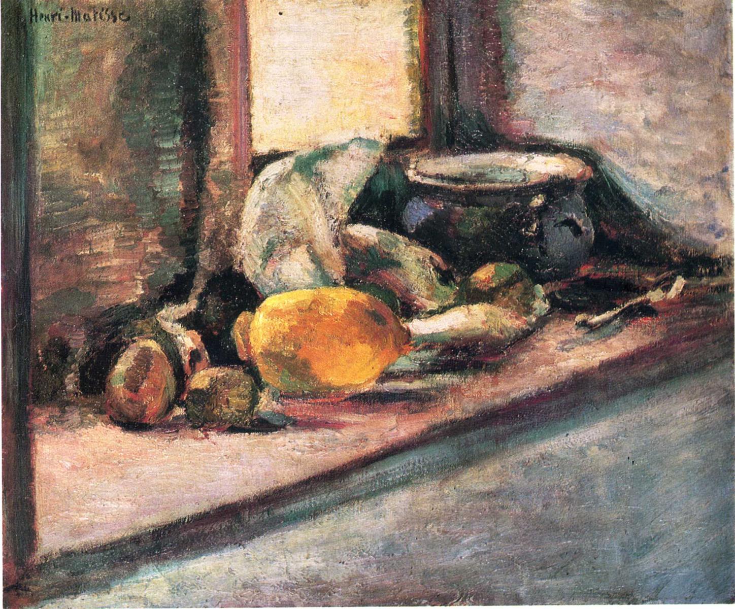
“Blue Pot and Lemon” is a compact, searching still life from 1897 in which Henri Matisse turns a tabletop arrangement into an arena for testing structure, color, and touch. A heavy, dark-blue pot sits back in space, half-lidded and reflecting the room. In front of it lie a fat lemon and a cluster of onions, pears, and other rustic produce, all pulled forward by the slant of the table. The palette is restrained—earths, cool grays, bruised greens, and measured yellows—but the surface is alive with strokes that push and pull the forms into place. Rather than counting details, Matisse builds the image from relations: the pot’s cool mass countering the lemon’s warm light, a diagonal plane of table leading the eye, a high wall holding the arrangement in. The result is a still life that feels grounded and inevitable, a study in how economy and judgment can make ordinary things radiant.
1897 and the Crucible of Still Life
The late 1890s were pivotal for Matisse. After rigorous academic training, he had spent 1896 painting outdoors in Brittany and on Belle-Île, simplifying cliffs and ports into clear, load-bearing shapes. Returning to the studio, he used still life to consolidate what the landscape had taught him. “Blue Pot and Lemon” belongs to this consolidating moment. It keeps the structural seriousness of the seascapes—the insistence that big forms must sit and planes must meet—while developing a tonal harmony closer to Chardin and Cézanne. In this canvas Matisse confirms that he can build space without linear fuss, that he can make white and gray carry light, and that a carefully pitched yellow can turn an entire picture.
The Motif and the Deliberate Edit
The subject is modest: a lidded blue pot, a lemon, several onions or small pears, a bone-handled utensil, and the corner of a table abutting a wall. The arrangement is not cluttered; it is edited. We feel the weight of the pot, the waxy flesh of the lemon, the papery onion skins, the rubbed grain of the tabletop. The pot is cropped by the upper edge and pushed slightly to the right, a modern decision that eliminates dead space and commits the painting to its subject. This closeness forces the objects to behave as actors with presence rather than as props. Everything matters because everything is structurally involved.
Composition and the Architecture of Planes
The composition rests on a diagonal plane of table that rises from the lower right toward the left center before meeting the verticals of wall and window. That diagonally tilted surface is the painting’s engine: it projects the lemon and onions into our space and tucks the pot back into its own. The left edge holds a vertical panel, perhaps a window frame or cupboard, whose darker value anchors the scheme. Against that stable scaffold, Matisse lets forms interlock. The lemon sits near the compositional fulcrum, where the diagonal changes pressure; its oval repeats the pot’s circular lid in smaller scale, echoing shape while reversing color and value. The utensil at right reprises the diagonal and keeps the eye from slipping off the picture. The whole array is a network of long forces and short counterforces, belying the quiet of the subject with rigorous design.
The Blue Pot as Pictorial Gravity
The pot’s saturated, cool body provides the image with weight. Its color leans toward indigo and bottle green in the shadows, with cold whites skimming the rim and lid. Matisse paints it as a rounded, reflective mass that gathers the room’s tones and redistributes them as faint echoes. The pot’s dark halo separates it from the background without resorting to outline; its edge exists because cool dark abuts warm light. The pot is both object and anchor: it sets the tonal floor, calibrates the mid-range values, and keeps the arrangement from floating. Even when the lemon flares in front, the eye feels the pull of that dense blue shape.
The Lemon as Light and Counterpoint
The lemon supplies the painting’s internal sun. It is not a flat emblem of yellow but a modulated form modeled by cool light and warm bounce, its highlight nudged toward pale cream and its shadows toward olive and rust. Matisse pushes the fruit’s color just far enough to lift the overall key while refusing sugary brightness. The lemon’s position midway between foreground and pot lets it mediate depth. Its roundness answers the pot’s lid; its warm spectrum answers the pot’s cool; its small size answers the pot’s volume. In a painting that prizes relation over detail, the lemon is the decisive counterweight.
Color Architecture and the Discipline of Restraint
The palette is narrow and disciplined: earth reds, umbers, and siennas for the table; leaden blues and blue-greens for the pot; gray-violets and pearl whites for wall and light; bruised greens and ochres for produce; a single, controlled chord of yellow for the lemon. Because hues are held in check, temperature carries expression. Warm and cool alternate in small steps—warm tabletop cooling as it recedes, cool wall warming near the left vertical, cool pot catching warm reflections—so the painting breathes without glare. This restraint, learned from looking long at old masters and paid forward in later high-chroma years, shows that Matisse’s famous colorism was founded on exact tonal hearing.
Light, Weather, and the Impression of a Room
The light is indoor and filtered, perhaps from a window above or behind the viewer’s left. It bleaches the wall, glazes the pot’s rim, and slides across the lemon’s curve; it falters in the deeper shadow under the fruit and in the pot’s belly. There are no theatrical beams, only a steady pressure that clarifies planes. Matisse paints the wall with thin, scumbled whites and grays so air seems to circulate between backdrop and objects. He allows the undercolor to whisper through thin passages, a device that lends the entire scene a breathable atmosphere rather than a stage-set glare.
Brushwork and the Grammar of Touch
Each substance receives a specific touch. The pot’s body is built with rounded, slightly longer strokes that travel around the form, conferring volume without tight contour. The lemon is made of short, directional strokes that turn crisply at the highlight. Onions and pears are rubbed into place with a drier brush, their skins suggested by small frays and color breaks. The tabletop is dragged in broad sweeps—some opaque, some translucent—so the paint itself imitates rubbed wood grain. Along edges Matisse often lets strokes cross the boundary, then adjusts the neighboring color to correct the contour; the result is a living seam rather than a drawn line. The surface tells the story of making but never at the expense of legibility.
Drawing by Abutment rather than Outline
A hallmark of the picture is how edges are formed by adjacent planes meeting at the proper value, not by a dark contour. The lemon’s lower edge happens where the warm tabletop turns a notch cooler; the pot’s lip exists because a cold, bright stroke rides a darker field; the utensil appears through a slim chain of value flips rather than a line around a shape. This method keeps the image unified in one light. It also makes the painting adjustable: if a form needs to sit back, Matisse cools or lowers the abutting tone; if it must advance, he warms or raises it. Drawing becomes a system of negotiations rather than an ink boundary to be colored in.
Space and Depth Without Diagram
Depth is created through the tilt of the table top, the recession of values, and the orchestration of edges. The near corner is lighter and more textured; the far plane is cooler and quieter. The left vertical panel pushes behind the tabletop with a darker, more opaque treatment, while the luminous wall recedes by thinness rather than darkness. The pot sits back because its darkest darks are reserved for its core and because its edges are softened in places by reflected light. The lemon and onions advance because they own the warmest warms and because their edges are firm where they rest on the tabletop. Linear perspective is implied rather than measured; the eye accepts depth because the color intervals and brush scales are convincing.
White as a Living Color
Matisse treats white as a working hue. The wall’s white is pearl and lavender; the pot’s highlight is a colder white with blue in it; the lemon’s glint is a creamy white warmed by the fruit’s body; the tabletop’s wipe of light is chalky and thin. This diversity of whites unifies the picture and situates the objects in a shared illumination. It also foreshadows the interiors of the next decade where white curtains, tablecloths, and walls become luminous fields that set the key for entire rooms.
The Table Edge and the Kinetics of Placement
The splayed table edge is more than a boundary: it sets tempo. Its diagonal thrust quickens the otherwise quiet arrangement and directs the gaze from lower right into the group of objects. The utensil, placed near that edge, checks the slide and returns attention to the lemon. Slight irregularities—the table’s wavering contour, the small jog along the wall—keep the geometry from becoming schematic. The painting feels made and lived with, not fabricated according to a draft.
Echoes of Tradition and Matisse’s Divergence
“Blue Pot and Lemon” converses with the French still-life tradition. From Chardin it borrows the modest motif, the discipline of values, and the humble nobility of domestic objects. From Cézanne it borrows the constructive stroke and the willingness to twist the table plane for pictorial need. Yet the painting diverges in the intimacy of its palette and the clarity of its relational design. Where Cézanne often builds tapestries of interlocking facets, Matisse keeps larger planes and allows fewer, more decisive pivots. The emphasis is not on optical complexity but on the inevitability of a few well-judged balances.
The Psychology of Color and the Mood of the Room
The canvas radiates a steady, contemplative mood. The blue pot’s cool gravity provides calm; the lemon’s warm glow offers a quiet optimism; the earth of the table brings human scale and use. Nothing is theatrical; the harmony feels like mid-afternoon light in a working room. Even the bruise-greens and russets inside the onions add a low note, preventing sentimentality and reminding us of the slow labor of cooking and keeping house. The picture dignifies the ordinary not by coating it in shine, but by listening to its true colors.
Materiality, Ground, and Layering
A muted undertone—somewhere between raw canvas and a warm gray—breathes through thin scumbles across the wall and table. Matisse leverages this ground to knit the harmony and to keep cool passages from dying. He alternates layered opacities with veils, letting undercolor show where air is needed and packing paint where solidity is required. In a few places he drags a nearly dry brush over semi-wet paint, raising the texture into small burrs that catch actual light and turn surfaces tactile—pot metal feels hard, tabletop feels rubbed, fruit feels resilient. The objecthood of the painting, its physical crust, participates in the illusion it creates.
Rhythm and Movement Across the Surface
Despite its quiet subject, the painting moves. The diagonal of the table sets a strong vector. The curved rim of the pot and the oval of the lemon create a counter-rhythm of rounded shapes. Small repetitions—three or four fruits echoing masses, two strong highlights answering across the composition, the utensil’s linear accent replaying the table’s slope—keep the eye circulating. Because color is understated, this movement does not flash; it pulses, the way attention pulses when one cooks or polishes a pot and light changes in a room.
The Ethics of Omission
Part of the picture’s authority comes from what Matisse refuses to include. There is no decorative tablecloth, no floral pattern, no careful label on the pot, no crisp cast shadow delineated for drama. By omitting anecdote, he places responsibility on relations of color and plane. The painting insists that accuracy in those relations is enough to deliver truth, and that truth—of weight, light, and space—is deeply satisfying.
Foreshadowing the Fauvist Leap
Although painted eight years before the blazing Fauvist canvases, the logic here points forward. Color is structural, not accessory. Edges are made by abutting hues rather than by hard outlines. Whites are modulated and alive. A few large shapes govern many small incidents. Had Matisse chosen to intensify the lemon into pure cadmium or the wall into saturated blue, the composition would still hold because the scaffolding is sound. “Blue Pot and Lemon” demonstrates that radical color depends on sober architecture.
How to Look at the Painting Today
Stand close to the lemon and watch how a handful of strokes shift temperature around the highlight, making the form turn without academic blending. Trace the pot’s rim and notice where the light hardens and where it dissolves into a cloud of cool reflection. Step left to the vertical panel and feel how its darker, denser paint pushes it back, paradoxically increasing depth by weight. Glide along the tabletop and sense how the brush alternates pressure to create a ribbon of rubbed grain. Then step back until the arrangement resolves into three strong actors—the blue pot, the lemon, and the diagonal table—held in a pale, breathing room. The longer you look, the more the picture convinces by the sufficiency of its few, exact decisions.
Conclusion
“Blue Pot and Lemon” is a small manifesto of balance. With a limited palette and a plain arrangement, Matisse composes a world that feels inevitable: a cool mass and a warm light locked on a slanted plane under a steady illumination. The painting dignifies domestic life by clarifying it; it converts ordinary objects into a structure of relations so persuasive that narrative becomes unnecessary. Here we see the foundations of Matisse’s later audacity: a commitment to living whites, to edges born of color meetings, to big shapes that carry a whole room, and to the belief that the right yellow in the right place can turn the day. The canvas is quiet, but its lessons are loud. They echo through his interiors, still lifes, and even his cut-outs—proof that clarity is the most radical of virtues.
