Image source: wikiart.org
Introduction
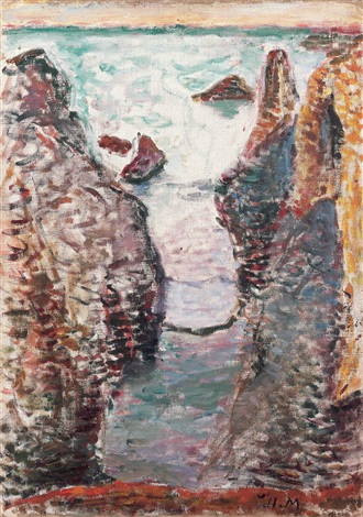
“Cliffs, Belle-Île” presents Henri Matisse in 1897 standing on the Atlantic edge and translating the island’s split rock and hard light into an intense arrangement of color, stroke, and space. The view is steep, almost vertiginous. Two striated slabs drop toward a narrow gut of water, beyond which low rocks sit in a milky, wind-ruffled sea. The horizon is a pale band, the sky only a whisper; everything important happens where stone meets water. Rather than cataloging geology, Matisse builds the scene from a few commanding relations—warm earth against cool sea, vertical chutes against horizontal swell, thick impasto against transparent veils—until the picture reads as both place and pressure. This canvas belongs to the brief, crucial period when he learned to let color and brushwork do structural work, a lesson that would underpin his later, bolder art.
Belle-Île and the Turning Point of the Late 1890s
Belle-Île-en-Mer was Matisse’s outdoor studio in 1896–97. The island’s Atlantic façade offered cliffs that fell like cut stone, narrow inlets where tide compressed into force, and weather that changed as fast as a painter could reload a brush. Working there from the motif forced him to simplify. In 1896 he often pursued a darker, tonal gravity; a year later the key lifts, whites become active, and the surface breaks into rhythmic marks. “Cliffs, Belle-Île” sits precisely at that hinge. It retains the structural seriousness of his early discipline yet trusts repeated strokes and chromatic edges to carry form. What might be a descriptive seascape becomes an experiment in how far a few large relations can conjure lived experience at the coast.
Motif, Vantage, and the Courage of the Crop
The motif is elemental: a cleft between two cliff faces leading to open water. Matisse chooses a high, close vantage, eliminating foreground safety so the viewer peers downward into the slot. The cropping is audacious. The cliffs are truncated at the top; the left wall plunges out of frame; the right wall presses hard against the edge. This refusal of panoramic comfort gives the composition modern energy and implicates the viewer’s body—you feel your toes near the drop. The sea beyond is thinly painted, a luminous counterplane that relieves the compression without turning the work into a postcard view. By structuring the image as a confrontation between vertical rock funnels and the horizontal reach of water, Matisse makes geology read as force rather than scenery.
Composition and Spatial Design
The composition rests on three simple actors: the paired cliffs, the narrow basin between them, and the bright sea beyond. The cliffs form a steep V whose sides are articulated by slanting striations; the water channel runs down the center like a plumb line; the horizon is a narrow band that caps the whole. This V-shaped architecture accelerates the gaze into depth and then releases it outward to the calm plane of ocean. Small rocks floating just past the cleft act as stepping-stones that extend space while keeping the eye from sliding off the surface. The overall plan is a study in counterforces: gravity and lift, confinement and release, mass and light.
Color Architecture: Warm Stone, Cool Water, Living Whites
Matisse organizes color into two families that interlock without blending. The cliffs are built from warm, earthen sequences—rust reds, ochres, iron browns—tempered by slate violets and touches of moss green that hint at lichen and shadow. The water family is cooler: blue-greens and teal in the near basin; paler turquoise, milk, and lavender in the open sea. Whites are never neutral. In the surf and sky they carry rose and blue so the light feels present rather than pasted on; in wet rock seams the white is chalkier, catching glints and describing texture. Because the palette is relational, each chord is calibrated against its neighbor. Warm stone emerges as weight; cool water reads as depth and motion; the whites tie the system together and set the painting’s high, maritime key.
Light, Weather, and the Atlantic Atmosphere
The light is coastal and diffused, likely a clearing day when cloud thins and glare spreads. There are few theatrical shadows. Instead, value steps are close, and temperature provides most of the description. Cliffs brighten where planes turn toward the pale sky and sink into wine-cool halftones where they fold away. The basin holds a darker pool whose surface reflects the enclosing rock, then lightens as it reaches the sun-struck outer sea. The horizon’s pale strip is not an empty band; it is the breath of the day, achieved with thin, scumbled paint that lets the ground warm through. The effect is convincing weather without narrative effect—no storm, no sunset—just the working brightness of the Atlantic.
Brushwork and the Tactile Grammar of the Surface
The canvas is written in strokes that change character with substance. On the cliffs, Matisse uses short, angled marks laid in stacks that mimic stratification and erosion. He drags and lifts the brush so the ridges of paint catch literal light, producing a tactile rasp that reads as stone. In the inner basin, strokes are more horizontal and gently curved, indicating ripple and swell under the cliff’s shadow. In the outer sea, he lays down lighter, longer drags and pockets of scumbled white to convey sparkle and glare. This choreography of touches turns the surface into a record of both seeing and weather: compressed marks where pressure mounts, released marks where air and water open.
Drawing by Abutment: Edges as Contact, Not Outline
One of the modern qualities of the picture is how edges arise from color meeting color rather than from drawn contour. The lip of the cliff is a thin seam where a warm plane abuts a cooler sky; the rock’s inner edge appears as the place where violet shadow touches pale water; the floating stones beyond are defined by value flips and temperature shifts, not by black lines. This logic of contact keeps the image breathing. It lets Matisse choose the exact color that will both describe and connect—perhaps a violet that cools a hot rock while also quieting a busy passage of sea, or a rose-tinged white that reads as foam and unites different water tones.
Space and Depth Without a Linear Diagram
Depth is built chromatically and texturally. The near cliffs are the largest, warmest, and most textured forms; their strokes are thick and assertive. The inner basin cools and darkens slightly, flattening reflections into a tight weave of marks. The outer water brightens and smooths, its strokes longer and fewer, the hue shifting toward turquoise and milk. Small, darker forms—two rock islets—sit between basin and sea, acting as pivot points. Without drafting linear perspective, Matisse creates a believable plunge and release, a spatial journey your eye can walk even while your feet grip the cliff edge.
Materiality, Ground, and the Breath of the Canvas
The painting reveals a warm ground that glows through thin passages, especially near the horizon and in sections of cliff where scumbling allows undercolor to participate. This undertone unifies the harmony and prevents cools from going lifeless. Alternation of thin and thick paint is purposeful: scumbled sky, veiled outer sea, and heavier cliff strokes create a hierarchy of attention. Where he wants solidity—rock ledges, striations—the impasto stands; where he wants air—horizon, surf—paint thins to a whisper. The physical skin of the painting thus echoes its subject: hard against soft, weight against breath.
Rhythm and Movement Across the Surface
Despite the fixed architecture of rock, the painting pulses with movement. The cliffs’ striations set a downward rhythm, quickened by the V-shape that funnels the eye. The basin’s horizontal strokes provide a counter-rhythm, slow and insistent, like water slipping through a narrow gate. The sea beyond introduces a higher, lighter tempo through streaks of pale color and dabs of foam. Your gaze accelerates through the cleft, pauses on the intermediate rocks, glides into the open, then returns along the striations to begin again. The rhythm feels natural because it corresponds to how the body would scan such a view.
Dialogue with Influences and Neighbors
The broken touch and on-site urgency share ground with Impressionist practice, yet Matisse differs in his insistence on underlying structure. Unlike a purely optical study, “Cliffs, Belle-Île” rests on firm architecture—the paired masses, the cleft, the horizon—that could survive even sharper color. In this he remembers Cézanne’s constructive lesson: forms must sit in the world. The chromatic oppositions, especially the play of red-orange warms against blue-green cools, also reflect the encouragement he received from contemporaries who urged bolder color. But he is not yet a system-driven Divisionist; his strokes are rhythmic rather than algorithmic, chosen to match the behavior of stone and sea.
Foreshadowing of Fauvism
Although the palette is tempered compared to the blaze of 1905, the logic here points straight toward Fauvism. Color is structural, not decorative; whites are inflected and alive; edges appear where hues abut; a few large shapes govern the whole. Most importantly, emotional pitch arises from color intervals rather than from detailed modeling. Warm cliffs under cool, milky air create a sensation of exposure and brightness without theatrical effects. Intensify the saturation and the picture would still hold, because its scaffolding—those decisive relations—is already secure.
The Human Scale Without Figures
There are no people in the painting, yet the view carries human scale. The cleft is wide enough to imagine a small boat slipping through at high tide; the rock is scored in layers that someone could trace with a hand; the horizon band is the height of a gaze accustomed to judging weather. By withholding anecdotal figures, Matisse lets structure and surface carry presence. The cliffs become the protagonists, their flanks bearing the record of time and tide, their meeting a dramatic stage on which the sea performs.
The Psychology of Color and the Feel of Being There
Color here does more than identify materials; it sets temperature and mood. Rust and iron notes warm the stone until it feels sun-cured; rose and lavender whites cool the water and air until they feel blown and saline; purple stripes inside the cleft suggest dampness and depth. The viewer registers not a catalog of facts but a bodily sensation: brightness at the brow; wind flowing up from the slot; the uneasy invitation to lean closer. The painting’s emotional truth comes from these intervals, not from storytelling.
How to Look at the Painting Today
Begin at the lower edge where the ledge of fore-rock cuts across and feel the heft of its impasto. Let your eyes climb the left wall, reading the striations as stacked strokes that change temperature with small shifts of light. Slip into the basin and notice how the brush switches from facets to low, horizontal pulls; watch the inner pool darken then brighten as it meets open water. Pause on the tiny rock islets and see how a few touches make them sit and cast presence. Lift to the horizon and test how thin scumbles produce a believable field of light. Finally, step back until you sense the painting’s larger chord: warm flanks enclosing cool depth under a high, pale sky.
Technique and the Sequence of Decisions
The order of making remains legible. A toned ground warms the enterprise. Large masses are blocked first: the paired cliffs, the inner water, the outer sea, the horizon band. Over these flats, directional strokes build geology and motion—angled striations on rock, horizontal pulls on water. Whites and pale tints are scumbled late, to top-light surfaces and open air. Last come the small accents that calibrate depth: darker touches in the basin’s seam, brighter notes along the outer surf, a few lifted highlights that pick out rock teeth. Nothing feels overworked; each layer contributes a clear function—structure, substance, light.
Place in Matisse’s Belle-Île Series
Compared with the broader cliff panoramas and harbor views of the same period, “Cliffs, Belle-Île” is more concentrated and architectural. It compresses the island experience into a single, dramatic gesture—the plunge between rocks—so that brushwork and color can be tested against a firm armature. Seen with the other Belle-Île canvases, it reveals the consistency of Matisse’s coastal experiment: whether he paints a port, a lane, or a split headland, he is teaching himself to rely on large relations and to let whites and chromatic edges carry the day.
Conclusion
“Cliffs, Belle-Île” matters because it shows Matisse turning landscape into a clear, modern structure without losing the bite of place. Two warm rock masses, a cool cleft of water, and a thin horizon are enough. Stroke by stroke he converts geology and weather into a coherent rhythm—vertical striations, horizontal swells, scumbled light—until the scene feels inevitable. From this discipline grows the freedom of the years to come. When color later surges in his Fauvist canvases, it will stand on scaffolding built on the Breton edge: edges as meetings of color, whites as living light, and a trust that a few large decisions, honestly made, can carry all the complexity a viewer needs.
