Image source: wikiart.org
Introduction
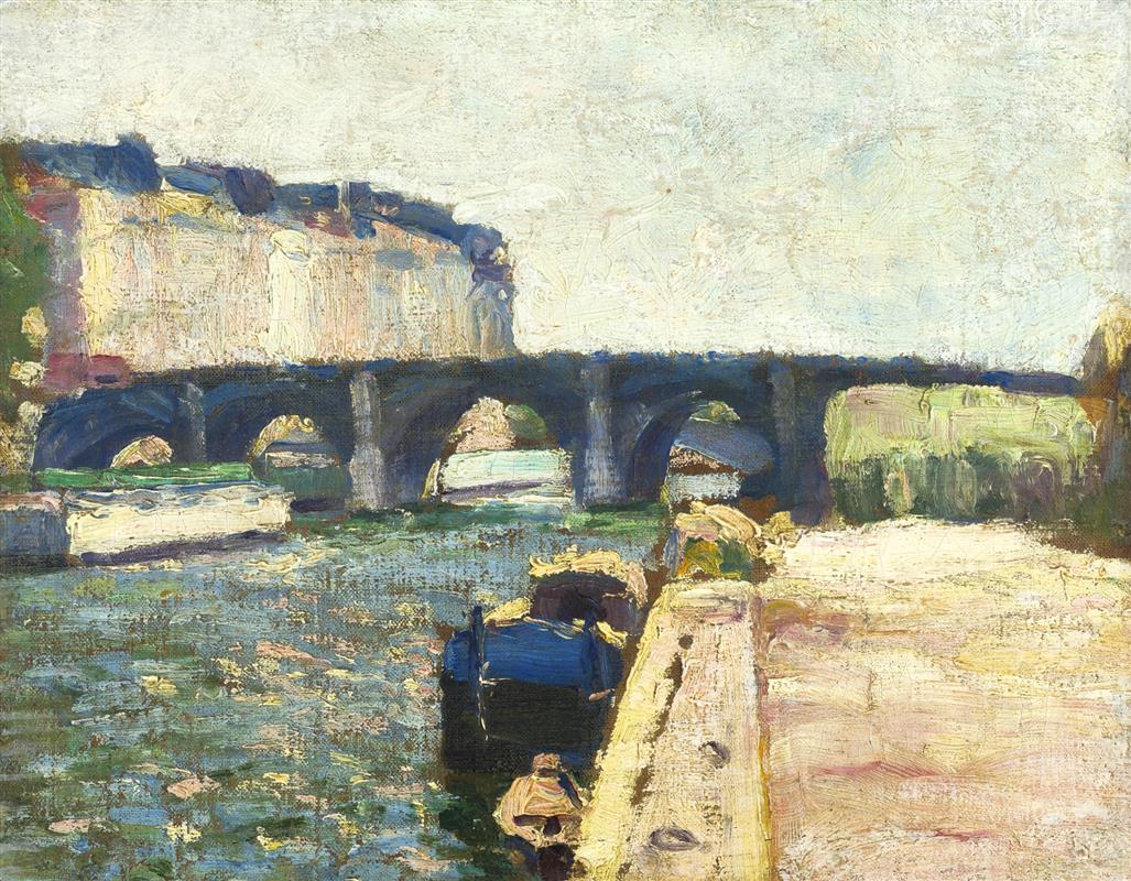
“Pont de Seine” shows Henri Matisse in 1897 standing on a stone quay and converting the river’s ordinary traffic into an experiment in structure, light, and touch. A multi-arched bridge crosses the center of the painting like a single dark chord; pale barges slide beneath its spans; a sun-struck embankment elbows into the foreground at the right; the left bank piles up into a block of ochre buildings trimmed with blue shadow; the sky is a high, chalky field. The scene is prosaic—no monuments, no crowds—yet the surface thrums with decisions. Matisse restrains his palette and lets the brush carry information: thick strokes model stone, short choppy touches knit water, and scumbled whites keep the sky breathing. The result is a compact cityscape that reads as both place and proposition, announcing how color relations and directional marks can organize the modern river.
Historical Context: Matisse Between Academic Habit and Modern Clarity
The late 1890s were Matisse’s crucible. He had passed through disciplined academic study, learned old-master values in the Louvre, and, the year before, wrestled with the windswept geology of Belle-Île. Those experiences taught him two complementary lessons: the need for structural order and the power of on-site observation. “Pont de Seine,” painted in 1897, belongs to that moment when he began to apply these lessons to the city. Instead of the blazing chroma of his Fauvist breakthrough eight years later, he works in a tempered key: blue-greens, ochres, umbers, and smoke-violets. Yet the logic already sounds like Matisse—the image is built from large, legible planes that hold the eye and from color intervals that carry mood more than literal detail.
The Motif and the Viewpoint
The motif is simple: a stone bridge crossing the Seine on a bright day with barges moving through its arches. Matisse appears to stand on the near quay at the right edge, looking diagonally across the water. The perspective is low enough to feel the river’s breadth and high enough to see into the arches. The embankment thrusts toward us like a ramp, its warm limestone catching light; the river stretches away in a sheet of broken green; the bridge cuts across as a steadying band; and beyond it a strip of pale buildings and a wedge of vegetation frame the sky. The subject is not the landmark status of the bridge but the lived, workaday river that such bridges make possible.
Composition: Bands, Arches, and the Engine of the Quay
The composition organizes itself into horizontal bands—water, bridge, sky—energized by three devices. First, the right-hand quay is a strong diagonal that propels the eye inward; its dotted mooring holes beat time like notes on a staff. Second, the procession of arches sets a rhythm of dark ovals whose inner lights lead attention to the river’s tunnels and the glinting barges passing through them. Third, the mass of left-bank buildings balances the pale void of the sunlit quay, preventing the picture from tipping to the right. Together these pieces create a Z-shaped path: from the lower right along the quay, across to the far bank through the arches, and finally up into the expanse of sky. The composition is both simple and muscular, built to survive the restless surface that Matisse will lay upon it.
Color Architecture: A Tempered Harmony of Stone, Water, and Air
Color in “Pont de Seine” is disciplined, almost austere, and therefore eloquent. The water is a scale of blue-greens and olive tones brushed with small flecks of yellow that read as reflected light. The bridge is anchored in cool blues and soot-violets that keep its masonry in shade without deadening it. The left bank is ochre and cream with blue shadow scalloped along its top edge—warm against cool, light against dark. The sunlit quay at right is laid in pale straw, pinkish stone, and hints of violet; those warm notes make the water feel cooler by contrast. The sky is a scraped, broken white with whispers of lemon and gray. None of these colors are theatrical; they are relational. Each field finds its pitch by listening to the others, the way instruments tune to a central A. That relational tuning is what will later allow Matisse to operate with much higher chroma without losing coherence.
Light, Weather, and the Urban Atmosphere
The light is midday or early afternoon, high and slightly hazed, giving the entire scene a milky envelope. There are no dramatic cast shadows, only soft transitions from sun to shade. The sky’s impastoed whites are dragged thin in places, letting a warm undertone breathe through; this creates the feeling of brightness without resorting to pure, flat white. On the river, short, horizontal strokes mix greens and yellows so that light seems to break into fragments on the choppy surface. The bridge takes the light more sparingly—its arches are dark caves whose edges catch small, cool reflections. The effect is a true urban weather: not heroic glare, not sentimental sunset, but a working brightness under which boats move and stone warms.
Brushwork and the Material Fact of Paint
Matisse uses brushwork as a descriptive and structural tool. On the water he lays short, parallel dashes that travel with the current and chop the light into rhythmic bits. On the quay he drags broader, heavier strokes that fuse into limestone; you can feel the grit and the scraped mortar along the top edge. The bridge’s stone is built with blocky strokes that respect the arch’s load-bearing curve. In the sky he scumbles and scrapes, leaving licks and swirls that keep the field from congealing. Paint thickness varies strategically—thin where air is required, thick where solidity is the point. Look closely and the picture reads like a ledger of actions: drag, scumble, dash, press, pull. That ledger keeps the river alive even when the palette is quiet.
Boats, Barges, and the Human Trace
No figures are clearly visible, yet the painting is saturated with human presence. Barges crawl under the spans, one with a green deck plate, another white and sun-hit, a dark hull nosing along the near bank. The embankment’s pitted coping stones record moorings tied and untied; the left-bank buildings form a serrated wall of windows worn by weather and labor. By refusing anecdotal figures, Matisse lets objects and surfaces speak for work: this is a lived river, a thoroughfare of transport and exchange. The painting honors that prosaic life the way Dutch cityscapes did, but with modern economy—the life is encoded in the way planes meet and colors trade.
Space and Depth Without Diagram
Perspective is felt rather than plotted. The quay narrows convincingly, but there is no fussy linear diagram; its recession is handled by value steps and brush scale. The arches are not perfectly symmetrical; they vary because our vantage grazes them at an angle. The far bank softens into lighter, warmer notes, creating aerial depth without smoke. The small, bright patch of water glimpsed through the farthest arch is a masterstroke: a quiet beacon that tells the eye the river continues beyond the bridge and that space remains open. This is how Matisse prefers to build depth—through a succession of tuned planes—rather than through mathematical perspective lines.
Cropping and the Modern Edge
The right foreground is a bold crop. The quay occupies a large, unornamented wedge of picture space, its edge slicing off anything anecdotal that might distract. That wedge behaves like a stage wing: it frames the action and reminds us of our bodily position on the near bank. The distant left buildings are also cropped abruptly, refusing skyline prettiness. These choices make the picture feel modern. They accept that a painting can present a section of the world, not a panorama, and that such a section can still convey the whole by implication.
Rhythm and Movement Across the Surface
The painting has a quiet but insistent rhythm. The arches beat across the canvas in a slow four-count; the small barges mark syncopations; the dashed water keeps time like a brushed snare; and the long, pale quay delivers a sustained note that cuts through the texture. Your eye enters at the lower right, skims the quay, pauses at the dark hull near the bank, crosses through the arches from right to left, and lifts into the sky. Then the left-bank building’s blue shadow guides you back to the water, where the dashes set you moving again. The painting’s music is not spectacular, but it is steady and convincing, the kind of rhythm that governs long workdays.
Dialogue with Influence: From Cézanne’s Construction to Urban Impression
The bridge’s mass and the quay’s planarity reveal a Cézannian respect for construction: forms must sit sturdily in the world. The broken water and open sky share ground with Impressionist practice, yet Matisse is less interested in optical shimmer than in a stable scaffold on which shimmer can happen. He prefers to lock large shapes first, then animate them. That sequence—structure before sparkle—is what will later allow him to push hue with confidence, because the picture will continue to hold even as color becomes more audacious.
Foreshadowing Later Matisse
Though the palette is low-key, the logic is already Matisse’s. Whites are active participants, tinged by neighboring colors rather than used as neutral filler. Edges often arise from one color abutting another, not from drawn outlines. Local color yields to relational necessity: the water is as green as it needs to be to set off the ochre quay; the bridge is as blue-violet as it must be to sit between the warm bank and the cool water; the sky is as textured as required to keep the upper half breathing. These are the habits that will underpin Fauvism: build the image from color relations that feel inevitable, not from transcribed details.
Technique, Ground, and Layering
A warm, mid-tone ground seems to underlie the painting, surfacing in scumbled passages, especially in the sky and on the quay. Matisse alternates opaque strokes with translucent veils, letting the undertone unify the separate zones. In the water he sometimes drags a loaded, darker stroke across semi-dry paint, creating ridges that catch real light and mimic ripples. In the sky he scrapes with the brush’s side to thin the white and show the ground, a move that brightens the field without thickening it. These layered procedures make the surface a participant in the subject: stone looks built, water looks layered, air looks lightly worn.
The Psychology of Color in a Working River
The painting’s emotional weather emerges from its color intervals. Olive and blue-green suggest coolness and depth; the ochre quay answers with warmth and stability; violet-blue bridge tones add a note of gravity; the scraped white sky keeps the whole from sinking. Nothing is sentimental or dramatic. The mood is industrious calm—the kind of day when barges keep their schedules and the city breathes through work rather than spectacle. That psychological steadiness is an achievement of relation: not one hue dominates, each carries its share.
How to Look at the Painting Today
Stand close to the water and watch the brush decide: short horizontal dashes, little lifts, and colliding greens that make a surface out of marks. Move to the quay and feel how a few dragged strokes become limestone coping. Slide to the arches and count how small flashes of light inside them set space running. Step back and check how the left-bank block balances the blankness of the right. Finally, look at the sky until its scraped whites and pale yellows consolidate into high, diffused brightness. The painting rewards this movement between scrutiny and overview because it was built from that rhythm of looking.
Why “Pont de Seine” Matters
This small cityscape matters because it shows Matisse consolidating the grammar that would soon free his color. He proves he can organize a complicated scene—architecture, water, traffic—into a few robust planes; he demonstrates that a tempered palette can convey weather and mood through temperature alone; and he trusts brushwork to carry material truth without narrative props. In other words, the picture stands on structure and relations—the same pillars that will support the audacity to come. When later canvases explode with pure hues, they will do so on the foundation laid here: a bridge that holds.
