Image source: wikiart.org
Introduction
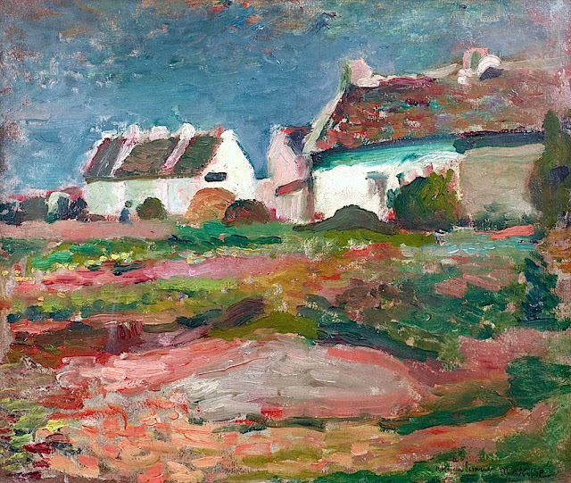
“Houses in Kervilahouen, Belle Île” shows Henri Matisse in 1896 standing before a small Breton hamlet and discovering how color and brushwork alone can carry the feeling of a place. Clustered white houses sit under a gusty blue sky; the ground between painter and buildings is a mosaic of pinks, reds, and greens that churn like surf translated into earth. The scene is simple, almost bare of anecdote, yet the surface thrums with decisions. Instead of drawing every stone and hedge, Matisse knits the image from broad planes, abrupt accents, and broken strokes that let atmosphere, light, and texture emerge from paint itself. The result is a daylight counterpart to his rough seascapes from the same year and a crucial step toward the liberated color structures that would soon make his name.
Belle Île, Kervilahouen, and the Turning Point of 1896
Belle Île-en-Mer, off the coast of Brittany, offered Matisse an outdoor workshop in wind, salt, and volatile light. The hamlet of Kervilahouen sits inland from the Atlantic needles of Port-Coton, where weathered houses nestle among sandy plots and low hedges. In 1896 Matisse came to the island seeking distance from the strictures of studio training. Working outdoors forced speed and economy. It also placed him in dialogue with painters who emphasized direct observation and bold chromatic relations. On Belle Île he learned to treat the motif as material for construction rather than transcription, translating topography into interlocking fields of color and value. “Houses in Kervilahouen” records that shift: solid architecture is kept, but the real subject is the choreography of color under a maritime sky.
Motif and Point of View
The motif could not be humbler: a few whitewashed houses with sloped roofs, a patch of garden or meadow, a pair of bushes shouldering against a wall, and the open sky. Matisse positions us low in the foreground, so that the field occupies most of the image and the buildings ride the horizon like luminous caps. The vantage feels intimate and slightly off-axis, as if the artist had paused on a sandy track, turned halfway toward the houses, and began painting before the light changed. The composition’s energy starts on the ground and runs upward. The houses act as markers of stability, but the land and sky carry the movement.
Composition and Spatial Design
The painting is organized as a sequence of horizontal bands—foreground earth, mid-ground vegetation, the white planes of walls, and the blue ceiling of sky—crossed by smaller verticals and diagonals that break rigidity. A broad, warm wedge of earth enters from the lower edge and sweeps toward the center, encouraging the eye forward. Low shrubs interrupt the middle band with dark humps, while the houses supply strong, geometric silhouettes that anchor the upper register. Rooflines lift slightly toward the right, creating a gentle rise that keeps the horizon alive. Matisse compresses depth; he does not build space with strict perspective but with the stacking of color zones and the change in brush scale from near to far. The houses are crisply stated in light and shadow; the foreground retains a rougher weave of marks, preserving immediacy.
Color Architecture and the Warm–Cool Engine
Color is the painting’s architecture. The ground is a quilt of warm reds, oranges, and pinks spliced with cool greens, setting up a warm–cool shimmer that reads as sunlit soil scattered with heather, gorse, and grass. The houses are not neutral white but nuanced planes of pale turquoise shadow, creamy halftone, and quick salmon reflections that bounce from the earth. Roofs carry tertiaries—brick red rubbed with green—so that even in the most saturated areas the color networks restrain one another and keep the eye moving. The sky is a dense, worked blue with touches of violet and gray that temper sweetness and match the wind-bent mood of the island. Nothing is filled flatly. Each plane holds small temperature shifts that do the descriptive work of modeling while also knitting the surface into a single, breathing harmony.
Light, Weather, and the Atlantic Atmosphere
The light feels high and mobile, the kind of hilltop brightness that clears in gusts after a squall. It is not Mediterranean blaze; it is Breton light that brightens whites without bleaching them and that cools shadows into green-blue. Matisse records this with limited value jumps and frequent temperature turns, implying a sky that flickers rather than floods. The houses catch the strongest beams, but their edges are softened by the surrounding air. In the field, light arranges itself as scattered patches rather than cast shadows, suggesting scrubby plants catching sun at different angles. The atmosphere is present in the way edges dissolve and colors mingle, as if the painting were ventilated from behind.
Brushwork and Surface: Building with Strokes
The surface is a map of brush decisions. In the foreground, Matisse uses thick, lateral pulls and short, choppy marks that evoke gravel, soil, and low vegetation. Mid-ground strokes settle into broader planes, setting up a calmer counterpoint before the eye hits the walls. On the houses, strokes are fewer and more planar, granting architecture the clarity it needs to read amid the unruly field. The sky is knitted from long, slightly curved streaks that echo gusts and lend the upper register a subtle rotation. Paint is sometimes scumbled thinly enough to let the ground glow through and sometimes laid more densely to declare a ridge, a roofline, or a hedge. This variety of handling keeps the painting live; texture becomes information.
White as Color
One of the lesson-bearing features of the picture is how it treats white. The houses might seem pure white at first glance, but a closer look shows that “white” here is a chord built from mint, pearl, warm cream, and flashes of coral. Because the surrounding ground bristles with red-orange, the cool greens inside the house shadows push forward, making the facades luminous rather than flat. This is the strategy Matisse would later deploy on a grand scale: let “white” participate in the color system instead of sitting apart as a neutral. In practical terms, this lets the houses feel bright while still belonging to the painting’s overall temperature.
The Houses as Characters
Each building reads as a personality. The leftmost house steps forward modestly with a simple pitched roof and a dark rectangle suggesting a door or window. The central building is the bravest, catching the most light on its gable and unfurling a turquoise shadow under the eaves that functions like an eyebrow. The rightmost structure recedes, half merged with trees, an anchor rather than a protagonist. None of the houses are fussed over; their individuality comes from silhouette, roof color, and the way their whites shift against sky and ground. They carry human presence without figures, declaring this as a lived landscape where shelter and work shape the terrain.
The Ground as a Painted Meadow
The foreground could be a miniature treatise on how to paint a meadow without painting every blade. Matisse toggles between warm and cool notes, interrupts horizontal runs with oblique swipes, and inserts small darker knots for clumps of low shrubs. Occasional streaks of pale, almost chalky color operate as sandy paths. A single gray-pink slab near the bottom center reads as bedrock or a flat stone, a quiet pause amid the churning textures. By preserving the brush’s energy and avoiding smooth blends, Matisse makes the earth feel springy, uneven, and alive with small color changes—the kind of surface you feel underfoot.
Rhythm, Movement, and the Viewer’s Path
The painting’s rhythm is defined by alternating calm and agitation. The field is restless; the houses are settled; the sky is somewhere between, with large strokes that feel broader than the ground but not as architectural as the walls. The viewer’s path follows this rhythm: enter through the warm foreground, weave across the green interruptions, arrive at the white planes where the eye rests, then drift into the blue depth above. Color accents serve as directional cues. A coral flash beneath a roof or a green streak caught in a wall’s shadow nudges movement. The composition’s music is pastoral but not sleepy; gusts of color keep the tempo alert.
Dialogue with Influence and Place
Brittany had been a magnet for painters who sought a more structural and symbolic approach to landscape. Without imitating anyone, Matisse here benefits from that tradition: simplify forms, let color carry emotion, and design the picture around large relationships. He retains respect for observed light—unlike the cloisonné partitions of some Pont-Aven works, his forms remain open and permeable—but he shares the urge to let a village read as a pattern more than a catalog of facts. The emphasis on constructive brushwork also reflects his admiration for painters who built volume with strokes rather than with tight contour. At Kervilahouen, these various currents align with the particularities of place: whitewashed houses that reflect sky, scrub that introduces lively warmth, and weather that keeps colors honest.
Foreshadowing Fauvism
This is an early work, yet its logic foreshadows the radical color of 1905. Color is already the structural agent. The warm-cool engine of the field does the work of perspective by pulling the viewer through near and mid zones. The whites of the houses are already active members of the palette. Edges are often the meeting of two colors rather than a drawn line. And most critically, local color bends to pictorial need without breaking the sense of truth: the turquoise in the eaves shadow is more intense than observation alone would demand, but it makes the wall glow and binds architecture to sky. That willingness to let relationships outrank description is the seed of Fauvism, still tempered by the sobriety of the Breton key.
The Ethics of Omission
Matisse’s restraint is as important as his selections. He omits signage, individual shingles, stone joints, and all the minor narrative details that could turn the image into a genre scene. He withholds figures so that houses and field speak for human habitation without anecdote. He keeps the sky free of theatrical clouds, preserving it as a color plane that weighs on the village. These omissions focus attention on pictorial essentials—shape, temperature, and rhythm—and align the painting with a modern ethic of clarity.
Technique and Ground
The canvas appears to have been prepared with a toned ground that interacts with both field and sky. In places where paint is thinly scumbled, a warm undertone glows through, especially in the lower half, lending coherence to the pinks and oranges. Thicker passages ride atop as accents, catching light physically and supplying texture. Edges are negotiated by abutting strokes more often than by enclosing outline, which gives forms a living seam rather than a static border. The cumulative effect is a surface that remembers its making: the field looks rubbed and dragged; the houses look decisively placed; the sky looks swept.
Domesticity, Shelter, and the Poetics of Place
Beyond its formal strengths, the painting carries a quiet poetry of domestic life. The houses are white because they are maintained; their roofs are patched in mixed colors because repairs accrue; the field is a tangle because wind and salt refuse strict order. Matisse’s sympathy lies with such ordinary endurance. He finds dignity in the way architecture gathers light and scatters it back into the grass. He assigns the field a complex voice rather than a backdrop role. The painting proposes that a village can be modern not through industrial novelty but through the clarity with which it is seen and translated into paint.
Relation to Matisse’s Other Belle Île Works
Compared with the severe seascapes and rock studies of 1896, “Houses in Kervilahouen” brightens the key and softens the silhouette. Where the cliffs are defined by mass against void, the village is defined by interpenetrating planes. The earlier seascapes lean on tonal gravity; this village study leans on chromatic buoyancy. Read together, they show the breadth of Matisse’s Belle Île experiment: he could make the Atlantic feel weighty with lowered hues and the hamlet feel wind-polished with heightened ones, all while maintaining structural clarity across subjects.
How to Look at the Painting Today
Stand close enough to see the individual strokes in the foreground and notice how few of them are literal. Step back until the pinks and greens cohere into a convincing field, then return to the houses and watch how their whites change as your distance shifts. Let your eyes travel along the roofline from left to right; feel how the slight rise imparts lift to the sky. Finally, settle in the turquoise shadow under the central eave and test how it glues the wall to the air. The longer you look, the less the scene reads as “houses on a hill” and the more it reads as a fabric of relationships tuned to the weather of a particular hour.
Conclusion
“Houses in Kervilahouen, Belle Île” matters because it crystallizes the moment when Matisse trusted color and handling to do architecture’s work. The picture honors the physical facts of a Breton hamlet while transforming them into a system of warm–cool exchanges, decisive silhouettes, and rhythmic strokes that carry emotion without story. It is both pastoral and modern, anchored in observation and propelled by invention. From the pinks and greens of the meadow to the breathing whites of the houses and the worked blue of the sky, everything here is an argument for painting as a way of understanding place through the logic of color. In that argument lies the road to his later, bolder canvases.
