Image source: wikiart.org
Introduction
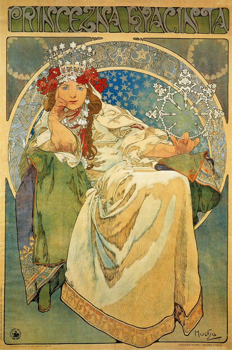
Alphonse Mucha’s “Princess Hyacinth” of 1911 is one of the artist’s most dazzling late posters, a work that marries the cosmopolitan language of Art Nouveau to the rising tide of Czech cultural pride. The composition stages a crowned heroine seated within a circular mandorla, her white gown pooling in luminous folds while constellations, lacework ornaments, and Slavic floral garlands orbit her like a private galaxy. Lettering across the top spells “PRINCEZNA HYACINTA,” announcing a theatrical event, yet the poster functions as far more than an advertisement. It is a self-contained myth, a manifesto of national style, and a virtuoso display of lithographic craft that turns performance into icon.
Historical Context and Theatrical Commission
“Princess Hyacinth” was created for a stage production at Prague’s National Theatre at the moment when Mucha, after his long Parisian success, had returned to Central Europe and was actively shaping a visual identity rooted in Slavic tradition. The poster’s fusion of folk costume, celestial symbolism, and crystalline ornament speaks to that dual allegiance. It had to work on the street—legible, alluring, immediate—but it also had to signal that the performance belonged to a specifically Czech cultural world. Mucha achieves both by casting the star of the production as an allegorical princess whose beauty and authority are framed not by French arabesque alone but by motifs familiar from regional embroidery, metalwork, and fairy-tale illustration.
Composition and the Architecture of Majesty
The figure occupies nearly the entire height of the sheet, seated in a three-quarter pose that forms a stable pyramid. One elbow rests on a raised knee, the hand supporting a contemplative chin; the other arm extends outward, palm up, as if she is presenting a jeweled snowflake to the audience. A sweeping circular frame encloses her, creating a stage within the poster and a halo around her status. Mucha interlocks three spatial systems—the rectangular poster, the circular medallion, and the pyramidal figure—so that the eye moves effortlessly from the headline to the face, across the sparkling device in her hand, and down through the cascading garment. The result is compositional authority: nothing feels accidental, and everything contributes to the sensation of sovereign poise.
The Crown, Garland, and the Language of Regalia
Mucha’s princess wears a striking crown that fuses theatrical headpiece with folk wreath. Silver tines tipped with stars shoot upward like frozen sparks, while a dense red garland of blossoms wraps the base of the diadem. The hybrid object signals two kinds of power—the celestial sanction implied by the starry crown and the earthly, communal authority suggested by flowers commonly found in Slavic bridal or festival wreaths. Pearled earrings and pendants complete the ensemble, their drops echoing the crown’s icicle rhythm. This regalia is not aristocratic bling for its own sake; it is a coded vocabulary that makes a national heroine from stage costume.
Gesture, Expression, and the Drama of Stillness
Although the poster advertises movement on the stage, the picture itself is a study in composed stillness. The chin-on-hand pose conveys alert intelligence and a touch of irony; the extended hand, wrist flexed, reads as invitation and command. Mucha favored small, exact gestures to convey character. Here he builds narrative without props. The princess is thinking, choosing, bestowing. The calm of her expression, framed by the soft fall of long braids, tempers the glitter of the crown and ornaments. Instead of a haughty diva, we encounter a heroine whose power is as much mental as ceremonial.
Color and the Emotional Temperature of Enchantment
The palette is a precise orchestration of creams, pale golds, deep greens, and dreamlike blues pricked with stars, set off by the decisive red of the flowered crown. Mucha allows the large field of the gown to carry most of the luminosity; its warm whites hold the eye, while the cool blues of the circular sky push back, creating depth. The green mantle and lining offer grounding earth tones, and a thin band of warm ornament at the hem seals the composition. Nothing is loud; even the red in the crown is moderated by the frosted sparkle of the diadem. The tonal harmony produces a mood of fairy-tale enchantment that remains stately rather than sugary.
Fabric, Pattern, and the Tactility of Luxury
As always, Mucha is a poet of fabric. The princess’s gown is built from long, supple strokes that describe weight and sheen without overmodeling, while the mantle’s interior reveals a patterned lining that hints at brocade. Cuffs, collar, and hem are edged with tiny repeats that feel like embroidery. These passages do not clutter the image; they convert the flatness of lithography into a tactile fiction. The viewer senses the rustle of cloth and the crisp, cool touch of metal and stone in the ornaments. Mucha’s genius lies in making decorative detail serve the larger clarity of form.
The Celestial Mandorla and Hidden Stories
The circular field behind the figure is alive with imagery: constellations and stars drift in a gradient from midnight blue to pale turquoise; within the ring that separates figure from sky, delicate white designs appear—lunar crescents, astral devices, perhaps even miniature theatrical emblems. This border operates as a celestial narrative frieze. It situates the princess in a cosmic order without tying her to a single myth. Audiences read the cue instantly: this is a heroine blessed by the heavens, a star among stars, a dream staged in planetary proportions.
Typography as Ornament and Overture
Across the top, Mucha’s headline lettering plays the role of orchestral overture. Each capital is a small composition of swelling stems, knotted counters, and gentle serifs, all joined into a horizontal ribbon that echoes the curves below. The green-on-cream scheme integrates it with the palette, while the thick outlines ensure legibility at a distance. Mucha never treated type as an afterthought. Here the letters perform as much as they inform, turning language into design and inviting the passerby to “hear” the title before reading it.
Line, Contour, and the Pulse of Art Nouveau
Even in this late work, Mucha’s line remains supple and alive. Contours thicken at points of weight—the bent elbow, the gathered knee—then taper to a hair’s breadth along the lit edges of the sleeve. Parallel strokes inside the gown suggest fold and shadow with a calligrapher’s economy. Hair is rendered as flowing strands that merge visually with the floral garland and with the organic repeat at the hem, a favorite Mucha strategy for binding human figure to ornament. The drawing is not merely an outline to be colored; it is the pulse that carries energy through the entire sheet.
Lithographic Craft and Street Legibility
Posters in 1911 still functioned as urban billboards, competing on kiosks and façades. “Princess Hyacinth” is engineered for such theaters. From across the street the passerby registers the dramatic silhouette of the seated figure, the glittering crown, and the large title. At mid-distance, the quiet interplay of robe and sky delivers mood. Up close, the micro-world of embroidery, jeweled devices, and frieze motifs rewards slow viewing. Mucha had perfected this tiered legibility in Paris; here he applies it to a Czech subject with undiminished finesse.
Folklore, National Style, and Cultural Politics
Mucha’s embrace of folklore is never a retreat into quaintness. The braids, wreath, and patterned textiles assert cultural inheritance at a moment when Czechs were consolidating national identity within a multiethnic empire. The poster declares that modern spectacle can speak in a Slavic accent without losing international elegance. The work’s authority thus extends beyond the box office. It participates in the visual nation-building that would preoccupy Mucha for the rest of his career and culminate in the monumental “Slav Epic.”
The Princess as Personification
Although the image advertised a specific production, Mucha casts the heroine as more than a role. She personifies a cluster of values—grace under thought, beauty wedded to intelligence, sovereignty balanced by community—articulated through the visual grammar of crown, wreath, and gesture. Even the crystalline device in her open hand reads as a stylized snowflake or star cluster, a token of blessing or inspiration to be shared. She is an icon of possibility, the kind of figure who could preside over a national theater as a presiding muse.
Rhythm, Repetition, and the Music of Design
Look closely and the poster reveals a choreography of repeats. Star points echo crown tines, which in turn rhyme with the lace-like rosettes on the white fringe jewelry. The scalloped hem repeats in smaller scales at cuffs and collar. The circular mandorla answers the roundels buried in its own border. Such repetitions create visual “beats,” a rhythm that keeps the eye moving and binds disparate elements into a single melody. Mucha composes with motifs the way a composer weaves themes through a score.
Scale, Presence, and the Viewer’s Encounter
Mucha’s princess is near life-size, and her direct gaze, half smile, and grounded posture establish an encounter rather than a procession. She sits slightly off center, so the viewer feels invited into her space rather than addressed from a distance. The throne-like drapery and the luminous field behind her cause the foreground to read as a shallow stage; we, the viewers, stand at the footlights. This staging transforms a passerby into a participant, the first step in turning curiosity into a ticket purchase and, more broadly, into cultural allegiance.
Material Imagination and Sensory Appeal
Part of the poster’s seduction is sensory. One imagines the cool touch of the silver crown, the crisp rustle of the sleeve, the warm weight of the green mantle, the faint perfume of the floral wreath, the electric sparkle of the star device. Mucha conjures these sensations without literal realism; they arise from the way line and color are placed, from the confident shorthand of his textures. The senses, once engaged, tether memory to the image long after the viewer has left the street.
Continuity and Innovation in Mucha’s Late Style
By 1911 the international fever for Art Nouveau was cooling, yet “Princess Hyacinth” shows Mucha refining rather than abandoning his signature idiom. He reduces the more florid whiplashes of the 1890s to an ordered interplay of line and emblem, enriches the decorative vocabulary with Slavic specifics, and elaborates type into a modern, national script. The poster is thus both familiar and new—recognizably Mucha, yet tuned to the cultural frequency of Prague on the eve of modern nationhood.
Legacy and Contemporary Resonance
The image has endured because it reconciles several desires at once: the desire for spectacle and the desire for roots, the love of ornament and the need for clarity, the magnetism of a star and the intimacy of a face. For today’s viewers the poster still works as both advertisement and artwork, a reminder that design can dignify public life without sacrificing pleasure. It remains one of Mucha’s most quoted images precisely because it distills his late vision into a single, generous icon.
