Image source: wikiart.org
Introduction
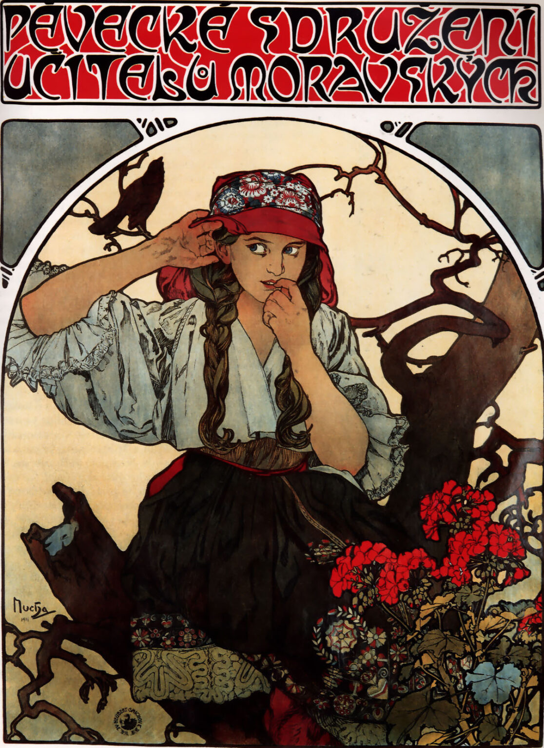
Alphonse Mucha’s “Moravian Teachers’ Choir” (1911) is a late poster that fuses the designer’s Paris-honed Art Nouveau language with a deeply rooted Central European identity. At first glance the work seems straightforward: a Moravian girl in folk costume sits among gnarled branches while bright geraniums bloom at her knee and a black bird perches on a limb behind her. But every decision—pose, costume, lettering, color, and framing—works like a chord in a song about listening, memory, and national culture. Created to promote a choral association of Moravian schoolteachers, the poster is both advertisement and cultural testament, celebrating the voice as a communal instrument and the countryside as the choir’s spiritual home.
Historical Context and Purpose
By 1911 Mucha had returned increasingly to the lands of his birth after a decade of Parisian fame. He supported Czech and Moravian cultural institutions and believed the applied arts could serve a national revival. A teachers’ choir represented education, language, and shared repertoire—the very mechanisms by which culture is transmitted. The poster’s blend of folk imagery and modern design addresses an audience that straddled town and countryside. It honors rural tradition while speaking in an urbane visual idiom legible on city walls, reminding viewers that national song belongs in modern life as much as in village squares.
Typography as Voice
The poster begins to sing in its headline: the broad red band at the top carries sweeping, interlaced letterforms that read like musical ornament. The diacritics and ligatures of the Czech language become design assets, their curving strokes echoing the arabesques below. Thick stems, ribbon-like counters, and sinuous joins create a rhythm one feels before deciphering the words. Mucha often treated lettering as architecture; here it becomes voice. The headline’s scarlet intensity declares vigor, while the cream outlines and small black infills give the title clarity from a distance. Typography, image, and theme are inseparable: language itself is music.
Composition and the Architecture of Listening
A circular frame encloses the figure and branches, nested inside the poster’s vertical rectangle. This geometry stabilizes the design and dramatizes the girl’s inward turn. She sits three-quarter view, knees angled left, head slightly lifted, right hand cupped behind her ear. The gesture is unmistakable: she is catching a distant song, perhaps the choir itself. Her left hand rests near her mouth as if she might join at any moment. The surrounding branches create a counterpoint of diagonals that guide the eye around the circle—up past the bird, through the knitted twigs, and back to the girl’s attentive face. The circular boundary behaves like a resonant shell; within it, sound seems to gather.
Gesture, Narrative, and the Moment Before Song
Mucha preferred quiet drama, and the poster’s story resides in a single poised moment. The cupped ear, the watchful eyes, and the hand near the lips describe a transition from hearing to singing. It is the instant in music when breath is drawn and pitch is found. The black bird perched on the left branch supplies a second source of sound, nature’s own singer. The girl’s body appears relaxed yet ready; the set of her shoulders and the slight forward tilt of the head communicate concentration without strain. Viewers understand the narrative without props or text: song begins in listening.
Folk Costume and Cultural Self-Portrait
The costume is rendered with loving specificity: a floral-embroidered red cap and headscarf, long braids, a white blouse with billowing sleeves finished in lace, a dark skirt banded with bright, patterned ribbon, and an apron with intricate motifs. Mucha’s bold outlines and restrained modeling give each textile a graphic clarity suited to lithography, while subtle interior patterns reward close looking. The costume’s authenticity matters. It locates the choir’s identity in Moravian rural tradition and suggests that the teachers who lead community song are rooted in the same culture they nurture. The girl becomes a cultural self-portrait—at once individual and emblem.
Flora, Fauna, and the Grammar of Symbols
The geraniums at the lower right blaze in saturated reds, their leaves modeling into olive and blue-green. In Central Europe geraniums are ubiquitous in window boxes and village gardens; they signal homeliness, perseverance, and communal pride. The bird on the branch, dark against the pale sky, embodies song in its raw, natural form. The branches themselves, twisting with almost calligraphic vigor, recall the whiplash curves of Art Nouveau while remaining botanically plausible. Together these elements form a symbolic grammar: nature sings; community blooms; culture listens and answers.
Color, Tonality, and Emotional Temperature
The palette is anchored by three zones of color: the assertive red of the headline and flowers, the quiet whites and creams of blouse and sky, and the deep browns and umbers of bark and skirt. Accents of slate blue in the corners and the patterned ribbons cool the composition and keep the reds from overpowering it. Mucha’s color behaves like harmony: warm notes carry the melody of tradition and voice; cool notes provide ground and atmosphere. The overall tonality feels autumnal—earthy and reflective—suggesting maturity rather than naïve folklore.
Line, Contour, and Decorative Energy
Mucha’s line, supple and decisive, is the poster’s lifeblood. He outlines the figure, branches, leaves, and birds in strong, variegated strokes that thicken at points of weight and taper where form turns in light. Inside those contours, he uses a minimum of shading, allowing flat areas of color to read at distance. The effect is both ornamental and structural. Branches loop with graphic vigor, the girl’s braids fall in measured strands, and the folds of the blouse gather into scalloped rhythms. The poster vibrates with decorative energy without losing legibility—a hallmark of Mucha’s mature printcraft.
Lithographic Craft and Street Legibility
As a color lithograph, the poster needed to perform on kiosks and walls. Mucha builds clear silhouettes and high-contrast relationships so the subject reads instantly: the red headline, the light blouse against darker branches, the punch of geraniums, and the framing circle that locks the scene into a single, graspable unit. At closer range, the viewer discovers delicate lace edges, tiny floral embroidery, and the grain of bark. This layered legibility—impact from afar, richness up close—explains why his posters dominated crowded urban settings while remaining beloved in domestic interiors.
Circle and Rectangle, Nature and Design
The circular frame is more than ornament; it is the poster’s principal device for reconciling the organic with the constructed. Inside the circle, branches grow and twist; outside, rectangular corners carry cool blue panels and small decorative marks that feel like printer’s ornaments or breath marks in a score. The circle also reads as a moon or sun, lending the image a timeless, cyclical aura appropriate to song traditions that pass from generation to generation. By yoking circle to rectangle, Mucha visualizes a broader reconciliation: traditional culture housed within modern design.
Sound Made Visible
One of the poster’s most striking achievements is its visualization of sound without musical notation. Lines of branches radiate like staves; the headline’s sinuous letterforms ripple like melody; the girl’s cupped hand carves an acoustic shell to gather tones; the bird becomes a living note perched on a staff of wood. Even the clusters of geraniums resemble resonant bursts. The viewer senses rhythm in the repeated curves and rests in the pale sky. Mucha turns the page into a score that can be “read” with the eyes and sung in the mind.
Gender, Education, and Cultural Continuity
Choosing a young woman as the central figure aligns the poster with Mucha’s long tradition of female personifications, but the role here is specifically pedagogical. Schoolteachers—many of them women—were custodians of language and song in Moravia’s towns and villages. The sitter’s age suggests a bridge between generations: old tunes entering young bodies to be carried forward. Her posture conveys agency; she is not a passive ornament but an active listener about to sing. The poster honors women’s role in sustaining cultural continuity without slipping into sentimentality.
National Sentiment without Agitation
Mucha’s nationalism was humanistic rather than strident. In this poster there is no flag, coat of arms, or explicit political emblem. Instead, national feeling is embedded in costume, flora, and language. The message is cultural durability: the teacher’s choir will keep the people’s voice strong. By avoiding agitational imagery, Mucha ensures the poster speaks across the social spectrum, from urban professionals to rural families, and remains persuasive in mixed political climates.
Relationship to Mucha’s Broader Oeuvre
“Moravian Teachers’ Choir” converses with several strands of Mucha’s work. The framing circle and entwined branches recall his Parisian posters, yet the subject’s folk dress and the earthy palette foreshadow the ethnographic sensitivity of the “Slav Epic.” The headline’s animated typography echoes his belief that letters are living forms. Compared with the glamorous commercial commissions of the 1890s, this poster is sturdier and more grounded, replacing champagne effervescence with the steady breath of choral singing.
Materiality, Scale, and Domestic Afterlife
While conceived for public display, the poster’s balanced palette and intimate narrative made it easy to bring into homes, schools, and cultural societies. Its materials—lithographic inks on paper—carry a matte glow that suits interior light. The image functions well as a keepsake because it frames a universally accessible moment: a young person listening, a bird ready to sing, flowers blooming at the edge of a clearing. Its domestic afterlife would have reinforced the choir’s presence in everyday life.
Reading the Corners and Minor Ornaments
Mucha never wastes corners. The upper left and right quadrants beyond the circle carry calm blue-gray panels punctuated by tiny seed-like marks. These act as rests within the composition—brief silences that prevent the page from becoming saturated. Near the bottom left we find the artist’s signature and date, integrated into the bark’s curve like a carver’s monogram. Such details demonstrate his control across scales, from headline sweep to the smallest punctuation.
Time of Year and Seasonal Atmosphere
Bare branches and the richness of the geraniums suggest a late-summer-to-autumn atmosphere, a time when choirs often resume after harvest and schools reopen. The cool sky and warm earth tones reinforce this seasonal reading, producing a mood of readiness, not exuberance. The poster’s emotional weather matches the disciplined joy of choral practice: communal, cyclical, and grounded.
Why the Poster Endures
The work endures because it solves a difficult design problem with grace: how to honor local culture using a modern international style, how to picture music without notes, and how to make a public advertisement that feels like a personal emblem. Its storytelling is immediate yet layered, its symbolism readable yet open. Viewers today can appreciate its beauty even without knowing the choir it promoted, and those with roots in the region sense in it a faithful portrait of place and voice.
Conclusion
“Moravian Teachers’ Choir” crystallizes Alphonse Mucha’s conviction that art should serve communal life. Every element—the headline’s singing letters, the listening gesture, the bird, the geraniums, the rooted branches, the embracing circle—contributes to a single promise: tradition can be renewed through attention and song. In 1911, as Europe moved toward convulsion, Mucha offered an image of cultural resilience grounded not in power but in listening together. The poster remains a masterclass in how design can carry memory, identity, and sound on a sheet of paper.
