Image source: wikiart.org
Introduction
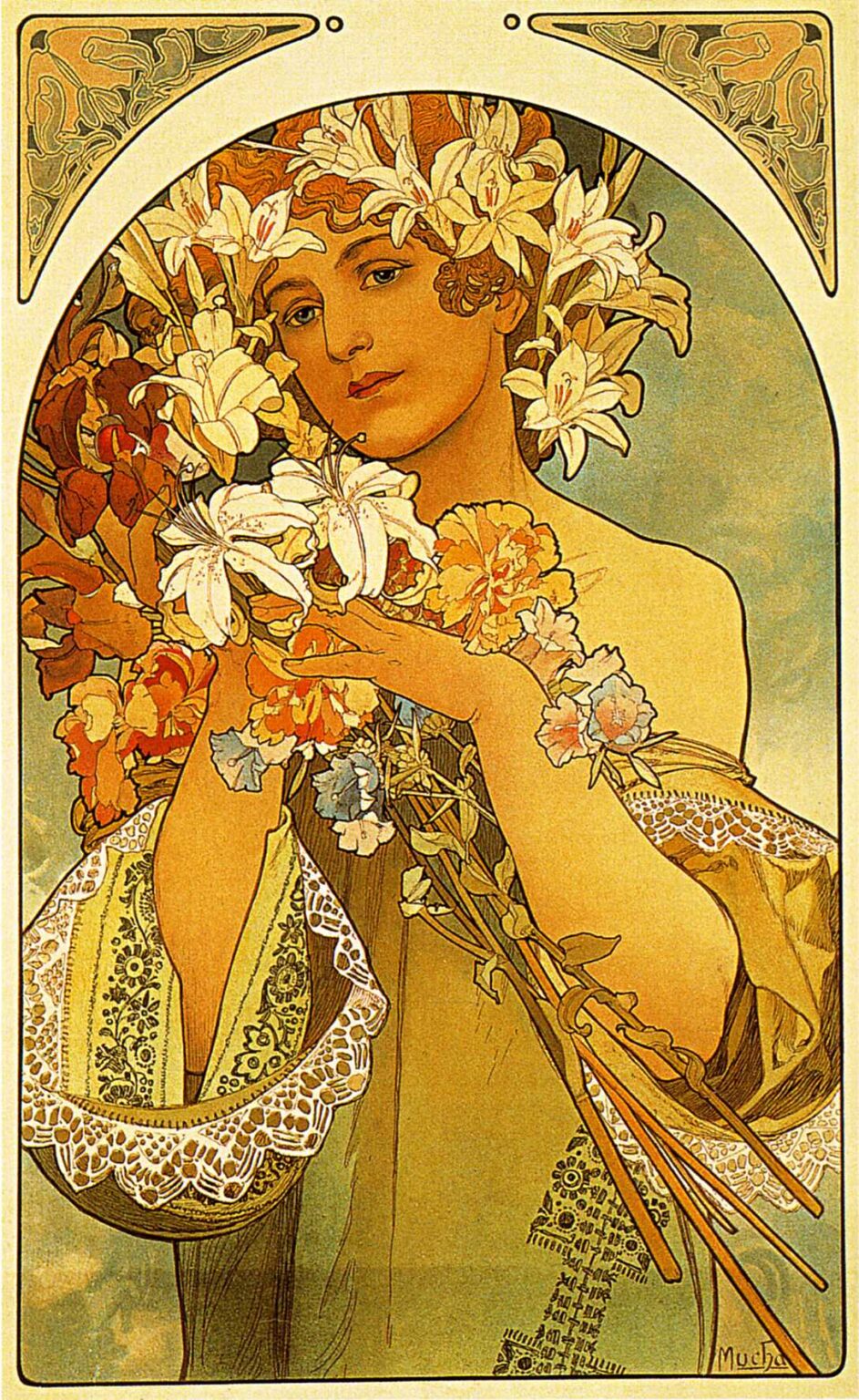
Alphonse Mucha’s “Flower” (1897) is a hymn to abundance. A young woman, crowned with lilies and enveloped in a profusion of blossoms, looks out with a calm, inviting gaze. Her hands cradle stems and petals as if gathering light. The picture belongs to the decorative panels Mucha created in the years after his meteoric rise in Paris, and it distills the essentials of his language: a central heroine, a shallow stage of color, a halo of arabesques, and an architectural frame softened by plant motifs. Everything curves, everything flows, and yet the composition is lucid at a glance. “Flower” transforms the Belle Époque taste for the femme-fleur—the woman-as-flower—into a serene emblem where nature and figure are joined by line.
Historical Context
The late 1890s were Mucha’s years of extraordinary productivity. Following the success of his posters for Sarah Bernhardt, he worked closely with the printer F. Champenois to produce series of decorative panels—affordable color lithographs designed for salons, cafés, and private apartments. These panels created a new market for art in the home, somewhere between fine painting and commercial poster. “Flower” belongs to this moment, when audiences wanted images that could lend an interior the atmosphere of grace they saw on Paris’s boulevards. The work has no advertising copy and no narrative caption; its subject is simply the allure of nature filtered through the artist’s ideal of feminine poise. That combination—accessible, ornamental, and quietly elevated—helped define Art Nouveau itself.
Decorative Panel Format and Purpose
The image is framed by a tall rectangle whose upper edge resolves into a broad arch. Two triangular spandrels in the corners carry low-relief patterns of leaves and stems, giving the panel the feel of a lunette lifted from architecture. Such framing devices were practical: they stabilized the composition when hung as a pair or a set, and they gave printers a consistent template for series based on seasons, arts, or personifications. “Flower” uses the format to evoke sanctuary. The arch behaves like a garden gate; inside it, the woman and the blossoms appear sheltered from weather and noise. A decorative panel had to function at two distances—across a room and at arm’s length—and the clear framing lets it telegraph its theme while inviting the viewer to savor textures up close.
Composition and Framing
Mucha builds the picture as a slow spiral. The viewer enters through the white lilies that crown the figure’s auburn hair, then descends along the curve of her cheek to the bouquet she lifts in her hands, and finally sweeps across the sleeves, where lace and embroidery form a second, ornamental garden. The stems gathered at the lower right send the eye back upward in a diagonally rising fan, so that the journey repeats. This movement is graceful but not aimless: the large shapes—the oval of the face, the mass of the bouquet, the block of the sleeve—touch the frame at strategic points, locking the figure into the arch and preventing the profusion of flowers from drifting apart. Mucha’s genius lies in letting abundance feel structured without ever becoming stiff.
The Figure: Gesture and Expression
The woman’s expression is typical of Mucha’s heroines—self-possessed, luminous, and a little inward. She does not pose for us so much as exist in a state of gentle recognition, as if the fragrance of the bouquet had conjured a memory she allows herself to enjoy. Her hands choreograph the scene. One hand supports the flowers at the center; the other trails lightly across stems in a gesture that both gathers and releases. Shoulders are bare, but the moment is not eroticized; it is devotional. The figure serves as priestess of bloom, presiding over a ritual of scent and color, and her calm gaze gives the whole panel its rare stillness.
Costume, Lace, and Moravian Memory
Mucha’s affinity for folk ornament from his Moravian childhood appears in the sleeves. Lace edgings ripple like little waterfalls, and the bands of embroidery along the cuffs and bodice echo patterns found in Central European textiles. He translates those memories into a Parisian key: the motifs are stylized and refined, woven into a garment that reads as timeless. The sleeves do more than decorate; they anchor the composition’s lower register, giving weight to a picture that might otherwise float. Their whiteness rhymes with the lilies, tying domestic craft to natural splendor, and the fastidious drawing of the lace borders shows the lithographer’s pleasure in pattern.
The Flowers as Language and Symbol
The crown of white lilies dominates and is not accidental. Lilies traditionally signify purity, renewal, and a luminous kind of dignity. Mucha often used them when he wanted an atmosphere of quiet elevation rather than theatrical drama. Interlaced among them are warmer blossoms—peach, apricot, and coral—suggestive of carnations or poppies. These add temperament to the theme, keeping the panel from becoming a simple allegory of chastity. Their frilled edges and soft gradations let the eye move from the crisp spikes of lily stamen to the lazier roll of petals below, a change of tempo that animates the picture. The bouquet thus reads as a chord rather than a single note: clear, bright, and warmed by human feeling.
Color and Light
The palette is honeyed and restrained. Ochres, creams, and pale golds dominate the figure and the lilies, while the background dissolves into a gradient of blue-green reminiscent of distant sky. Mucha avoids deep shadow; modeling is accomplished by small shifts in value and by the authority of contour. The effect is a gentle, chamber-music light that flatters skin and flower alike. Against this quiet field, the few saturated accents—copper hair, coral petals, olives in the leaves—carry great weight. It is a palette designed for domestic interiors lit by gas or early electric lamps, where matte paper could absorb light and still appear luminous.
The Art Nouveau Line
More than color, line is the star. Mucha’s contours swell and taper like musical phrasing. The curve that defines the cheekbone echoes the curve of a petal; the loop that describes a lock of hair echoes the loop in a leaf. Nowhere is the line dead; it breathes in the way a violinist’s bow breathes. This calligraphic energy creates unity across diverse textures—hair, lace, petal, skin—without insisting that they look the same. The famous whiplash curve of Art Nouveau runs through the whole panel, but it is tempered here. The lines do not crack like whips; they slide, hover, and settle, creating a mood of melodic ease.
Pattern, Surface, and Haptics
One reason Mucha’s panels remain so irresistible is the sense of touch they offer. In “Flower,” textures are orchestrated like a bouquet for the hand: the cool smoothness of lily petals, the spring of stems bunched in a fist, the granular softness of carnation heads, the tickle of lace. The surface of the print translates these haptic cues through careful drawing of edges and through small variations in value that imply sheen. Even the flat background participates, its subtle mottling suggesting air stirred by perfume. Though the image is silent and still, it approaches us through the senses other images neglect—touch and scent—making the experience intimate.
Space and Scale
The space is shallow by design. There is no deep landscape, no furniture or architecture to distract. Background and figure nearly share a plane, separated mainly by the dark outline that rings the arch. This shallowness lets the poster retain legibility in a bright room and encourages a relationship akin to portraiture: we stand before a presence rather than surveying a scene. Scale is generous—the figure fills the frame from shoulder to hem—so that the panel can carry a wall by itself. At the same time, the internal scale of detail—the embroidery’s threads, the lace’s scallops—rewards a close approach. That dual scale, grand and intimate, is the home decorator’s best ally.
Printing and Lithographic Craft
“Flower” depends on the subtle capacities of color lithography as practiced in the Paris workshops of the 1890s. Multiple stones carried successive layers of color, each aligned with the next to create smooth gradients and precise contours. Mucha designed with the printer in mind. He kept the number of tones manageable, relied on the paper’s white for the highest lights, and reserved the most intricate linework for areas—like lace—where the stone’s greasy drawing could capture filigree without breaking. The result is a sheet that remains crisp over time and whose matte inks read beautifully under varied illumination.
Comparisons within Mucha’s Oeuvre
Seen beside other panels from the period—such as series dedicated to the seasons, the arts, gemstones, or flowers—this image feels both typical and concentrated. The central arch, the ornamental spandrels, and the crown of plant life recur across his production, but “Flower” strips away narrative and allegorical labels. There is no inscription; we are not told which season or which virtue the figure personifies. The emphasis is on pure sensation organized by form. That emphasis explains the panel’s lasting popularity: it is adaptable. It can hang in any room and be read as celebration rather than instruction.
The Femme-Fleur and Gendered Meanings
The Belle Époque loved to imagine women as gardens and flowers as women. Mucha participates in this trope while steering it away from decadence. His heroine is not consumable like a bouquet on a table; she is the gardener and the bloom, a person whose agency is expressed in the way she arranges and holds the stems. The image suggests reciprocity rather than objectification: the flowers lend her their freshness, and she lends them her attention. That partnership aligns with Mucha’s broader project of elevating domestic ideals—care, beauty, patience—into the realm of art.
Sensory Imagination: Scent, Touch, and Time
“Flower” engages the imagination of scent and the memory of touch. Viewers often report “smelling” the lilies when they look, a testament to how convincingly the image conjures air. Time, too, is present. The bouquet is not tightly bound; petals appear at different stages of opening; the stems are of various lengths. The panel feels like a moment caught in the gentle work of arranging. That temporal softness matches the figure’s expression, which suggests a thought passing but not rushing. In an era of accelerating technology, Mucha’s panels offered interiors a pocket of slowed, scented time.
Reception, Collecting, and Modern Appeal
Because the panels were issued in editions and priced for the middle class, many households could own them. Their success created a new category of décor between painting and print, and their influence can still be seen in everything from magazine layouts to contemporary packaging that borrows Mucha’s curving frames and flower crowns. “Flower,” in particular, has remained a favorite because it bridges tastes: it is decorative without fuss, sensual without provocation, and classic without preaching. Reproductions continue to circulate widely, a sign that the combination of clear contour and generous bloom satisfies viewers across styles and decades.
Conclusion
Alphonse Mucha’s “Flower” condenses the principles of Art Nouveau into a single, fragrant image. A woman crowned with lilies occupies a sanctuary of line; drapery and lace join with petal and stem to build a symphony of curves; color warms without shouting; the whole surface invites touch and memory. The panel speaks the language Mucha perfected after his triumphs in the street: a language designed for the home, where beauty’s task is not to astonish but to soothe and elevate. In “Flower” that task is accomplished with unforced grace. It is as if the act of looking were a form of breathing in, and the bloom of the image were a breath we share.
