Image source: wikiart.org
Introduction
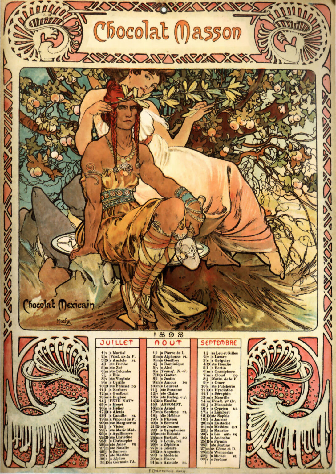
Alphonse Mucha’s “Chocolat Masson” (1897) is a lavish advertisement that reads like a small epic. At first glance it is a calendar card promoting a Parisian chocolatier, but the page stages a myth of chocolate’s origins and its passage into European pleasure. A strong, ornamented youth with copper skin and scarlet hair ornaments sits in the foreground, poised between vigilance and repose. Behind him a pale woman in a loose robe leans into a flowering bough and reaches toward pods in a tree. The frame is packed with arabesques, Mayan- and Aztec-inspired emblems, and Mucha’s unmistakable typography. Across the lower third, a tidy calendar grounds the reverie in daily life. The sheet is half marketplace, half legend, and wholly Art Nouveau.
Historical Context
By 1897 Mucha had become the most recognizable poster artist in Paris, his lithographs for Sarah Bernhardt and luxury goods turning city walls into galleries. Manufacturers of food and drink rushed to enlist the new graphic glamour. Chocolate, which had moved from monastic and aristocratic circles into mass consumption during the nineteenth century, was ripe for a prestige makeover. “Chocolat Masson” is part of a wave of calendars and posters that tethered a brand to an entire atmosphere. Mucha’s image ties the product to deep time and distant lands while letting the consumer carry that myth into a kitchen or café. The sheet likely circulated as a giveaway calendar, a form that kept a brand in view for months while collectors preserved the art long after the dates expired.
Calendar Advertising as Total Design
The lower register of the sheet presents columns of saints’ days and dates for summer months, set within a border of stylized birds and seed pods. Mucha doesn’t treat this as a pragmatic add-on; he choreographs it into the poster’s rhythm. The bold headline “Chocolat Masson” rides a floral cartouche at the top; the central image fills the largest rectangle; the calendar block stabilizes the composition like a foundation stone. A hole at the top edge indicates the page was meant to hang, turning the advertisement into a domestic ornament that spent a season in a kitchen, shop, or salon. Utility and fantasy share the same frame and the same visual language.
Composition and Dramatic Focus
Mucha builds the scene as a shallow stage with a triangular arrangement of forms. The seated youth occupies the left foreground, his torso angled to display strength while his gaze holds steady beyond the frame. The woman reclines behind him along a diagonal that runs from her shoulder to her outstretched hand, which grazes the fruiting branch. A tangle of cacao foliage arches overhead like the proscenium of a theater. The ground under the figures is simplified into a few planes of brown and olive, so the eye can linger on bodies, jewelry, and fruit without distraction. Mucha’s borders—interlaced bands and symbolic medallions—trap the action inside, giving the whole page the unity of a woven textile.
Iconography and Chocolate’s Origin Story
In the lower left corner the words “Chocolat Mexicain” name the motif. French chocolate makers loved to invoke Mesoamerican origin myths as a guarantee of authenticity and exotic savor. Mucha adapts that story into a duet. The male figure, adorned with feathers, beads, armlets, and patterned textiles, stands for a pre-Columbian nobility linked with cacao rituals. The woman, draped in a pale classical garment, acts as an allegory of European pleasure discovering the fruit. Between them hangs the tree, heavy with creamy blossoms and swelling pods, a literal source that bridges cultures. The message is simple and effective: this brand unites ancient prestige with modern taste.
Color and Light
The poster’s palette is earthy and sumptuous. Bronze, terracotta, and honey dominate the foreground, echoing the color of roasted cacao and hot chocolate. These warmths are tempered by the cool greens and blue-grays of leaves and background stone. The woman’s gown is a peach-pink that collects and reflects surrounding hues, while touches of turquoise in the youth’s bracelets and belt brighten the midtones. Mucha keeps shadows soft; contours carry most of the modeling. The overall light is that of a lazy afternoon in an orchard, a mood that encourages indulgence. Nothing glares; everything glows.
Line, Pattern, and the Art Nouveau Arabesque
Mucha’s line is the true engine of the design. Contours swell and taper like calligraphy, shaping muscles, hair, and vines with the same cursive energy. The border motif—braided bands punctuated by small medallions—echoes indigenous textile patterns without copying any single source, a typical late-nineteenth-century blend of homage and stylization. Inside the picture, leaves and pods fill space as pattern as much as botany, creating a tapestry look that allows the figures to read as large, clean silhouettes. The line never stops moving, yet it never becomes chaotic; it guides the viewer in loops that always return to the product name.
Typography as Ornament and Voice
The headline “Chocolat Masson” uses a letterform that breathes the same air as the drawing: rounded terminals, generous counters, and a measured sway from letter to letter. Small capitals for the calendar months keep the bottom register crisp. Type and image knit together through framing devices that treat words like objects inside the same garden. This integration matters in an era when posters competed for attention in crowded streets. A passerby can read the brand at a glance; a patron standing closer can enjoy the calligraphy as part of the picture’s decorative music.
The Mesoamerican Protagonist
The seated youth is an unusual lead figure in Mucha’s commercial work, where women often carry the scene. His presence acknowledges the non-European origin of chocolate and lends the brand a flavor of authenticity. Mucha draws him with dignity rather than caricature: broad shoulders, calm mouth, steady gaze. Jewelry and textiles are elaborated with loving precision but without pedantry. The body is not hyper-muscular or exoticized through distortion; it sits within Mucha’s standard of beauty, which favors flowing outlines and balanced proportion. The figure’s restraint allows fantasy to appear as respect.
The European Counterpart
The woman behind the youth enacts discovery and delight. Her pose—one arm draped over the bough, the other curling near the youth’s shoulder—suggests both curiosity and partnership. She is not depicted as a conqueror or thief; she appears as a guest in the orchard, at ease enough to reach into the tree yet deferential enough to remain partly in shadow. This choreography softens the colonial fantasy that often haunted European advertising of the time. The brand gains the glamour of exotic origin while the figures model a staged harmony.
The Garden of Cacao
Mucha’s flora is legible even when stylized. The cacao pods swell in ribbed ovals, their color ripening from green to russet; cream blossoms cluster along branches; a few leaves twist in a way that mirrors feathers and textiles. The garden fills the upper half of the rectangle so fully that it becomes an architectural canopy. That canopy does double duty: it frames the central action and quietly promises abundance. Chocolate, the image says, comes from a living tree in a generous climate; the brand is a conduit to that fecundity.
Space, Rhythm, and the Viewer’s Path
The poster controls the eye with larger rhythms that echo the figures’ poses. From the headline, the gaze drops to the youth’s red headpiece, crosses his chest to the pale plate at his feet, sweeps up the woman’s arm to the fruiting branch, and loops back through the border to the brand name again. The calendar block offers a resting place where attention can settle before repeating the circuit. This movement is leisurely and circular, like stirring a cup, and it keeps brand, image, and schedule in comfortable conversation.
Printing Craft and the Lithographic Surface
The signature of the printer, F. Champenois, appears under the calendar, and the sheet shows the workshop’s finesse. Flat areas of color meet with clean registration; delicate line remains intact across overlapping stones; matte inks soak into the paper to produce a soft, velvety finish. Lithography suits Mucha’s way of drawing: contours carry information; flat tints create atmosphere; and a few highlights from the untouched paper serve as the brightest lights. The poster would have read well under cloudy Paris skies and aged gracefully in interiors, which explains why many such calendars were kept long past their season.
Consumer Culture and the Lure of Exoticism
“Chocolat Masson” participates in a broader European fashion for exotic advertising themes—Egypt for cigarettes, Japan for perfume, North Africa for travel and spices. Mucha’s take is relatively gentle, presenting cultural difference as a scene of exchange rather than domination. Still, the image belongs to its moment, when origin stories were simplified to flatter European daydreams. The poster’s long afterlife invites a modern viewer to enjoy its decorative intelligence while acknowledging the selective mythmaking that links a Parisian sweet to a Mesoamerican orchard.
Comparisons within Mucha’s Work
Compared with Mucha’s theatrical posters, “Chocolat Masson” feels denser in pattern and more narrative. It stands near his calendars for other brands where months and imagery are integrated within a single ornamental layout. It also foreshadows the later Slav Epic in the way it treats history and legend as partners, although here the stakes are lighthearted. The page shows how flexible Mucha’s system could be: the same toolkit of haloed figures, arabesque foliage, and integrated type can serve a celebrated actress, a railway destination, or a bar of chocolate.
The Page as Domestic Ornament
Because this is a calendar, the sheet was meant to live with people, not just to arrest them on the street. In kitchens and cafés it would have hung at eye level, its seasonal dates marked by pencil, its imagery slowly absorbed into the atmosphere of daily life. That domestic intimacy explains the warmth of Mucha’s colors and the tender handling of bodies and fruit. The brand is not shouted; it is lived with. The poster turns consumption into an ongoing relationship, sustained by the pleasure of the picture itself.
Reading the Border
The border is more than a frame; it is a second narrative layer. At the top, two stylized crests with plume-like forms flank the brand name, hinting at indigenous emblems; along the sides, interlaced bands act like woven belts; at the bottom, two ornamental birds with trailing feathers flank the calendar. These devices connect the product to a family of motifs that feel ancient without citing a particular tribe. The strategy gives the brand an aura of timelessness and keeps the page coherent from edge to edge.
Why the Poster Still Works
A century later the poster still reads in an instant and rewards sustained attention. Its clarity of silhouette, graceful type, and disciplined palette are lessons many contemporary campaigns would benefit from. More importantly, it shows how advertising can carry stories about origin, craft, and pleasure without drowning in text. The image creates a world in which chocolate is not merely a sweet but a bridge between climates, histories, and bodies. That world is believable for as long as the viewer stands before the page.
Conclusion
“Chocolat Masson” is an advertisement that behaves like a decorative panel and a legend. A Mesoamerican youth anchors the scene with calm strength; a European muse reaches toward the cacao branch; the brand name crowns them both; and a calendar of practical dates unrolls below. The sheet delivers the most persuasive of messages: that a common luxury has uncommon roots, and that by choosing this brand the viewer participates in a chain from orchard to cup. With supple line, warm color, and typographic grace, Alphonse Mucha turns chocolate into narrative and the calendar into art.
