Image source: wikiart.org
Introduction
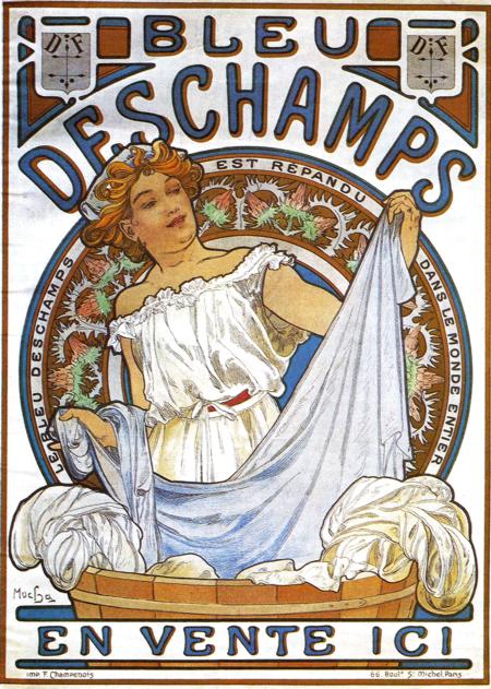
Alphonse Mucha’s “Bleu Deschamps” (1897) turns an everyday household product into a moment of theatre. A young woman stands at a wooden tub and lifts a sheet whose folds spill like surf, the fabric tinted with the faintest blue. Around her head a circular medallion blossoms with stylized flora, and across the top the word “DESCHAMPS” arcs in commanding letters. At the bottom, a simple promise—“EN VENTE ICI”—anchors the message: this magic of brightness is available right here. The sheet’s airy movement, the botanical halo, and the cool palette make laundering feel less like labor and more like a rite of renewal. It is advertising as allegory, where bluing becomes light and cleanliness becomes grace.
Historical Moment and the Product Behind the Picture
By 1897 Mucha had remade the Paris street into an open-air gallery with his posters for Sarah Bernhardt and luxury goods. At the same time, manufacturers of everyday items recognized that the new Art Nouveau style could dignify the mundane. Bleu Deschamps was a laundry bluing—a concentrated dye used in the rinse to neutralize yellowing and make white fabrics appear brighter. Mucha’s poster had to do two things instantly: identify the brand and visualize an invisible benefit. The design solves both with disarming elegance. The name commands the skyline; the image shows whites that seem to glow with heaven’s own tint; the ring of text around the medallion proclaims the product’s reach “dans le monde entier.” It is the modern language of ubiquity couched in ornamental poetry.
Composition as Theater of Clarity
The composition is a masterclass in legibility. The figure rises from a broad washtub positioned at the lower edge, a stage that gives the scene a sturdy base. The sheet loops from left to right in a long diagonal, creating a bright river that guides the eye through the poster. That diagonal is fenced by concentric curves: the rim of the tub, the wreath-like medallion, and, higher still, the swell of the title letters. This stacking of arcs builds depth without confusion and frames the heroine like an icon. The overall silhouette reads at a distance, while interior details—the rucked sleeve, the subtle clasp of fingers, the ruffled smock—reward a closer look. Mucha makes the poster’s first second decisive and its second second pleasurable.
The Washerwoman as Muse
Mucha’s women often occupy the border between person and emblem. Here the laundress is idealized without becoming decorative furniture. Her shoulders are bare beneath a bloused chemise; a ribbon binds the waist; copper hair tumbles in loose coils. She is neither fashion plate nor peasant caricature; she is an image of vital capability. The soft tilt of the head and the easy heft of the cloth suggest mastery rather than strain. By encircling her with a botanical halo, Mucha borrows the format of the sacred image to elevate domestic work. Cleanliness is not drudgery in this world; it is a kind of natural magic that the woman—and by extension, the buyer—commands.
The Logic of Blue and White
Color is the poster’s argument. Mucha floods the scene with whites that are never chalky and blues that vary from powdered sky to dense ultramarine. The sheet itself carries a cool cast, signaling the effect of bluing without showing a bottle or pellet. Warm notes—the auburn hair, the honeyed wood of the tub, the terracotta undertone of skin—keep the composition from chilling into monochrome and make the blues feel even cleaner by contrast. The palette is also brand strategy. In a crowded boulevard of reds and yellows, a lotus pond of blues announces itself. The product’s name is color, and color does the selling.
Ornament and the Medallion Halo
Behind the figure sits a circular panel filled with stylized plants and tiny stars. Its pattern is neither specific species nor generic swirl; it is the ordered abundance associated with Art Nouveau, a symbolic garden where nature behaves like architecture. The medallion functions as halo, trademark cartouche, and compositional wheel. The ring of small lettering embedded in it—“LE BLEU DE DESCHAMPS EST RÉPANDU DANS LE MONDE ENTIER”—acts as a guarantee that circulates like a crown of laurels. Ornamental density inside the circle makes the plain expanses of sheet feel even more luminous. Mucha balances complexity and calm so the message remains legible at speed.
Lettering as Architecture
In Mucha’s posters, type is never an afterthought. The massive “DESCHAMPS” stretches like a bridge, each letter swelling with the same organic curves that sculpt the woman’s hair and the tub’s rim. The word “BLEU” perched above it delivers the headline in a crisp, compact burst, while “EN VENTE ICI” below spreads in an inviting cadence, the phrase framed by scrolls that echo the laundry’s folds. This integration of lettering and image ensures that the passerby reads the brand even if the central picture is glimpsed only obliquely. Typography becomes a part of the scenery—legible from across a boulevard and harmonious at arm’s length.
Lithographic Craft and the Street Test
Printed by the accomplished house of F. Champenois, the poster reveals the era’s best color-stone work. Flat fields of blue meet warm flesh tones without muddy overlap; line holds its calligraphic character across large shapes; the white of the paper gleams through in highlights on cloth and basin. These technical virtues matter because a poster must survive the street test. It competes with reflections, soot, and rain. Mucha designs for such conditions by keeping the tonal range simple, anchoring the scene with strong contours, and letting the paper’s brightness serve as the whitest white. The result is an image that remains legible under cloud or glare and that ages handsomely even when weathered.
Motion and the Viewer’s Path
The movement of the sheet is the poster’s choreography. The fabric rises from the left hand, arcs across the chest, and drops toward the right edge. That path invites the viewer to follow, and when the eye falls to the right margin, the circular medallion and the lower banner catch it and swing it back to the brand name above. It is a visual loop that simulates the rhythm of washing—lift, swish, release—while ensuring that no glance leaves without reading “Deschamps.” Mucha turns a household gesture into a navigational tool.
The Promise of Whiteness and the Culture of Clean
Late nineteenth-century advertising often framed domestic products as guarantors of health, order, and modernity. “Bleu Deschamps” participates in that discourse while avoiding moralizing tone. The whiteness on display is not sterile; it feels fresh and sunlit, a natural purity rather than a laboratory result. The product thus becomes a mediator between the household and the outdoors, a way to bring the brightness of day into the laundry room. The poster’s botanical halo reinforces that promise: nature endorses this whiteness.
The Domestic Heroine and Modern Consumer Culture
Mucha’s laundress also reflects a changing economy of gender and consumption. She is shown at work, yet her labor is framed with dignity and style. The message to prospective buyers—many of them women running households—is that modern products grant agency and elegance to daily tasks. Advertising of the period sometimes trivialized female subjects; Mucha’s approach does the opposite. His heroine is an expert operator of color and cloth, a figure as central to modern life as the actress or the traveler in his other posters.
Comparisons Within Mucha’s Oeuvre
“Bleu Deschamps” shares structural DNA with Mucha’s celebrated panels for perfumes and champagnes: the frontal heroine, the circular backdrop, the halo of pattern. Where those images peddle glamour, this one peddles clarity. The palette narrows to blues, whites, creams, and a few earth notes. The props are humble—a tub, cloth, a sash—yet the layout is every bit as grand. The poster proves that Art Nouveau’s elegance was not restricted to luxury goods; it could illuminate the domestic sphere with the same grace.
Iconography and Semiotics
The poster’s signs are spare and potent. The tub signals work and reliability; the flowing sheet signifies the result—bright, soft, abundant cleanliness; the ring of flora denotes naturalness and continuity; the woman’s raised arms suggest confident display; the word “BLEU” translates the entire effect into a single concept. Mucha’s semiotic economy is what lets the design travel across languages. Even without reading the French, a passerby understands the claim: this brand makes whites beautifully, convincingly blue-white.
The Ethics of Ornament
A persistent criticism of Art Nouveau in its own time was that ornament distracts from function. “Bleu Deschamps” answers the charge gracefully. Ornament here is an instrument of function. Curves guide attention; pattern encodes authority; type sings the name; color crystallizes the benefit. Nothing is extraneous. The poster demonstrates how decoration can clarify rather than clutter, an argument that still resonates in contemporary design practice.
The Poster’s Afterlife and Contemporary Appeal
More than a century on, the image feels uncannily modern. Flat color, bold contour, integrated lettering, and a hero image that is both aspirational and accessible—all are staples of present-day branding. At the same time, the poster’s beauty is not a veneer; it arises from a humane vision of labor and from an artist’s respect for the intelligence of ordinary viewers. In an era saturated with digital gradients and photographic retouching, Mucha’s hand-drawn clarity and lithographic matte surfaces offer a welcome counterpoint. The image sells a product, but it also preserves a certain gentleness in how to speak to a public.
Conclusion
“Bleu Deschamps” is one of those rare advertisements that rises to the level of emblem. It captures an action as old as washing and reframes it as a modern, almost celebratory gesture. The sheet’s blue-white arc, the crown of stylized plants, the elegant architecture of lettering, and the poised laundress join into a single promise: brightness made easy, beauty made daily. Alphonse Mucha brings the full orchestra of Art Nouveau—line, color, pattern, and type—to a humble product and, in doing so, proves that good design can make even a tub of laundry feel like a vignette of joy.
