Image source: artvee.com
Introduction
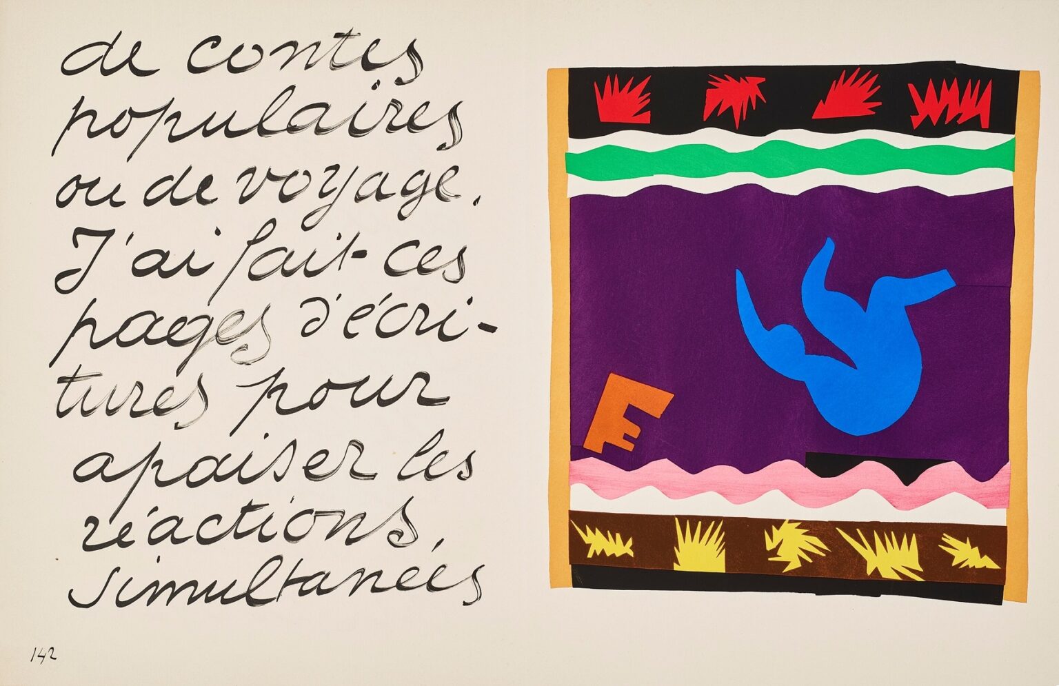
Henri Matisse’s “The Toboggan” (1947) is one of the most theatrical pages in the Jazz portfolio, a two-page spread that pairs the artist’s sweeping handwritten text with a brilliant cut-paper tableau. At a glance the right-hand panel reads like a stage bordered by colored bands: a purple field framed in warm ochre contains a tumbling ultramarine figure; a crest of green and white rides near the top; red bursts flare along a black frieze; a pink wave and a darker border of ochre and yellow motifs anchor the base. The left page, entirely in Matisse’s script, works as an audible prelude, a spoken tempo that meets the visual rhythm across the gutter. Together the pages convert a simple idea—a body sliding or flipping down a toboggan—into a compact meditation on speed, joy, and the art of designing motion.
Jazz and the invention of a new grammar
By the mid-1940s Matisse had reinvented his practice. Convalescent and unable to paint for long periods, he began brushing sheets of paper with matte gouache and cutting directly into the color. He moved the pieces around his studio walls until they clicked into place, describing the process as “drawing with scissors.” Jazz, published in 1947, gathered twenty such compositions interleaved with pages of his calligraphic commentary. “The Toboggan” exemplifies the portfolio’s central insight: performance can be rendered not by mimetic description but by the placement of elemental shapes, each one tuned like a note in a score. Color becomes character, edges become choreography, and a page can swing as surely as a band.
Reading the two-page stage
The left page is more than caption; it is voice and timing. Matisse’s slanted script runs large, elastic, and slightly irregular, the ink pooling at turns and thinning along fast strokes. You can almost hear breath in the long descenders and quick ascents. This written rhythm primes the eye for the image to the right, where a bordered rectangle functions like a proscenium. Inside, the purple ground is the night of a fair, the soft stage of snow at dusk, or simply a saturated field against which motion can be seen clearly. The blue figure in the upper right quadrant, limbs flung outward, is both dancer and child, readable as a silhouette at any distance. The text and the tableau are inseparable; one supplies cadence, the other the leap.
Composition and the logic of borders
The composition is constructed from stacked frames and friezes that act like theater architecture. A narrow ochre frame wraps the image to separate it from the cream paper of the book and to warm the cool colors inside. At the very top a black band holds a row of jagged red shapes; they read as sparks, fireworks, or stylized firs flashing past. Beneath it a green strip rides over a white one, both cut in wavy lines that suggest the crest of a hill or the edge of a track. Near the bottom a wide pink band, scalloped like a gentle drift of snow, repeats the wavy profile in a slower register. Along the base a dark ochre strip carries yellow starbursts, a procession that feels like straw, pine boughs, or speed lines blurred by a rush. These horizontal bands establish a terrain; within it the figure tumbles.
The blue figure and the design of motion
The body is reduced to a single cut shape in ultramarine, a color Matisse used often when he wanted intensity without glare. The figure’s back is arched, legs bent, one arm pitched forward, the other thrown back. The silhouette is ambiguous enough to hold two readings at once. We can see a rider sliding down a track and flipping into the air, but also a diver turning in a somersault, or even an acrobat tossed above a net. That flexibility is deliberate. Matisse concentrates on the essential curve that signals gravitational sweep and bodily exhilaration. By placing the figure high and right, he builds in the idea of future time: the body is about to drop across the purple field toward the pink drift, and our eye travels with it.
Color as temperature and velocity
Matisse assigns jobs to colors and then lets them do the work. Purple is depth and night—the calm against which every accent registers. Ultramarine is the cold shock of speed, a cool note that still carries power. Red in the top frieze is flame; it accelerates the eye. Green is a slice of terrain, a memory of conifers or a bright rim of the track. Pink is the softest landing: a color that mitigates risk and invites delight. Ochre warms the edges and grounds the entire event in a festive glow. Because the gouache surfaces are matte, the colors feel physical rather than glossy. They read as cloth, paper, and stage, not as reflective illusion, and that tangibility heightens the sense of a real performance.
Figure–ground play and the feel of gravity
The spread’s energy comes from a constant exchange between figure and ground. The blue body is not modeled; its edge alone carries weight. The purple field can flip perceptually between air and snow; the wavy white and pink bands can rise up as drifts or sink to become negative space against which other colors push. This oscillation is not a trick; it is how the page simulates gravity without perspective. As our eye toggles readings, the figure seems to move. The brain completes the motion, and that completion is pleasure.
Material presence and the truth of the cut
Because Jazz reproductions were made by pochoir stenciling, the edges retain the physical truth of scissors. The red spikes along the top band are similar but not identical; their small differences keep the frieze alive. The green and white waves show tiny accelerations where the blade sped up, and slight hesitations where it turned. The blue body’s curves thicken and thin, recording pressure like a handwriting sample. These modest irregularities persuade us that the event is handmade rather than mechanically printed. In a scene about speed and bodily risk, the visible trace of the artist’s hand provides a human counterweight.
The letter that isn’t a letter
At the lower left of the purple field a tilted orange form reads as a fragment of a letter—an F, perhaps—or as a fallen block. It performs several tasks at once. Its warm hue binds the cool interior to the ochre frame. Its angle and weight counterbalance the blue figure and prevent the composition from tipping. It also introduces a hint of language inside the image to echo the page of text opposite. Like the collaged words in a poster, it flirtatiously promises a message without delivering one. The page remains a picture, not an illustration.
The top frieze and the noise of speed
The black strip with red bursts along the top edge behaves like sound. The repeated jagged shapes are visual onomatopoeia for the hiss and rush of a sled on hard snow or the crackle of fireworks at a winter fair. The strip also functions as a ceiling that keeps the action from flying away. Without it the purple would feel unbounded; with it the field becomes a stage.
The pink wave and the logic of landing
The pink band near the bottom is scalloped into soft arcs like a line of cumulative drifts. It mirrors the white wave above, but with a different emotional charge. Where white feels crisp and cold, pink arrives as warmth and cushion. The color’s placement just above the bottom frieze builds a two-step landing: the blue figure will cross the purple, meet the pink, and then be held by the brown-black base. The eye rehearses that trip every time it looks, and that rehearsal is what makes the spread feel kinetic.
Calligraphy as tempo and ethos
Matisse’s Jazz texts are not explanations so much as reflections on making, and here the large script carries another kind of job. Its broad loops and slanted rows set the tempo of reading; they slow us down, then deliver us into the image with a rhythm already in our bodies. The handwriting also reiterates the portfolio’s ethic: energy, sincerity, and clarity. It is large and legible, personal without being private. Placed beside the tableau, it reminds us that the cut-out is not only picture but thought—an idea expressed with the fewest possible means.
A stage without perspective
Like many Jazz plates, “The Toboggan” refuses the usual cues of depth. There is no horizon line, cast shadow, or recession of scale. Space is created by overlap and by the hierarchy of borders. The ochre frame sits in front of the cream paper; the black top band sits over purple; the pink sits over the brown-black base. In that shallow stage, Matisse can choreograph with precision. The result is intimate rather than distant; we watch as if from the front row.
Parable without narrative
The plate offers the thrill of a winter amusement while holding back from anecdote. There is no depiction of the sled, no crowd of onlookers, no scenery beyond the abstracted bands. That restraint liberates the image from a single story. It becomes a parable of taking a ride, of trusting momentum, of enjoying the play between risk and soft landing. Because it is not tied to a particular tale, the plate can stand for many experiences in which a body gives itself to a designed path and delights in the ride.
Dialogues within the Jazz suite
Viewed among its companions, “The Toboggan” speaks to other subjects in Jazz. The blue figure echoes the star-studded black silhouette of “Icarus,” but where Icarus is solitary and cosmic, the tobogganer is communal and festive, grounded in a framed stage. The pink waves rhyme with the scallops in “The Sword Swallower,” while the red bursts nod toward the fireworks energy scattered throughout the suite. The use of a rectangular proscenium bordered by patterned bands links it to “Pierrot’s Funeral,” “The Codomas,” and “The Swimmer in the Tank.” The continuity is not repetition but vocabulary: Matisse rearranges familiar parts to conduct a new mood.
Why the image still feels modern
Decades later the spread reads as contemporary design. The colors are flat yet resonant, the shapes crisp yet human, the composition legible at distance and rewarding up close. You can imagine the right-hand panel as a poster, a stage backdrop, a screen graphic. Its clarity emerges from the discipline of subtraction. By removing everything not essential to the sensation, Matisse keeps only what moves the eye and body. The page is modern not because it chases novelty but because it trusts fundamentals—contrast, rhythm, edge.
Lessons for image makers today
“The Toboggan” offers practical guidance. Build a world with borders and give those borders jobs beyond containment. Choose a dominant field color to hold the composition and then punctuate it with active accents. Stage motion by placing a figure asymmetrically and letting the surrounding bands imply the path. Use repetition with variation to simulate sound and speed. Let handwriting or typographic gesture converse with imagery rather than merely label it. Most of all, reduce the scene to relations that anyone can grasp in a second, and then layer small surprises—a tilted orange form, a doubled wave—to keep the eye engaged.
The calm after the ride
For all its excitement, the spread is fundamentally serene. The purple field settles like evening, the pink softens the fall, the ochre warms the edges, and the handwritten page offers a conversational hush. The image suggests that exhilaration and repose are not opposites but phases of one experience. The ride is quick, the memory lingering. Matisse captures both in one turn of the page.
Conclusion
“The Toboggan” compresses the joy of sliding downhill into a lucid play of color and edge. A blue body arcs within a purple stage bordered by friezes of red, green, white, pink, and ochre; handwritten text keeps time beside it. Nothing literal is required to feel motion, gravity, and delight. With scissors and painted paper, Matisse builds a theater where a single curve can carry a narrative and a handful of hues can hold a season. The plate remains a model of how to design sensation: set the stage, trust the edge, and let the eye take the ride.
