Image source: artvee.com
Introduction
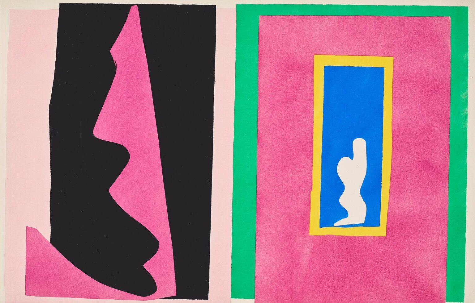
Henri Matisse’s “Destiny” (1947) is a poised encounter between two worlds on a single sheet. On the left, a tall black mass carved from fuchsia rises like a cliff, a curtain, or the profile of a figure in shadow. On the right, a broad plane of the same fuchsia is encased by a cool green band; within that field sits a small vertical window of ultramarine trimmed with yellow, sheltering a white, votive-like silhouette with an upraised arm. Between these halves a narrow column of pale pink operates as a threshold. The image belongs to the Jazz portfolio, created when Matisse “drew with scissors,” cutting shapes from paper painted with gouache and arranging them into crisp, rhythmic compositions. “Destiny” arranges color and edge as a drama of approach and revelation: mass moves toward image, stage meets shrine, the unknown presses up to the known.
The Late Method and the Logic of the Cut
Matisse’s cut-out method fused drawing and color in a single gesture. He painted sheets of paper with matte gouache, then cut directly into them, composing on the wall until the fragments locked. The edge made by the scissors is both contour and pigment; it is the work’s handwriting. The Jazz plates, translated to pochoir, keep that matte density and the living precision of the cut. “Destiny” depends completely on this logic. There is no modeled form, no illusionistic depth, only the push and pull of perfectly placed color fields. The sheet is graphic and architectural, yet the edges breathe with the tremor of a hand, keeping the emblematic subject intimate.
The Composition as Encounter
The sheet divides into two unequal domains. On the left, black and fuchsia stack to form a towering wedge that leans inward. Its profile undulates, implying chin, breast, and knee—hints of a body translated into geology. On the right, an expansively calm plane of fuchsia, bracketed by green, holds a tiny “picture within a picture”: a blue niche with a yellow frame and, inside, a white figure whose raised arm reads like a signal or blessing. The narrow pale band between the halves is crucial. It is at once mortar line, aisle, and measure of distance. We read the black mass as something advancing—a destiny approaching—while the framed figure appears steadfast, a fixed idea held in a column of color.
Window, Shrine, and the Image Within
The small blue window immediately establishes hierarchy. Against the large fields, it is a concentrated point of attention, as if an altar had been inset into the sheet. Its yellow frame warms the ultramarine and sharpens the focus; the white figure within feels cut from light itself. This inner figure carries multiple readings: the stylized body of a dancer, a beckoning genie, a saint in a niche, a chess pawn standing its ground. The gesture of the raised arm is the only directional cue in the whole right half, a civil counterweight to the looming left. In a portfolio devoted to the theater of bodies, Matisse here places a body behind glass—an image one contemplates rather than a performer one watches.
The Black Mass and the Theatre of Approach
The left shape is made from two pieces—a black slab edged by a strip of fuchsia that both reveals and conceals its profile. The cut traces bulge and indentation like a shoreline, and the lowest corner flares outward as if stepping onto the stage. This mass is not simply “negative”; its blackness is active, an element Matisse often used like a color rather than an absence. Here it suggests shadow, backstage, night, or Fate itself—something larger than character. Because its edge is so descriptive, many viewers see a monumental profile approaching the window. If the niche is what one holds sacred or clear, the mass is what will test it.
Color Temperature and Emotional Weather
The palette is sharply tuned. Fuchsia dominates both halves, a saturated field that feels like theatre velvet or hot air; its warmth unifies the split composition. Black provides gravity and suspense. Green cools the right panel, making it feel sheltered and materially different from the left—like the felt around a precious inset. The blue of the window declares calm distance, while yellow acts as a thin radiance that dignifies the inset figure. White, used only for the tiny silhouette, becomes the brightest point on the sheet; it reads as illumination, memory, or an unassailable core. Each color has a job—heat, weight, shelter, distance, light—and together they compose a legible climate.
Figure–Ground Games and the Pleasure of Reversal
“Destiny” thrives on the simple but inexhaustible game of figure and ground. Is the left side a black figure carved from pink, or is it a pink figure backlit by void? Is the right half a field of fuchsia containing a window, or is the window the only true “form” while the rest is atmosphere? Matisse calibrates the borders to keep both readings alive. The green band functions as a structural scaffold that makes the pink on the right read as wall; the left has no such scaffold, so the black feels mobile, like a presence in the act of arriving. Because the mind can reverse these roles at will, the composition stays alive in perception far longer than a literal scene.
Scale, Proportion, and the Ethics of Clarity
The inner blue niche is small—perhaps one seventh the height of the right field—yet it commands attention because of its stacked frame and brilliant color contrast. The black mass, by contrast, owns space but not detail; its power is in scale, not intricacy. This distribution of visual energy is ethical as well as formal. Matisse’s late work offers clarity to the viewer: a large, simple force confronts a small, concentrated image. We are given the structure of a choice—what approaches and what is held—without being told how to feel. The composition trusts the viewer to complete the drama.
Destiny as Theme: Approach, Choice, and Witness
The title steers the reading without fastening it. “Destiny” here feels less like predestination and more like rendezvous: the moment when an outer event meets an inner image. The black mass could be circumstance pressing forward; the niche could be a vow, a memory, or an ideal one protects. The pale band between them is the listening space in which a decision happens. Because the inner figure raises an arm, “Destiny” also reads as summons or salute; the self within the window recognizes the approach and answers. In a book where acrobats leap and heroes fall, this plate stages the quiet theater of recognition.
The Shrine as Picture of the Artist
It is tempting to see the inset silhouette as Matisse himself: an image distilled to essentials, held within a crisp frame of color, signaling from a blue sea of possibility. The green band that braces the right panel echoes the way his studio walls often held pinned cut papers; the fuchsia field becomes the felt of concentration. The left mass—tradition, cliché, or the world’s noise—slides toward the small, stubborn clarity of an artist’s image. This autobiographical reading aligns with Jazz’s handwritten texts, which urge energy, sincerity, and modesty to “clear away old clichés.” “Destiny” presents that clearing as spatial relation.
Architecture, Curtain, and Stage
Matisse constructs his stage with minimal means. The left half behaves like a curtain opening; the right half is the scene revealed—an icon glowing in a colored wall. The thin pale strip between them is an aisle or architectural joint. Because the edges are handmade, the geometry never stiffens; the play between stage and shrine remains supple, as if the curtain might move again, as if the niche could grow brighter. The sheet has the practicality of stage design and the poise of a chapel wall.
Rhythm and the Music of Blocks
Even without repeated motifs, “Destiny” feels musical. The eye moves from the large bass note of black to the alto warmth of fuchsia, rests on the cool green, and lands, finally, on the treble spark of yellow and white. The inward jogs of the left profile act like syncopations; the snug rectangles on the right keep steady time. Matisse’s ability to make static color fields feel like measures of sound is one reason the Jazz plates remain so legible. They do not depict music; they practice it.
Relation to Other Plates in Jazz
“Destiny” sits between the emblematic minimalism of plates like “Forms” or “The Heart” and the spatial staging of “The Swimmer in the Tank.” The small white body in the blue window recalls the reduced figure in “Forms,” while the framing architecture relates to the tanks, nets, and proscenia of other pages. Yet its atmosphere is distinct: contemplative rather than kinetic, ceremonious rather than circus-bright. Where “Icarus” externalizes risk in starbursts, “Destiny” interiorizes it—risk becomes approach and response, shadow and icon.
Material Candor and the Truth of Edges
Because pochoir preserves the cut edge, the sheet’s honesty is tactile. You can feel where scissors paused, where a corner softened, where two fields barely overlap. The fuchsia right field shows faint brush textures from the gouache; the green band’s inner edge wobbles almost imperceptibly, keeping it human. These traces matter. They prevent the plate from becoming a rigid diagram and keep the theme of “destiny” grounded in making: this is not an abstract machine but a set of choices, edits, and placements—exactly the labor by which a life’s direction is decided.
Reading at Two Distances
Across a room the opposition is unmistakable: a dark approach versus a small, framed light. Up close, the edges become the emotional script. The notch in the left profile at mid-height suggests a pause, a catching of breath; the tiny bevels around the yellow frame make the window feel inserted by hand; the negative space around the white silhouette reads as air. This dual readability—poster force at distance, human touch near—was Matisse’s late superpower and a major reason the Jazz plates still feel contemporary.
Lessons in Design
“Destiny” teaches transferable lessons. A single contrast, scaled properly, can carry a narrative. Borders can do storytelling work; frames can become characters. Color should be assigned jobs and allowed to do them without interference—fuchsia for atmosphere, black for weight, green for brace, blue for depth, yellow for sanctifying light. Figures may be withheld and then reintroduced at a different scale to control attention. And most importantly, simplification is not reduction; when essentials are carefully tuned, meaning grows rather than shrinks.
Postwar Clarity and the Will to Light
Composed in the first years after World War II, the Jazz portfolio often balances joy with sobriety. “Destiny” speaks to that mood. There is shadow, but it is lucid; there is an interior light, but it does not shout. The composition proposes a way to live after shock: protect a small, clear image and meet what comes with poise. The late Matisse believed art could offer equilibrium without denial, and this plate is one of the quietest and most persuasive demonstrations of that belief.
Conclusion
“Destiny” is a rendezvous staged in color. A dark, mobile mass leans toward a small, framed figure that stands in blue light. Between them, a pale space of attention. The cut edge carries all the acting; the palette supplies temperature and gravity; the architecture of rectangles turns the sheet into both chapel and stage. With almost nothing—blocks of gouache and the path of scissors—Matisse composes a parable about what we face and what we keep. It is a picture of fate that refuses fatalism, a modern icon for the inner image we choose to honor when the world draws near.
