Image source: artvee.com
Introduction
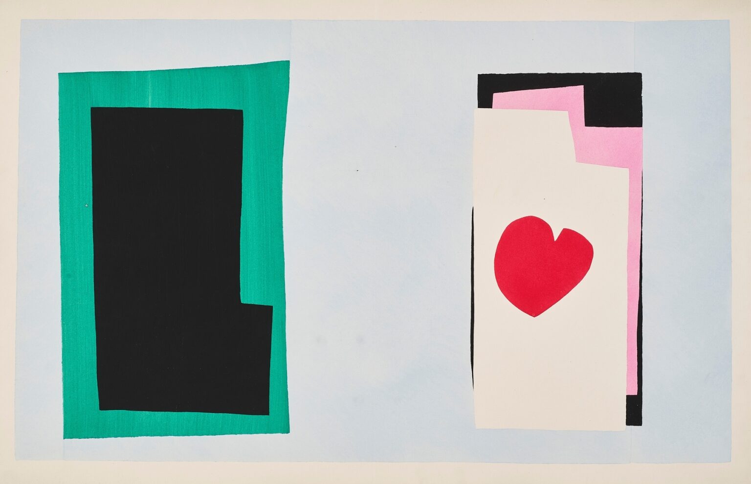
Henri Matisse’s “The Heart” (1947) belongs to the incandescent late period when he “drew with scissors,” cutting painted papers into pure color-shapes and orchestrating them with the logic of music and theater. A red heart floats on stacked rectangles of cream, pink, and black to the right; to the left, a deep black form sits inside a viridian frame. All of it rests on a pale blue ground that behaves like air rather than backdrop. The scene is both diagram and drama—geometry charged with feeling—showing how Matisse could make emotion legible through the simplest means.
The Late Invention of the Cut-Out
In the 1940s, after illness made long hours at the easel difficult, Matisse invented a method that fused drawing and painting. He brushed sheets of paper with matte gouache, then cut the color directly, shaping contours as he went. This gave him the speed and plasticity of collage with the chromatic authority of paint. Many of these compositions were reproduced the same year as pochoir plates in his book “Jazz,” a portfolio that married brilliant images with pages of his handwritten reflections. “The Heart,” like its companion plates, demonstrates how the cut-out transformed color into structure, letting a single emblem inhabit a field of carefully tuned relationships.
Composition as Stagecraft
The design divides the sheet like a set for two actors. On the left, a large black figure sits within a green border—rectangular, weighty, nearly mute. On the right, a stack of cream, pink, and black rectangles forms a vertical plinth on which the heart appears. The pale blue ground between the two is not empty; it is a stage where tension builds across the gap. The composition thus reads as a duet: mass and emblem, silence and speech, shadow and pulse. The eye paces the distance like a breath between two beats.
Figure–Ground Clarity
Matisse’s cut-outs thrive on instant readability. Here the heart is unmistakable even though it is not anatomically literal. It tilts slightly, a tender asymmetry that turns a sign into a presence. Around it, the cream rectangle behaves as both page and pedestal. Because the heart sits inside a nested stack of shapes, the figure–ground relation doubles and redoubles: heart within page, page within pink, pink within black, all within the blue atmosphere. Each enclosure adds pressure, the way a frame charges whatever it surrounds.
Color as Temperature and Grammar
Color orchestrates the scene without gradients or shadows. The red is a single, saturated note—warmth, urgency, speech. The cream rectangle softens that heat, keeping the heart from shouting. Pink amplifies warmth while remaining delicate, like inner light. Black introduces gravity; it steadies the right-hand stack and mirrors the monolith at left. Green counters with cool proliferation, a living border that encloses the black shape but leaves breath at the edges. Pale blue washes across the whole sheet as climate, an open sky that keeps the composition lucid.
The Black Monolith and the Logic of Counterweight
The left-hand configuration is not a window or doorway; it is a counterweight. Its heavy black plane anchors the sheet and gives the heart something to answer. Without it, the right stack would dominate and the image would tip. With it, a conversation begins. The small notch cut from the monolith’s lower right corner is crucial: it breaks perfection, introduces a footfall, and keeps the block from feeling tyrannical. Matisse understood that a single irregularity could humanize a mass as effectively as a face.
Edges Cut by Hand
The authority of the image resides in its edges. None are ruler-straight. Each bears the minute tremor of scissors guided by a living hand. That tremor is expressive: the green frame waivers just enough to feel painted, the cream rectangle slips a fraction out of square, the black planes lean by millimeters. These micro-deviations create vitality and prevent the composition from hardening into signage. They also honor the physical fact of collage, resisting the illusionism that would erase process.
Rhythm, Pause, and the Music of “Jazz”
Matisse titled the portfolio “Jazz” because he conceived the plates as improvisations—structures animated by syncopation, repetition, and riff. “The Heart” plays its rhythm through spacing. The broad blue pause between left and right becomes a rest in the score; the tight stacking of rectangles on the right compresses time, like a quick run on a horn. The red entrance of the heart is the accent, the off-beat surprise that makes the phrase memorable. Looking becomes listening: we feel beats, rests, and reprises.
Abstraction and Legibility
The cut-outs reach a paradox: extreme abstraction that remains perfectly legible. Why does it work? Because Matisse compresses forms to their communicative cores. A heart is a rounded triangle with a cleft; a page is a rectangle; weight is a dark mass. By arranging these essentials with precision—balancing distances, calibrating scale—he lets meaning arise without narrative illustrations. The image can be read by a child and studied by a designer, each finding an appropriate level of complexity.
The Heart as Emblem Rather Than Illustration
Matisse’s heart is not sugary sentiment; it is architecture. Placed off-center within the cream rectangle, it creates torque, a slight pull toward the lower right that energizes the stack. Its red saturates the page but never bleeds into kitsch because it sits inside a hierarchy of rectilinear forms that dignify it. The emblem’s simplicity is reinforced by restraint everywhere else: no lettering, no arrows, no shadow. Feeling is carried by placement, not by theatrical flourish.
Balance Through Asymmetry
Although the sheet is roughly symmetrical left to right—heavy block here, heavy stack there—the internal proportions are asymmetric, which keeps the image alive. The green border flares at the top and thins at the bottom; the black monolith sits a bit low; the cream page rides high in its nest; the heart tilts. Each decision appears casual but results from delicate tuning. Perfect symmetry would deaden the scene; these tiny misalignments create pulse.
Space That Breathes
The pale blue field is painted in gentle, streaked passes that leave a trace of brush movement. That texture matters. It distinguishes the ground from the flat, knife-edged solids and prevents the blue from reading as printed void. The slight variations of value make space feel breathable, airy, and humane—a sky against which the hard shapes can stage their encounter.
The Pochoir Translation and Material Truth
The Jazz plates were produced by pochoir, a labor-intensive stencil process prized for its ability to deliver rich, flat color. In “The Heart,” pochoir keeps the gouache’s matte glow and preserves the cut contours’ fidelity. The technique makes reproduction an extension of the original method rather than a compromise, allowing viewers to experience the crispness of edges, the density of red, and the cool spread of blue as Matisse intended. Material truth—color as substance—is central to the image’s authority.
Dialogue With “The Wolf” and Other Plates
Seen alongside the portfolio’s more tumultuous scenes—acrobats, swimmers, masks—“The Heart” is a pause of candor. Where “The Wolf” dramatizes threat with jagged white, this plate offers commitment rendered as calm geometry. Both rely on emblem and field, accent and counterweight, yet their tones diverge: one alarms; the other steadies. This internal conversation across the suite demonstrates Matisse’s range within a single vocabulary.
Echoes of Poster and Book Design
Matisse spent decades mastering graphic clarity through posters, covers, and typography. “The Heart” inherits that discipline. It reads at a glance from across a room and still rewards near study. The cream rectangle suggests a page, the pink a flyleaf, the black a backboard—an entire book distilled into stacked planes. The heart, then, becomes content—what the book holds—and the left-hand monolith becomes the closed volume’s weight. The metaphor is latent, not literal, but it deepens the image’s resonance.
Emotional Intelligence Without Illustration
How does the plate convey feeling without faces or gestures? Through relational decisions. The physical gap between the black block and the heart-bearing stack is not neutral; it feels like a distance crossed by desire or memory. The heart’s off-center placement reads as vulnerability. The black weighing on the right side hints at gravity—love under the aspect of seriousness—while the buoyant green on the left keeps the scene from collapsing into solemnity. Such emotional intelligence emerges from design choices rather than narrative cues.
The Ethics of Simplicity
Matisse once sought to give viewers an art of balance, purity, and serenity—“a soothing, calming influence on the mind.” In “The Heart,” simplicity is not reduction for its own sake; it is a moral choice to make meaning available, uncluttered by virtuoso display. The work does not conceal effort—one sees the cut edges, the brushed ground—but it refuses artifice that would distract from the central sign. Clarity, here, is a form of generosity.
Influence and Contemporary Relevance
Designers, brand builders, and digital artists continue to learn from plates like “The Heart.” The lesson is perennial: one dominant emblem, one accent color, a ground that breathes, and a counterweight to keep the composition honest. In an age of screens, where images must read at postage-stamp and billboard scales, Matisse’s cut-out grammar remains a toolkit of first principles. The plate’s frankness—the courage to say “heart” with a single shape—feels newly radical amid visual noise.
Conclusion
“The Heart” shows how late Matisse could speak in a few perfectly chosen words. A red emblem, a stack of pages, a black mass, and a blue climate add up to a scene of balance and feeling. The scissors’ path is legible in every edge; the painter’s hand is present in the brushed ground; the designer’s mind is audible in the spacing and counterweights. What remains is a kind of visual vow: that color, arrangement, and air can carry emotion without illustration, and that simplicity, when honestly earned, can move us as deeply as any flourish.
