Image source: artvee.com
Introduction
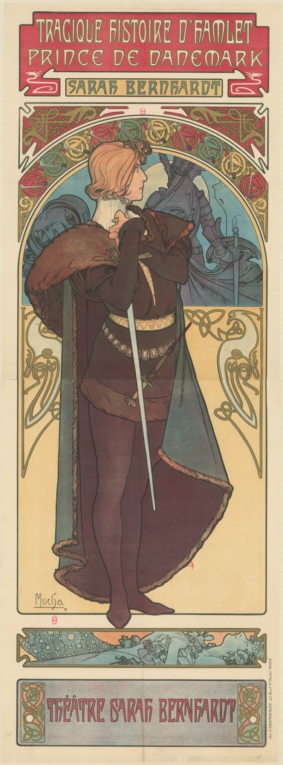
Alphonse Mucha’s “The Tragic Story of Hamlet, Prince of Denmark, Sarah Bernhardt. Sarah Bernhardt Theatre” (1899) distills Shakespeare’s most psychologically complex tragedy into a single, unforgettable column of line, color, and emblem. The poster was created to promote Sarah Bernhardt’s celebrated production in which she, the greatest French actor of her age, played Hamlet in a daring trouser role. Mucha answers that modern casting with a design that is both ceremonial and intimate. A solitary figure stands in profile beneath a great decorative arch; a pale apparition looms behind him; a narrow sword marks the center like a plumb line; and, at the base, Ophelia drifts in a botanical frieze of water and flowers. The entire sheet becomes a portable stage that audiences could read in seconds on a Paris boulevard and then recall for years.
Context: Bernhardt, Shakespeare, and a New Kind of Poster
When the Théâtre Sarah Bernhardt mounted Hamlet in 1899, the production was as much an event of modern culture as of classical drama. Bernhardt’s decision to play the Danish prince reignited debate about gender and interpretation, while Paris’s print culture gave the play a second stage on billboard kiosks. Mucha, already Bernhardt’s trusted designer, had a rare gift for condensing narrative into ornament that could survive rain, gaslight, and distance. His Hamlet poster belongs to the golden age of chromolithography, when artists and printers could pull thousands of richly colored sheets without losing finesse. It also belongs to Bernhardt’s personal brand. From Gismonda to Lorenzaccio, she and Mucha had developed a visual language—haloes, tall formats, dignified type, and sinuous line—that told the city an evening in her theatre promised more than performance. It promised an experience.
First Look: The Architecture of the Sheet
The poster reads like a medieval altar transferred to the street. A deep red title panel crowns the composition with hand-drawn lettering; beneath it a secondary cartouche bearing “Sarah Bernhardt” functions like a dedication. The image window is framed by an arch packed with interlace and stylized blossoms. Within the arch stands Hamlet, isolated against a cool blue ground. The figure’s silhouette is a self-contained design: cropped cape trimmed with fur, long tunic belted in squares of metal, tight hose, soft shoes, and a sword that falls in a cold straight line nearly the length of the sheet. The background is not empty; the ghost of King Hamlet rises behind the prince, armor and cloak reduced to dusky blues. At the very bottom a horizontal panel slides in like a stage apron and shows Ophelia among water plants, her body tipped back, hair combed by the stream. The architecture organizes emotion. High above is public proclamation; in the center is a private encounter with the supernatural; at ground level is the cost of tragedy.
Hamlet’s Pose and Psychology
Mucha chooses a three-quarter profile, the prince’s face turned left in a listening attitude. One gloved hand touches his collar, the other holds the hilt of the sword so lightly that the blade reads as a staff rather than a weapon. He is beautifully dressed but withdrawn, a figure of concentration rather than bravado. This is Bernhardt’s Hamlet: not a hot-blooded avenger but a mind operating under pressure. The fur-trimmed cape supplies a tactile note that anchors the spiritual tension of the composition; the belt’s repeated squares mark reason and discipline. By reducing gesture to a few controlled angles, Mucha allows the viewer to project thought onto the face and hands. The result is instantly legible even at a distance—an introspective prince on the brink of an act.
The Ghost in the Lunette
Behind Hamlet, inside the curved upper register, the father’s ghost materializes in a low, even tone that neither competes with nor vanishes behind the protagonist. Mucha refuses vapor; his specter is a quiet, sculptural presence in armor, a memory that carries mass. The placement is cunning. Because the ghost lives in the arch rather than on Hamlet’s plane, it becomes both backdrop and halo, like a continuing pressure from above. The apparition is not a scene illustration but a psychological diagram of the play. Every time viewers returned to the poster, they saw the prince shadowed by duty and accusation.
Ophelia’s Panel: A Lyrical Counterweight
The frieze at the base of the poster offsets the vertical severity of the central figure. Ophelia reclines among anemones, daisies, and long water grasses; the panel’s cool sky-blue and soft greens read as hush after drama. Mucha often nested secondary narratives in horizontal bands, and here that device carries enormous pathos. Ophelia’s panel is both chronological foreshadowing and moral surcharge. It reminds the passerby that Hamlet’s crisis of conscience ripples out into other lives. The quiet drawing of her hands, the closed eyes, and the delicate patterning of flowers explain the tragedy without sensationalism. It also gives the poster a slow rhythm: title at the top, conflict in the center, consequence at the bottom.
Ornament and Lettering: Medievalizing Denmark for Modern Paris
Ornament is Mucha’s grammar, and in Hamlet it speaks in Celtic knots and knotted vines that echo northern Europe while remaining squarely Art Nouveau. Interlacing bands knit the arch; stylized blossoms punctuate scrollwork; small shields and cartouches embed type. The lettering itself is a modulated performance, heavy-stroked block letters at the top, more compressed forms declaring Sarah Bernhardt’s name, and rounded capitals along the bottom identifying the theatre. Everything is hand-drawn so that text participates in image. That integration is not only aesthetic; it makes the poster immediately memorable to passersby who may never enter the theatre yet carry the production’s look in their mind’s eye.
Color and Atmosphere
Mucha orchestrates three temperature zones. The title fields glow in red and coral, the color of public proclamation. The central image cools to slate blue, forest green, and the mulberry of Hamlet’s costume. The lower panel slides back to pale greens and blue-grays. Golds and honey tones thread through border, belt, and cape trim, supplying the aristocratic register. The arrangement reads like a descending scale: the shout of the street, the inwardness of the prince, the whisper of the stream. The relative flatness of the hues, typical of chromolithography, is not a limitation but a strength. It allows the contour to do the storytelling while color sets the emotional weather.
The Sword as Axis and Metaphor
The blade that runs nearly the length of the figure is the poster’s axial event. It anchors composition, divides space, and acts as a moral pointer. Because the hand barely grips the hilt, the sword is not an emblem of action already taken but of action deferred. It becomes a metronome counting the play’s pauses. When the viewer traces the blade from tip to guard, the eye passes the belt, the hand, the fur, and the face, and then returns to the ghost. The loop replicates Hamlet’s mental loop: the thought of vengeance repeatedly meets hesitation and returns to duty.
The Reading Path
Mucha leads the eye in a choreography as deliberate as a stage blocking. The gaze lands on the crimson title and drops to Sarah Bernhardt’s name. The arch catches and slows the descent into the blue field where the profile face holds attention. From there the eye ricochets between the white plane of the sword, the glean of the belt, and the looming gray of the ghost. The final glide is downward to the Ophelia panel and then to the lavender plaque that proclaims the theatre. The whole cycle takes only moments on the street, yet it delivers title, star, mood, and consequence in a precise order.
Material and Process
The poster is a multi-stone chromolithograph printed by Champenois, whose press translated Mucha’s key drawing into layers of transparent color. The design depends on a strong black or dark key line, thin glazes that let the paper breathe, and a controlled registration that keeps the sword perfectly straight and the lettering crisp. The technique’s virtue is repeatability—hundreds of copies could cover the city with nearly identical vibrancy. But Mucha also composes with lithography in mind. Flat color planes avoid the risk of misregistration in complicated modeling; repeating ornaments offer printers steady benchmarks; and generous margins at top and bottom accommodate trimming and pasting.
Gender and Modernity
Bernhardt playing Hamlet was not a novelty stunt; it was a thesis about the universality of intellect and conscience. Mucha honors that thesis by refusing the easy joke or the coy wink. His Hamlet is a synthesis of feminine grace and masculine costume, an androgynous intelligence in a world of sharp lines and obligations. For a late–nineteenth-century audience, the image argued that modern theatre could both respect Shakespeare and renew him. In this sense the poster is as modern as any painting from the decade: it treats identity as performed, contingent, and open to interpretation.
Medieval Echoes and Scandinavian Flavor
Mucha rarely pursues archaeological accuracy; he prefers to invent convincing worlds from fragments. In Hamlet he borrows freely from medieval manuscripts, Norse ornament, and Slavic pattern to suggest a northern court. The interlace and serpent-like forms in the arch have a faintly Viking energy that suits a Danish prince. The cloak’s fur edging speaks of cold climate. The result is not a textbook reconstruction but a persuasive atmosphere. Viewers feel they have entered a remote, storied time where honor and fate grip tightly.
The Poster as Public Promise
Posters in fin-de-siècle Paris were not keepsakes alone; they were contracts. This one promises a production that will be luxurious without losing darkness, stylish without losing intellect. It promises Bernhardt’s star power, announced three times by name and by the echoed look of earlier Mucha collaborations. It promises that the theatre understands the modern city’s visual hunger and will reward it not with ordinary playbills but with art objects capable of living on walls at home. The promise proved credible; people tore such sheets from kiosks and collected them, a practice that kept Mucha’s designs circulating long after the run ended.
Influence and Afterlife
Mucha’s Hamlet set a template for theatrical posters for decades. Designers learned how to combine a central, iconic figure with narrative vignettes, how to make typography function as architecture, and how to use limited palette to project across distance. Contemporary illustrators still borrow the elongated format, the haloed figure, and the bottom frieze as ways to organize complex stories without clutter. The poster also feeds the broader myth of Bernhardt, binding her image inseparably to an ambitious reading of Shakespeare that continues to influence gender-conscious stagings.
Why the Image Endures
More than a century later the poster remains strangely contemporary. Its clarity of structure feels editorial; its restraint of color anticipates modern brand systems; its androgynous glamour speaks to current ideas about performance and identity. Above all, it contains a real argument about Hamlet: that the action of the play is thinking under pressure, that the ghost is a steady weight rather than a momentary fright, and that the tragedy’s cost is borne by others as much as by the prince. Few single images communicate so much with so little noise.
Conclusion
Alphonse Mucha’s 1899 poster for Sarah Bernhardt’s Hamlet is more than an advertisement. It is a fully composed meditation on duty, delay, and consequence. A red proclamation shouts the title; an arch of interlace encloses the drama; a listening prince leans into the vertical of his sword; a shadowed father urges action; and, below, Ophelia drifts in her last quiet. The sheet is at once medieval and modern, public and private, decorative and deeply narrative. It demonstrates how a poster can carry a production’s soul into the street and how a single image can make Shakespeare’s complexity newly legible.
