Image source: artvee.com
Introduction
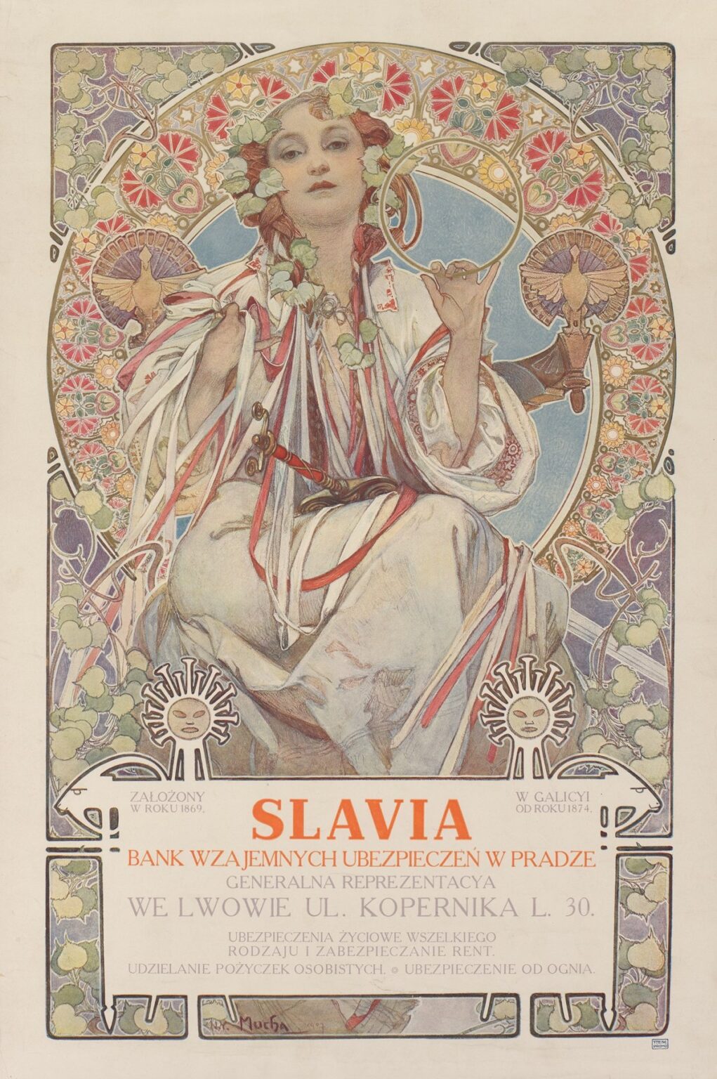
Alphonse Mucha’s 1912 poster commonly titled “Slavia – Bank Wzajemnych Ubezpieczeń w Pradze. Generalna Reprezentacya we Lwowie” is one of the most eloquent examples of how the artist fused advertising with allegory. At first glance it is sumptuous: a seated woman crowned with linden leaves occupies a radiant circular frame, her embroidered sleeves exploding into cascades of ribbons, while a wreath of starry rosettes turns like a jeweled halo behind her. Look longer and the commercial message clarifies. The woman is Slavia herself—the personification of a pan-Slavic ideal—recruited to represent a mutual insurance bank headquartered in Prague and, in this specific version, promoting its Polish-language agency in Lwów (today Lviv). Mucha creates an image that flatters national sentiment, sanctifies the ordinary act of purchasing a policy, and assures the viewer that protection can be as beautiful and enduring as folklore.
What This Poster Advertises
The orange headline SLAVIA anchors a polished white tablet shaped like a stylized animal cart. Around it, Polish copy lists the company’s pedigree and the Lwów address, underscoring that the firm is established, local, and accessible. Mutual insurance was, by design, a community enterprise; the client’s premiums protected neighbors as well as self. Mucha encodes that promise in a figure who looks less like a clerk and more like a benevolent guardian. The advertisement’s genius lies in making finance feel ancestral rather than abstract, communal rather than extractive. A viewer reading the text receives facts; a viewer absorbing the image receives reassurance.
The Allegorical Figure Called “Slavia”
Mucha’s central protagonist is a classic personification. She is neither a specific woman nor a goddess from a single pantheon. Instead she combines Slavic motifs—embroidered cuffs, linden leaves, red and white ribbons—into a serene, modern archetype. Her posture is confident but gentle: one arm bent as if adjusting a ribbon at the collar, the other raised with a circular emblem. The face, modeled with unusually soft transitions for a poster, projects a steady calm. In an era when banking imagery often featured stern eagles or stone facades, Mucha offers human warmth framed by radiant order. Clients are invited not just to sign a policy but to join a cultural family whose emblem is a woman you can trust.
The Protective Ring and the Grammar of Insurance
Held delicately between thumb and forefinger is a golden ring—neither jewel nor coin, but a pure form. In Mucha’s visual language, circles suggest continuity, wholeness, and recurrence. Here the ring doubles as a symbol of mutuality. A policy is a contract that closes into a loop; once joined, a member participates in a collective that protects in return. The raised ring quietly echoes the large circular halo of rosettes that contains the composition. The small gesture mirrors the big structure, implying that each client’s contract contributes to the safety of the whole.
Keys, Ribbons, and the Security of the Everyday
Pinned at the chest and tangled among the ribbons hangs a set of keys. They are the most domestic of symbols—doors, chests, locks—and in an insurance poster they are perfectly chosen. Keys promise that what matters will be kept safe. Mucha lets the metal gleam just enough to catch the eye, then dissolves it into the river of ribbons. The effect suggests that personal property is woven into a wider fabric of community care. The red and white bands recall folk costume and, in this Polish version, resonate with national colors, transforming the poster into a quiet patriotic statement about shared responsibility.
The Radiant Halo and Ornament that Works
Mucha’s circular backplate of patterned rosettes behaves like both decoration and engine. From a distance it reads as a single glowing disk, an iconic device he used to make figures legible across a street. Up close it resolves into a kaleidoscope of geometric blossoms and tiny medallions. The design feels Byzantine and folkloric at once, borrowing the sanctity of an icon and the homeliness of embroidery. It is more than a halo: it is an organizational calendar, a wheel of good fortune, a metaphor for actuarial stability. The woman’s figure sits precisely within it, evidence of Mucha’s liking for geometry that is felt more than measured.
Flora, Fauna, and the Pan-Slavic Garden
Vines, tendrils, and linden leaves thread the corners and creep across the ring. Linden, a tree of gathering and justice in many Slavic regions, is an apt emblem for a mutual insurance bank. Nestled to either side of the halo are stylized birds—fan-tailed and ceremonially posed—as if participating in a seasonal ritual. The creatures lend the scene a heraldic density without stealing attention from the figure. Mucha’s nature is never wild; it is ordered and benevolent, a garden cultivated by culture. In this environment the concept of risk is domesticated; storms may exist, but within Slavia’s circle they become patterns one can insure against.
Color as Climate and Character
The color scheme operates like a climate. Soft celadons and lilacs cool the perimeter; warm creams and blushes illuminate the figure’s skin and linen; coral and crimson pulse in the rosettes and ribbons; gold articulates the ring and the outlines of the ornamental band. The balance communicates stability. Nothing is too hot, nothing too cold. The bank presents itself as a place where extremes are harmonized and apprehension smooths into confidence. Printed in tuned chromolithographic layers, the colors also suggest material value; the poster looks expensive and therefore makes the product feel premium.
The White Tablet and its Zoomorphic Frame
The information panel at the bottom is not a plain rectangle. Mucha shapes it into a zoomorphic bracket with horn-like corners and small, sun-faced roundels at either end. The device reads like a ceremonial cart or altar table that carries the company’s message. The little suns double as good-luck emblems and as “wheels” that support the load of text. In functional terms the white field guarantees maximum legibility for Polish diacritics and varying line lengths; in symbolic terms it lifts prosaic copy to the status of inscription. Your policy, the panel implies, is not a mere sheet but a civic covenant.
Typography, Language, and Audience
Mucha draws the letters as carefully as he draws leaves. SLAVIA is set in strong, open capitals whose strokes echo the ring’s geometry. The remaining lines, in Polish, alternate sizes to establish hierarchy: company category, location, services. By producing parallel designs in Czech, Polish, and other languages, Slavia could address local audiences while keeping an unmistakable brand look. The poster’s bilingual logic—universal allegory plus language-specific details—anticipates contemporary identity systems where imagery remains constant as text localizes.
Printing Intelligence and the Craft of Reproducible Luxury
As with Mucha’s celebrated theater posters, the sheet is engineered for chromolithography. Large, flat shapes take transparent inks cleanly; a dark key line unifies the drawing and forgives minor misregistration; open areas of paper keep the work luminous while saving ink. The halo’s complex pattern is a virtuoso demonstration of what multi-stone printing can do without resorting to harsh outlines. Advertisers valued Mucha because his designs survived the realities of mass production without losing their aura. Here that aura reinforces the bank’s pitch: reliable, beautiful, consistent.
Reading Path: How the Poster Guides the Eye
Mucha choreographs attention with a conductor’s precision. The eye lands on the face, slides to the raised ring, circles the halo’s glitter, and drops along the cascade of ribbons to the white tablet where the headline locks the message. From there, smaller copy and the sun badges call the eye back into the frame’s corners, where vines and birds return attention to the figure. This circular tour mimics the logic of insurance itself: the client’s decision moves through a system and returns as protection. You do not merely scan the page; you participate in its rhythm.
Folklore, Finance, and Pan-Slavism
The poster’s fusion of folk ornament and corporate assurance is not accidental. In the early twentieth century, Czech and Polish cultural circles cultivated a pan-Slavic identity that emphasized shared roots across modern borders. A mutual insurance bank adopting the name “Slavia” tapped that sentiment. Mucha’s heroine, wreath of linden leaves on her brow, becomes a guarantor whose authority derives from tradition as much as from capital reserves. For customers in Lwów, still within the Austro-Hungarian sphere in 1912, the image offered a dignified, modern product wrapped in familiar symbols of community.
Comparisons within Mucha’s “Slavia” Posters
Mucha designed several variants for the company over the years. Some display heavier gold and denser geometry; others vary the woman’s pose or the textual language. The 1912 Polish-language version is notable for the balance it strikes between sumptuousness and approachability. The modeling of the face is gentler, the palette slightly cooler, and the informational tablet more integrated than in earlier editions. This refinement reflects a mature Mucha who knew how to let ornament breathe and how to give typography a voice equal to imagery.
The Ethical Temperature of the Image
Finance rarely appears humane in art. Mucha’s solution is to give the company a personality that is maternal without sentimentality. The woman is neither seductress nor severe guardian; she is a centered presence whose grace seems to arise from fairness. Keys, rings, and ribbons are practical objects, but he treats them with ritual respect. The viewer senses a system that takes promises seriously and honors the households it serves. That ethical temperature—warm, steady, ceremonial—was precisely the emotion a mutual insurer wished to evoke.
The Poster’s Modernity
Despite its folkloric content, the sheet is thoroughly modern. The spatial construction is flat and graphic; the face is modeled but never painterly; the whole composition relies on a disciplined grid masked by vegetal flourish. Stand it beside contemporaneous corporate stationery or bank façades and it looks like the future. Mucha proves that modern branding can be built from cultural memory rather than from anonymous geometry, a lesson many contemporary financial institutions have relearned.
Why the Image Endures
The poster continues to circulate because it solves a marketing problem with beauty and empathy. Insurance is invisible until disaster arrives; to sell it you must sell trust. Mucha provides a language of trust rooted in shared symbols, quiet authority, and luminous craft. The ring’s glint, the halo’s measured intricacy, the keys half-hidden among ribbons—these details offer little discoveries that deepen affection with each viewing. The sheet remains a persuasive ambassador for the artist’s larger philosophy: that daily life improves when the useful adopts the beautiful.
Conclusion
“Slavia – Bank Wzajemnych Ubezpieczeń w Pradze. Generalna Reprezentacya we Lwowie” demonstrates the full maturity of Alphonse Mucha’s advertising art. It welcomes strangers with a face, promises continuity with a ring, and grounds a financial product in the living soil of Slavic culture. Ornamental brilliance serves clarity; national motifs serve universal reassurance; luxury printing serves an egalitarian business model. A century later, the poster still shines because it turns a contract into a ceremony and a bank into a guardian. One reads the copy to learn where to sign, but one remembers the image because it makes protection feel like belonging.
