Image source: artvee.com
Introduction
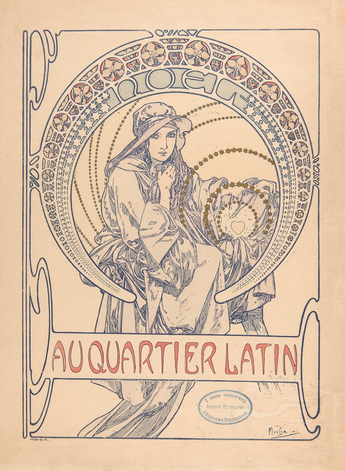
Alphonse Mucha’s “Au Quartier Latin – cover design” (1900) distills the spirit of Paris at the turn of the century into a single, elegant page. A contemplative young woman, cloaked and crowned by a circular halo of ornaments, sits within a frame of disciplined curves. Around her, constellations of tiny stars arc in widening bands; above her head the word “NOËL” announces the festive season; across the lower register, the title “AU QUARTIER LATIN” flows in warm red letters. The drawing appears almost monochrome at first—ink-blue lines on cream paper—but the design ignites wherever Mucha drops muted gold and coral into the composition. It is a cover, a poster, and a devotional image all at once, turning the bohemian world of the Latin Quarter into a modern icon.
The Latin Quarter and the Culture of Covers
At the fin de siècle the Quartier Latin was the living room of the Parisian avant-garde. Students, printers, illustrators, and small publishers crowded its streets, and periodicals thrived on the traffic between cafés, studios, and bookstalls. Cover designs mattered. They were not disposable wrappings but visual manifestos that declared a magazine’s sensibility the instant a passerby glanced at a kiosk. Mucha—already a star through his theater posters and decorative panels—was an ideal collaborator for such publications. He could compress atmosphere, information, and aspiration into a sheet that read at a distance and rewarded close inspection. For a holiday issue in 1900, he gave the Latin Quarter a cover that bridges sacred and secular, student merriment and winter reverie.
Composition and Geometry
The page is built on circles, arcs, and carefully squared borders. A large medallion dominates the upper field, its rim packed with tiny rosettes, stones, and repeating motifs. Inside that ring, Mucha stages a second, subtler rotation: rows of small stars sweep in concentric ellipses, like breath crystallizing in cold air. The seated figure occupies the center of that architecture, knees drawn, cloak gathered, hands near the collar in a gesture both protective and contemplative. The square page thus hosts two energies—centripetal ornament and inward human concentration—so the viewer experiences festive motion stabilized by private calm.
The Figure and the Echo of the Icon
Mucha’s women often serve as allegories. Here the pose, veil, and mantle recall centuries of Marian iconography, yet the model remains unmistakably modern. She wears a soft cap instead of a crown, her cloak folds like fabric rather than theology, and her gaze meets ours with quiet alertness rather than remote sanctity. The effect is a gentle sanctifying of the urban present: the Latin Quarter’s student world receives a holiday image that borrows the dignity of a medieval pageant without surrendering its Belle Époque poise. The hand at the throat intensifies that double reading. It is a natural reaction to winter chill and a symbolic gesture of inwardness appropriate to the word “NOËL” that arcs above.
The Halo as Page Architecture
The circular frame around the figure is more than decoration; it is the page’s spine. Mucha populates the ring with a repertory of small forms—disks, quatrefoils, gem-like lozenges—that behave like the metered beats of a carol. Between those beats the letters of “NOËL” glide, sharing the same curve as the rosettes so that text and ornament feel of a piece. This is a core Mucha principle: lettering should inhabit the same world as the drawing, not sit on top of it. The halo also gives the printer an area of consistent tone that sets the figure off from the creamy paper ground; the result is a design that reads instantly even when reproduced small.
The Title Band and the Rhythm of Type
Across the lower third, the title “AU QUARTIER LATIN” rides within a horizontal tablet that intersects the figure’s robe. The block is not an afterthought. Its rounded terminals lock into the outer border’s curves, and the letterforms—slender, slightly flared, rhythmically spaced—echo the medallion’s cadence. Mucha uses a warm red for the title, the only strong color plane on the page, ensuring that the name of the periodical anchors the composition while harmonizing with the softer gold of the starry arcs. Because the text shares the page’s curvilinear grammar, the information feels inevitable rather than inserted.
Line as the Primary Material
This cover demonstrates how Mucha’s line can carry both contour and mood. The drawing is built from a single tone of bluish-gray ink that thickens and thins with calligraphic ease. It is strong enough to hold the forms when seen across a shop window, and supple enough to render cloth folds, hair wisps, and delicate facial features at arm’s length. Inside large shapes, he uses short directional strokes to suggest weight and depth—the way a sleeve bunches at a wrist, the way a hem drapes across a knee—without resorting to heavy shading. The economy of means is astonishing: the page looks opulent, yet it is mostly reserved paper and a few disciplined lines.
Color and Seasonal Atmosphere
Mucha restrains the palette to three families—ink blue, muted gold, and coral red—over an ivory sheet. The gold arrives as star chains, the suggestion of festive illumination; the red, confined to the title, acts like a hearth at the base of the page; the blue organizes the drawing and border. Together they produce a winter atmosphere that is warm without glare, nostalgic without sepia. The choice of colors also suits the holiday theme in a nonliteral way. Instead of evergreen and scarlet, we get candlelight and carmine; instead of snow white, we get paper cream. The cover feels seasonal without slipping into cliché.
Ornament that Means Something
The cover is thick with pattern, but nothing is arbitrary. The halo’s repeating units recall stained glass medallions and goldsmith’s bezels—a nod toward craft traditions that the Latin Quarter prized. The star chains serve as both celestial metaphor and compositional glue, tying the figure to the ring and the ring to the page. Even the outermost border—the thin frame whose corners soften into stylized plant forms—participates in the theme: nature tamed into line, the modern city wrapping itself in organic motifs for a holiday frame of mind.
Sacred and Secular in Tension
“NOËL” crowns the image with religious resonance, yet the cover avoids direct piety. The model’s features are contemporary, her clothing practical, and her body language grounded in everyday experience. This balance suited a readership for whom Christmas was as much a social season as a holy one: parties and charity drives; concerts and markets; student theatricals and printers’ banquets. Mucha gives them an image in which the rituals of winter radiate through the familiar face of a neighbor. The Latin Quarter becomes a place where sacred icon meets modern cover design.
Printing Intelligence and the Logic of Economy
The cover is a lesson in how to design for lithography. Flat color fields are minimal and well separated; the unifying key line is strong enough to carry the drawing while forgiving of slight misregister in a long print run; large areas of untouched paper deliver brightness at low cost. The gold is likely printed with a bronzing ink rather than true metallic leaf, a practical solution that still reads as festive. By building richness from restraint, Mucha ensures that the design could be reproduced reliably and distributed widely—a crucial consideration for a periodical cover that would be handled, mailed, and archived.
The Reading Path and the Experience of the Page
The eye enters at the figure’s gaze, slides up to the word “NOËL,” follows the stars as they spiral to the right, and then drops into the red title band that names the magazine. From there the border’s curves return the eye to the figure’s lap and back to her hands, completing a loop that feels like a carol’s refrain. This choreography matters because a cover must communicate in seconds while sustaining interest for longer. Mucha’s page offers both: an immediate motif and a slow circuit of details that reward lingering.
Relationship to Mucha’s Broader Oeuvre
The cover converses with several strands of Mucha’s practice. The halo and rosette grammar recall his famous calendar “La Plume” the year before; the contemplative woman connects to his allegorical panels; the tight integration of lettering and figure echoes his theater posters. Yet the sheet has a distinctive tone: cooler, more linear, almost pen-and-ink compared to the lush chromolithographs of the mid-1890s. That tempering suits the purpose. A cover must be handled, annotated, and saved; its dignity should outlast a season. This design achieves that equilibrium between timeliness and permanence.
The Latin Quarter as Brand
“Au Quartier Latin” is more than a geographic label; it is a brand for a way of living with art. The title across the page claims a territory where students and printers exchange ideas, where ornaments from medieval churches inform café menus and magazine mastheads, where a winter issue can be both festive and sober. Mucha’s cover visualizes that brand with unusual tact. It flatters the district’s self-image—erudite, handmade, generous—without lapsing into caricature. One sees in the figure a reader, a model, a writer, or a shop assistant; in short, a citizen of the quarter.
Symbolic Tenderness and the Heart
Within the starry arcs, near the figure’s lap, Mucha includes a small heart enclosed by delicate patterns. The motif is almost hidden; it is a secret for close viewers. Its placement suggests warmth gathered under the cloak, a private core of feeling amid public celebration. The heart humanizes the page just as the word “NOËL” formalizes it. Between them the cover locates the season’s meaning—not as spectacle, but as an inward light that radiates outward in rings of shared ritual and décor.
Negative Space and Breath
A great deal of the sheet is simply paper. That blankness is not emptiness but breath. It keeps the figure luminous, prevents the ring from becoming claustrophobic, and ensures the title band reads cleanly at a glance. In the Latin Quarter’s crowded visual culture—shop signs, chalkboards, fly-posters—such restraint was a luxury signal. It says that the publication trusts its audience to appreciate clarity and that it is worth clearing a little silence around the text and image.
Lessons for Present-Day Designers
The cover still speaks as a design primer. Establish a strong geometric armature; integrate type with the same visual logic as image; choose a restricted palette keyed to mood; let line carry both structure and emotion; and reserve space so the page can breathe. Perhaps most importantly, attach information to an atmosphere. The content here is minimal—title, seasonal word—but the feeling is precise. That is why the sheet continues to read across cultures and decades.
Enduring Appeal
More than a century later, the cover’s power lies in its tender balance of opposites: public and private, sacred and secular, ornate and spare. The woman is specific enough to feel near and generalized enough to symbolize a community. The stars suggest festivity, yet they move with the calm of snowfall. The letters are hand-drawn, but they communicate with the clarity of typeset lines. People respond to this balance because it mirrors what a holiday in a city often is: old forms lived anew by modern faces.
Conclusion
“Au Quartier Latin – cover design” transforms a single sheet into a season, a neighborhood, and a point of view. Mucha takes the tools of the printer—line, border, flat ink—and turns them into winter ceremony. He proves that a cover can be both an invitation and a keepsake, a guide to what lies inside and an independent artwork that holds its wall space long after the issue has been read. The Latin Quarter wanted an image worthy of its name; Mucha gave it a haloed figure whose quiet concentration still makes the city’s noise fall away.
