Image source: artvee.com
Introduction
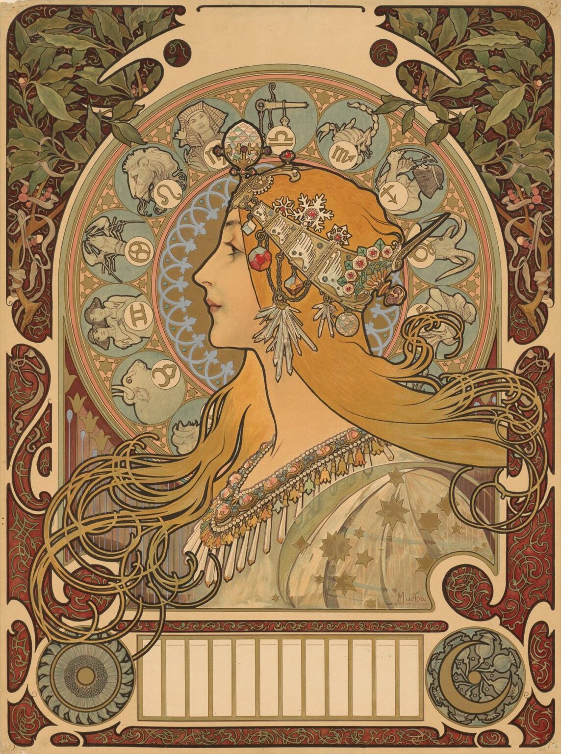
Alphonse Mucha’s 1896 poster “La Plume” is one of those works that seems to condense an entire movement into a single, irresistible image. A young woman in profile, crowned with a diadem of jewels and seasonal motifs, floats before a radiant wheel of zodiac signs. Her honey-gold hair streams into a maze of arabesques, and every square inch of the sheet is alive with ornament—ivy tendrils in the corners, interlaced scrolls in the border, celestial emblems near the bottom. The composition is both stately and kinetic, classical and unabashedly modern. Created at the very moment Art Nouveau crystallized in the public imagination, “La Plume” presents Mucha’s signature grammar at full power: a poetic female figure, a halo that doubles as a structural device, and a tapestry of stylized nature framing it all. It is equal parts portrait, calendar, branding, and talisman of time.
Historical Moment and Purpose
The mid-1890s in Paris were a golden age for lithography. New presses and better inks had turned the city into a gallery of street art; posters promoted theaters, cosmetics, champagne, and magazines with a level of artistry previously reserved for salon canvases. Mucha had erupted into fame in 1895 with his long, lyrical posters for Sarah Bernhardt. Publishers quickly learned that his distinctive language—serene heroines encircled by decorative haloes—could sell anything. “La Plume” took shape within this feverish culture of images. It is commonly known by two names: “Zodiac,” which describes the subject, and “La Plume,” the Parisian literary magazine that adopted the design for its calendar promotion. The sheet’s large blank panel near the bottom was meant for the printer to insert monthly blocks or event listings, turning fine art into a practical object that lived in bookstores, editorial offices, and homes.
Composition as a Clockwork Theatre
Mucha organizes the page like a mechanical stage where every element marks time. The woman’s head, drawn in pure profile like an antique cameo, occupies the central vertical axis. Behind her is a large circular medallion subdivided into twelve smaller roundels, each containing a zodiac sign rendered as a bas-relief cameo: Libra’s scales, Scorpio’s scorpion, Aquarius pouring water, and so on. The roundels rotate clockwise as if to suggest the year’s procession. Around this wheel, Mucha nests another ring of lace-like pattern and then a border of ivy that grows from the upper corners and curls inward. The entire structure reads from a distance as a single radiant disk with leafy brackets—a perfect billboard geometry—yet at arm’s length it resolves into a finely articulated universe of symbols.
The Woman as Allegory of Time
Mucha’s women rarely function as individual portraits; they personify ideas. Here, she is less a specific muse than a figure of Time imagined as youthful and inexhaustible. The profile stance is deliberate: in coins and medallions, a profile implies authority and continuity, and Mucha taps that association to make time feel both sovereign and benign. Her expression is calm, even introspective, and the line of her nose and lips is drawn with a classical restraint that keeps the ornament from tipping into excess. A collar of gemstones encircles her neck; a crescent-like shoulder mantle dotted with stars slips across the lower right; her hair, released from constraint, offers the image its kinetic energy, flowing in long ribbons that double as grafters of rhythm. She is the still center around which the year whirls.
The Diadem and Its Encyclopedic Symbols
The headpiece is a miniature cosmos. A crystalline orb, darts of icicles, tiny blossoms, and berries sit beside miniature architectural motifs—little towers and decorative plaques—suggesting the passage of seasons and the cultures that mark them. The result reads like a portable calendar crown: winter’s frost and summer’s fruit occupying the same tiara, bound together by chains of jewels. Mucha delights in objects; each pendant and clasp is drawn with jeweler’s precision, yet he keeps the whole diadem light by suspending it on linear filaments rather than thick bands, so it hovers rather than weighs.
Zodiac Wheel and the Logic of the Year
The zodiac is both ornament and mechanism. Mucha sets the twelve signs in circular cameos around the woman’s head, using the rotational logic to collapse a year’s worth of constellations into a single sightline. The wheel’s placement has two effects. First, it acts as a halo, borrowing from religious iconography to sanctify the secular subject of time. Second, it invites reading as a clock face. Viewers can track their own month within the wreath, finding meaning in the poster as one finds a birthday in a calendar. This interactive quality made the design perfect for a magazine’s promotional calendar: it was literally an image people wanted to stand near and consult.
The Border, Corners, and the Architecture of Ornament
Art Nouveau sought to erase the boundary between fine and applied arts, and Mucha’s border work is a manifesto for that idea. The side panels are tapestries of intertwined vines and blossoms; the lower corners hold circular medallions filled with solar and lunar motifs. These are not generic fillers. The ivy recalls persistence and the evergreen drive of time; the medallions balance sun and moon to suggest the daily cycle nested within the yearly one. The long rectangle at the bottom—empty in many surviving impressions—was a practical zone for a printer’s calendar blocks or advertiser’s copy. Compositionally, it acts like a plinth that stabilizes the spinning world above it.
The Line that Holds and Sings
Mucha’s drawing is famously musical. In “La Plume,” the contour line swells and thins like phrasing in a melody. It is strong enough to hold the colored shapes during printing, yet elastic enough to keep the image supple. Hair strands bifurcate and reunite; jewelry chains droop with believable weight; ivy stems loop in gracious arcs. Mucha uses short, directional hatchings inside garments to suggest volume without heavy modeling, allowing color to carry the atmospherics. The line’s discipline is what makes the poster so legible at a distance while remaining luxurious up close.
Color as Season and Atmosphere
The palette is tuned to an antique serenity: celadon greens, tea browns, oxidized reds, and the soft blue of worn enamel. Metallic ideas—bronze, copper, gilt—glimmer without literal metallic ink; Mucha evokes their warmth through carefully chosen pigments. The woman’s skin is a gentle vellum peach, contrasted with the cool sage of her mantle and the honey of her hair. Around her, the zodiac roundels shift through muted blues and greens, keeping the halo cool so that the figure feels alive and sunlit. The harmony suggests old bindings, Byzantine mosaics, and folk embroidery all at once—timeworn but radiant, exactly the quality a magazine allied with the arts would want to project.
Printing Intelligence and Chromolithographic Craft
Although the poster looks opulent, it is built from economical means: flat color fields printed in multiple stones with a unifying key line. Mucha designed with the press in mind. He simplified forms into separable shapes so each color could have its own stone, then used transparent inks to create subtle overlaps in hair and background. The lace-like ring behind the woman is a tour de force of stone registration: fine enough to seem carved, but robust enough to print cleanly by the thousands. The large areas of cream paper left unprinted serve two purposes—they protect the image from heaviness and save ink, a practical consideration for a publisher’s promotional piece.
Dialogue with Antiquity and the Modern Magazine
“La Plume” bridges worlds. Its profile and jewel-laden costume nod to cameos, coins, and Byzantine icons, while the poster format, empty advertising panel, and reproducibility celebrate modern mass media. It is as if a coin goddess stepped from a museum case to staff the front desk of a literary journal. That union of sacred and everyday, of craft and commerce, lies at the heart of Mucha’s appeal. He asks viewers to accept that beauty belongs on a calendar, that an image meant to be handled and annotated can also bear the grace of high art.
Female Personification and the Ethics of the Gaze
Mucha’s women have been called decorative, but they are not passive. Here the subject looks towards the future, chin slightly lifted, eyelids half-lowered in concentration. She receives the world rather than courting it. The profile distances her from the viewer’s direct gaze, exchanging flirtation for authority. That stance dignifies the poster’s purpose: the woman does not sell; she presides. She is the keeper of time, not its victim.
The Role of Nature and the Idea of the Year
Nature in “La Plume” is stylized into heraldry: ivy, blossoms, and stars become emblems rather than specimens. Yet their rhythms remain organic. Mucha’s layout translates natural cycles into graphic patterns—the spiral of hair echoes the coil of vines, which in turn rhymes with the rotary flow of the zodiac. The viewer senses, perhaps without articulating it, that days, months, and seasons are variations on the same curve. If Art Nouveau had a worldview, this was it: the line of a plant stem and the line of a woman’s hair are two instances of one life-pattern.
Practical Design: Why the Poster Works as a Calendar
The large halo is more than a visual motif; it clears a quiet field around the figure where overprinting for dates would not muddle her face. The bottom panel’s proportions suit twelve monthly blocks or a single strip of dates. The color balance is gentle enough not to fight handwritten notes. Even the corner medallions—one solar, one lunar—act like visual anchors guiding the eye from the image to the dates and back again. Mucha understood that for an image to remain on a wall all year, it had to look inevitable with and without the practical elements. “La Plume” does.
Comparisons within Mucha’s Oeuvre
Many of Mucha’s celebrated posters share elements with this sheet: the halo from his “Seasons,” the profile authority from his Sarah Bernhardt portraits, the border luxuriance from his decorative panels. Yet “La Plume” synthesizes them with unusual balance. It is less narrative than his theater sheets and more structured than his allegories. It also introduced a circular zodiac motif that he would revisit in different colorways and formats, influencing calendar design for decades.
Reception, Variants, and Collectability
The poster’s immediate impact was enormous; it became one of the most reproduced images of the period. Printers issued variants with different typography, and later editions circulated as autonomous art prints shorn of calendar text. Collectors prized it not only for its beauty but for how completely it encapsulated the style of 1896. Museums and private owners have preserved pristine impressions where the bottom panel remains blank, a reminder that the design straddled use and art. Its survival in so many contexts—magazine promotion, gallery print, salon decoration—speaks to its adaptability and to Mucha’s uncanny sense of what the public wished to live with.
Influence on Graphic Design and Popular Culture
Beyond the Belle Époque, “La Plume” has served as a toolkit for designers. The radial composition, cameo profile, and modular border offer a template for posters, album covers, and even user-interface badges. The zodiac wheel, in particular, provided a modern way to visualize cycles, inspiring innumerable calendars and astrological charts. The work also shaped the iconography of feminine profile-with-halo that resurged in the psychedelic posters of the 1960s and in contemporary branding seeking vintage glamour without nostalgia’s dust.
The Work’s Enduring Allure
Why does “La Plume” continue to captivate? Partly because it performs a neat magic trick: it freezes time while celebrating time’s flow. The woman never ages, her halo never stops, and yet the viewer senses the year moving under her steady gaze. Partly because it is generous with detail without becoming a puzzle. You can enjoy it from across a room or spend minutes tracing the hair, the lattice of the lace ring, the miniature glyphs in the zodiac. And partly because it proposes a world where daily tools—a calendar, a magazine—deserve sumptuous design. In a culture that often separates usefulness from beauty, the poster offers a persuasive counterexample.
Conclusion
“La Plume” is far more than a pretty emblem of Art Nouveau. It is a diagram of the year rendered as ornament, a portrait of Time wearing a diadem of seasons, a calendar masquerading as a jewel. Mucha fused rigorous structure with lyrical drawing, tuned a palette that feels both antique and fresh, and embedded practical functions within an image that asks to be cherished. The poster is a masterclass in how to turn information into enchantment. More than a century later, its lines still sing, its symbols still orbit, and its serene heroine still presides over our passing days with inexhaustible grace.
