Image source: artvee.com
Introduction
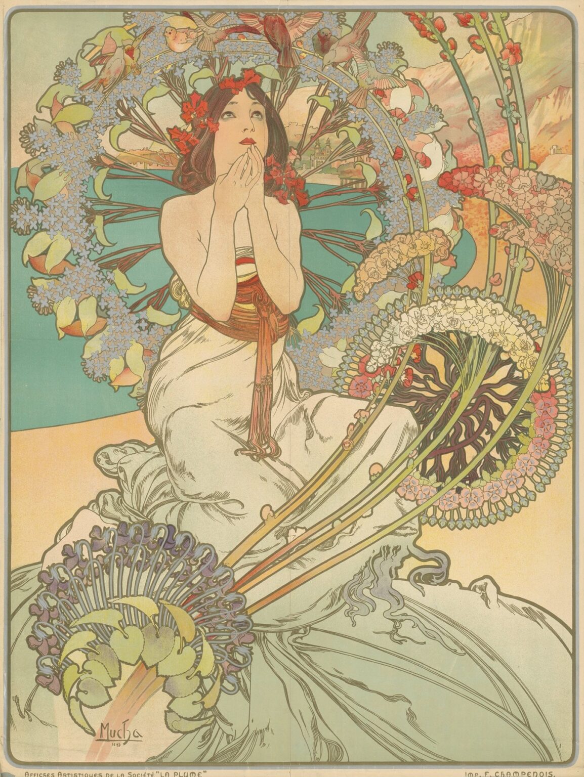
Alphonse Mucha’s 1897 poster “Monaco Monte-Carlo” is one of the great visual invitations of the Belle Époque. It promises sunlight and spectacle without showing a single roulette table. Instead, a young woman kneels in a sea-colored world of flowers and birds, her hands raised in rapt expectation as if about to breathe a wish. Around her, whiplash stems arc like musical staves; a circular garland becomes a radiant halo alive with finches; the turquoise of the Mediterranean meets the peach of Riviera cliffs. The image is both advertisement and daydream, compressing the glamour of Europe’s most famous resort into the language of Art Nouveau—ornament that moves like living things, color that feels like climate, and a heroine whose private reverie becomes the viewer’s own anticipation of travel and luck.
Belle Époque Tourism and Why This Poster Mattered
In the last decade of the nineteenth century the Riviera rebranded winter. Railways made southern France reachable in a day; palaces, promenades, and the Casino turned Monte-Carlo into a stage where Europe’s elites performed leisure. Posters were the medium that stitched that story across the continent. They hung in stations and arcades, promising sea air to Parisians and Vienna’s snowbound citizens alike. Mucha—already a sensation for his theater advertisements—was the ideal interpreter. He understood that the modern tourist was not only buying a train ticket but a mood. “Monaco Monte-Carlo” sells warmth and fortune, yes, but it also sells a feeling of suspension between nature’s abundance and the charged hush before a throw of the dice.
Purpose, Publisher, and Audience
The design promoted the resort’s season, circulated by the principality’s publicity machine and printed by the Paris house of F. Champenois. Unlike commercial posters that shouted brand names, this sheet works by enchantment. The resort’s name is tucked along the upper edge in restrained lettering, while the entire field is given to imagery. Its intended viewers were travelers lingering in grand halls and station platforms—people with the time and means to answer a beautiful suggestion. The poster thus had to operate at two distances: legible across a concourse and rewarding up close. Mucha’s solution—big radiating forms that resolve into botanical detail—solves the problem with elegance.
The Composition’s Radial Symphony
At the design’s heart is a simple device: a circle. Mucha builds a floral nimbus behind the woman that reads across a room as a single radiant disk. Seen nearer, that disk is a ring of star-blue florets interleaved with creamy bells; birds share the wreath like guests at a carousel. From the woman’s waist, stems sweep outward in tightening arcs, echoing the circle and creating a sensation of expanding motion. Their tips bloom into fantastically stylized inflorescences that hover between botany and ornament. Horizontal planes hold the exuberance in place—the flat turquoise sea to the left, the rocky ochres to the right—so the eye alternates between the calm of place and the whirl of decoration. The poster hums because the geometry is musical: a steady beat under a cascade of trills.
The Central Figure and the Drama of Expectation
Mucha’s women are famous for serenity, but this one thrums with anticipation. She kneels atop a spill of pale drapery that pools like surf at her feet. A sash girds her waist; red blossoms thread through her dark hair. Her gaze tilts upward, hands gathered at the lips in the universal pose of inward prayer or whispered wish. The gesture is brilliant advertising. It never states “casino,” yet anyone who has ever counted seconds before a roulette ball lands recognizes the moment. She prays for luck, or perhaps simply for sun and song; either way the viewer supplies the story. Because her hope is private, the poster avoids vulgarity and courts the aspirational imagination that luxury travel depends on.
Birds, Blossoms, and the Roulette Idea
Art Nouveau loved to blur natural forms with human symbols, and Mucha turns that talent into sly metaphor. The wreath of flowers does not merely frame; it spins. Birds perch at equal intervals like numbers on a wheel, beaks ajar as if to announce the winning color. The sinuous stems that shoot forward from the lower right describe arcs so close to concentric that one can almost hear the clatter of a ball circling a croupier’s rim. Yet the poster never collapses into literalness. The plants remain plants—hyacinths, lily-bells, and invented hybrids drawn with botanic affection—so the metaphor breathes instead of shouting.
Place Without Postcard Cliché
Mucha anchors the fantasy to the real Riviera with two restrained passages. On the left, behind the halo of flowers, the turquoise bay lies in a quiet plane, punctuated by the silhouette of seaside buildings and a pale bridge. On the right, ochre and rose cliffs climb under high, fair weather clouds. The geography is generic enough to stand for any bright winter day on the Côte d’Azur but specific enough to whisper of Monaco’s harbor and rocky promontories. Because these passages are flat and delicately tinted, they behave like stage flats behind the action, allowing the poster to be both landscape and ornament at once.
Color as Climate
The palette is a climate more than a scheme. Turquoise dominates, the exact cool of Mediterranean water seen from shade. Warmth arrives as apricot and honey, echoed in the woman’s skin and the shore. Accents of coral pulse in her wreath and sash, sparking the composition like pomegranate seeds. Cool lavenders and blue-grays keep the whites from chalkiness, while the line drawing—printed in a soft, olive-brown rather than harsh black—binds the fields without weighing them down. Stand before the poster and you can feel the temperature it proposes: not summer blaze but winter gentleness, the Riviera promise that January can be pastel.
The Line That Moves Like Music
Mucha’s line is a performance in itself. It swells and thins with calligraphic ease, turning sharply to articulate a petal, then lingering over the soft roll of drapery. The whiplash curve—Art Nouveau’s signature—is everywhere, but never mechanical. Each curve seems to answer another, creating counterpoint. Even the woman’s profile is written as a sequence of supple turns, echoing the botanicals around her. Because the drawing is so musical, the poster can be dense with detail without becoming busy; the eye follows the line like a melody.
Elegant Restraint in Lettering and Border
The typography is modest by design. “Monaco Monte-Carlo” sits quietly at the upper margin in open, rounded capitals spaced like pearls. A fine border with softened corners holds the fields together, its color choosing neutrality so as not to interrupt the chromatic atmosphere. This restraint lets the image itself carry the resort’s personality. It also makes the sheet adaptable; later printings could vary the caption without disturbing the design’s harmony, an important practical advantage for an image meant to circulate widely.
Chromolithography and the Craft of Reproducible Luxury
The poster’s richness comes from chromolithography’s patient layering of transparent inks. Each hue demanded a separate stone; highlights were often built by leaving the paper untouched; delicate tints in the sky and sea required gradient rolls that had to be pulled with consistency. Mucha designed for the medium, separating colors into flat shapes that lock together under a unifying key line. The technical discipline allowed printers to produce an object that felt luxurious yet remained affordable to distribute by the thousands. That paradox—mass-produced enchantment—is the miracle of Belle Époque print culture and the reason such posters survive as art.
Selling Travel Without Showing Transport
Most railway posters of the era promised speed and comfort with images of engines and carriages. Mucha does something cannier. He omits all machinery and shows the reward instead: the feeling upon arrival, the first breath at the balustrade when the sea opens before you and the day’s possibilities unfurl. In advertising terms, the poster sells the end state, not the means. It treats the viewer as already worthy of the scene—as someone who belongs among flowers and birds. That generosity of address is why the image reads as invitation rather than command.
The Feminine Ideal and the Ethics of Looking
Mucha’s figure is idealized, yet she is not a spectacle for consumption. Her gaze is upward and inward; her pose, though revealing of shoulder and arm, is about emotion rather than display. In a market saturated with coquettish beauties, this woman’s reverie commands a different kind of attention. She is the subject of the poster’s narrative, not its object. Even her gown, a white cascade wrapped with a simple sash, reads as classical and modest. The image courts desire by aligning the viewer with her wish rather than by presenting her as the wish fulfilled.
Dialogue with Mucha’s Other Works
“Monaco Monte-Carlo” converses with Mucha’s famous allegories. The halo recalls the seasonal wreaths in his “Seasons” series; the botanical profusion echoes his decorative panels; the serenely lifted face belongs to the same family as his theater heroines. Yet the poster has its own tone—lighter than the dramatic portraits of Sarah Bernhardt, more exuberant than the introspective “Winter,” more public than the private panels made for collectors. It occupies the sweet spot where sophisticated ornament meets mass desire, which is precisely where Mucha made his lasting contribution to visual culture.
Reading the Poster as a Map of Desire
The image traces a path from inward hope to outward journey. Hands gather at the lips; lines burst from the figure’s waist; the garland spins; sea and shore open; distant buildings beckon. The movement is from center to circumference, from the private wish to the wide world. That geometry mirrors the act of travel itself—a decision in the heart expanding into a change of place. In this sense the poster is not just decoration but a diagram of longing, explaining why a resort like Monte-Carlo could grip European imagination so firmly.
Legacy, Collecting, and Afterlives
Like the best Belle Époque posters, “Monaco Monte-Carlo” escaped its initial task to become a portable emblem of an era. It was reissued in art portfolios, pinned in cafés, and later framed in homes far from the Riviera. The design influenced generations of travel advertising that learned from its strategy of selling atmosphere rather than infrastructure. Contemporary designers still borrow its radial layouts, its palette keyed to climate, and its humane central figure who experiences rather than poses. The poster’s endurance testifies to the persuasive power of beauty when it is joined to clarity of purpose.
Conclusion
“Monaco Monte-Carlo” captures a precise promise: in winter, come south where the air is pastel, wishes hum like birds, and luck feels almost botanical. Alphonse Mucha achieves this without a single literal cue to gambling or timetables, relying instead on the poetics of line and a palette that seems to warm the room. The poster is an act of hospitality. It invites viewers into a moment of expectancy and lets them complete the scene. More than a century later, its charm has not dimmed because it speaks a language that commerce rarely remembers to use—the language of wonder. If you follow the arcs of those stems and the circle of that living halo, you can almost hear the soft clatter of a roulette ball becoming a memory.
