Image source: artvee.com
Introduction
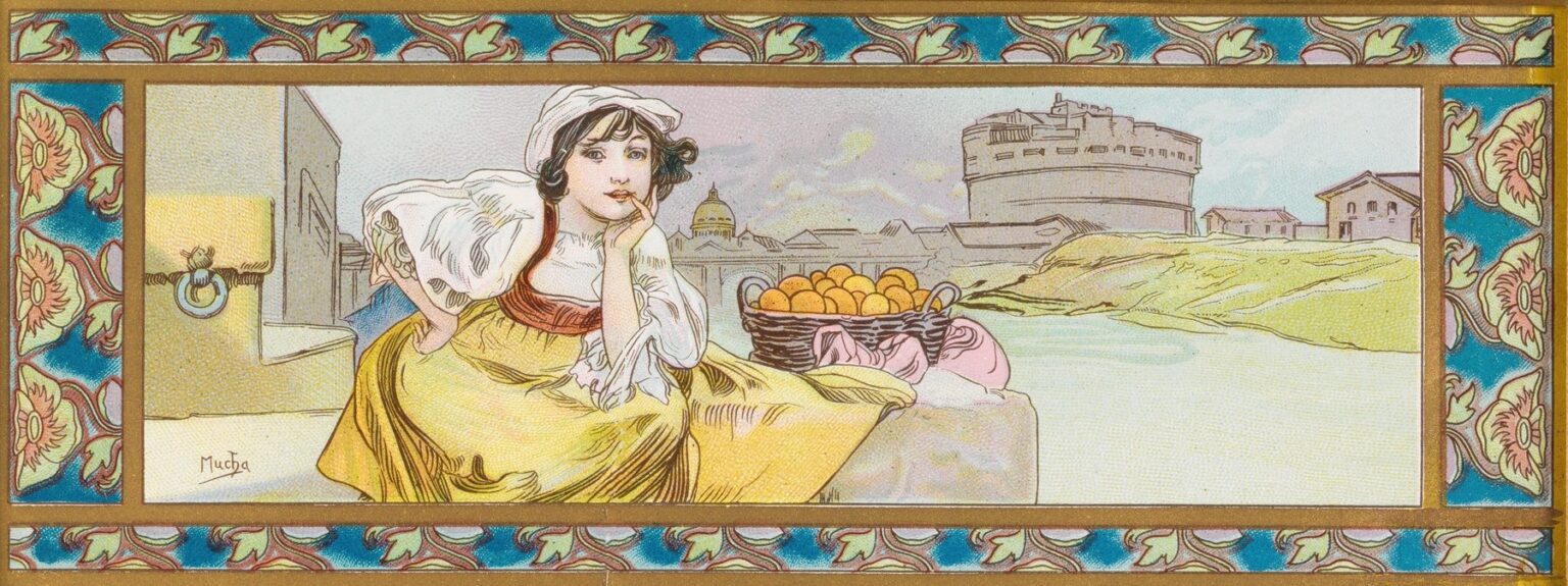
Alphonse Mucha’s “Design for a box of Lefèvre-Utile biscuits” (1897) turns a simple package into a miniature stage where brand, place, ornament, and personality perform together. The sheet is a long horizontal frieze: at left a young vendor in a white coif leans on a parapet with a basket of oranges; beyond her, the Tiber glides past the cylindrical mass of Castel Sant’Angelo and the distant dome of Rome. All of it is pressed into a decorative frame of teal-and-coral floral motifs that could easily wrap a tin. Mucha’s print is charming at first glance, but it is also a tightly engineered piece of design that reveals how Art Nouveau transformed everyday goods into objects of desire—and how Mucha, more than any of his contemporaries, fused narrative, ornament, and commerce into a single image.
Historical Context: LU, Paris, and the rise of artist-designed packaging
By the mid-1890s, the French biscuit maker Lefèvre-Utile (LU) had become a model of modern branding. Based in Nantes, LU sold its “petits beurres” and assorted biscuits across France and abroad, competing in the new landscape of department stores, mail-order catalogs, and railway kiosks. The company understood that recognizable images were as important as recipes. Artists and printers had turned the Paris street into a gallery of posters; the next frontier was the object one carried home. Tins, wrappers, and labels promised permanence on the kitchen shelf long after a poster was pasted over. Mucha, already famous for his theater sheets, was an obvious collaborator. In 1897 he was at the height of his powers, translating his poster grammar—an expressive female figure framed by ornament—into formats that could be printed on paper or metal in large numbers. LU, for its part, gained an instantly recognizable aura of elegance and cosmopolitan polish.
Packaging as a modern medium
Unlike a wall poster, a box must be handled, turned, and stacked. Its image is not merely looked at; it accompanies the consumer home, sits on a table, is opened and closed. Mucha’s design answers this new intimacy. The wide panoramic proportion suggests the lid of a rectangular tin, while the continuous border indicates how the pattern could run around the sides. The composition is shallow enough to read at a glance but packed with small pleasures—the stippled textures of the sky, the basket weave, the bee-medallion on the left block—that reward close inspection. It is a picture to live with, and that is precisely what a brand wants from a package: an image that remains friendly through repetition.
Composition: a frieze engineered for storytelling
Mucha arranges his picture like a sentence read left to right. First comes the figure, the “subject” of the phrase; then the oranges—the “object,” bright and enticing; finally, the architectural predicate of Rome, a promise of origin and travel. The girl anchors the left margin with a comfortable triangle of shoulder, elbow, and hip. Her cheek rests on her hand; her other hand’s fingertip touches her lip, a playful intermediary between viewer and fruit. The basket sits exactly at the compositional hinge, where private reverie turns into public offering. The river and walls run horizontally to the right, slowing the eye and letting the landmarks settle in memory. The result is a balanced frieze that can be cropped for a label, stretched for a lid, or repeated on the box’s flanks without losing legibility.
The figure: personality becomes brand voice
Mucha’s women are never anonymous mannequins. Here the vendor is modestly dressed—a peasant coif, rolled sleeves, bodice and skirt—yet she is unmistakably a “Mucha” heroine: luminous eyes, soft oval face, and that relaxed, slightly ironic pose that suggests an inner life. Her lean against the parapet invites a pause. She is not hawking; she is keeping company. On a box, such a figure functions as a spokesperson whose tone is friendly rather than strident. The gesture to the lips carries a hint of secrecy and invitation, an intimate nudge that makes the oranges—and by extension the biscuits within the tin—feel like a treat chosen just for you.
The setting: Rome as cosmopolitan shorthand
Behind the vendor rise forms any traveler of the period would recognize: the rounded fortress of Castel Sant’Angelo and, farther off, a great dome that evokes St. Peter’s. The Tiber draws a pale ribbon through the middle ground, its banks rendered as broad, light shapes that keep the architecture legible. Why Rome for a French biscuit? Modern brands traded in geography as flavor. Evoking a celebrated city suggested quality, provenance, and a worldliness that consumers in Paris, Nantes, or Brussels could buy into. Oranges reinforce the Mediterranean theme: fragrance, sunshine, winter sweetness—a perfect flavor note for biscuits and a sunny antidote to northern winters. Whether or not the product inside was orange-scented, the image promises warmth, travel, and a little holiday in a tin.
Symbols in plain view: oranges, a bee, and the basket
Mucha seldom leaves a motif without a second meaning. Oranges are more than fruit: they symbolize generosity and festivity, their round forms echoing coins of pleasure to be spent. The basket suggests honest labor and artisanal gathering rather than factory anonymity. And then there is the small detail on the left—the ring set into a yellow block, its plate marked by what appears to be a bee. Bees are emblems of industry and sweetness, guardians of the hive and providers of honey. For a biscuit maker, the bee quietly endorses both the flavor profile and the ethic of careful work. Mucha tucks the symbol into the architecture, as if to say that sweetness and labor are built into the very fabric of the scene.
Color and line: a calm, edible harmony
The palette is subtly keyed to appetite and ease. Butter-yellow dominates the skirt and sun-lit walls; apricot and rose tint the vest and the sacks under the basket; teal blues in the border cool the warmth so the image doesn’t cloy. The sky is a powdered lavender that keeps the Roman masses from becoming heavy. Oranges sit as the purest color notes, small suns at the frieze’s center. Mucha’s lines do the rest of the work: supple contour strokes clarify edges without blackening them; interior hatchings create the shimmer of fabric and the matte pith of fruit. The overall effect is crisp enough for print yet gentle on the eye—an image you can look at while you eat without visual fatigue.
The border: ornament that behaves like architecture
Mucha frames the central picture in a band of repeating floral units—cream petals with coral hearts floating on a turquoise ground, all tied by gold bars. This border is not a detachable flourish; it tells the package how to behave. On a tin, it would align the lid with the sides, corner to corner, turning the box into a small jewel-like object. The units are large enough to be read at a distance and regular enough to survive manufacturing variance. At the same time, the border functions like a curtain in a theater: it announces a genre (elegant, slightly exotic) and primes the viewer for pleasure before the main scene even arrives.
Technique and translation to tin
Designs like this began as gouache and watercolor drawings with a firm pencil or ink outline. For mass production they were transferred to lithographic stones or zinc plates, then printed on paper labels or directly on sheet metal for tin manufacture. Mucha anticipates the mechanical process by using flat, separable color fields and contour lines that hold shapes together even if registration slips a hair. Stippling in the sky and walls hints at Ben-Day–like textures that lithographers could reproduce economically. The end result would be durable, glossy, and precise—qualities that made LU tins collectible long after the biscuits were gone.
The narrative of taste
What story does the box tell in the few seconds a shopper glances at it? It says that the biscuits inside are worldly yet wholesome, flavored by sun and tradition, delivered by a companionable figure rather than a faceless factory. It locates pleasure in a place—Rome—and sets that place within a frame of refined ornament. It promises consistency through the border’s steady rhythm and surprise through the little details (the bee, the sacks under the basket, the distant bridge). It also respects its space on the pantry shelf: the long format sits happily alongside other tins without shouting.
Art Nouveau’s language scaled to the everyday
“The Lefèvre-Utile box design” shows how Mucha scaled the vocabulary of Art Nouveau to fit not a poster-plastered boulevard but a kitchen. The “whiplash” curve appears in the girl’s hair and the vine of the border; Byzantine-inspired ornament adds glamour without heaviness; Japonisme’s flat planes and cropping keep the scene fresh and contemporary. Yet all this style serves an everyday purpose: to make a box you touch and open feel special every time. Mucha’s genius was to see no distinction between “high” allegory and a biscuit tin; both deserved grace, and both could carry a brand’s story.
Comparative glance: from theater star to street vendor
Put this design beside Mucha’s celebrated posters—for Sarah Bernhardt, for JOB cigarette papers, for Moët & Chandon—and you notice a crucial shift. The diva, haloed and monumental, sells drama; the vendor, contemplative and approachable, sells comfort. The poster faces a crowd; the box meets a single person at a table. Yet the underlying structure is the same: a central figure, a decorative frame, a signature harmony of color. Rather than diluting his style for commerce, Mucha simply tunes the volume and changes the instrument.
Psychology of the gaze
The vendor’s eyes do not seek the viewer aggressively; they drift outward, as if thinking of a story she might tell. The hand at her lip turns the encounter inward. That gentleness matters in retail psychology: it reduces resistance. Consumers are more likely to pick up a product that invites without pressuring, especially when the purchase is indulgent. The image creates a private, almost conspiratorial space in which the buyer can feel like a traveler in Rome choosing a basket of sun-warmed fruit. A biscuit is small; the picture makes it emotionally large.
From ephemera to collectible
Most packages are collateral to the real product; here the package is the product’s afterlife. LU tins with artist designs were kept for buttons, letters, and sewing kits; their images entered the domestic landscape as keepsakes. That is why the design invests so much in finish and detail. It is built for reuse and memory. In that sense, Mucha’s collaborative work with LU anticipates contemporary limited-edition packaging that collectors seek long after the contents are gone.
Place, flavor, and the network of modernity
The Roman landmarks also whisper something about distribution. By the 1890s, biscuits could travel—railways and steamships made it so. Mucha’s design trades on this new mobility: you can be in Nantes and taste Rome; you can be in Brussels and keep a tin that brings the Tiber to your kitchen. The image is a map folded into decoration, declaring that a modern brand belongs to a network of cities and tastes. Packaging thus becomes a passport, stamped in ornament.
Conclusion
“Design for a box of Lefèvre-Utile biscuits” is more than a pretty panel; it is a perfectly judged answer to a modern problem: how to make an everyday object feel like a treat every time it is seen and touched. Mucha orchestrates a friendly figure, a legible setting, a suggestive flavor, and a disciplined frame into a single horizontal melody that could wrap a tin as naturally as a ribbon. The picture’s grace lies in its restraint—one quiet scene, one basket of oranges, one city on a river—yet within that calm it folds a world of associations: travel, craft, sweetness, and the promise that good design can elevate the simplest pleasures. Over a century later, the panel still performs its task effortlessly. You look, you smile, and, whether or not you taste the biscuits, you believe in the sunshine they promise.
