Image source: artvee.com
Introduction
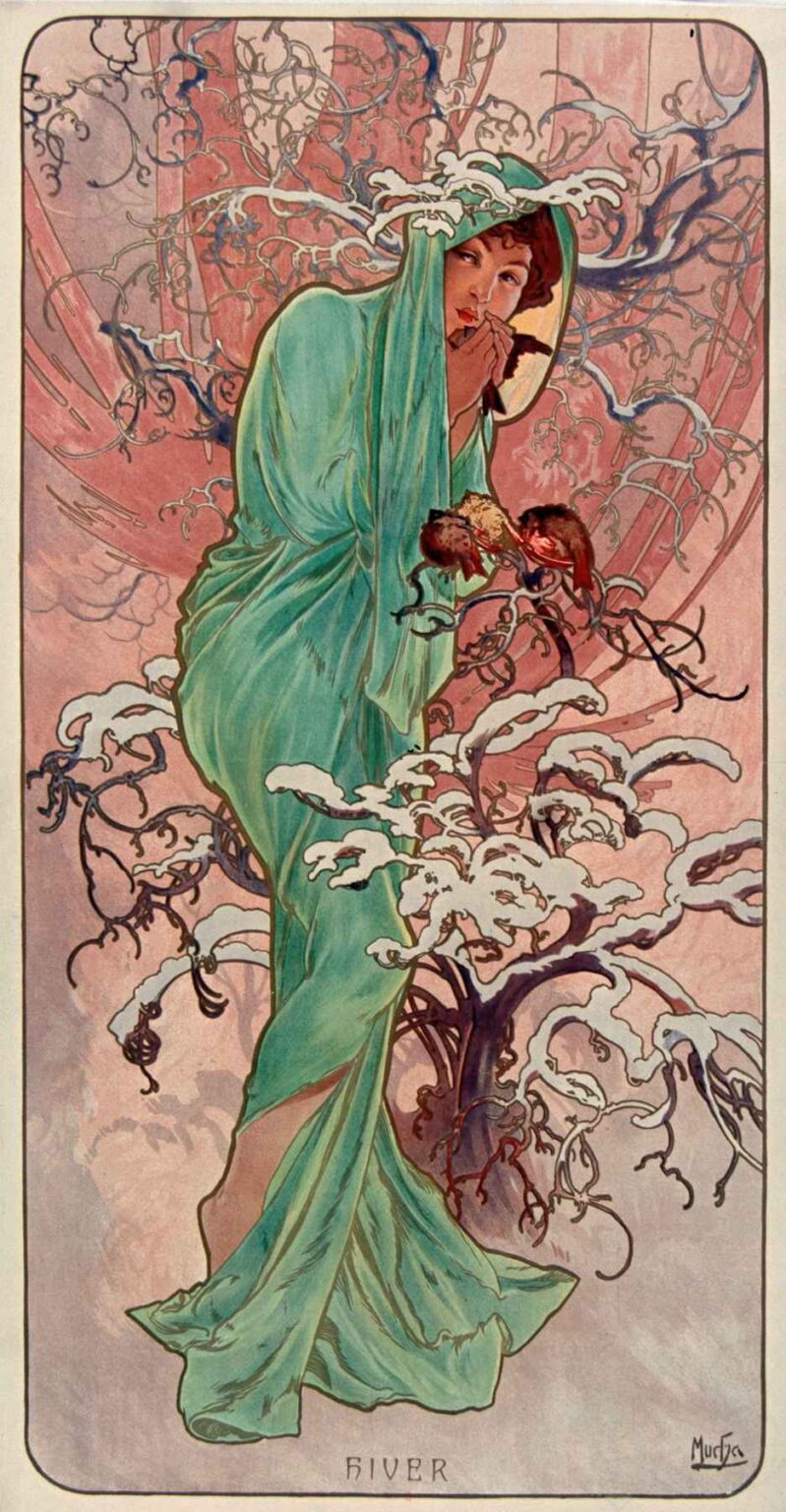
Alphonse Mucha’s “The Seasons – Winter” (1896) distills the coldest quarter of the year into a single, lyrical image. A young woman, cocooned in a turquoise mantle, draws her hands to her lips for warmth while snow-laden branches swirl around her like frozen arabesques. Two small birds punctuate the chill with their red breasts, a living accent of hope. The panel is one of the four decorative chromolithographs that made Mucha’s name synonymous with Art Nouveau, and it captures not only the look of winter but the sensation of it—hushed air, pale light, and the reflex to gather oneself against the cold. The design fuses allegory, ornament, and humane observation into a poster that feels as intimate as a whispered breath on a frosty morning.
Historical Context
When Mucha conceived The Seasons in 1896, Paris was enthralled with the poster as an art form. Collectors brought billboards home and arranged them like tapestries; printers invested in ever more sophisticated color lithography. Mucha had risen to instant fame the previous year with his poster for Sarah Bernhardt’s “Gismonda.” That success led to commissions for decorative panels, among them the quartet of seasons printed by Champenois. These large vertical sheets were meant for interiors rather than streets. They unified fine and applied arts by turning the allegorical figure—once a staple of salon painting—into a daily companion in the living room. “Winter,” as the final station in the cycle, completes a narrative arc from awakening to fullness to harvest and finally to inward retreat. It embodies the fin-de-siècle fascination with nature’s rhythms and the belief that a modern home could be sanctified by beautiful, affordable images.
Composition and Gesture
The figure stands slightly off-center, wrapped from head to ankle in a mantle whose folds fall in a long diagonal from shoulder to hem. This diagonal gives the composition its quiet propulsion, carrying the eye from the hood’s edge down to the trailing fabric at her feet. Her body turns inward and forward at once: one foot steps toward the viewer as the head dips into the hood’s shadow. The gesture of hands cupped to the mouth is decisive. It defines the season more vividly than any attribute—no ice-crusted staff or snowflake crown is needed. The posture is a small theater of survival: shoulders hunched, chin tucked, lips parted as if exhaling a tiny cloud. Around her, branching lines coil in rhythmic whorls, and clumps of snow perch on the boughs like calligraphic white notes. The rectangle with rounded corners contains the storm of lines, and the tiny inscription “HIVER” centers the lower edge, a quiet signature for the season.
Color and Light
Mucha controls the mood through a restrained palette keyed to chill and dusk. The mantle is an icy aquamarine with green undertones, the one large field of saturated color in the panel. It floats against a background of mauve, rose, and dove gray that reads like winter light at sundown—cool where it recedes and warm where it thins. Snow is not simply white; it is touched by pale lilac and blue so that it sits firmly on the branches. Two birds—likely bullfinches or robins—carry the only warm high notes. Their russet chests glow against the teal cloak, a tiny hearth in the cold. Mucha’s chromolithographic inks lay color as soft, even veils, allowing gentle gradients in the sky and small modulations across drapery. Instead of dramatic spotlighting, the panel bathes everything in a diffused glow, the kind of light that flattens edges in fog and muffles sound.
Line, Pattern, and the Whiplash Curve
The famous Art Nouveau “whiplash” line is everywhere in “Winter.” Branches loop and recoil; tendrils knot into elegant arabesques. These lines are not botanical illustration so much as choreography, each curve answering another across the surface. The cloak’s edges are drawn with thicker, elastic contours that give the figure presence against the busy background. Within those outlines, small directional strokes hint at fabric weight and the pull of gravity. Mucha repeats motifs at different scales—the little curls in the branch ends echo the petite curls in the hair peeking from the hood—so that ornament and anatomy speak the same language. The circle hovering behind the figure, half moon and half halo, stabilizes the vortex of lines, adding a geometry of calm to the storm’s calligraphy.
Iconography and Symbolism
“Winter” builds its meaning from modest things rather than grand emblems. The hooded cloak signifies shelter and introspection; it converts the woman into a portable hearth. The birds carry symbolic double duty. In folklore, small birds in winter are omens of endurance and messengers of spring’s return; in the panel they also humanize the scene, as the figure seems about to warm her hands and then share their heat with the fragile creatures. Snow on branches is drawn as soft, foamy shapes—more like clustered blossoms than harsh crust—suggesting that even in dormancy the world tends toward ornament. The circular disk behind the head is ambiguous enough to hold multiple meanings: pale sun dimmed by cold, full moon in a crystalline sky, or a Byzantine halo that elevates the allegory to a secular saint of the season. Mucha’s winter is not a desolate absolute; it is a pause between pulses, protective rather than punitive.
Materiality and the Illusion of Texture
Mucha’s economy of means produces convincing textures. The cloak reads as thick but pliant wool, indicated not by heavy modeling but by long, continuous folds and a few crisp creases. Snow gains its frosty presence from sparing highlights and clean negative shapes that carve it from the background. Branches feel woody because their lines change speed and thickness, accelerating through curves and hesitating at joints. The face—one of Mucha’s gifts—is modeled with the slightest shifts of value: a warm blush at the cheek, a cooled shadow near the mouth, a glint at the lower lip. The effect is painterly but achieved through the logic of printmaking: flat fields of color orchestrated by a precise key line.
Chromolithography and Craft
Technically, “Winter” is a triumph of chromolithography. Each hue required its own lithographic stone, drawn and etched so that the successive printings would register perfectly. The key black outline defines the drawing; transparent color layers float beneath and atop it to form the final image. The background gradient—from pink to mauve—is accomplished by overprinting translucent inks, while the mantle’s green carries subtle shifts where it overlaps shadows. Cold colors can easily go dull in lithography; Mucha avoids this by pairing the greens with nearby warms and by letting the paper’s lightness act as reflective snow. The print’s scale amplifies its presence: the figure stands almost life-size, inviting the viewer into her zone of quiet.
Comparison within the Series
Placed alongside “Spring,” “Summer,” and “Autumn,” this sheet completes a carefully balanced suite. Spring leans outward amid new shoots; Summer reclines in heat; Autumn luxuriates in harvest; Winter gathers inward. Mucha keeps the grammar constant across all four—central figure, looping vegetation, rounded border—so differences in color and gesture carry the seasonal meaning. “Winter” is the most enclosed and the most graphic, its mantle a continuous block of color that anchors the panel as the other seasons’ vines and blossoms proliferate. Where Autumn wears grapes and Summer poppies, Winter has nothing to flaunt; restraint is its ornament. That restraint makes the tiny birds and the flicker of lips all the more eloquent.
Sources and Influences
The panel’s flattened spaces and decorative cropping show Mucha’s debt to Japonisme, particularly woodblock prints that treat branches as pattern and sky as a field of tone. The halo-like disk recalls Byzantine mosaics and medieval icon painting, both long-standing inspirations for Mucha’s sacred-secular hybrids. Pre-Raphaelite sensitivity to women in nature lingers in the face and in the lyrical treatment of hair. Yet the result is unmistakably Mucha: a synthesis of calligraphic contour, botanically informed arabesque, and a quietly modern sense of design that transforms allegory into a domestic object.
Emotional Temperature
Beyond iconography, the panel succeeds because it feels like winter. The posture generates empathy; most viewers have folded themselves just so on a cold day. The muted soundscape implied by the soft palette and the absorbent snow shapes creates an inner silence. The color psychology is exact: greens cool the skin, mauves withdraw the distance, the birds’ reds kindle a spot of warmth that makes the surrounding chill legible. The image invites slowness. One reads it the way one watches breath dissolve in cold air—attentive, brief, and oddly consoling.
Reception and Legacy
The Seasons were instant successes and remained in print in various states and sizes for years. They decorated apartments, cafés, and department stores, helping Art Nouveau seep into everyday Parisian life and far beyond. “Winter,” in particular, proved adaptable; its mantle, birds, and snow-laden branches became a shorthand for seasonal advertising and later for holiday graphics. Designers still study the image for lessons in balance, limited palette, and the expressive power of gesture. Museums continue to exhibit the series as a keystone of fin-de-siècle design, but “Winter” often draws special affection because it turns a season of scarcity into an image of tender care.
Why It Endures
The sheet endures because it harmonizes opposites. It is at once decorative and compassionate, stylized and observant, cool in palette and warm in feeling. Mucha’s winter does not threaten; it invites hibernation, patience, and small acts of kindness. The birds survive, the woman will breathe warm again, the branches hold their snow like lace. In an age that often associates winter with harshness, this print offers another model: austerity as beauty, quiet as strength.
Conclusion
“The Seasons – Winter” is More than the last panel in a popular set. It is a compact meditation on shelter, resilience, and the poetics of cold. Mucha’s mastery of line and color, his sensitivity to human gesture, and his command of chromolithographic craft produce an image that can hang on a wall for years without losing freshness. Look long enough and you can almost hear the soft rattle of frozen twigs, feel the prick of air in your lungs, and sense the small flare of warmth that lets the season pass. Few posters manage that blend of formal perfection and lived sensation. Mucha’s winter does, and it continues to thaw viewers more than a century later.
