Image source: artvee.com
Introduction: The Birth of Decoration as Subject
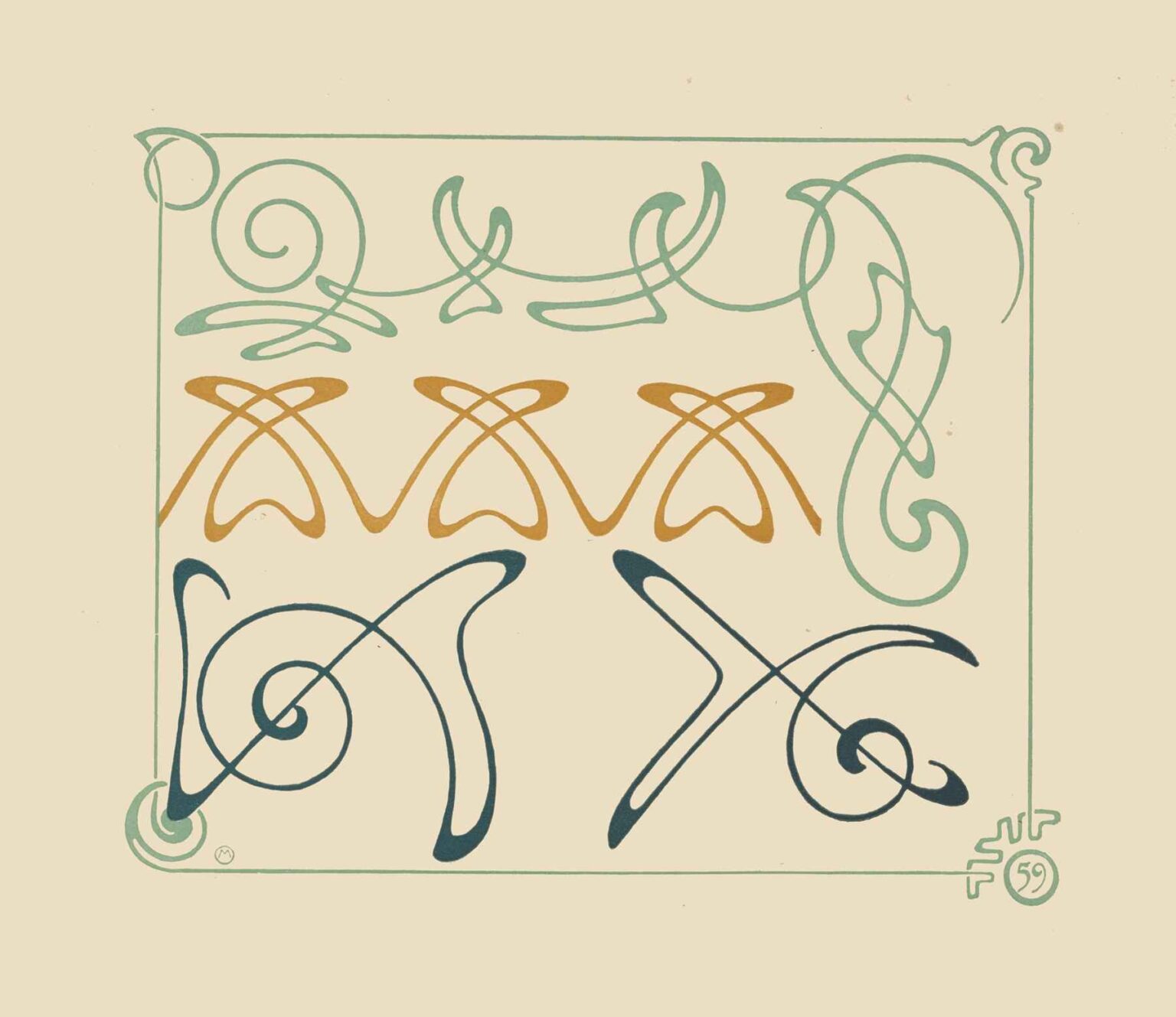
At the close of the nineteenth century, Alphonse Mucha was best known for his theatrical posters and allegorical panels. Yet alongside his celebrated figural work lay a quieter, profound inquiry into the nature of ornament itself. “Abstract Design Based on Arabesques,” created in 1900, marks a turning point in Mucha’s career: he sets aside narrative and human form to explore pure decorative line. By isolating the arabesque—a motif with roots stretching from medieval European ornament to the flora-inspired scrollwork of Islamic art—Mucha invites us to witness decoration in its most distilled state. Free from the demands of storytelling, each sinuous curve and elegant spiral becomes an act of creation unto itself. In this sheet of four studies, we see Mucha’s belief that ornament is not mere embellishment but a living language, capable of expressing rhythm, balance, and poetic movement.
Historical Roots of the Arabesque and Its Reinterpretation
The arabesque motif has a storied past. It first flourished in Islamic art as an infinite interlacing of stylized foliage and geometric forms, symbolizing divine unity and the boundless creativity of nature. During the Renaissance, European craftsmen adapted arabesques into book bindings, woodcarving, and metalwork, weaving them with acanthus leaves and grotesques. By the nineteenth century, the arabesque had become a shorthand for luxury and exoticism. Mucha, steeped in the decorative revivals of his day, absorbed these influences. Yet rather than replicate historical patterns, he distilled their essence—emphasizing fluidity over rigidity, spontaneity over strict geometry. His arabesques pulse with a sense of growth and gestural freedom, bridging centuries of ornament while pointing toward the modern abstractions of the twentieth century.
Composition and Spatial Dialogue
“Abstract Design Based on Arabesques” unfolds within a vertical sheet, dominated by a thin double-line frame in pale green. Within this boundary, Mucha arranges four distinct motifs in a loose grid: a sweeping spiral at top; a row of three gold loops across the center; a vertical flourish on the right; a pair of dark-teal loops at bottom. The cream ground plays a crucial role, providing negative space that allows each form to resonate without visual overcrowding. The largest spiral anchors the composition, its broad arcs inviting the eye to trace a spiral path. Below, the gold loops introduce a rhythmic counterpoint; to the right, the vertical flourish echoes the upward thrust of vegetal growth; at the bottom, the dark-teal forms mirror and invert the spiral, creating a cyclical echo. This spatial dialogue between motifs and voids embodies Mucha’s mastery of balance, as each element relates to the others in a harmonious dance across the page.
The Calligraphic Line as Expressive Gesture
Central to Mucha’s arabesque studies is the vitality of his line work. Drawing directly onto lithographic stone with greasy crayon, he varies pressure and speed to produce strokes that breathe with life. The thickest curves—the decisive arcs of the spiral—bear the heft of an artist’s confident hand. Hairline offshoots trail like new shoots emerging from a vine, thin and tentative. At junctions, ink pools slightly, suggesting a bead of dew gathering at a leaf’s tip. This modulation of line weight and texture transforms each motif from static pattern into animated gesture. The arabesque becomes a record of Mucha’s physical movement, capturing the moment of creation in every loop and swoop. Such calligraphic nuance laid the groundwork for later explorations of abstraction, where line itself would serve as subject.
Color as Poetic Accent and Structural Guide
Mucha’s choice to limit his palette to pale green, warm gold, and deep teal is both aesthetic and strategic. The pale-green motifs—evocative of new foliage—appear at the top and right, anchoring the composition’s lighter tones. The row of gold loops across the center introduces metallic warmth, calling to mind gilt illumination and medieval manuscripts. The deep teal at the bottom provides visual weight, grounding the design. By confining color to select motifs, Mucha emphasizes the primacy of line: color serves as accent rather than distraction. Moreover, the chromatic hierarchy subtly guides the viewer’s eye: the pale green invites initial focus, the gold draws attention to the horizontal axis, and the dark teal resolves the visual journey. This restrained approach foreshadows Mucha’s later poster work, where carefully placed hues amplify impact.
The Frame as Living Ornament
In Art Nouveau, frames often cease to be mere boundaries; they integrate with the central design. Mucha’s pale-green double-line frame does precisely this. Corners feature minor arabesque flourishes that echo the larger motifs within. The frame’s color matches the pale-green arabesques, visually linking boundary and content. This treatment dissolves the barrier between figure and margin, suggesting that ornament is not confined but can extend across surfaces. Rather than boxing in patterns, Mucha invites decoration to flow seamlessly from interior to edge. The frame thus becomes an active participant in the decorative scheme—a guiding gesture that both contains and liberates the arabesques.
Variations on a Core Theme: Discipline Meeting Creativity
Perhaps the most remarkable aspect of this sheet is how much variation Mucha achieves from a constrained set of formal ideas. All four motifs derive from the same vocabulary of spirals, loops, and tapering strokes, yet each possesses unique character. The expansive upper spiral exudes a sense of open freedom; the gold loops offer measured repetition with subtle modulation; the vertical pale-green flourish conveys upward growth and poised elegance; the dark-teal loops engage in mirrored counterpoint, suggesting dialogue. This disciplined exploration demonstrates that ornament need not be repetitive; it can be generative, unfolding new possibilities with each variation. Mucha’s studies thus serve as both artistic statements and practical templates for craftsmen seeking visual inspiration.
Technical Mastery and the Lithographic Process
Translating these arabesques from hand to print demanded exceptional skill. Mucha drew each motif directly onto lithographic stones, employing greasy crayons and tusche washes. Separate stones printed each color layer—pale green, gold, teal, and the cream ground—requiring precise registration to avoid misalignment. The opaqueness of white highlights in some impressions further attests to advanced ink layering techniques. The lithographer’s art lay in preserving the subtle pressure variations and feathering of Mucha’s original crayon strokes. The success of these prints underscores the collaboration between artist and printer, where technical mastery enabled the full expressive range of line and hue to emerge intact on the page.
Symbolism and the Living Quality of Ornament
Beyond its graphic beauty, “Abstract Design Based on Arabesques” conveys symbolic undertones. The motifs evoke vine tendrils, floral buds, and unfurling leaves—universal emblems of growth, renewal, and life’s cyclical rhythms. In a fin-de-siècle milieu fascinated by nature’s patterns, Mucha’s arabesques resonate with the idea that beauty emerges from the organic interplay of curve and countercurve. The spiral—a potent symbol of eternity and evolution—dominates the composition, suggesting that ornament itself partakes in life’s unfolding. While non-narrative, the sheet invites contemplation: each motif, though abstract, feels animated, as if caught mid-growth. In this sense, Mucha’s arabesques transcend decoration to become living metaphors for nature’s vitality.
Influence on Decorative Arts and Beyond
Although overshadowed by his figural posters in popular memory, Mucha’s arabesque studies quietly shaped decorative practice across Europe. Wallpaper manufacturers, textile designers, and metalworkers adapted his motifs for use in interiors, fashion, and jewelry. The sheet’s emphasis on scalable, reversible forms proved ideal for border repeats and frieze patterns. Furthermore, his calligraphic approach prefigured later abstract art movements that prized line and gesture over representational content. Designers from Art Deco to mid-century modernism would revisit arabesque-derived curves in furniture, ceramics, and typography, tracing a lineage back to Mucha’s early experiments in pure ornament.
Reception and Collecting History
When originally published as part of Mucha’s pattern series, these arabesque studies circulated among a coterie of decorators and collectors devoted to Art Nouveau. Although they lacked the immediate commercial appeal of theatrical posters, they were prized for their instructional value and formal elegance. Today, museum collections of graphic art hold original impressions as exemplars of turn-of-the-century design. Scholars study them to understand Mucha’s workshop practices and the technical innovations of multi-stone lithography. Private collectors, too, seek these prints for their rarity and the way they reveal Mucha’s deeper theoretical engagement with decoration.
Conservation Considerations
Original arabesque prints face conservation challenges. The greasy crayon and tusche washes are sensitive to light, and colored inks can fade or shift over time. Conservators mount these works under UV-filtered glazing, use buffered mats to neutralize paper acidity, and maintain stable humidity to prevent ink cracking. Digital archiving has become essential, allowing high-resolution study of line texture and color separation without exposing fragile originals to repeated handling. These preservation efforts ensure that Mucha’s experiments in ornament endure for future generations to admire and learn from.
Modern Resonance and Digital Adaptation
In the twenty-first century, Mucha’s arabesques find new life in digital design. Graphic artists and typographers extract vectorized versions of his motifs for use in branding, packaging, and user-interface backgrounds. The modular quality of the motifs makes them ideal for algorithmic pattern generation, where curves can be programmatically adapted to varying scales and color schemes. In interior design, wallpapers and textiles echo Mucha’s arabesques in contemporary interpretations, marrying historical elegance with modern manufacturing techniques. His work thus bridges the hand-drawn artistry of lithography with the parametric flexibility of digital creation.
Conclusion: Ornament as Living Art
“Abstract Design Based on Arabesques” stands as a testament to Alphonse Mucha’s conviction that decoration is not mere embellishment but a vital art form in its own right. Through four sinuous studies, he demonstrates how line, color, and space can converge to produce rhythms that echo nature’s own cadences. The sheet invites us to see ornament not as secondary to figuration, but as a living language capable of profound aesthetic expression. Over a century later, Mucha’s arabesque studies continue to inspire—reminding artists, designers, and appreciators that beauty lives in the graceful curve, the finely weighted line, and the endless possibilities of decorative imagination.
