Image source: artvee.com
Introduction
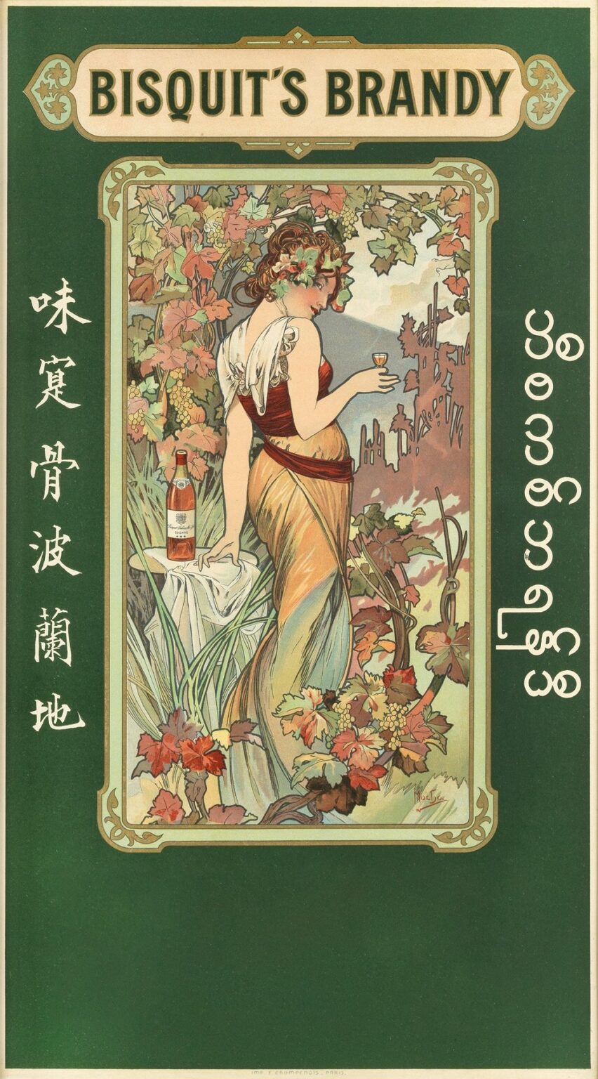
In Bisquit’s Brandy Lithographic Poster In Colours, created by Alphonse Mucha in 1899, the French Art Nouveau master transformed a simple commercial advertisement into a timeless work of decorative art. Commissioned by the prestigious Cognac house of Bisquit & Dubouché, this lithographic poster marries sumptuous color, graceful linework, and sophisticated symbolism to evoke the elegance and sophistication associated with fine brandy. Mucha’s design goes beyond mere product promotion, offering viewers a richly layered visual experience that celebrates craftsmanship, natural abundance, and the cultured ritual of brandy appreciation. In what follows, we delve deeply into the historical, aesthetic, and technical dimensions of this iconic poster, revealing how it exemplifies the peak of Art Nouveau poster art and why it continues to inspire graphic designers and connoisseurs more than a century later.
Historical and Cultural Context of Bisquit’s Brandy Poster
By the closing years of the nineteenth century, Cognac had become a symbol of luxury and refinement across Europe and beyond. The Bisquit & Dubouché company, founded in 1819 by Claude Bisquit, sought to position its brandy as the epitome of fine taste. In 1899, they turned to Alphonse Mucha, already celebrated in Paris and abroad for his theater posters, to create a promotional image that would capture the attention of an affluent clientele. Mucha’s appointment reflected broader cultural currents: the rise of the Art Nouveau movement, which championed organic forms and the fusion of fine art with applied design, and the burgeoning market for collectible advertising posters. Bisquit’s Brandy Poster was intended not only to advertise product quality but also to affirm Bisquit & Dubouché’s place among Parisian elite social circles.
Alphonse Mucha’s Artistic Journey to 1899
Born in 1860 in Moravia, Mucha arrived in Paris in the mid-1880s seeking opportunities as an illustrator. His breakthrough came in 1894 with a poster for Sarah Bernhardt, which launched him to international fame and established his distinctive style—characterized by sinuous lines, lush botanicals, and idealized female figures. By 1899, Mucha had produced dozens of theater posters and commercial commissions, honing his lithographic techniques and refining his decorative vocabulary. His collaboration with the Imprimerie Champenois printworks allowed him to exploit multi-stone lithography for precise color registration and subtle tonal layering. Bisquit’s Brandy represented a further evolution: a design that combined Mucha’s penchant for allegorical female muses with a more expansive natural setting, integrating the product seamlessly into an evocative, immersive tableau.
Brand History and Bisquit & Dubouché’s Marketing Strategy
Bisquit & Dubouché had long relied on high-quality cognac and selective distribution to build its reputation. By the late 19th century, the company embraced modern marketing techniques, commissioning lavish print campaigns to distinguish its brandy from competitors. Posters appeared in cafés, wine shops, and on Parisian boulevards, targeting both local connoisseurs and international tourists. In choosing Mucha, Bisquit & Dubouché linked their product to the avant-garde world of art and fashion. The poster’s subsequent circulation through periodicals and exhibitions, including Mucha’s own Alphonse Mucha’s Exhibition of Decorative Arts, further amplified its reach. Thus, Bisquit’s Brandy Poster functioned as a strategic blend of fine art, psycho-visual appeal, and brand narrative, elevating cognac consumption into an aesthetic ritual.
Composition and Layout Analysis
Mucha arranges Bisquit’s Brandy Poster within a tall, rectangular frame featuring softly rounded corners. At the top, a stylized cartouche bears the inscription “BISQUIT’S BRANDY” in bold, custom lettering, flanked by filigree flourishes that echo the organic motifs below. The central panel unfolds a lush vineyard scene bathed in warm sunlight, dominated by a graceful female figure draped in a flowing, autumnal-hued gown. She stands amid ripple-like vines laden with ripe grape clusters, holding a delicate glass of brandy aloft as if offering a toast. To her left, a table draped in white cloth supports a bottle of Bisquit’s brandy, its label rendered with meticulous attention to typography and decorative seals. Vertical bands of stylized French and Japanese lettering flank the image, signaling the brand’s international aspirations. The bottom region remains largely empty, allowing the central imagery and branding to command undivided visual focus.
Mastery of Line and Form
At the heart of Mucha’s design lies his unparalleled command of line. The figure’s drapery cascades in broad, undulating curves that seem to swirl around her mobile posture. Each vine tendril and leaf is delineated with crisp, varied strokes—some thick and bold, others fine and graceful—imbuing the composition with a sense of living dynamism. Mucha balances complex ornamentation in the foliage with the smooth, simplified contours of the figure’s arms and shoulders, ensuring that the viewer’s eye is drawn first to her elegant form before exploring the abundant details of the vineyard background. The interplay of line weight produces both volume and decorative pattern, achieving sculptural presence without heavy modeling or chiaroscuro.
Color Palette and Printing Technique
Mucha’s color choices for Bisquit’s Brandy reflect both autumnal warmth and classical harmony. The central figure’s gown transitions from deep russet to golden ochre, complemented by minty greens of newly sprouted leaves and the muted purples of gallant Riesling clusters. The sky beyond the vines glows with soft apricot and pale azure, suggesting a sunlit harvest morning. Achieving such subtle chromatic shifts required a sophisticated multi-stone lithographic process. Mucha provided full-color gouache studies to the Champenois workshop, indicating precise ink mixes for each hue. Lithographers then prepared separate limestone plates—often eight or more—each inked with a distinct transparent pigment. Careful registration, combined with judicious wiping techniques, produced crisp lines, smooth gradations, and luminous overlays. The result is a poster whose color harmony remains as fresh today as it was over a century ago.
Symbolism and Allegorical Content
While at first glance a literal vineyard scene, Mucha’s poster is rich in allegorical resonance. The figure—often interpreted as Dionysia or an embodiment of harvest and plenty—occupies the role of muse and harvest deity. Her wreath of grape leaves and flowers reinforces her connection to viticulture and celebration. The raised glass, held at eye level, becomes a symbol of refinement and conviviality, inviting onlookers to partake in Bisquit’s brandy as both taste and ritual. The vine’s intertwining branches evoke the cyclical nature of seasons and production, linking the brandy’s quality to the land’s bounty. By embedding these symbols subtly within a decorative tableau, Mucha transforms a commercial poster into a visual paean to nature’s generosity and the art of tasteful indulgence.
Representation of the Feminine Ideal
Mucha’s portrayal of women consistently blends beauty, grace, and allegory, and in Bisquit’s Brandy, the female figure exemplifies the era’s ideal of cultivated femininity. Her posture—slightly contrapposto, one hip thrust outward—conveys both confidence and poise. Mucha elongates her limbs and drapery lines, emphasizing verticality and rhythmic flow. Yet her facial features remain softly natural, with a serene countenance and slightly parted lips suggesting introspection and allure. Rather than a mere decorative surface, she exudes presence and character. Her role is not passive ornament but active host, guiding viewers toward the sensory pleasures of brandy. In doing so, Mucha aligns the feminine form with hospitality, elegance, and the refined connoisseurship that Bisquit & Dubouché sought to embody.
Typography and Text Integration
Typography in Mucha’s posters served both functional and ornamental purposes, and Bisquit’s Brandy demonstrates his integrative approach. The main title lettering appears in a bespoke, elongated serif typeface with subtle flares and stokes that echo vine tendrils. Letterforms cast gentle shadows, achieving a slight engraving-like appearance that underscores the brand’s prestige. The Japanese characters on the right side signal the cognac’s export markets in Asia, rendered in a vertical orientation to balance the composition horizontally. The French text on the left—translating to “Château Petit-Bisquit, Cognac”—appears in elegant kanji-inspired script, showcasing cross-cultural appeal. By weaving text seamlessly into the decorative frame, Mucha ensures that product information remains legible without disrupting overall visual harmony.
Botanical Motifs and Ornamental Vocabulary
Central to Mucha’s Art Nouveau vocabulary are botanical motifs drawn from nature—vines, blossoms, and leaf scrolls—that serve as both frame and narrative device. In Bisquit’s Brandy, the grapevine patterns proliferate across the background and border, their twisting canes and bountiful clusters evoking vineyard abundance. Mucha stylizes leaf shapes into repetitive, rhythmic patterns that parallel the figure’s drapery folds, creating a seamless interplay between human and natural forms. Subtle insects—a butterfly alighting on a leaf, a bee foraging on a blossom—may also appear upon close inspection, reinforcing the ecosystem’s vitality. This ornamental lexicon of flora communicates both the product’s origin and the Art Nouveau principle of art unified with nature.
Cross-Cultural Influences
Mucha’s decorative style reflects a syncretism of influences—a hallmark of fin de siècle Paris. In Bisquit’s Brandy, the symmetrical vine loops and medallion-like framing echo medieval stained glass and Byzantine mosaics, while the flowing line and flat color areas show the impact of Japanese woodblock prints (Japonisme). The poster’s overall balance between ornate detail and large color fields also anticipates later graphic modernism. By weaving these diverse sources into a unified design, Mucha offered viewers a cosmopolitan aesthetic that conveyed both historical depth and contemporary innovation.
Technical Process and Workshop Collaboration
The creation of Bisquit’s Brandy hinged on a close partnership between Mucha and the Imprimerie Champenois. Mucha began with detailed plein-air sketches of Château Petit-Bisquit’s vineyards and preparatory studies of model poses and drapery. He then produced full-scale gouache paintings as color keys. Champenois lithographers translated the line drawings into limestone plates using greased crayon and tusche techniques. Each color required meticulous inking and pressing sequences, with transparent washes built up gradually. The workshop’s capacity for subtle color overlays and precise registration allowed Mucha to achieve his signature blend of vibrant pigments and crisp contours. The result was a high-quality chromolithograph, printed on heavyweight wove paper, designed for durability in outdoor display.
Reception and Legacy
Upon its release, the Bisquit’s Brandy poster was hailed as a landmark in commercial graphic art. Collectors and connoisseurs praised its fusion of fine art aesthetics with effective brand communication. The poster’s widespread display in European capitals and adsorption into design exhibitions cemented Mucha’s reputation as the leading poster artist of his age. In the decades that followed, the design influenced cognac advertising, wine label art, and broader beverage marketing, introducing Art Nouveau’s ornamental flair into product packaging. Today, original prints are highly prized by museums and private collectors, while digital reproductions continue to inspire contemporary illustrators seeking to evoke vintage elegance in branding and editorial illustration.
Preservation and Modern Relevance
More than 120 years after its creation, Bisquit’s Brandy posters require careful conservation—protecting delicate inks and paper from light exposure and acidic degradation. Archival framing and climate‐controlled display ensure that the poster’s luminous colors and intricate linework endure. Digitally, high‐resolution scans allow scholars to study Mucha’s technique without risking damage to originals. Meanwhile, modern designers draw upon Mucha’s ornamental vocabulary in packaging design, advertising campaigns, and user‐interface graphics, demonstrating the enduring power of decorative line and organic form. Bisquit’s Brandy remains a case study in how artful design elevates product identity, bridging centuries of aesthetic tradition.
Conclusion
Alphonse Mucha’s Bisquit’s Brandy Lithographic Poster In Colours stands as a testament to the transformative potential of Art Nouveau graphic art. Through masterful composition, fluid linework, harmonious color, and rich symbolism, Mucha crafted a promotional image that transcends its commercial purpose to become an enduring icon of design excellence. By situating a gracefully allegorical figure within a lush vineyard tableau, integrating ornamental type and botanical motifs, and leveraging advanced lithographic techniques, Mucha created a visual narrative celebrating both the artisanal heritage of Cognac and the cultivated pleasures of brandy appreciation. Over a century later, the poster’s impact resonates in design education, branding philosophy, and the continued fascination with the Art Nouveau era.
