Image source: artvee.com
Introduction
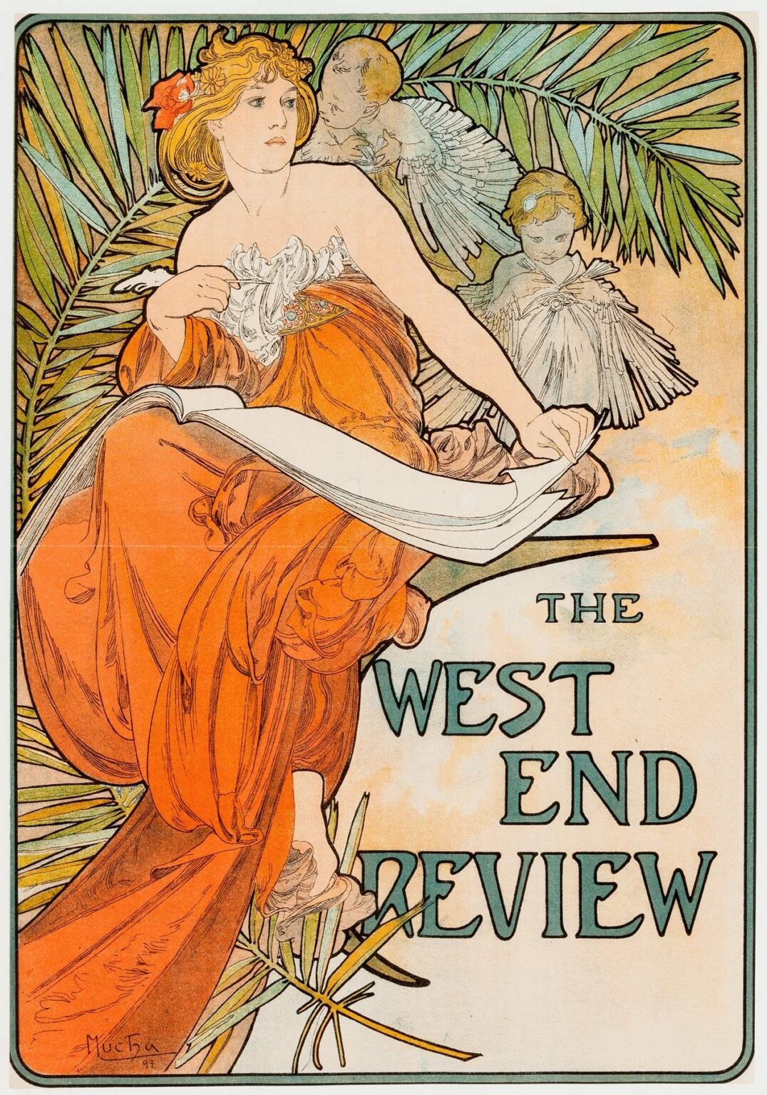
“The West End Review” by Alphonse Mucha, created in 1897, stands as a quintessential example of Art Nouveau’s golden age and the masterful grace of Mucha’s poster artistry. Commissioned to promote a theatrical magazine that covered the vibrant cultural life of London’s West End, this lithographic poster transcends its commercial function to become an enduring work of design. Rather than merely announcing a publication, Mucha’s composition evokes the glamour, sophistication, and creative ferment of the period. A solitary femme fatale figure reclines amid lush palm fronds and ethereal cherubic figures, drawing the viewer into a world of theatrical intrigue and artistic refinement. Through its flowing lines, sumptuous color palette, and seamless integration of text and image, “The West End Review” exemplifies how publicity art could achieve the status of high art at the fin de siècle.
Historical Context
By the mid-1890s, Art Nouveau had emerged across Europe as a reaction against academic historicism and industrial blandness. Artists and designers sought inspiration in organic forms, Japanese prints, and medieval manuscript illumination. Paris, Brussels, and Munich became centers of the movement, but London’s West End—home to theatres, salons, and literary cafes—offered its own fertile ground for artistic experimentation. Theatrical reviews and magazines proliferated, catering to an increasingly literate public eager for news of stage premieres, social gossip, and critical essays. “The West End Review,” launched in 1896, positioned itself at the nexus of this cultural ferment, covering drama, music halls, and high society events. Mucha, already celebrated for his posters for Sarah Bernhardt and automotive companies, brought his distinctive style to bear on this new client, imbuing the magazine’s promotion with a level of visual poetry that mirrored the theatrical arts it celebrated.
Commission and Publication
Mucha’s commission for “The West End Review” fit naturally within his evolving portfolio of magazine covers and theatrical posters. Printed by the renowned Champenois studio in Paris, the poster first appeared in London’s streets in late 1897, plastered on hoardings near theatre entrances and in bohemian quarters. Its debut coincided with a surge of interest in graphic design as a vehicle for mass communication. The poster’s large scale and bold composition attracted immediate public attention, while the magazine itself benefited from the association with Mucha’s high art credentials. Later issues of “The West End Review” would feature Mucha’s cover designs, establishing a visual continuity that reinforced the magazine’s identity. Through this collaboration, Mucha helped elevate periodical illustration to a form of collectible art.
Composition and Layout
At first glance, “The West End Review” presents a striking asymmetrical composition. Dominating the left half of the poster is a gracefully reclining female figure draped in sumptuous crimson robes. She lounges on a stylized branch or ledge, one arm supporting an unfurled scroll that bears the magazine’s title. To her right, two cherubic figures—rendered in pale tones—hover among fan-like palm leaves, their gestures playful yet slightly mischievous. The text block, set in an elegant hand-drawn font reminiscent of medieval script, occupies the lower right quadrant, balancing the weight of the figure and foliage. Thin, undulating border lines frame the entire scene, guiding the viewer’s gaze inward and unifying the diverse elements. Mucha’s layout masterfully orchestrates positive and negative space, ensuring that the viewer’s eye moves seamlessly from the figure to the cherubs to the magazine’s title.
Mastery of Line
Central to Mucha’s aesthetic is his fluid, calligraphic line. In “The West End Review,” every contour—from the cliff-like ledge to the folds of the heroine’s gown—flows with rhythmic grace. The fabric of her robe cascades in broad, sweeping curves, creating a dramatic sense of movement even within a static pose. Contrastingly, the cherubs’ wings and palm fronds are defined by finer, more delicate strokes, suggesting filigree and filaments. Line weight varies subtly: thicker outlines anchor major forms, while thinner strokes convey texture and detail. This modulation enhances the sense of volume and depth without resorting to heavy shading. The result is a composition that reads clearly from a distance and rewards close inspection, revealing layers of exquisite linear nuance.
Color Palette and Lithographic Technique
Mucha’s color choices for “The West End Review” reflect both theatrical drama and refined elegance. The central figure’s robe glows in a rich vermilion, contrasting with the cool greens of the palm fronds and the soft pinkish-beiges of the cherub skin. The scroll’s blank parchment tones provide a neutral foil for the bold title lettering rendered in deep teal and graphite. Achieving such harmonious effects required a sophisticated multi-stone lithographic process. Mucha collaborated closely with the Champenois press to prepare separate stones for each hue—often six to eight in total. Precise registration ensured that each layer aligned perfectly, while transparent inks allowed underlying colors to show through, creating subtle gradations. This technical rigor elevated the poster’s visual impact, underscoring that commercial lithography could rival fine art printmaking in quality.
Symbolism and Theatrical Allusion
Beneath its ornamental surface, “The West End Review” brims with symbolic resonance and theatrical allusion. The reclining woman—often interpreted as an allegory of Drama or Inspiration—holds an empty scroll, inviting readers to imagine the unfolding pages of the magazine. Her opulent attire and languid pose evoke the grandeur of stage costumes and the allure of star actors. The cherubic figures, half-child, half-bird, serve as muses or heralds, fluttering around her like stagehands behind the scenes. Palm leaves, associated with triumph and celebration, frame the composition, hinting at the West End’s festive atmosphere. The interplay of these symbols transforms the poster into a mise-en-scène where the art of the printed page meets the spectacle of live performance.
Representation of the Feminine Ideal
Mucha’s portrayal of the female figure embodies the Art Nouveau ideal of grace, beauty, and poetic introspection. Her elongated proportions, sculpted features, and serene expression align with contemporary tastes for idealized femininity. Mucha elongates her limbs and drapery to emphasize decorative flow, while her face retains a gentle naturalism that lends her psychological presence. She is not a mere decorative motif but a character imbued with poise and quiet authority. Her sideways glance, directed beyond the poster’s frame, suggests both invitation and aloofness—qualities that mirror the public’s fascination with celebrity performers. Through this nuanced depiction, Mucha elevates the female form from pure ornamental function to allegorical protagonism.
Typography and Text Integration
Typography in “The West End Review” exemplifies Mucha’s belief that lettering should harmonize with illustration rather than stand apart. The magazine’s title, rendered in bespoke capitals, echoes the rhythmic curves of the surrounding floriated motifs. Each letterform exhibits gentle variation in stroke width—thicker verticals, tapering serifs—that mirror the calligraphic quality of the illustrative lines. The placement of text within the scroll, slightly angled to match the branch’s incline, further integrates type and image. The words “THE WEST END” appear in a condensed format above the more expansive “REVIEW,” creating a clear hierarchy while maintaining overall balance. Mucha’s approach ensures that the title reads as a visual element within the poster’s design, rather than an afterthought.
Botanical and Angelic Motifs
The interplay of botanical and angelic motifs in “The West End Review” evokes a dreamlike atmosphere. Fan-like palm fronds fan out behind the central figure, their radiating lines recalling theatrical spotlights or stage curtains. The cherubic figures, with feathered wings and playful expressions, drift among the leaves like spirits of inspiration. Mucha’s stylization of both flora and fauna draws from medieval and Byzantine art, yet his forms remain distinctly modern. Leaves overlap in rhythmic patterns, while the cherubs’ garments shimmer with filigree-like folds. These motifs serve both decorative and narrative purposes: they frame the heroine, evoke the West End’s festival spirit, and blur the boundary between reality and the imagination—a signature effect of Art Nouveau’s dream-inspired ethos.
The Art Nouveau Aesthetic
“The West End Review” exemplifies the defining features of Art Nouveau: organic lines, flattened perspective, and total design. Mucha’s work resists strict spatial realism, instead presenting figure and ornament on a unified plane. His synthesis of medieval illumination, Japanese prints, and Byzantine mosaics yields a fresh ornamental vocabulary marked by fluid curves and botanical stylization. The poster’s harmonious integration of text, image, and pattern demonstrates Art Nouveau’s ambition to dissolve boundaries between fine art and applied design. Rather than placing a picture within a frame, Mucha creates a self-contained environment where every element—from the heroine’s hair ringlets to the lettering’s serifs—participates in a cohesive visual symphony.
Influence on Poster Art and Graphic Design
Mucha’s posters, including “The West End Review,” catalyzed a revolution in graphic design at the turn of the century. Prior to Art Nouveau, advertising rarely aspired to high artistic merit; posters were primarily functional announcements. Mucha demonstrated that commercial prints could possess enduring aesthetic value. His use of lithography, combined with his skillful distribution through Parisian print shops and London’s West End, created a new paradigm for marketing. Artists and printers across Europe and North America adopted his stylistic cues—flowing lines, integrated typography, and botanical ornament—ushering in a golden age of poster art. The concept of the poster as a collectible work persisted well into the twentieth century, laying the groundwork for modern branding and visual identity practices.
Technical Process and Workshop Collaboration
The realization of “The West End Review” depended on a close collaboration between Mucha and the lithographic workshop of Champenois. Mucha supplied precise line drawings and color keys, specifying the number of stones and ink mixtures. Skilled artisans then prepared limestone plates, each inked with a different hue. Exact alignment, or registration, ensured that the vibrant vermilion of the gown, the verdant greens of the foliage, and the soft flesh tones of the cherubs printed crisply without overlap errors. Varnish inks provided transparency, allowing underlying layers to shimmer through. This labor-intensive process underscored the high value placed on printed quality for elite commissions and distinguished Mucha’s work from the coarser output of mass-market chromolithographs.
Reception and Legacy
Upon its release, “The West End Review” quickly became a coveted image among art collectors and theater enthusiasts alike. Its appearances on London’s streets coincided with the flourishing of illustrated periodicals and the rise of mass advertising. Collectors prized early impressions for their precise color registration and rich textures. Museums later acquired original lithographs, recognizing their historical and artistic significance. Today, “The West End Review” remains one of Mucha’s most celebrated works, studied in design schools and exhibited in major institutions. Its motifs—especially the reclining heroine and playful cherubs—have been reinterpreted in countless contemporary designs, from fashion collections to digital illustrations, testament to Mucha’s enduring influence.
Preservation and Modern Relevance
Original prints of “The West End Review” require careful conservation to protect the delicate paper and pigments from light damage and acid deterioration. Modern archival framing and controlled display conditions help preserve the luminous colors and crisp lines. Digitally, the poster circulates widely, inspiring a new generation of graphic artists and illustrators who draw upon Mucha’s integrated approach. Luxury brands and cultural institutions occasionally commission reinterpretations of the motif, leveraging its timeless elegance to evoke a sense of heritage and sophistication. In an era dominated by screen-based design, “The West End Review” reminds us of the enduring power of hand-drawn art and the tangible allure of printed matter.
Conclusion
Alphonse Mucha’s “The West End Review” transcends its function as a magazine advertisement to achieve the status of a masterpiece of Art Nouveau design. Through sinuous linework, a sumptuous yet refined color palette, and the seamless integration of figure, ornament, and typography, Mucha elevates the poster into an emblem of theatrical glamour and artistic innovation. Its allegorical depiction of a reclining muse, attended by cherubic heralds amidst lush botanical friezes, captures the spirit of late-19th-century cultural effervescence. Decades later, the poster’s influence endures—in design curricula, museum collections, and contemporary creative practice—testifying to Mucha’s conviction that beauty and commerce can merge to inspire and delight.
