Image source: artvee.com
Introduction
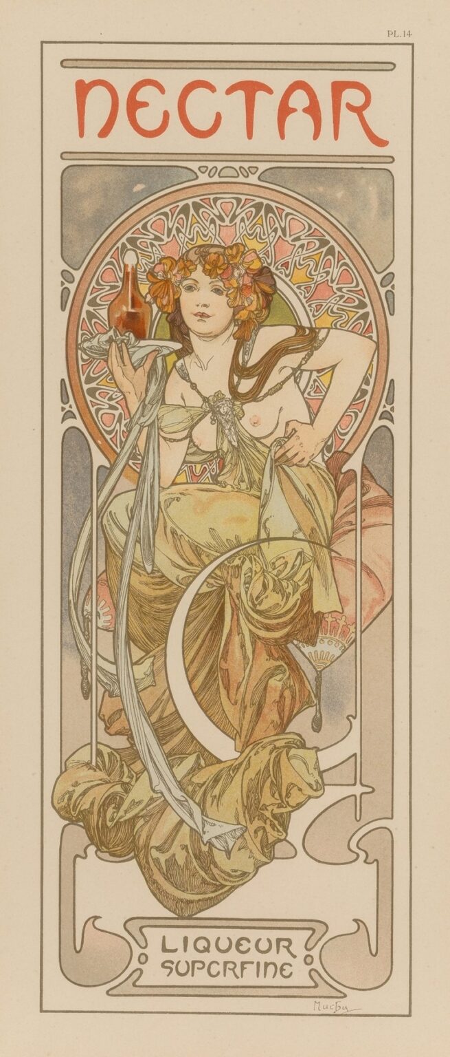
“Nectar,” created in 1902 by Alphonse Mucha, stands as one of the most sensuous and emblematic posters of the Art Nouveau era. Commissioned to advertise a refined liqueur, this lithograph captures the essence of opulence and natural beauty through its flowing lines, rich symbolism, and harmonious composition. Mucha transforms the advertisement into a poetic tableau, inviting viewers into a world where indulgence and art merge seamlessly. At first glance, the viewer is struck by the central female figure—half-draped in luxurious fabrics—raising a glass in a toast to celebration and refinement. Yet beneath this surface lies a deeper narrative of botanical abundance, mythic resonance, and emerging modern design, all delivered through Mucha’s unparalleled mastery of line, color, and ornament.
Historical Context and Commission
At the dawn of the twentieth century, Paris was the beating heart of the Art Nouveau movement, which sought to break with academic traditions and celebrate organic forms inspired by nature. Alphonse Mucha had already achieved renown through his theater posters for Sarah Bernhardt and his commercial work for jewelry and cosmetics. In 1902, the prestigious Parisian firm Maison Gustave F. Champenois enlisted Mucha to design a promotional poster for “Nectar,” a premium liqueur renowned for its floral and honeyed notes. The collaboration reflected a growing trend among luxury producers to harness avant-garde art for marketing, elevating commercial graphics to collectible artworks. “Nectar” thus emerged at a moment when applied art and fine art converged, and advertising became a means of shaping cultural taste.
Purpose and Brand Alignment
Beyond its function as an announcement for a beverage, “Nectar” serves as a visual manifesto of luxury and taste. Mucha’s poster does not merely display the product; it envelops it in mythic allusion. The central figure, crowned with blossoms, appears as an allegorical embodiment of the drink itself—a living personification of the heady sweetness and delicate floral aroma that define the liqueur. By aligning the brand with ideals of femininity, nature, and ceremonial enjoyment, Mucha ensures that “Nectar” transcends the shelf and enters the realm of aspiration. The poster communicates not just taste but lifestyle: sipping Nectar becomes an act of refined self-indulgence, a ritual that summons the divine pleasures of nature.
Composition and Spatial Dynamics
“Nectar” employs a vertical format typical of Mucha’s poster work, measuring approximately 80 by 40 centimeters in its original lithographic print. The design is organized around three horizontal zones: a top band bearing the word “NECTAR” in custom lettering, a central panel dominated by the female figure, and a lower register displaying the subtitle “Liqueur Superfine” within a decorative frame. Mucha achieves dynamic balance by positioning the figure slightly off-center, draped in fluid fabric that arcs gracefully across the panel. The interplay of positive and negative space guides the viewer’s gaze from the title, through the figure’s outstretched arm, and down to the product name. The symmetrical botanical patterns flanking the central image reinforce the composition’s vertical thrust, while the oval halo behind the figure’s head anchors the design, lending it a quasi-sacred iconography.
Mastery of Line and Contour
At the heart of “Nectar” lies Mucha’s signature use of line. The drapery folds, floral wreath, and ribbon-like sashes swirl with rhythmic grace, their sinuous contours creating a sense of movement despite the static pose. Line weight varies subtly: fine, delicate strokes define the flowers and facial features, while bolder outlines emphasize fabric edges and botanical shapes. This modulation imparts dimensionality without heavy shading, preserving the design’s flat decorative quality. The flowing curves echo organic growth patterns found in vines and petals, reinforcing the poster’s thematic focus on nature’s bounty. Mucha’s line work transforms paper into living art, where every stroke feels purposeful and alive.
Color Palette and Lithographic Technique
Mucha’s color choices in “Nectar” reveal both refinement and symbolic intent. The figure’s gown transitions from soft apricot to deep terracotta, suggesting the warmth of honey and the ripeness of blossoms. Accents of muted green in the foliage and the background halo evoke the vitality of plant life. Pale creams and grays balance the richer hues, ensuring that the central figure stands out without overwhelming the eye. Achieving such nuanced color harmony required a complex multi-stone lithographic process: each shade was applied via a separate limestone plate and carefully registered. Mucha collaborated closely with the Champenois workshop to exploit transparent inks, creating subtle gradations and luminous effects. The result is a print that glows with depth and vibrancy, befitting the liqueur it celebrates.
Symbolism and Allegory
The iconography of “Nectar” operates on multiple levels. The floral wreath adorning the woman’s hair alludes to the blossoms used in the liqueur’s infusion—perhaps orange blossom, elderflower, or other fragrant varieties. The raised glass becomes a chalice of sacred offering, reminiscent of ancient rituals to gods of wine and fertility. Stars that seem to sparkle around her shoulder hint at celestial favor, elevating the simple act of drinking into a near-mystical communion. Through these symbols, Mucha weaves a narrative of nature’s alchemy: petals and honey transformed into liquid delight. The allegorical figure thus invites viewers to partake in both sensory pleasure and mythic reverence.
Integration of Figure and Ornament
A defining characteristic of Mucha’s work is the seamless fusion of figure and ornament, and “Nectar” exemplifies this integration. The woman’s flowing garments morph into trailing vines and curling ribbons that entwine with the decorative border. Floral motifs extend from her wreath into the background, blurring the boundary between foreground and frame. This unity of form and pattern creates an immersive scene in which the advertisement’s text and imagery coexist without hierarchy. Mucha’s approach dissolves the conventional separation between content and decoration, treating every element as part of a coherent visual ecosystem.
Typography and Custom Lettering
Typography in “Nectar” plays a crucial role in reinforcing the poster’s aesthetic. The word “NECTAR,” set in bespoke capital letters, features rounded, organic shapes that echo the curves of the surrounding ornament. Each letter seems to grow from the border’s lines, as if harvested from the same botanical sinews. The subtitle “Liqueur Superfine” appears in a more restrained script, its slender serifs and consistent stroke width ensuring legibility at a distance. Mucha’s hand-drawn fonts harmonize with the illustration, eliminating any sense of textual intrusion. This holistic treatment of lettering as visual ornament exemplifies his belief that typography should be as artful as the images it accompanies.
Representation of the Feminine Ideal
The central figure in “Nectar” embodies the Art Nouveau conception of the female muse: ethereal, sensual, and intertwined with nature. Mucha idealizes her features—high cheekbones, full lips, and dreamy eyes—while elongating her limbs and drapery to emphasize decorative flow. Her partial nudity, tempered by strategic swathes of cloth, conveys both vulnerability and empowerment. The goddess-like pose, with one arm raised and the other resting on her hip, suggests confidence and invitation. She is at once a seductress of the senses and a conduit for nature’s gifts. Through this portrayal, Mucha elevates the feminine form from mere ornament to active symbol, celebrating women’s creative and regenerative powers.
Ornamental Borders and Patterns
Surrounding the central figure, Mucha populates the composition with stylized botanical and geometric patterns. The oval halo behind the woman’s head features repeated petal shapes and concentric rings, recalling Byzantine mosaics and medieval manuscript illumination. Flanking panels of vines and blossoms echo Japanese woodblock prints, reflecting the influence of Japonisme on European art. The outer border, with its sinuous lines and subtle flourishes, ties together these disparate sources into a unified decorative framework. Each motif is carefully balanced, ensuring that the viewer’s eye can roam freely while remaining anchored to the central narrative of abundance and celebration.
Cross-Cultural Influences and Japonisme
Mucha’s design reflects a syncretism of East and West. The flattened perspective and emphasis on outline pay homage to Japanese ukiyo-e prints, while the intricate halo recalls Byzantine and Gothic ornament. Further, the decorative border’s flowing lines echo Islamic calligraphy and medieval European scrollwork. This cross-cultural tapestry exemplifies Paris’s cosmopolitan milieu at the fin de siècle, where artists absorbed and reinterpreted global visual traditions. In “Nectar,” these diverse influences coalesce into a fresh, cohesive style that speaks to universal themes of nature, beauty, and celebration.
Impact on Advertising and Graphic Design
“Nectar” contributed to a revolution in commercial art, demonstrating that advertising could achieve the aesthetic heights of gallery works. Mucha’s posters spurred a wave of imitators and established the poster as a legitimate art form. Printers and advertisers across Europe and the United States adopted his emphasis on integrated design, flowing lines, and custom typography. “Nectar” in particular influenced packaging, label design, and hospitality graphics, laying the groundwork for modern branding and visual identity. Mucha’s holistic approach—treating every element, from illustration to text, as part of an orchestrated whole—remains a guiding principle in contemporary design.
Technical Collaboration and Craftsmanship
The production of “Nectar” relied on a close partnership between Mucha and the skilled lithographers at the Maison Champenois workshop. Mucha provided full-scale color studies and precise instructions for each lithographic stone. The craftspeople then prepared multiple limestone plates, each inked with a different hue, and practiced meticulous registration to align each layer. The use of transparent varnishes allowed underlying colors to show through, creating subtle gradients and a luminous depth. This labor-intensive process underscores the high value placed on print quality for luxury commissions, contrasting starkly with mass-market chromolithography of the era.
Preservation and Continued Legacy
More than a century later, original impressions of “Nectar” reside in museum collections and private archives around the world. Conservation efforts focus on protecting the fragile paper and vibrant inks from light damage and acid migration. Digital reproductions and scholarly publications have introduced newer generations to Mucha’s artistry, inspiring countless designers to reinterpret his motifs. Luxury beverage brands and boutique producers often commission custom posters and labels that nod to the poster’s flowing lines and elegant typography. The enduring appeal of “Nectar” lies in its intrinsic beauty and its demonstration that commercial art can achieve timeless artistic merit.
Conclusion
Alphonse Mucha’s “Nectar” stands as a crowning achievement of Art Nouveau, where the boundaries between art and commerce dissolve in a lavish display of line, color, and symbolism. Through his masterful integration of figure, ornament, and typography, Mucha elevates a simple liqueur advertisement into an icon of beauty and refinement. The poster’s allegorical narrative of floral abundance and sensual celebration continues to captivate viewers more than a century after its creation. “Nectar” reminds us that when artistry infuses everyday objects, it transforms them into enduring works that speak to both the eyes and the imagination.
