Image source: artvee.com
Introduction
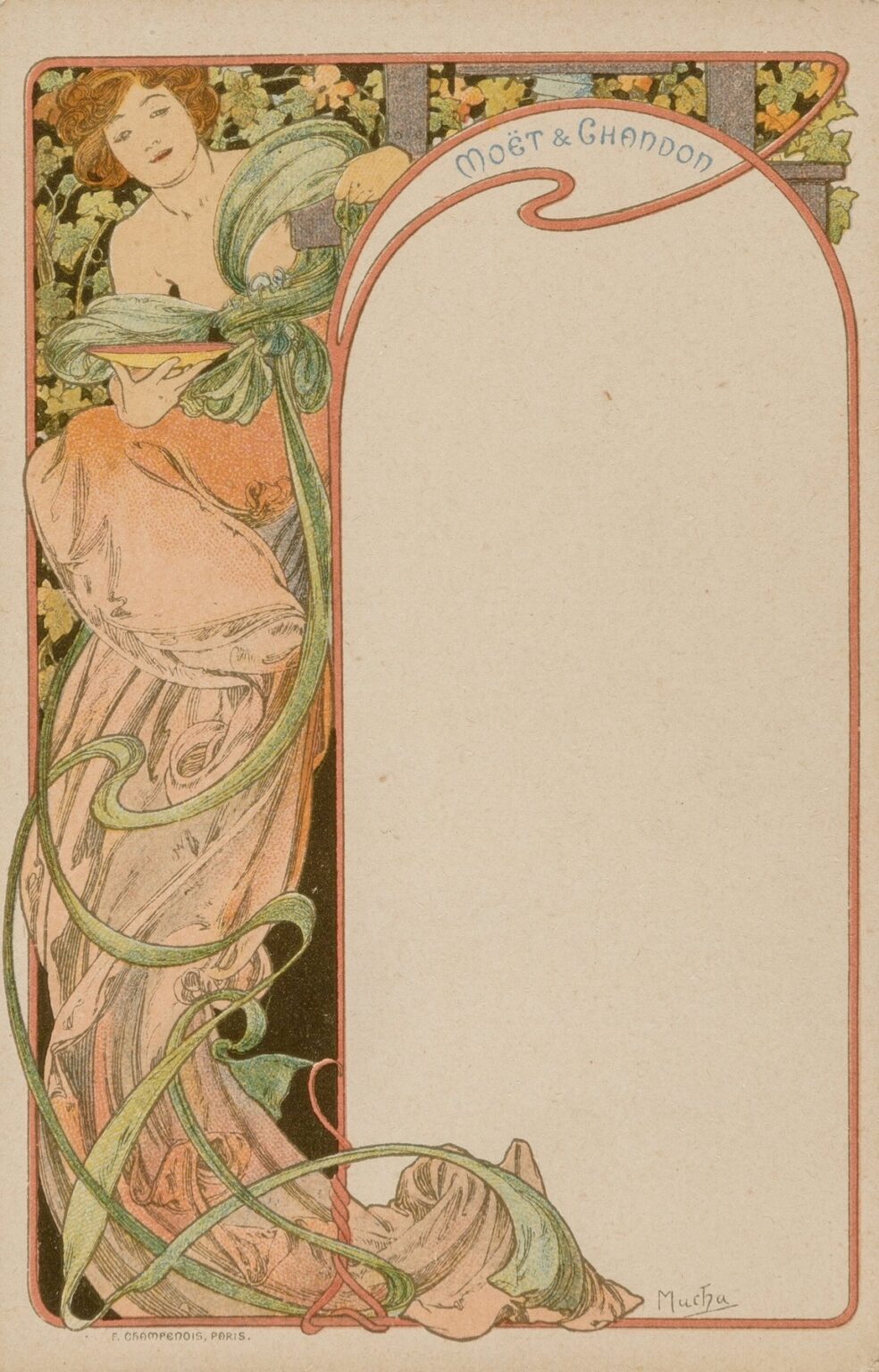
“Menu Card” by Alphonse Mucha, created in 1900, exemplifies the artist’s mastery of Art Nouveau graphic design applied to everyday objects. Commissioned for a special dining event, this lithographic menu transcends mere functionality to become a work of art that elevates the gastronomic experience. Mucha’s seamless integration of figurative elegance, ornate decoration, and custom typography transforms the humble dinner invitation into a sensory voyage. The vertical format, soft color palette, and sinuous lines characteristic of his poster work reappear here with fresh purpose, guiding the diner’s eye through courses as if they were chapters in a visual narrative. In “Menu Card,” Mucha demonstrates that beauty and utility need not be mutually exclusive—every detail, from the framing border to the position of the model, serves both aesthetic and communicative ends.
Historical and Cultural Context
At the turn of the 20th century, Paris was the epicenter of the Art Nouveau movement, which sought to dissolve boundaries between fine art and applied design. Mucha emerged as one of the movement’s leading figures through his celebrated theatrical posters, but he quickly extended his influence into commercial commissions, including invitations, bookplates, and luxury product advertisements. “Menu Card” reflects a moment when elite social gatherings embraced aesthetic innovation as a mark of sophistication. Wealthy patrons commissioned artists to design bespoke event materials that conveyed refinement and modern taste. Mucha’s menu card aligns with this trend, marrying the emerging decorative vocabulary of whiplash curves and botanical ornamentation with the pragmatic need to present a list of dishes. The result is both an artifact of its time and a timeless exemplar of design excellence.
Purpose and Function of the Menu Card
Beyond its role as a practical listing of hors d’œuvre, entrées, and desserts, Mucha’s “Menu Card” functions as a statement piece, setting the tone for the evening’s culinary journey. The card would have greeted guests at their place settings, immediately signaling that they were participating in an elevated experience. Unlike utilitarian printed menus, this design invites contemplation before consumption begins. Each course becomes embedded within the visual aesthetics of the card, fostering anticipation and a sense of ceremony. By leveraging his skills in lithography, Mucha ensured that the text remained legible while the decorative elements enhanced rather than obstructed information. The interplay of image and type conveys that dining, like theatre or art exhibition, can be a curated performance.
Composition and Layout
“Menu Card” employs a vertical, nearly rectangular format that echoes Mucha’s poster compositions. The left-hand panel features the central figure, while the right-hand panel remains intentionally blank in the lower register for the menu text. Above, an arching cartouche bears the hosting venue’s name in hand-drawn lettering. The figure’s swirling drapery and elongated form occupy the left third of the design, creating a dynamic counterpoint to the reserved text area. This asymmetrical balance demonstrates Mucha’s prowess in orchestrating positive and negative space: ornament and figure draw the eye, but ample blank ground ensures that course descriptions are easily read. Framing lines around the perimeter unify the two zones, guiding the viewer’s gaze downward from title to illustration to text.
Use of Line and Form
Central to Mucha’s style is his skillful use of line to convey movement and elegance. In “Menu Card,” the model’s garments cascade in a cascade of whiplash curves that seem to flutter like ribbons in a gentle breeze. These sinuous lines vary in thickness, lending a sculptural quality to the drapery folds. The figure’s pose—a relaxed seated posture with one arm draped over a curved armrest—forms a subtle S-curve that lends harmony and rhythm. Beyond the figure, the botanical border—stylized ivy leaves and curling vines—echoes these organic shapes, weaving around the outer frame in a continuous loop. By repeating curvilinear motifs, Mucha integrates the human form and decorative flourishes, reinforcing the interconnectedness of natural beauty and graphic design.
Color Palette and Printing Technique
Mucha’s “Menu Card” employs a subdued palette of warm apricot, sage green, pale cream, and muted ochre, set against a neutral background that allows both image and text to stand out. Each hue was applied via separate lithographic stones, a demanding process that required exact registration to avoid misalignment. Mucha collaborated with the Champenois printing firm to achieve transparent ink layers, permitting underlying tones to show through and creating soft gradients rarely seen in early commercial prints. The restrained palette serves a dual purpose: it conveys the sophistication of the gathering and ensures that the printed menu items remain legible. Subtle shifts in tone suggest depth in the drapery folds and foliage without resorting to heavy shading, maintaining the flat decorative quality prized in Art Nouveau.
Integration of Figurative and Ornamental Elements
“Menu Card” epitomizes Mucha’s philosophy that figure and ornament should form a unified visual language. The seated woman, clad in flowing garments, appears almost carved from the surrounding arabesques of foliage and ribbon-like extensions. Ivy and vine motifs sprout from the lower frame, creeping upward to meet the figure’s gown, as if nature itself drapes the heroine in living fabric. This blurring of boundaries creates an immersive scene: the model does not simply occupy a space within decoration but emerges organically from it. The harmonious fusion of representational portraiture and stylized ornament demonstrates Mucha’s ability to elevate applied art to the realm of poetic expression.
Symbolism and Iconography
While ostensibly a decorative menu, Mucha’s design subtly embeds symbolic meaning. The ivy bordering the composition traditionally represents fidelity and enduring affection—apt metaphors for communal dining and shared celebration. The graceful ribbons that encircle the figure suggest the flow of conversation and continuity of tradition. The seated model, with her serene expression and open posture, embodies hospitality and warmth. Together, these elements transform the menu card from a static object into a vessel of invitation and conviviality. Guests, upon seeing these symbols, would have been primed to engage in the ritual of dining not merely as consumption but as an act of social bonding.
Typography and Text Integration
Much of Mucha’s innovation lay in his custom lettering, and “Menu Card” is no exception. The venue name appears in decorative capitals whose curves echo the surrounding ornament. Course headings—such as “Hors d’Œuvre,” “Poisson,” “Viande,” and “Entremets”—are rendered in an elegant serif script that balances clarity with aesthetic flair. Body text for dish descriptions appears in a slender, upright typeface, ensuring legibility even at small point sizes. Importantly, Mucha positions text within the blank right-hand panel, avoiding any overlap with the decorative left panel. This clear demarcation underscores his understanding of functional design: typography must harmonize with illustration without compromising readability.
Representation of the Feminine Figure
Mucha’s penchant for idealized feminine forms finds subtle expression in “Menu Card.” The seated woman exemplifies the Art Nouveau femme-fatale archetype: she is both approachable and enigmatic. Her loose, low-set hairstyle and softly defined features convey demureness, while her draped robe suggests luxury and refinement. Mucha elongates her limbs and exaggerates the sweep of her sleeves, emphasizing decorative flow over naturalistic accuracy. The figure functions less as a portrait of a specific individual and more as an emblem of elegance—inviting the viewer to project their own associations of grace, taste, and hospitality onto her form.
Decorative Motifs and Patterns
The border of ivy leaves and curling ribbons, combined with the arching cartouche above, reflect Mucha’s extensive inspiration from medieval manuscripts, Byzantine mosaics, and Japanese woodblock prints. The repetitive leaf patterns echo the rhythmic structures found in nature, while the intersecting lines of the cartouche suggest architectural frames. Mucha adapts these historical sources into a fresh ornamental vocabulary, one that speaks to a modern audience yet remains rooted in time-honored decorative traditions. The result is a design that feels both ancient and cutting-edge, sublimely resonant with the fin de siècle fascination for revivalist motifs reinterpreted through contemporary lenses.
Influence of Japonisme and Other Cultural Sources
The subtle flattening of spatial perspective and the emphasis on outline in Mucha’s “Menu Card” owe much to Japonisme, the late-19th-century European craze for Japanese art. By minimizing chiaroscuro and focusing on silhouette, Mucha channels the ukiyo-e aesthetic, integrating it with Western techniques. At the same time, the botanical motifs recall medieval herbal illustrations, and the curved frame lines hint at Gothic archways. These cross-cultural and historical references demonstrate Mucha’s eclectic influences and his skill at synthesizing disparate elements into a cohesive modern style. The menu card thus serves as a microcosm of late Belle Époque cosmopolitanism, where East meets West and past informs present.
Impact on Graphic Design and Advertising
Though created as a bespoke menu, Mucha’s “Menu Card” exemplifies principles that would reshape graphic design in the 20th century. His holistic approach—marrying illustration, typography, and ornament—anticipated the concept of corporate identity, where every printed item reflects a unified brand ethos. Designers of luxury goods, hospitality venues, and cultural events adopted Mucha’s techniques to convey refinement and exclusivity. Moreover, the notion that functional printed matter could also serve as collectible art laid the groundwork for later movements such as Art Deco and Modernist poster design. “Menu Card” thus occupies a pivotal place in design history, illustrating how applied graphics can transcend their utility to become cultural icons.
Technical Process of Production
The production of “Menu Card” involved a multi-step lithographic process requiring collaboration between Mucha and expert craftsmen. The artist first executed original line work and color studies on paper, determining the precise placement of each hue. Specialized lithographic stones were then prepared for each color layer—often upwards of six to eight stones—to achieve the full palette. Precise registration techniques ensured that colors aligned perfectly, while varnish mediums created transparent effects and subtle gradients. This labor-intensive process underscored the value placed on high-quality print work for elite commissions, in contrast with cheaper chromolithography used for mass-market items. The finished piece attests to the artistry possible when commercial printing techniques are executed at the highest level.
Preservation and Modern Relevance
Over a century since its creation, surviving impressions of Mucha’s “Menu Card” are held in museum collections and private archives, valued for their beauty and historical import. Modern designers continue to draw inspiration from its ornamental unity and elegant typography. Digital exhibitions and art books reproduce the menu in high resolution, ensuring that its influence extends into the digital age. Hospitality brands seeking to evoke nostalgia or artisanal charm frequently reference Mucha’s approach, commissioning custom collateral that honors his legacy. The enduring appeal of “Menu Card” lies in its proof that functional design can enchant as much as fine art—an ethos that remains central to contemporary graphic practice.
Conclusion
Alphonse Mucha’s “Menu Card” exemplifies the transformative power of Art Nouveau applied to everyday objects. Through fluid linework, harmonious color, and integrated typography, Mucha elevates a utilitarian dinner menu into a work of art that celebrates elegance, hospitality, and craftsmanship. The interplay of feminine form, botanical ornament, and custom lettering creates a cohesive visual narrative that primes guests for a curated dining experience. As both historical artifact and ongoing inspiration, “Menu Card” underscores Mucha’s conviction that beauty and function belong together—a principle that continues to guide designers more than a century after its creation.
