Image source: artvee.com
Introduction
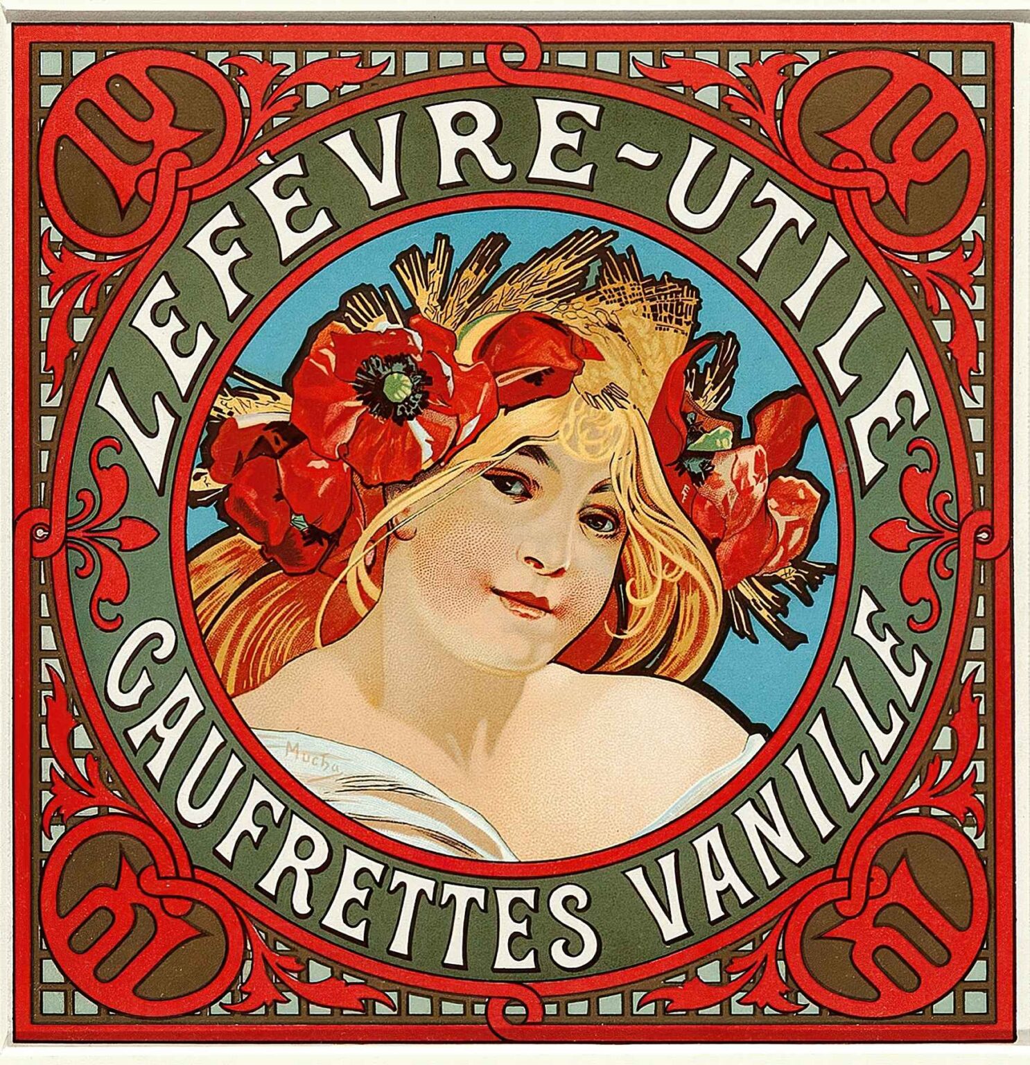
Alphonse Mucha’s Lefèvre-Utile Gaufrettes Vanille poster, created in 1900, stands as a masterful example of Art Nouveau applied to commercial design. Commissioned by the French biscuit manufacturer Lefèvre-Utile (LU) to advertise their vanilla wafers, the poster transcends mere marketing and becomes a celebration of beauty, elegance, and modernity. Mucha—already renowned for his sinuous lines, floral motifs, and idealized female figures—transformed a simple product announcement into a lavish decorative panel. By marrying precise lithographic technique with allegorical imagery, he produced an artwork that captured public imagination, elevated consumer culture, and helped define early twentieth-century graphic art.
Historical Background of Lefèvre-Utile
Founded in Nantes in 1846, Lefèvre-Utile quickly gained fame for its thin, crisp biscuits. By the late 1890s, the company sought to distinguish its products through striking visual promotion. They turned to Alphonse Mucha, whose 1895 poster for Sarah Bernhardt’s play Gismonda had propelled him to fame. Recognizing the power of art to sell, LU invited Mucha to create a series of posters that would associate their gaufrettes vanille with refinement and luxury. Mucha embraced the challenge, applying his decorative aesthetic to a domestic product. His work for LU exemplifies the intersection of advertising, art, and industry in the burgeoning consumer society of Belle Époque France.
Mucha’s Art Nouveau Vision
Art Nouveau—literally “new art”—arose in the 1890s as a reaction against academic historicism and the mechanization of industrial production. Artists sought inspiration in nature’s organic forms, Japanese prints, and medieval ornament. Mucha’s style epitomized this movement: elongated, graceful women crowned with halos of petals; rhythmic arabesques that seemed to grow like vines; pastel hues and gold accents that captured the era’s optimism. In the Gaufrettes Vanille poster, Mucha synthesized these elements into a unified whole. Every line, curve, and color choice reflects his conviction that art should permeate all aspects of life—including the wrappers on a box of vanilla wafers.
Composition and Central Imagery
The poster’s square format breaks from the tall, vertical shape typical of Mucha’s theatrical posters, yet retains a strong central focus. A young woman—probably an allegory of sweetness or of the spring season—occupies the heart of the design, her head crowned with scarlet poppies and golden wheat stalks. These symbols allude both to the gaufrettes’ key flavor ingredient, vanilla’s subtle counterpart in the natural world, and to the product’s connection to rustic harvest traditions. She turns toward the viewer with a serene, slightly bemused expression, her bare shoulders and flowing hair suggesting both vulnerability and enchantment. The figure’s central placement asserts her as the living emblem of the brand’s promise: delicate taste and natural elegance.
Ornamental Borders and Frame
Encircling the central figure is a broad circular frame in muted olive green, edged with crimson and punctuated by stylized floral motifs. The outer square border employs repeating lattice patterns reminiscent of wrought iron grilles or church screens, grounding the design in a sense of structure while allowing ornamental freedom within. In each corner, a circular medallion features the LU monogram—two intertwined letters—rendered in red against a gold ground. Between these medallions, scrolling acanthus leaves and geometric filigree knit the composition into a cohesive decorative tapestry. Mucha’s borders do more than enclose; they speak to the unity of form and content that defines Art Nouveau.
Color Harmony and Emotional Impact
Mucha’s palette for Gaufrettes Vanille is at once sumptuous and comforting. The dominant tones of scarlet red, olive green, and soft gold convey richness and warmth, while touches of pale skin tone and muted blues add contrast. The red poppies crown the figure’s hair, drawing the eye upward, while the green frame suggests growth and freshness. Gold accents catch the light—both in the printed poster and in viewers’ imaginations—evoking the golden crust of a freshly baked wafer. Mucha composed these hues with scientific precision, balancing warm and cool notes to evoke appetite and delight without resorting to garishness. The result is a poster that both soothes and excites the senses, much like the product it advertises.
Use of Line and Rhythm
Line sits at the core of Mucha’s decorative method. In Gaufrettes Vanille, his outlines vary in weight—thicker around the figure’s silhouette to ensure clarity at a distance, thinner within the curls of hair and floral petals to suggest delicacy. The undulating contours of the woman’s hair and drapery create a visual rhythm that echoes the ring-like structure of the frame. Repeated arcs and counter-arcs guide the viewer’s gaze in effortless loops, reinforcing the poster’s cyclical unity. Even the monogram medallions and lattice grid adhere to this rhythmic principle, as geometric lines contrast with organic curves, achieving dynamic equilibrium.
Symbolism of Poppies and Wheat
The choice of poppies and wheat stalks as decorative elements carries layered symbolism. Poppies—flowers that open wide and close at night—symbolize ephemeral beauty and the fleeting joys of life. Their fiery red hue connotes vitality and passion. Wheat stalks, by contrast, represent abundance, sustenance, and cycles of growth. Together, they form a visual metaphor for the dual qualities of Gaufrettes Vanille: ephemeral pleasure (the wafer’s delicate crispness) grounded in natural, nourishing ingredients. By weaving these symbols into his composition, Mucha aligns the product with the rhythms of nature and the deeper currents of human experience.
Typography and Brand Identity
The poster’s lettering is integral to its decorative appeal. The brand name, LEFÈVRE-UTILE, appears in uppercase in a crisp, custom typeface, its letters slightly flared at the terminals to echo the organic curves around them. Below, “GAUFRETTES VANILLE” takes on a similar but narrower form, ensuring visual hierarchy. Mucha designed these letters by hand, allowing minor irregularities that lend warmth and character—qualities absent in mechanical type. The interplay of letters and ornament solidifies the product’s identity: it is both modern (through bold, clear typography) and artisanal (through handcrafted nuances), inviting consumers to trust its quality.
Technical Process and Lithography
Much like his theatrical posters, Mucha produced Gaufrettes Vanille as a color lithograph. He prepared separate stones for each of the principal colors—scarlet, olive, gold, and black outlines plus flesh tone—and oversaw the proofing process to ensure precise registration. The lithographer’s challenge lay in capturing the subtle stippling of the woman’s skin and the deep saturation of the border colors. Mucha’s mastery over the medium meant that even complex ornamental patterns remained crisp and vibrant. The final prints, often displayed outdoors on city walls, withstood the demands of mass distribution while retaining the painterly qualities that distinguished Mucha’s work from mere commercial art.
Public Reception and Commercial Success
Upon its release, Lefèvre-Utile Gaufrettes Vanille generated widespread acclaim. Shop windows across Paris displayed the poster, and lithographic reproductions appeared in newspapers and magazines, amplifying the campaign’s reach. Consumers associated the wafers with the poster’s elegance, perceiving the product as a treat worthy of connoisseurs. Sales of the vanilla wafers soared, validating the power of fine art advertising. More broadly, the poster affirmed Mucha’s status as the go-to designer for luxury goods, reinforcing the notion that quality design could drive consumer desire and enhance brand prestige.
Influence on Advertising and Design
Mucha’s work for Lefèvre-Utile influenced generations of advertisers and designers. His approach—treating commercial posters as canvases for original art—challenged competitors to seek equally innovative imagery. The integration of decorative ornament, custom typography, and symbolic content became a hallmark of high-end advertising in Europe and North America. Even brands outside the food industry adopted Mucha’s methods, commissioning artists to create bespoke posters that emphasized craftsmanship and narrative. In this way, Gaufrettes Vanille helped launch a new era in graphic design, one in which commerce and art collaborated to shape cultural taste.
Preservation and Legacy
Original prints of Lefèvre-Utile Gaufrettes Vanille are prized by collectors and preserved in museum collections worldwide. Conservation efforts focus on preventing fading of the vivid colors and repairing tears in the paper. The poster’s enduring legacy appears in exhibitions of Art Nouveau, where it stands alongside Mucha’s famous theatrical works. Contemporary artists and typographers study its composition and lettering, drawing lessons in the marriage of form and function. Even today, reproductions of the poster adorn cafés, homes, and design studios, testifying to its timeless appeal.
Conclusion
Alphonse Mucha’s Lefèvre-Utile Gaufrettes Vanille poster transcends its original role as product advertising to become a demonstration of the transformative power of Art Nouveau design. Through harmonious composition, evocative symbolism, custom typography, and lithographic mastery, Mucha crafted an image that resonated with consumers and shaped the trajectory of graphic design. The poster remains a benchmark for how art and commerce can collaborate to produce work of lasting beauty and cultural significance.
