Image source: artvee.com
Introduction
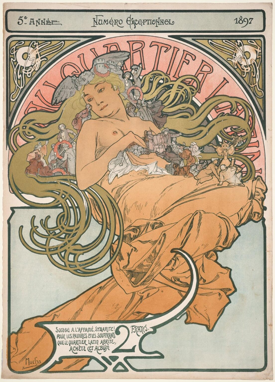
“Au Quartier Latin” (1897) by Alphonse Mucha is a striking poster created to benefit the Latin Quarter’s impoverished residents. Far more than a utilitarian advertisement, this work stands as a quintessential example of Art Nouveau’s organic forms, sinuous lines, and harmonious integration of text and image. Mucha transforms a charitable appeal into a visual poem, inviting viewers into a poetic world where a gracefully draped female figure symbolizes both the spirit of the Latin Quarter and the power of art to uplift society. Through an in-depth exploration of its historical context, compositional mastery, color harmony, ornamental line work, symbolic resonance, and technical innovation, we can appreciate why “Au Quartier Latin” endures as a masterpiece of turn-of-the-century graphic art.
Historical Context
In 1897, Paris’s Latin Quarter was renowned for its bohemian atmosphere, intellectual ferment, and pockets of deep poverty. Students, writers, artists, and university faculty mingled alongside destitute families, creating a neighborhood of intense contrasts. A devastating cholera outbreak and economic hardship spurred local philanthropists and organizations to seek relief for the most vulnerable. Mucha—already celebrated for his theatrical posters and commercial commissions—was approached to design a charitable campaign. His task was to craft an image that communicated urgency and compassion, while remaining aesthetically compelling enough to entice patrons. The resulting poster blends Mucha’s signature decorative style with a heartfelt social message, reflecting the era’s ideal that art could—and should—serve a broader humanitarian purpose.
Commission and Publication
The poster was commissioned by the Société de Secours du Quartier Latin, a charitable society founded by university students and professors. They intended to sell an album of prints for two francs, with proceeds directed toward food, medical aid, and shelter for the impoverished. Mucha worked swiftly to produce an image that would resonate with Parisian audiences, leveraging his growing reputation to elevate the campaign’s visibility. The album combined several of his designs, but “Au Quartier Latin” served as its emblematic cover. Printed via chromolithography by the Chaix printing house, the edition reached cafés, lecture halls, and salons, catalyzing both sales and public awareness of the neighborhood’s plight. This commission underscores Mucha’s conviction that graphic design possessed the power to engage, inform, and inspire collective action.
Composition and Layout
Mucha’s composition is anchored by a reclining allegorical figure whose flowing drapery and cascading hair dominate the poster’s central space. She is enveloped within a large circular motif rendered in subtle coral and gold, which in turn rests upon a rectangular field of pale blue. The panorama of dancing students, strolling couples, and toiling laborers appears miniature within her golden tresses—an ingenious device that unites the human drama of the Latin Quarter with the symbol of generosity embodied by the central figure. The bottom portion of the poster integrates the campaign’s plea—“Songe à l’affamé, Sybarite! Pour les pauvres et les souffrants que le Quartier Latin abrite…”—in a stylized cartouche that echoes the curve of the drapery above. Through a deft interplay of circular and rectilinear frames, Mucha orchestrates a visual rhythm that guides viewers’ eyes from text to image and back again.
Color Palette and Tonal Harmony
The poster’s color scheme exemplifies Mucha’s mastery of limited yet resonant palettes. Soft coral washes in the halo contrast gently with the cool blue background, while the central figure’s ivory flesh and golden hair stand out with luminous clarity. Minute figures within her hair are rendered in muted earth tones—terracotta, sage green, and ochre—ensuring they contribute visual interest without disrupting overall harmony. The drapery’s warm peach echoes the halo’s coral, unifying the composition. Mucha achieved these delicate tonal transitions through successive, translucent ink layers, a hallmark of chromolithographic technique. His palette avoids harsh contrasts; instead, it cultivates an enveloping warmth that invites empathy for the cause and reinforces the poster’s dual function as both artwork and charitable appeal.
Line Work and Ornamental Motifs
Line forms the backbone of Mucha’s design, shaping both figure and ornament with equal precision. The central figure’s silhouette is traced in a confident, sweeping contour, while her drapery and hair are articulated through a network of parallel hairline strokes that convey volume and motion. Within the circular frame, miniature vignettes of Parisian life emerge through terse, lively lines that capture gesture and expression. Corner panels feature stylized bellflowers and curling tendrils, tying the poster to the natural motifs typical of Art Nouveau. Mucha varies line weight to establish visual hierarchy: thicker strokes anchor primary forms, whereas finer lines delineate intricate details. This orchestration creates a richly textured surface that remains cohesive, guiding the viewer’s gaze through flowing curves and decorative flourishes.
Symbolism and Allegory
The reclining female figure embodies Sybaris, the mythical hedonist, repurposed here as a call to moral responsibility: “Songe à l’affamé, Sybarite!”—Think of the hungry, you who indulge. Her languorous pose and luxurious gown serve as a stark contrast to the suffering of Latin Quarter’s poor, illustrated within her hair. By contrasting opulence with destitution, Mucha transforms the poster into an allegorical admonition: indulgence should be balanced by compassion. The circular halo evokes a sacred aura, conferring dignity upon both the allegory and the charitable act itself. Mucha thereby elevates the campaign’s message, framing philanthropy not as a chore but as an ennobling gesture that connects every viewer to the communal fabric of Parisian life.
Portrayal of the Central Figure
Unlike Mucha’s theatrical heroines—often full-face, ethereal muses—this figure reclines in three-quarter view, her gaze directed toward the viewer with a gentle, almost melancholic expression. Her partially exposed form suggests both vulnerability and generosity, as though she offers her bounty to those in need. The drapery loosely wraps her body, evoking classical sculpture while retaining a modern decorative flair. Her hair, an undulating cascade of golden strands, becomes both ornament and narrative device—hosting scenes of daily life. Mucha’s skillful modeling of flesh through subtle shading underscores her humanity, making the allegory relatable rather than remote. In merging classical form with contemporary social commentary, he crafts a figure at once timeless and urgent.
Integration of Text and Image
Mucha treats the campaign’s plea—and the price of 2 francs—as integral visual elements rather than add-ons. The hand-lettered quote occupies a cartouche whose sweeping curves mirror the drapery folds above, ensuring visual continuity. The swirling line beneath the text leads the eye upward to the primary figure, unifying message and motif. The header “Quartier Latin” appears in large letters within the circular halo, its arched form echoing the overall composition’s curvature. Mucha’s typography avoids mechanical precision, favoring handcrafted irregularities that lend warmth and personality. By weaving text into the ornamental schema, Mucha ensures that the poster communicates both emotionally and informationally, demonstrating Art Nouveau’s ideal of total, seamless design.
Lithographic Technique and Craftsmanship
“Au Quartier Latin” was printed using chromolithography, a process that allowed Mucha’s nuanced line work and layered colors to be reproduced in rich detail. Each hue—coral, gold, ivory, blue—required a separate lithographic stone, precisely registered to ensure perfect alignment. Mucha collaborated closely with the Chaix printing firm to refine ink viscosity and paper texture, achieving soft washes that retained luminosity. The delicate highlights on the central figure’s skin and the subtle gradations in the halo’s coral background testify to the technical prowess of both artist and printers. Occasional hand—coloring touched up proofs, further enhancing depth and richness. This technical mastery transformed the poster from mere advertisement into a collectible work of fine art.
Influence of Japonisme and Classical Traditions
Mucha’s decorative language synthesizes influences from Japanese woodblock prints (Japonisme) and classical European art. The flattened color planes and asymmetrical floral panels recall ukiyo-e compositions, while the reclining figure and drapery nod to classical sculpture and Renaissance painting. The circular halo resembles Byzantine religious iconography, repurposed here for secular emphasis. These cross-cultural references—combined with Mucha’s modern sensibility—produce a hybrid style that feels both timeless and innovative. The poster’s harmonious blend of diverse traditions underscores Art Nouveau’s aspiration to unite global aesthetic currents into a coherent, decorative whole.
Reception and Legacy
Upon its release, “Au Quartier Latin” captured public attention for its beauty and social conscience. The charitable album sold briskly, raising funds and awareness for the Latin Quarter’s needy. Critics and collectors alike praised Mucha’s ability to marry artistic excellence with philanthropic purpose. The poster—and the album it fronted—helped to solidify the notion that graphic design could effect social good. In subsequent decades, historians have regarded the work as a seminal example of socially engaged art and a high point of Art Nouveau poster design. Original prints remain highly sought after in museum and private collections, and reproductions continue to inspire contemporary designers keen to marry aesthetic richness with meaningful messaging.
Modern Resonance and Applications
In the twenty-first century, “Au Quartier Latin” endures as a model of how design can inspire charitable action. Nonprofit campaigns and cultural festivals often cite Mucha’s poster when seeking to evoke elegance alongside social purpose. Digital designers adapt its curvilinear forms for websites and apps, while event organizers commission posters that reference Mucha’s integration of figure, ornament, and text. The allegory of indulgence balanced by empathy remains timely in an era of stark economic disparities. By demonstrating that aesthetic beauty can drive social engagement, Mucha’s poster retains its power to captivate and mobilize audiences across generations.
Conclusion
“Au Quartier Latin” by Alphonse Mucha stands as a testament to the transformative potential of graphic art. Through masterful composition, harmonious color, expressive line work, and layered symbolism, Mucha elevates a charitable appeal into an enduring work of beauty and conscience. The poster’s integration of text and image, its deft blend of artistic traditions, and its technical virtuosity exemplify Art Nouveau’s highest ideals. Over a century after its creation, “Au Quartier Latin” continues to inspire designers and philanthropists alike, reminding us that art at its best can both delight the senses and uplift the human spirit.
