Image source: artvee.com
Introduction
Alphonse Mucha’s 1902 calendar stands as a luminous testament to the union of beauty and utility that defines the Art Nouveau movement at its zenith. Far from a merely functional timekeeping device, this lithographic poster transforms the ordinary calendar into a work of art, inviting viewers to engage daily with the passing of months framed by graceful decoration. In meticulously rendered detail—from the sinuous lines of the allegorical figure to the delicate interplay of soft hues—Mucha elevates a commercial commission into a poetic celebration of time, nature, and culture. This analysis will explore how Mucha masterfully balances composition, color, symbolism, and typographic innovation to create a calendar that continues to captivate over a century after its creation.
Historical and Cultural Context
At the turn of the twentieth century, Europe was experiencing rapid industrialization alongside a burgeoning appreciation for decorative arts. In this climate, calendars, posters, and illustrated periodicals became prime vehicles for artists to reach a broad audience. Mucha, having risen to fame with his 1894 poster for Sarah Bernhardt, was in high demand for projects that married art with everyday objects. The 1902 calendar was commissioned by Librairie Centrale des Beaux-Arts in Paris, a leading publisher of art books and decorative prints. Mucha’s assignment was to devise a design that would grace walls throughout the French capital and beyond, embedding the rhythm of the seasons within an immersive, ornamental environment.
Commission and Purpose of the Calendar
Rather than simply printing dates and months, Mucha conceived the calendar as a decorative panel that homeowners and art aficionados would display as both a timepiece and an object of aesthetic delight. His design needed to accommodate twelve months of information—each day listed with its corresponding saint’s feast or public holiday—while preserving the integrity of his imagery. The distribution of the calendar as a wall hanging underscored the dual function of the work: to orient viewers in temporal increments and to delight them with the timeless elegance of Art Nouveau.
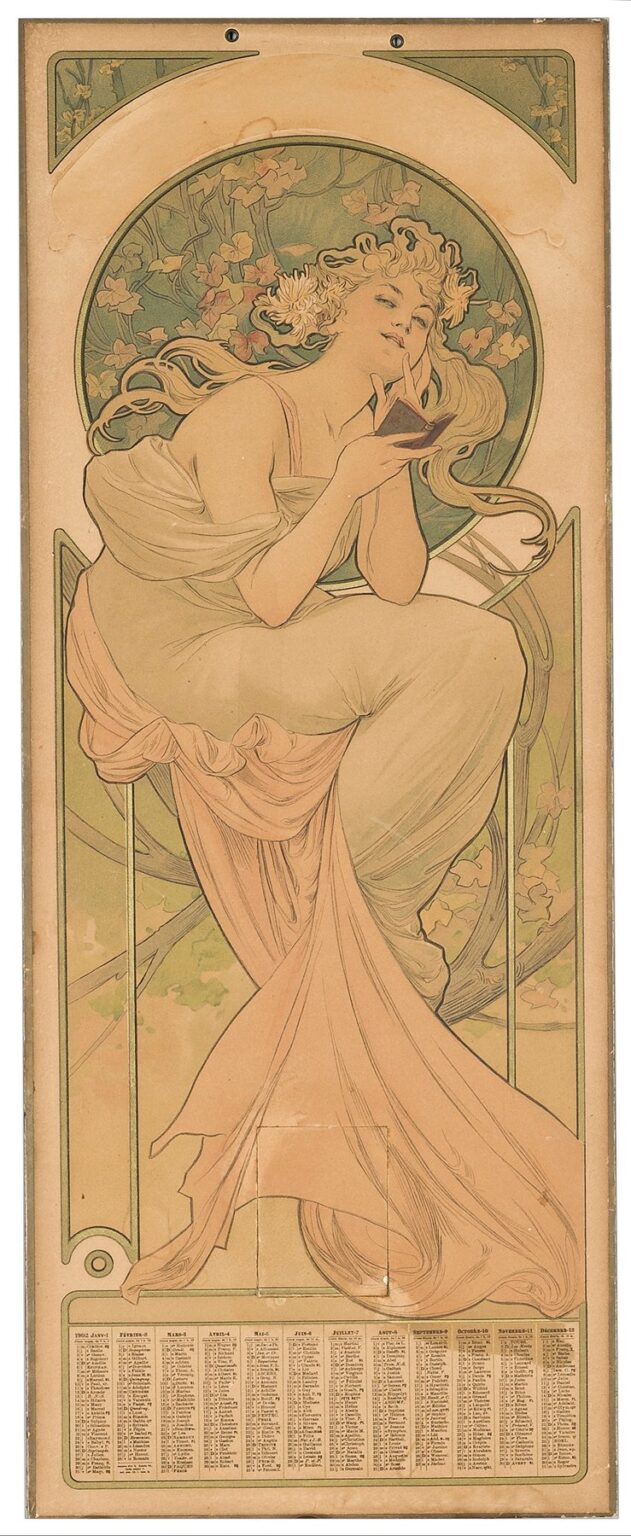
Composition and Format
The overall composition of the 1902 calendar is anchored by a vertically oriented rectangle divided into two primary zones. The upper three-quarters presents an allegorical female figure seated upon a stylized, vine-like framework. She leans slightly forward, absorbed in a small open book held delicately in her left hand while her right hand rests thoughtfully against her chin. Behind her, a large circular halo of intertwined ivy and geometric motifs frames her head and shoulders, creating a focal point that draws the viewer’s gaze. The lower quarter of the poster contains the calendar table: twelve columns enumerating each month, paired with numbered days and associated text. A narrow decorative border unifies the two sections, guiding the eye seamlessly between image and information.
Use of Color and Tonal Harmony
Mucha’s palette for the 1902 calendar is both restrained and richly evocative. Soft apricot and ivory washes provide a luminous background, while sage greens in the foliage and the figure’s drapery lend a calming, natural presence. The author’s skin is rendered in warm peach tones, contrasted by the crisp whites of her gown’s highlights. Subtle touches of gold ink accent the filamentous patterns within the circular halo and the angular corners, imparting a gentle radiance. By eschewing high-contrast or overly saturated colors, Mucha achieves a cohesive tonal harmony that emphasizes serenity, underscoring the idea that time’s passage can be both graceful and contemplative.
Line Quality and Decorative Flourish
Underlying Mucha’s color harmony is his trademark mastery of the line. The viewer’s eye follows a single, unbroken contour as it traces the gentle curve of the figure’s back, the swell of her drapery, and the curling tendrils of her hair. Within this main silhouette, finer hairline strokes delineate the folds of fabric, the sinuous vines of ivy, and the delicate petals of the background foliage. The angular corner panels introduce floral sprays rendered with the same confident stroke, balancing the circular halo with rectilinear precision. Mucha’s orchestration of varied line weights—bold for primary shapes, whisper-thin for interior details—produces a dynamic visual texture that is at once decorative and anatomically grounded.
Allegorical Figure and Symbolism
The seated woman at the heart of the calendar embodies a timeless allegory of contemplation and the unfolding of time. Her crown of ivy may allude to eternal growth, wisdom, and the unceasing cycles of nature. The small open book she studies suggests that each day invites reflection, study, or appreciation, transforming the act of marking off dates into an intellectual and spiritual practice. Her serene expression conveys the notion that time, while inexorable, can be embraced with thoughtful awareness. Mucha thereby positions the calendar as more than a utilitarian artifact: it is a visual meditation on the human relationship with time, memory, and knowledge.
The Role of Text and Typography
Integrating extensive textual information into an ornate composition posed a significant challenge, yet Mucha meets it with remarkable dexterity. The calendar grid at the bottom employs a clear, sans-serif typeface that remains legible even at small point sizes, ensuring practicality. Yet this plain typography does not jar against the surrounding decoration; instead, it is framed by thin linear borders that echo the contours found in the imagery above. Header titles for each month are set in a slightly larger, stylized serif font, recalling the handcrafted lettering that appears in Mucha’s posters. The harmonious marriage of text and image allows viewers to navigate the calendar’s informational content without detracting from the overall decorative unity.
Integration of Calendar and Art
Mucha’s genius lies in seamlessly weaving the calendar’s functional elements into the decorative schema. The twelve columns of the calendar table are arranged to follow the natural reading pattern from left to right, while their bottom placement prevents them from competing with the primary imagery. Decorative scrolls and corner motifs subtly draw the eye back upward, ensuring that the gaze circulates between the utilitarian and the ornamental. By integrating the date listings as an element of the overall design, Mucha demonstrates that art can serve everyday needs without compromising elegance—a core tenet of the Art Nouveau ethos.
Production Techniques and Lithography
The creation of the 1902 calendar relied on advanced chromolithographic techniques pioneered in late nineteenth-century Paris. Mucha began with careful preparatory sketches and color studies, working directly onto lithographic stones or zinc plates using greasy crayons and tusche washes. Each hue—apricot, sage, ivory, gold—required its own plate, registered with meticulous precision to ensure seamless alignment. Mucha collaborated closely with skilled printers at the Imprimerie Chaix in Paris to refine ink formulations and paper textures, achieving both vivid color saturation and delicate gradations. The resulting prints captured the full nuance of his original drawings, demonstrating chromolithography’s potential to reproduce fine art at scale.
Influence of Art Nouveau and Japonisme
Mucha’s decorative approach was deeply informed by Japonisme, the European fascination with Japanese art and design. The flattened color planes, asymmetrical botanical motifs, and rhythmic repetition of leaf forms in the 1902 calendar echo the compositional strategies of ukiyo-e masters like Hiroshige. Simultaneously, the piece draws on medieval manuscript illumination, evident in the circular halo’s mandorla and the stained-glass quality of the corner insets. By synthesizing these influences with academic figure drawing and Art Nouveau’s organic curves, Mucha created a hybrid style that felt both contemporaneous and timeless—a visual language that would reverberate throughout twentieth-century graphic design.
Reception and Legacy
Upon its release in late 1901, the 1902 calendar quickly gained popularity among Parisian households and art collectors. Its dual appeal—as an elegant wall hanging and a practical desk accessory—ensured widespread distribution. Interior decorators incorporated its motifs into wallpapers and textiles, while commercial artists adopted its integration of type and image for magazine layouts. Over the ensuing decades, the calendar would be reprinted, studied, and celebrated in museum retrospectives of Art Nouveau. Today, original impressions are highly prized in archives and private collections, and digital recreations circulate among design enthusiasts, underscoring the work’s enduring influence on calendar design, branding, and decorative graphics.
Modern Resonance and Significance
In the twenty-first century, Mucha’s 1902 calendar continues to inspire designers, typographers, and illustrators seeking to fuse functionality with visual splendor. Contemporary calendar makers reference his balanced integration of info and ornament, while UI/UX designers draw on his clarity of information hierarchy. Fine art print studios produce limited-edition reproductions, and enthusiasts display the work in digital galleries and themed exhibitions. At a time when digital devices dominate timekeeping, Mucha’s analog masterpiece reminds us of the tactile pleasure and contemplative pause that a beautifully rendered calendar can provide.
Conclusion
Alphonse Mucha’s 1902 calendar remains a crowning achievement of Art Nouveau’s aspiration to enrich everyday life through harmonious design. Through his masterful handling of composition, color, line, and typography, Mucha transformed a utilitarian object into a visual poem on time, nature, and human thought. The calendar exemplifies the artist’s conviction that art need not be confined to galleries—it can, and should, infuse the quotidian with beauty and meaning. As viewers consult its columns and admire its ornament, they partake in a dialogue between past and present, utility and aesthetics—a dialogue that Mucha’s work invites us to continue in every new turn of the page.
