Image source: artvee.com
Overview of the Poster
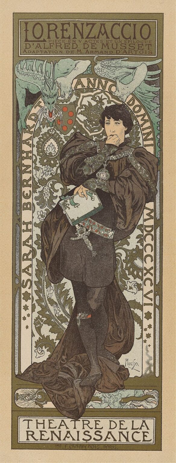
“Lorenzaccio” (1900) is a towering example of Alphonse Mucha’s ability to fuse theatrical promotion with Art Nouveau elegance. Commissioned to advertise Sarah Bernhardt’s production of Alfred de Musset’s drama at the Théâtre de la Renaissance, the poster presents the actor as the introspective Lorenzo de’ Medici, caught in a moment of self‑reflection. The vertical format emphasizes Bernhardt’s full‑figure portrayal, draped in sumptuous Renaissance costume, while a pair of mythical creatures—a dragon and a gryphon—hover above, hinting at the play’s undercurrents of political intrigue and moral conflict. Mucha encloses the figure within an ornamental frame of scrolling foliage and mosaic‑inspired patterns, integrating title, credits, and Roman numerals into the decorative scheme. The result is both an arresting advertisement and a self‑contained work of art, where narrative, portraiture, and ornament coalesce seamlessly.
Historical and Cultural Context
At the turn of the twentieth century, Parisian theatre was at the heart of European cultural life. Sarah Bernhardt, known as “The Divine Sarah,” was at the peak of her fame, and her productions drew audiences eager for both dramatic spectacle and star power. Alfred de Musset’s “Lorenzaccio,” a five‑act play with an epilogue, explores themes of ambition, betrayal, and the complexities of revolutionary action in sixteenth‑century Florence. Mucha’s poster debuted in a period when lithographic posters transformed the city into an open‑air gallery, and artists vied to capture attention in crowded boulevards. By employing classical motifs and Bernhardt’s distinctive celebrity, Mucha bridged the gap between high art and popular culture, reflecting an era that celebrated both historical revivalism and modern artistic innovation.
Alphonse Mucha’s Career in 1900
By 1900, Alphonse Mucha had solidified his reputation as the premier poster artist of the Belle Époque. After his breakthrough “Gismonda” poster in 1895, he produced influential campaigns for fashion houses, cafés, and theatre productions. Mucha’s signature style—characterized by graceful figures, intricate line work, and harmonious palettes—became synonymous with Art Nouveau itself. His collaboration with printer F. Champenois allowed him to experiment with multi‑stone lithography, incorporating metallic inks and subtle textural effects. “Lorenzaccio” represents one of his late‑nineteenth‑century theatrical commissions, where he applied his evolving decorative vocabulary to convey dramatic intensity and psychological depth.
Commission and Theatrical Collaboration
The creation of the “Lorenzaccio” poster was driven by Sarah Bernhardt’s theatrical ambitions. Adapted by Armand d’Artois, the play required a promotional image that captured its blend of historical grandeur and moral complexity. Mucha worked closely with the Théâtre de la Renaissance to ensure that the poster’s imagery resonated with the production’s set and costume design. Bernhardt’s pose—hand to her lips in thoughtful concealment—reflects Lorenzo’s internal struggle as much as the actor’s dramatic flair. The inclusion of two stylized heraldic creatures echoes the Medici family crest and underscores the political stakes of the narrative. By aligning graphic design with theatrical content, Mucha elevated the poster beyond mere advertisement to a visual prologue for the play itself.
Composition and Spatial Structure
Mucha’s composition is meticulously balanced. The central figure stands slightly off‑center, her gaze directed toward the viewer’s right, creating a subtle diagonal tension. Above her, the dragon on the left and the gryphon on the right mirror one another, forming a protective canopy. Behind Bernhardt, a circular medallion of interwoven botanical motifs acts as a halo, focusing attention on her expressive face. The rectangular title panel at the top anchors the composition, while the Théâtre de la Renaissance credit at the bottom provides a visual counterweight. Vertical pilasters of patterned ornament at either side frame the scene, guiding the eye upward from the drapery at her feet to the stylized lettering above. This layered structure harmonizes portrait, text, and decoration.
Typography and Text Integration
Mucha’s bespoke lettering for “Lorenzaccio” exemplifies his belief that text should be as decorative as imagery. The title letters are elongated, with serifs that echo the grape‑leaf curls in the background. Subtitles—“Pièce en V actes et un épilogue” and “d’Alfred de Musset”—are set in a refined serif that maintains legibility without breaking the ornamental flow. The actor’s name, “Sarah Bernhardt,” curves along the left border in capitals that interlock like puzzle pieces. Roman numerals indicating the year of the production (MCM) appear on the right border, reinforcing the poster’s symmetry. By designing typography that responds to surrounding motifs, Mucha ensures that every word is woven into the visual tapestry rather than tacked on as an afterthought.
Color Palette and Lithographic Technique
The poster’s muted palette of olive greens, soft browns, and pearly creams is punctuated by touches of coral red in the dragon’s tongue and the gryphon’s eye. These restrained hues evoke the patina of antique tapestries and frescoes, appropriate to a Renaissance drama. Mucha’s multi‑stone lithography employed separate stones for each color, requiring exacting registration to maintain crisp lines and clear demarcations. The lightly textured background, achieved through aquatint‑style halftones, contrasts with the flat, opaque areas of costume and ornament. Subtle metallic inks may have been used for fine highlights in the medallion and weapons of the mythical beasts, catching light and lending a tactile shimmer. The technical precision amplifies the poster’s visual sophistication.
Depiction of the Protagonist
In Bernhardt’s portrayal of Lorenzo, Mucha achieves both likeness and idealization. The actor’s features—strong nose, full lips, and dark eyes—are rendered with naturalistic shading, while her flowing cloak and embroidered tunic take on stylized forms. The corseted bodice and voluminous sleeves evoke late‑Renaissance fashion, yet Mucha streamlines folds into rhythmic curves. The hand raised to her mouth suggests contemplation or suppressed emotion, capturing the character’s moral ambivalence. Bernhardt’s posture—one hip shifted forward, weight borne on a single leg—echoes classical contrapposto, lending the figure a sculptural quality. This blend of portraiture and allegory allows the audience to see both the actor and the role she inhabits.
Symbolism and Iconography
Every element in “Lorenzaccio” carries symbolic weight. The dragon traditionally represents tyrannical power, while the gryphon—half‑eagle, half‑lion—embodies vigilance and courage. Their mirrored placement above Lorenzo’s head suggests the dual forces of oppression and resistance that drive the play’s conflict. The circular medallion, inscribed with swirling acanthus leaves and stylized fleurs‑de‑lis, alludes to the Medici crest and to themes of regeneration. Small roundels of red along the creature’s bodies recall drops of blood, hinting at the play’s tragic violence. Through these layered icons, Mucha invites viewers to ponder the moral and political dimensions of the drama before ever stepping foot in the theatre.
Decorative Motifs and Ornamentation
Mucha’s ornamental vocabulary here combines Byzantine tile patterns, Gothic tracery, and Renaissance arabesques. The background pilasters feature interlocking vine scrolls that alternate with geometric tesserae, creating a rich tapestry effect. The medallion behind the figure is composed of concentric bands of stylized foliage, their crisp outlines echoing the sinuous curves of the cloak’s drapery. Mucha often spoke of “total decoration,” and in “Lorenzaccio” every inch of space—positive or negative—is treated as an opportunity for embellishment. Even the borders of the poster carry small motifs—stars, fleur‑de‑lis, and mini medallions—that reward close inspection. The ornamental frame serves not merely to contain but to amplify the drama’s emotional intensity.
Use of Line and Form
Line is the backbone of Mucha’s design. He varies line weight to suggest depth and hierarchy: bold contours define the cloak and mythical beasts, while delicate filigree lines model facial features and embroidery. The sweeping curves of the cloak’s hem lead the eye in a graceful S‑curve, while the angular lines of the beasts’ wings introduce dynamic tension. Mucha’s mastery of contour allows him to integrate figure and ornament seamlessly; the cloak’s folds almost merge into the vine scrolls overhead. This continuous, unbroken line work creates a sense of organic unity, as though every element arises from a single, living organism.
Light, Shadow, and Texture
Despite its graphic flatness, the poster conveys a sense of materiality through judicious shading. The tunic’s puffed sleeves are given volume with subtle hatching, while the cloak’s heavy folds cast deep shadows that ground the figure. The medallion and beasts are rendered with stippled textures, suggesting carved stone or metalwork. Background panels of stippled halftone provide atmospheric depth without receding into true perspective. The interplay of light and dark elements enhances the dramatic mood, evoking torchlit interiors and moonlit terraces—settings familiar to “Lorenzaccio” audiences. Mucha’s control over tonal contrast thus strengthens both the visual impact and narrative resonance.
Emotional Resonance and Audience Engagement
“Lorenzaccio” captivates viewers by merging Bernhardt’s star persona with psychological complexity. The actor’s poised yet pensive expression invites empathy, while the surrounding motifs evoke the grandeur and peril of Renaissance Florence. Audiences encountering the poster on Parisian streets would have felt both curiosity and anticipation—curiosity about the play’s themes of power and betrayal, and anticipation of Bernhardt’s electrifying performance. Mucha’s design transforms a public announcement into an emotional prelude, stirring imagination and heightening dramatic expectation. This ability to engage viewers on both aesthetic and narrative levels is a testament to Mucha’s genius.
Influence and Legacy
“Lorenzaccio” exemplifies the apogee of Art Nouveau theatre posters. Mucha’s integration of figure, text, and ornament influenced graphic design across Europe and beyond. His bespoke typography and decorative motifs were adapted for magazine illustrations, bookplates, and decorative arts. The notion that commercial promotion could achieve fine‑art status reshaped advertising and branding practices in the twentieth century. Even today, designers cite Mucha’s theatrical posters as inspiration for campaigns that seek to combine beauty with narrative depth. “Lorenzaccio” endures as both a high point of poster art and a cultural artifact that captures the synergies of theatre, celebrity, and visual innovation.
Conservation and Modern Reception
Original prints of “Lorenzaccio” are prized by collectors and museums, yet their fragile nature requires careful preservation. Institutions use low‑light display cases, climate‑controlled storage, and archival framing to prevent fading and degradation of the delicate inks and paper. Modern digital reproductions have brought Mucha’s posters to a global audience, appearing in art books, exhibitions, and online galleries. Scholars and enthusiasts continue to study “Lorenzaccio” for its technical mastery, historical significance, and emotional impact. Retrospectives of Bernhardt’s career often feature this poster as emblematic of the actor’s collaboration with great visual artists of her day.
Conclusion
“Lorenzaccio” stands as a crowning achievement in Alphonse Mucha’s oeuvre, uniting theatrical drama, celebrity portraiture, and ornamental genius in a single, unforgettable image. Through harmonious composition, refined palette, and intricate typography, Mucha elevates a promotional poster to the status of high art. The interplay of symbolic creatures, medallion motifs, and Bernhardt’s expressive pose invites viewers into a world of political intrigue and moral ambiguity—long before the curtain rises. Over a century later, “Lorenzaccio” continues to inspire designers, historians, and art lovers, reminding us that the most powerful advertising can also be the most beautiful.
