Image source: artvee.com
Overview of the Artwork
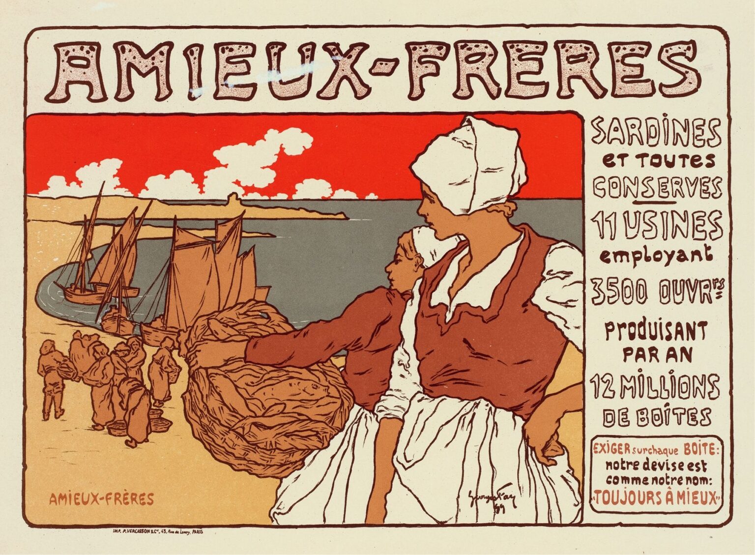
“Bières De La Meuse” (1899) is a quintessential Art Nouveau poster by Alphonse Mucha, created to advertise the famous Belgian brewery located on the Meuse River. The composition features two young women in traditional regional dress—white coifs, red bodices, and full skirts—engaged in the harvest of brewing ingredients. One figure carries a large wicker basket overflowing with barley or hops, while the other surveys the distant riverbank where sailboats and brewery buildings punctuate the horizon. Behind them, a vibrant red band of sky contrasts with the muted earth tones of their clothing and the cool gray of the water. To the right, block‐form lettering proclaims the brewery’s name and production statistics, integrated into the design as a decorative panel. Through elegant line work, harmonious color choices, and carefully balanced typography, Mucha transforms a simple commercial announcement into a celebration of regional identity, artisanal craftsmanship, and the decorative potential of graphic art.
Historical and Cultural Context
At the turn of the nineteenth century, industrial enterprises across Europe sought to refine their public image by commissioning celebrated artists to design advertising posters. The prosperous brewery on the banks of the Meuse River in Belgium aimed to emphasize both its large‐scale modern production and its roots in local tradition. In 1899, Alphonse Mucha had already earned acclaim for his Sarah Bernhardt posters and for elevating commercial art through the Art Nouveau style. His distinctive approach—combining sinuous lines, ornamental borders, and idealized figures—resonated with consumers eager for visual appeals that spoke to both quality and beauty. “Bières De La Meuse” thus reflects a moment when industrial brands harnessed fine‐art aesthetics to project authenticity, sophistication, and regional pride, appealing to an audience that valued both tradition and modernity.
Alphonse Mucha’s Career in 1899
By 1899, Mucha had become the preeminent poster artist of the Belle Époque. After his breakthrough with the “Gismonda” poster (1895), he produced dozens of high‐profile commissions for actors, jewelers, and commercial clients. His collaboration with publishers such as Champenois and Lemercier allowed him to exploit the full potential of multi‐stone lithography, experimenting with pastel palettes and metallic accents. Mucha’s work was characterized by graceful, elongated figures set against decorative frames of flowing line and stylized botanical motifs. In that same period, he also embarked on long‐term projects such as “The Slav Epic,” yet he continued to accept commercial commissions that would fund his grander ambitions. “Bières De La Meuse” stands at the intersection of these pursuits, demonstrating his ability to marry fine‐art sensibility with promotional clarity.
Composition and Spatial Organization
The poster’s layout is organized around the diagonal sweep of the two harvesters’ bodies. The lead figure, angled toward the viewer’s left, establishes a dynamic thrust that guides the eye from her heaped basket backward to the secondary figure and then onward to the distant riverbank. A horizontal band of vivid red sky intersects the scene at eye level, visually separating foreground activity from background scenery. The brewery’s sailboats and shoreline are rendered in simplified, silhouette‐like forms, anchoring the composition and reinforcing the connection between harvest and production. To the right, the informational panel—with its stacked lines of text—balances the pictorial weight of the figures, creating a tripartite structure: figures, imagery, and typography. This careful orchestration of forms ensures both aesthetic harmony and legibility from a distance.
Color Palette and Lithographic Technique
Mucha’s palette for “Bières De La Meuse” blends muted earth tones—warm ochres, terracotta reds, and soft creams—with cooler grays and greens for the water and distant land. The bold red sky is printed in a single, opaque layer that immediately captures attention and contrasts with the poster’s more nuanced hues. Mucha employed a multi‐stone lithographic process, with separate stones for each color, enabling subtle gradations in skin tones and fabric folds. The limited palette reinforces unity while highlighting key elements: the white of the coifs, the rich red of the bodices, and the golden bounty in the basket. The precision of the registration and the clarity of the line work reflect Mucha’s technical mastery, ensuring that ornamental details—such as the basket weave and the typography’s stippled texture—remain crisp and vibrant.
The Figures: Pose, Costume, and Expression
The two women personify both regional identity and the human labor behind industrial production. Their traditional dress—characterized by fitted bodices, gathered skirts, and head coverings—evokes rural Belgian customs, grounding the poster’s narrative in local culture. The lead figure’s pose, with one hand resting at her hip and the other gripping the basket, conveys both strength and poise. Her companion, slightly turned to the right, engages the viewer with a gaze that suggests quiet determination. Mucha’s rendering of facial features is idealized yet individualized: soft contours, high cheekbones, and serene expressions communicate dignity and pride in labor. The attention to costume details—ruffled sleeves, pleated fabric, and woven basket texture—underscores the link between artisanal provenance and the brewery’s modern enterprise.
Symbolism and Iconography
Beyond its literal depiction of harvesters, “Bières De La Meuse” employs symbolic elements to communicate brand values. The abundant basket represents the quality and purity of ingredients, while the presence of sailboats hints at trade and distribution, suggesting that the brewery’s products travel far beyond the riverbank. The red sky band, though decorative, may also allude to the warming hues of a sunset over the Meuse, evoking both poetic romance and the passage of time—from harvest to fermentation to enjoyment. The juxtaposition of manual labor with industrial might—figures at the forefront, factories in the distance—conveys a narrative of progress built upon tradition. Such iconography reassures consumers that modern production remains rooted in craft and community.
Decorative Motifs and Ornamental Border
While the poster omits Mucha’s more elaborate floral frames, it nonetheless integrates decorative touches that elevate the design. The edges of the informational panel feature a subtly stippled texture, echoing the granular look of grain or barley kernels. Curvilinear treatments appear in the figures’ hair and in the folds of fabric, hinting at Mucha’s signature sinuous line without overwhelming the composition. The absence of an explicit border allows the figures and the typography to coexist within a unified space, yet the poster retains a sense of containment through the coherent use of color blocks. This restrained ornamentation underscores the brewery’s emphasis on clarity and quality while still reflecting the aesthetic ideals of the Art Nouveau movement.
Integration of Text and Image
Mucha’s innovative approach to combining text and illustration is evident in the way the brewery’s name and production details occupy a dedicated panel that feels part of the overall picture. Large, hand‑lettered capitals spell out “BIÈRES DE LA MEUSE” at the top of the panel, their irregular outlines and stippled interiors giving a handcrafted impression. Below, smaller type communicates facts—number of barrels produced, workforce size, and years in operation—arranged in a clear vertical hierarchy. The neutral background of this panel contrasts with the pictorial section, ensuring readability without disrupting the visual flow. By designing bespoke lettering that complements rather than competes with the imagery, Mucha ensures that the promotional message is both prominent and aesthetically integrated.
Light, Shadow, and Textural Contrasts
Despite the inherently flat nature of lithography, Mucha creates depth through selective shading and texture. The folds in the women’s skirts are delineated by fine hatch lines and tonal washes that imply volume and movement. Subtle shadows beneath the basket and at the figures’ feet suggest grounding in space. The smooth, unmodulated expanses of sky and water provide a visual respite, allowing the viewer’s eye to rest before reengaging with the richly detailed foreground. The wicker basket’s intricate line work contrasts with the broad blocks of color in the landscape, emphasizing the tactile qualities of woven material. These light‑and‑dark juxtapositions enhance the sensory appeal of the scene and showcase Mucha’s skill at balancing detail with clarity.
Emotional Resonance and Audience Engagement
“Bières De La Meuse” captivates audiences by humanizing the industrial process. Rather than focusing solely on factory architecture or corporate branding, Mucha places the laborers at the heart of the narrative, forging an emotional connection between producers and consumers. Viewers are invited to appreciate the harvesters’ skill and to imagine the transformation of raw ingredients into a finished beer enjoyed in convivial settings. The poster’s warm earth tones and serene expressions evoke a sense of trustworthiness and regional pride, encouraging consumers to associate the brewery with authenticity and artisanal care. Mucha’s ability to infuse commercial art with narrative depth ensures that the poster resonates beyond its immediate advertising function.
Influence on Art Nouveau and Poster Art
Although less celebrated than his Sarah Bernhardt series, “Bières De La Meuse” exemplifies Mucha’s broader impact on the art of advertising. His fusion of elegant figures, custom typography, and harmonious color schemes inspired designers across Europe to treat promotional imagery as a legitimate art form. The poster’s balanced composition and integrated text–image relationship became a model for countless posters promoting products from tea to transportation. By demonstrating that industrial clients could benefit from refined aesthetic treatment, Mucha helped to establish graphic design as a key component of modern marketing. His legacy endures today in branding strategies that prioritize storytelling, visual cohesion, and an emotional bond with consumers.
Conservation and Modern Reception
Original lithographs of “Bières De La Meuse” are rare and highly sought by collectors of Belle Époque posters. The delicate paper, fragile inks, and exposure to light necessitate careful preservation—often involving UV‑filtered framing, controlled humidity, and minimal handling. Modern reproductions have made Mucha’s work more accessible, appearing in books, calendars, and digital archives. Art historians regard the poster as an illustrative case study of Art Nouveau’s ability to humanize industrial advances, while designers continue to draw inspiration from its seamless integration of commerce and decoration. Exhibitions of Mucha’s commercial work frequently include the “Bières De La Meuse” poster, highlighting its role in broadening the scope of fine art and raising public expectations for visual quality in everyday contexts.
Conclusion
“Bières De La Meuse” stands as a testament to Alphonse Mucha’s vision of commercial art as a vehicle for beauty, narrative, and regional identity. Through a masterful arrangement of figures, color, and typography, Mucha transforms a beer advertisement into a celebration of artisanal heritage and industrial progress. The poster’s humanistic portrayal of harvesters, its ornamental yet restrained details, and its innovative text–image integration exemplify the ideals of the Art Nouveau movement. Over a century later, “Bières De La Meuse” continues to enchant modern audiences and inform contemporary design practice, proving that the finest advertisements resonate not only with products but with the stories and traditions that underpin them.
