Image source: artvee.com
Overview of the Poster
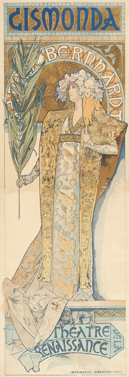
“Gismonda” (1895) stands as Alphonse Mucha’s breakthrough lithograph commissioned to promote Sarah Bernhardt’s Parisian stage production of Victorien Sardou’s play. The composition presents Bernhardt as Princess Gismonda, draped in a richly ornamented robe and crowned with a halo of flowers, her pose both statuesque and dynamic. Mucha frames her within a circular mosaic motif that blends Byzantine and medieval influences, while the title “GISMONDA” crowns the top in bold, geometric lettering. The overall effect is at once monumental and intimate: the viewer is drawn to the princess’s direct gaze and graceful gesture, while the intricate patterns and harmonious color scheme create a lush decorative environment. As a poster intended for public display, it transcended mere advertisement to become a defining image of the Art Nouveau movement, signaling a new era in graphic design where fine art and commercial art converge.
Historical and Cultural Context
Paris in the mid‑1890s was a crucible of artistic innovation, fueled by the Belle Époque’s spirit of optimism and fascination with history. Theatre and opera enjoyed immense popularity, and actresses like Sarah Bernhardt were celebrated as cultural icons. Victorien Sardou’s “Gismonda” premiered in January 1894, featuring Bernhardt in the title role of a Byzantine princess. Seeking to capitalize on her star power, the publisher Champenois commissioned Mucha to create a lithograph that would both advertise the play and elevate its aesthetic appeal. Mucha drew upon medieval and Eastern Christian art—mosaics, archways, and stylized flora—to evoke the opulence of Byzantium. Simultaneously, the emerging Art Nouveau style, with its emphasis on flowing lines and natural forms, permeates the work. “Gismonda” thus reflects a moment when historical nostalgia and modern decorative sensibilities intersected on the streets of Paris.
Alphonse Mucha’s Career and the Bernhardt Collaboration
By 1895, Alphonse Mucha was a relative newcomer in Paris’s art scene. A native of Moravia, he studied in Munich before arriving in the French capital to seek his fortune. His encounter with Sarah Bernhardt proved pivotal: when tasked at the last minute to design a poster for her play, he delivered “Gismonda,” which revealed his signature style of elongated figures, sinuous hair, and elaborate ornament. The lithograph’s immediate success—five thousand copies printed and plastered across Paris—cemented Mucha’s reputation. Over the next decade, he produced dozens of “Mucha girls” posters, book illustrations, and decorative panels, becoming the leading exponent of Art Nouveau. His collaboration with Bernhardt blended celebrity culture and graphic innovation, demonstrating how commercial commissions could yield works of enduring artistic value.
Iconography and Symbolism
Every element in “Gismonda” is charged with symbolic resonance. The palm frond held by the princess signifies victory and martyrdom, hinting at her moral fortitude. The floral crown—magnolias or lilies—evokes purity and renewal, aligning Gismonda with both nature’s bounty and spiritual grace. Her richly embroidered robe, patterned with stylized vines and blossoms, suggests fertility and the continuity of lineage. The circular mosaic behind her head functions like a halo, blending Christian iconography with Byzantine imperial imagery to present her as both saintly and sovereign. Even the color choices—golden ochres and pale blues—carry associations of wealth and tranquility. Mucha’s careful selection of these motifs transforms a theatrical advertisement into an allegory of feminine power and timeless beauty.
Composition and Design
Mucha’s compositional genius lies in his seamless integration of figure, ornament, and text. Gismonda’s vertical posture anchors the design, while her extended arm and palm frond introduce a diagonal that enlivens the scene. The circular mosaic, positioned behind her head and shoulders, balances her form and creates a focal point that draws the viewer’s eye upward to the play’s title. The framing rectangle is filled with repeating geometric patterns that echo the curves of her gown and the loops of her hair. Mucha employs flat but carefully modulated planes of color, avoiding deep perspective in favor of a shallow, decorative space. This approach ensures maximum visibility on the city’s walls, where posters competed for attention in crowded streets, while preserving the intricacy and harmony that reward close inspection.
Color Palette and Lithographic Technique
Mucha’s color scheme for “Gismonda” is refined and deliberate. He limits himself to a palette of warm ochres, muted turquoise, soft ivory, and accents of terracotta, creating a sense of cohesion and restrained luxury. The lithographic process involved multiple stones—one for each hue—painstakingly aligned to preserve the crisp interplay of line and color. The golden tones likely incorporate metallic or mica-based inks, giving the mosaic and embroidery a subtle shimmer under changing light. Mucha’s mastery of registration allows delicate linework—hair strands, floral patterns, and facial features—to retain their clarity against broad color fields. The result is both graphic boldness, essential for poster impact at a distance, and painterly subtlety, evident in the gentle transitions and textural details up close.
The Figure of Gismonda: Pose and Expression
Gismonda’s portrayal combines idealization with individual presence. Mucha elongates her form—slender neck, elegant posture, and flowing drapery—to create an almost otherworldly elegance. Yet her profile, with softly modeled features and a contemplative gaze, conveys introspection and resolve. The tilt of her head and the slight parting of her lips suggest a narrative moment, as though she is about to address her people or confront a crucial decision. Her hand, delicately grasping the palm frond, emphasizes both her agency and her connection to symbolic tradition. Mucha balances stylization with naturalism, using subtle shading on her cheek and throat to imply three-dimensionality, while preserving the graphic flatness that defines Art Nouveau poster art.
Ornamental Motifs and Decorative Frame
The border and background patterns in “Gismonda” draw inspiration from Byzantine mosaics, early Christian manuscripts, and medieval architecture. Interlocking tesserae shapes form the mosaic arch behind the figure, while the framing bands above and below feature repeating geometric motifs reminiscent of medieval floor tiles. Mucha’s decorative language also incorporates sinuous vegetal curls along the lower edge, foreshadowing his later botanical fantasies. These ornamental elements are not mere embellishment; they structure the composition, guiding the eye and reinforcing thematic connections—mosaic tesserae echo the circular halo, floral curls mirror the crown of blossoms. The seamless fusion of decoration and depiction exemplifies Mucha’s vision of “total art,” where every surface becomes an opportunity for artistic expression.
Integration of Text and Image
A hallmark of Mucha’s poster design is the bespoke typography he creates for each commission. In “Gismonda,” the title letters emerge from a tessellated field in bold, rounded forms that resonate with the curves of the figure and the mosaic. Rather than appearing as an afterthought, the lettering feels intrinsic to the decorative scheme, its negative spaces echoing motifs found in the border and gown. The interplay of color—deep cobalt for the letters against a warm ochre ground—ensures legibility from afar while harmonizing with the overall palette. This careful integration anticipates modern branding strategies, demonstrating how text can function as a visual element on par with imagery, conveying both information and aesthetic pleasure.
Light, Shadow, and Texture
Despite the flatness inherent in lithography, Mucha achieves a convincing sense of materiality. The folds of Gismonda’s robe display subtle gradations, suggesting the weight and sheen of velvet or brocade. Highlights on her brow and cheekbones imply a soft, natural light source, while shadowed areas beneath her chin and along the drapery lend volume to her form. The mosaic backdrop, in contrast, retains a uniform luminosity that underscores its decorative function. Mucha’s control over ink densities—varying from thin washes to opaque applications—creates tactile contrasts between metallic embroidery, matte background, and the porcelain smoothness of the skin. These textural distinctions enrich the viewer’s sensory experience and affirm the poster’s stature as both art and artifact.
Emotional Resonance and Audience Engagement
“Gismonda” captivated Parisian audiences not just as an advertisement but as an aesthetic revelation. Bernhardt’s portrayal of the princess, combined with Mucha’s fusion of historical romance and modern design, stirred the imagination of theatergoers and art lovers alike. The image conveyed an emotional narrative of nobility, sacrifice, and beauty, inviting onlookers to inhabit Gismonda’s inner world. Its public display transformed everyday streets into open galleries, democratizing access to art and stimulating a cultural dialogue about the role of beauty in urban life. The poster’s enduring appeal lies in its ability to evoke both historical drama and timeless elegance, forging a bond between consumer culture and artistic aspiration.
Influence and Legacy
As Mucha’s first major poster commission, “Gismonda” set a benchmark for Art Nouveau graphics. Its success led to a cascade of commercial and decorative projects—advertising posters, magazine covers, jewelry designs, and architectural details—spanning Europe and America. Designers adapted Mucha’s principles of integrated ornament, custom lettering, and harmonious color schemes to countless applications, from bookplates to furniture inlays. The notion that commercial illustration could achieve fine‑art status influenced the evolution of modern advertising, packaging, and brand identity. Today, “Gismonda” is celebrated in museums and private collections as a foundational work of graphic art. Its vibrant fusion of history, mythology, and modern design continues to inspire artists, typographers, and cultural historians, affirming Alphonse Mucha’s vision of art as a universal language.
Conclusion
“Gismonda” remains a masterpiece of late nineteenth‑century poster art, emblematic of both Sarah Bernhardt’s theatrical magnetism and Alphonse Mucha’s decorative genius. Its synthesis of historical iconography, custom typography, and lithographic virtuosity transformed a promotional image into a cultural touchstone. Over a century later, the princess’s noble bearing, her opulent attire, and the radiant mosaic that frames her continue to enchant new audiences. “Gismonda” not only launched Mucha’s career but also helped define Art Nouveau’s aesthetic ideals—celebrating beauty, craftsmanship, and the seamless integration of art into everyday life.
