Image source: artvee.com
Introduction
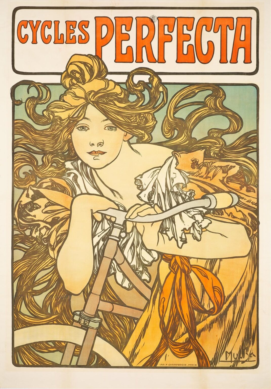
Alphonse Mucha’s 1897 poster Cycles Perfecta remains one of the most celebrated images of the Art Nouveau movement, encapsulating both the spirit of fin‑de‑siècle Paris and the dawn of modern commercial art. Commissioned to advertise the French bicycle manufacturer Perfecta, this lithograph transcends mere product promotion to become an icon of stylistic innovation. At its center stands an ethereal young woman, her fluid hair and drapery entwined with the handlebars of a bicycle, creating a dynamic interplay between organic form and mechanical precision. Through a masterful combination of sinuous line, a refined palette, ornamental typography, and symbolic resonance, Mucha elevates the humble bicycle into a symbol of freedom, progress, and aesthetic harmony. This comprehensive analysis will explore the historical context, composition, iconography, color theory, decorative motifs, typographic integration, technical lithographic process, and the enduring cultural impact of Cycles Perfecta.
Historical Context and the Bicycle Craze
By the late 1890s, the bicycle had emerged as both a practical mode of transportation and a cultural phenomenon. In France and across Europe, the “bicycle craze” democratized personal mobility, offering women and men unprecedented independence. Cycling clubs flourished, and races captured public imagination. Manufacturers vied for attention in a crowded market, commissioning posters to distinguish their brands. Against this backdrop, Perfecta sought an image that would associate its bicycles with modernity, elegance, and the forward‑looking ideals of the age. Mucha’s style—then at its zenith following his breakthrough with Sarah Bernhardt posters—proved the perfect vehicle for this marriage of commerce and high art.
Commission and Artist’s Evolution
Alphonse Mucha (1860–1939) had by 1897 become the poster artist of choice for major clients seeking a fresh visual language. His landmark 1895 Gismonda poster for Sarah Bernhardt inaugurated the “Mucha style”: flowing lines, idealized figures, rich ornamentation, and integrated typography. Over the next two years, Mucha honed this approach, producing lithographs for jewelry, soap, and theater. The Cycles Perfecta commission arrived at a moment when Mucha was exploring new compositional strategies—placing figures closer to the viewer, intertwining them with product imagery, and experimenting with more robust color contrasts. With Cycles Perfecta, he synthesized these developments into a cohesive statement that would reverberate throughout the design world.
Composition and Spatial Dynamics
At first glance, Cycles Perfecta presents a close‑up of the female rider, her bodice‑less figure dominating the frame. Mucha crops the scene tightly: the woman’s head nearly touches the top border, while her arms and the bicycle’s handlebars bisect the composition diagonally. This dynamic cropping creates immediacy and immersion, inviting the viewer into the scene. The diagonal line of the handlebars and the curve of the bicycle wheel at lower left inject energetic movement, echoing the sensation of forward motion. Background elements—a misty green gradient—recede in flat planes, allowing the central figure to stand out without distraction. Mucha thus balances depth and flatness, realism and decoration, forging an engaging visual rhythm.
Iconography and Symbolism
The poster’s central motif—a woman astride a bicycle—speaks to themes of liberation and modernity. Feminist scholars note that cycling offered women newfound autonomy; Mucha’s depiction of a free‑spirited “angel of the road” aligns Perfecta with progressive social change. Her windswept hair and loose drapery suggest natural forces, echoing the rhythmic spokes of the bicycle wheel. The bicycle itself, visible in stylized form, becomes a totem of technological advancement. Mucha’s figure embodies both classical idealism—recalling Nike or a Greek nymph—and contemporary vogue, her sensuous curves framed by mechanical precision. This duality underscores the poster’s power to blend mythic resonance with commercial appeal.
Color Palette and Visual Harmony
Mucha’s color choices in Cycles Perfecta are both bold and refined. The dominant hues—burnt orange, muted sage green, warm tan, and pale ivory—create a warm, inviting atmosphere. The vibrant orange of the title lettering at the top anchors the eye, while echoing accents in the rider’s sash and bicycle details unify the composition. Mucha’s layering of flat, uniform color fields with delicate gradient shading lends the image both graphic strength and luminous depth. The pastel green background provides a cool counterpoint to the warm foreground, setting the figure in a softly glowing environment. Through judicious contrast and harmonious transitions, Mucha ensures that no single element overwhelms, achieving a coherent visual symphony.
Ornamental Line Work and Decorative Motifs
True to his style, Mucha employs fluid, undulating lines to render hair, drapery, and decorative borders. The rider’s hair flows outward in curling tendrils, each strand drawn with deliberate, rhythmic strokes. This curling hair motif recurs in the stylized floral border at the poster’s edges, creating visual continuity between figure and frame. The fringe of the rider’s garment—suggestive of fluttering flags or stylized petals—blurs the boundary between natural and fabricated decoration. These ornamental lines do more than embellish; they generate energy and guide the eye across the surface. Mucha’s line work thus transforms flat color into a dynamic interplay of movement and form.
Typography and Brand Integration
The bold, custom lettering of CYCLES PERFECTA crowns the composition. The word “Perfecta” dominates, its letters rendered in a thick, slab‑serif style with interior white highlights. Mucha integrates this typography seamlessly: the letters share the same burnt‑orange hue as accents in the central image, reinforcing the viewer’s brand recognition. The white interior is echoed in the rider’s drapery and skin tones, binding type and image in chromatic kinship. A simple black outline contains both the title block and the lower image panel, providing structure while allowing for ornamental deviations at the corners. Mucha’s typographic strategy—merging brand identity with decorative flourish—laid groundwork for modern advertising design.
Technical Mastery: The Lithographic Process
Cycles Perfecta was produced by color lithography, the dominant poster‑printing technique of the time. Mucha prepared multiple limestone plates, each inked with a different color. His hand‑drawn chromium and tusche renderings were transferred directly onto the stones, preserving the subtlety of his line and the richness of his palette. The printers then took care to register each plate precisely, ensuring that lines and colors aligned perfectly. Original prints exhibit slight variations in ink density and texture—signs of the handcrafted process that collectors prize today. The crispness of the outlines combined with softly graded hues exemplifies the lithographic medium’s capabilities and Mucha’s command of its possibilities.
Gender, Modernity, and Reception
Upon its release, Cycles Perfecta captivated audiences with its daring portrayal of a semi‑nude female figure in an advertising context. Critics lauded Mucha’s decorative genius, while some conservative voices decried the image’s risqué sensuality. Yet the public’s appetite for visual novelty and the allure of modern emancipation far outweighed traditional prudery. Cycling clubs, cafés, and shop windows displayed the poster widely, associating Perfecta bicycles with style, progress, and the modern woman’s independence. As a commercial success, it boosted Perfecta’s visibility; as a work of art, it cemented Mucha’s reputation and shaped the visual language of graphic advertising for decades.
Legacy and Influence
More than a century after its creation, Cycles Perfecta endures as a touchstone of Art Nouveau. Its fusion of commerce and artistry influenced poster designers across Europe and North America, giving rise to similar campaigns for automobiles, tobacco, and consumer goods. In the mid‑20th century, the poster saw revivals among art collectors and designers seeking inspiration from pre‑modernist decorative traditions. Today, Mucha’s swirling lines and integrated typography inform everything from fashion branding to digital typography. Cycles Perfecta also serves as a cultural artifact, reminding us of the bicycle’s role in social transformation and the power of visual art to shape public ideals.
Conclusion
Alphonse Mucha’s Cycles Perfecta represents the zenith of Art Nouveau commercial art, a poster that simultaneously advertises a product and soars as a standalone artwork. Through dynamic composition, harmonious palette, ornamental line, and symbolic depth, Mucha transforms a simple bicycle ad into an icon of modernity and aesthetic innovation. The poster’s success lay in its ability to fuse mythic female imagery with the mechanical promise of new technology, capturing the optimistic spirit of the age. More than a century later, Cycles Perfecta continues to dazzle viewers with its blend of beauty and design prowess, affirming Mucha’s enduring legacy at the intersection of art and commerce.
