Image source: artvee.com
Introduction
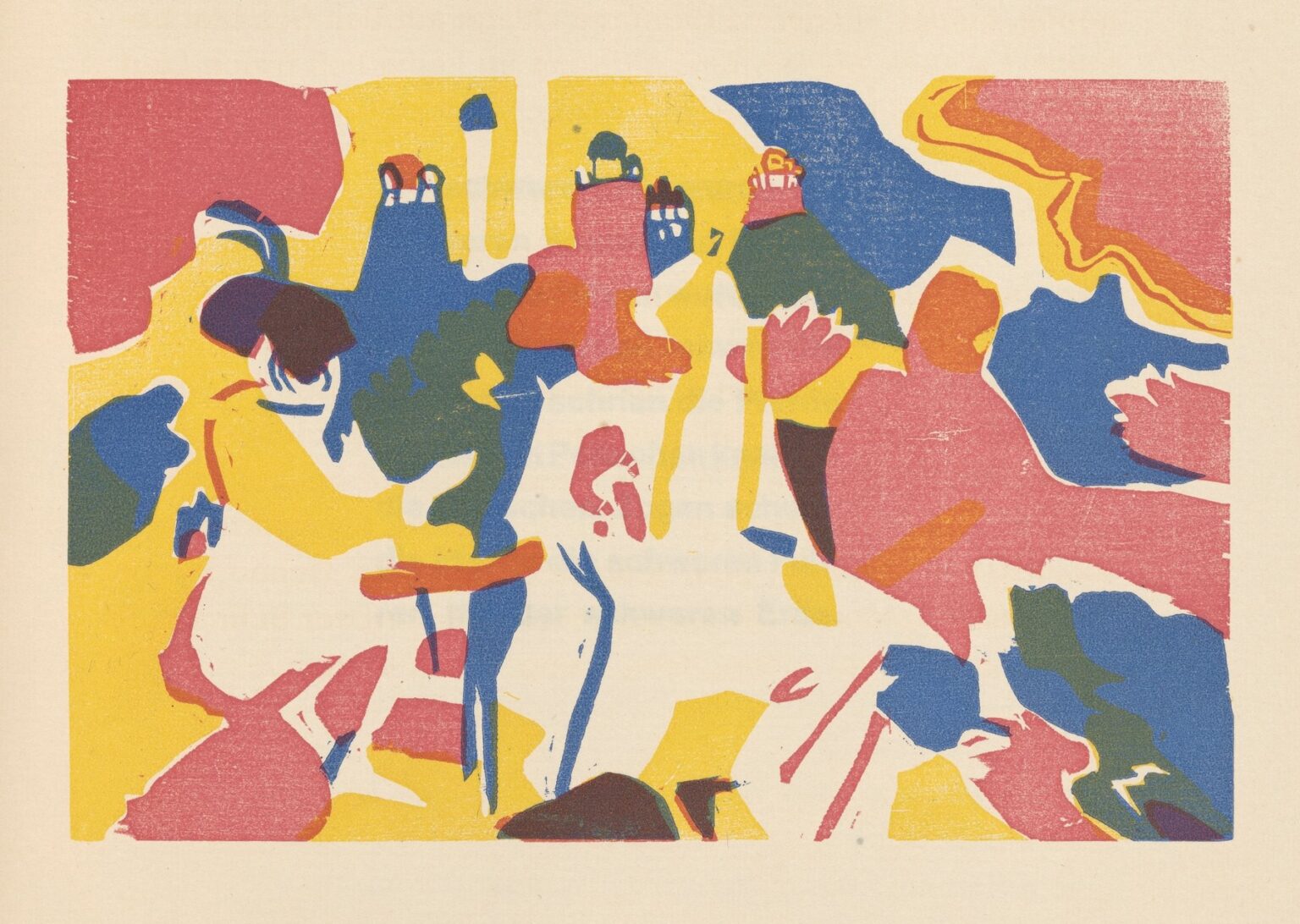
Wassily Kandinsky’s Klänge Pl. 19 (1913) stands at the confluence of sonic metaphor and graphic innovation, embodying the artist’s vision of visual art as a form of silent music. This woodcut print, number nineteen in the Klänge (“Sounds”) portfolio, unfolds as a vibrant tapestry of abstract shapes and colors, each element orchestrated to evoke rhythm, harmony, and emotional resonance. Far from mimicking any object in the visible world, the composition invites viewers to listen with their eyes, to sense the cadence of interlocking forms, and to experience the spiritual undercurrents that permeate its surface. Through a masterful interplay of warm crimson, golden yellow, cool blue, and verdant green, Kandinsky transforms the static medium of woodcut into a dynamic performance, demonstrating his belief that color, line, and shape can transcend literal meaning to stir the soul.
Historical and Artistic Context
By the early 1910s, Kandinsky had emerged as a leading figure in the avant‑garde, having co‑founded the Der Blaue Reiter group in Munich in 1911. His theoretical writings, most notably On the Spiritual in Art (1912), argued that art should aim for inner necessity rather than external depiction. Kandinsky saw color as inherently expressive and form as capable of conveying pure emotion. In parallel with his vibrant oil paintings, he embarked on the Klänge series of woodcuts to explore abstraction in a reproducible graphic medium. Executed between 1911 and 1913, these prints allowed Kandinsky to dissect the essence of his visual music: to reduce compositions to lines, shapes, and rhythmic patterns without the guiding hand of representational subject matter. Plate 19, created at the series’ apogee, encapsulates both the cultural ferment of pre‑war Europe and Kandinsky’s personal quest to fuse art, music, and spirituality.
Formal Composition and Color Dynamics
At first glance, Klänge Pl. 19 presents an exuberant field of interwoven color planes. Against a pale paper ground, bold areas of crimson sweep across the left margin, while golden yellow fills much of the lower and central zones with luminous warmth. Pockets of deep blue emerge near the top and right edges, introducing cooler counterpoints, and flashes of green punctuate the center with vitality. These primary color blocks interlock yet never fully merge, their boundaries defined by narrow strips of uninked paper that act as visual rests. Within and between these fields, Kandinsky integrates black relief accents—small squares, slanted lines, and organic curves—that ground the otherwise buoyant color masses. The overall effect is that of a multi‑instrument ensemble: each color functions as a separate voice, and the black elements serve as rhythmic percussion, punctuating the flow with staccato energy.
Rhythmic Interplay and Musical Analogy
Much like a musical composition, Klänge Pl. 19 unfolds through patterns of repetition, variation, and contrast. The swaths of yellow operate as a sustained pedal point, akin to a cello’s low register, while the crimson shapes leap and bound like a spirited horn line. The blue accents provide melodic pivot points, guiding the eye through the composition’s spatial progression. The black markings—some clustered like drum rolls, others scattered like pizzicato plucks—inject rhythmic vitality, preventing any section from feeling statically inert. As in a fugue, motifs recur in transformed guises: a triangular crimson form reappears in yellow, a looping blue curve echoes a green flash, and the spaces between shapes act as intentional silences that heighten anticipation. Kandinsky’s early exposure to music—he had studied piano and violin in his youth—infuses every cut with an acute sense of tempo, pacing, and tonal interplay.
Spatial Dynamics and Depth Without Perspective
In Klänge Pl. 19, spatial depth is achieved without resorting to traditional perspective. Instead, Kandinsky layers color and form to create shifting visual planes. Large color fields appear to press forward, while smaller shapes recede or hover at the surface. The black reliefs punctuate these layers, sometimes nesting within the color masses, sometimes floating atop them. The viewer’s eye navigates through overlapping zones: drifting from the bold crimson on the left into the golden heart of the print, then hinged upward by a blue cap, before swept back down by a green flourish. This non‑linear spatial arrangement mirrors the flow of listening to a multi‑voiced ensemble: sound sources overlap, migrate, and interweave, creating an immersive auditory environment. Kandinsky translated this experience into the visual realm, crafting a dynamic landscape of color and shape that feels alive and multi‑dimensional.
Technical Mastery of Multi‑Color Woodcut
Achieving such chromatic complexity in a relief print required Kandinsky to employ multiple blocks or a reduction carving technique, each block inked with a different color and printed in successive passes. Precise registration was crucial: any misalignment would blur boundaries and disrupt the intended interplay of shapes. Yet in Klänge Pl. 19, the colors align with remarkable crispness, and occasional overlaps produce subtle modulations in hue where inks converge. The wood’s grain and the pressure of the press impart a gentle texture to the color surfaces, preventing them from appearing overly flat. These technical choices underscore Kandinsky’s willingness to leverage the woodcut medium’s constraints—its calligraphic edges, its reliance on positive and negative relief—to achieve a painterly vibrancy and textural nuance that rivaled his canvases.
Symbolic Resonance and Spiritual Undertones
Although wholly abstract, Klänge Pl. 19 pulsates with symbolic resonance. Kandinsky’s engagement with Theosophical ideas led him to regard geometric shapes and colors as carriers of universal energy. In this plate, the red zones might signify warm, life‑affirming forces; the yellow expanses could evoke intellectual illumination or spiritual uplift; the blue pockets suggest introspection or the vastness of the soul; and the green flashes hint at renewal and growth. The black rhythmic accents function as the grounding principle, akin to an anchor or the earth itself. Together, these elements form a spiritual ecosystem, a visual hymn that speaks to the viewer’s inner landscape. Kandinsky intended such abstract symphonies to evoke personal, even mystical, experiences—moments when art transcends mere aesthetic appreciation to become a vehicle for inner transformation.
Emotional Impact and Viewer Engagement
Encountering Klänge Pl. 19 triggers an immediate emotional response. The warmth of the yellow and red fields can inspire feelings of joy and energy, while the coolness of the blues and greens offers counterbalancing calm. The interplay of rhythmic black marks adds a sense of excitement, like a musical overture that sweeps the listener along. Because the work abstains from figurative cues, each viewer projects their own memories, moods, and associations onto the composition. One might recall sunlit meadows, thunderous orchestral climaxes, or the quiet pulse of dawn. This open-ended engagement was precisely Kandinsky’s aim: abstraction as an invitation to personal resonance, a mirror for individual emotional landscapes.
Relationship to Kandinsky’s Oeuvre
Within Kandinsky’s broader corpus, Klänge Pl. 19 occupies a bridge between his early painterly improvisations and the more geometric abstractions of his later Bauhaus period. While his canvases from 1913—such as Composition VII—explored explosive color juxtapositions and fluid brushwork, the Klänge prints demanded distilled forms and a disciplined chromatic palette. Plate 19, with its harmonious color symphony, foreshadows Kandinsky’s post‑World War I experiments in color theory at the Bauhaus, where he taught from 1922 to 1933. Yet it retains the improvisational spirit of his prewar abstractions, capturing a moment when the boundaries between painting, printmaking, and music blurred in the service of spiritual expression.
Legacy and Influence
The Klänge series, and Pl. 19 in particular, left an enduring imprint on graphic design, printmaking, and the trajectory of abstract art. By demonstrating how multi‑color relief prints could carry the same expressive weight as oil paintings, Kandinsky inspired subsequent generations of printmakers to explore the medium’s possibilities. Mid‑20th‑century movements such as Abstract Expressionism and post‑war graphic design drew from his integration of color, form, and rhythm. Today, designers continue to reference the vibrant palettes and dynamic compositions of Klänge Pl. 19 in posters, album covers, and digital artworks. The print’s combination of technical daring and spiritual depth ensures its relevance in contemporary dialogues about art, perception, and the intersections between sensory domains.
Conclusion
Wassily Kandinsky’s Klänge Pl. 19 (1913) remains a landmark in the history of abstraction and printmaking, a work that transcends literal representation to become a visual symphony of color, shape, and rhythm. Through its masterful orchestration of chromatic planes and rhythmic black relief, the print invites viewers to engage with art as an act of listening, to perceive the silent cadences of form as one would musical notes. Emerging at the apex of Kandinsky’s pre‑war experiments, Plate 19 exemplifies his belief in the spiritual power of abstraction, offering a timeless reminder that art can resonate with the deepest chords of the human soul.
