Image source: artvee.com
Introduction
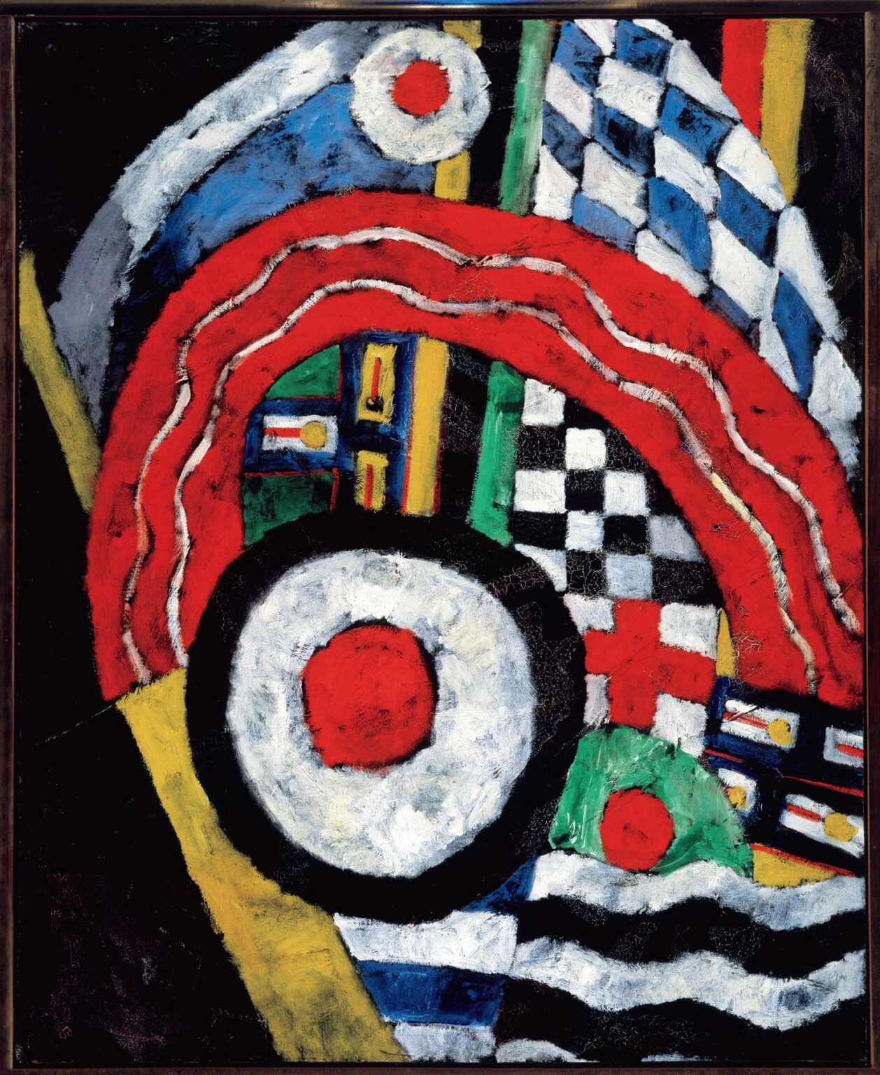
Marsden Hartley’s “Painting No. 46” (1915) erupts with martial color, fractured heraldry, and the insistent pulse of abstraction, crystallizing the moment when the American painter transformed European avant‑garde vocabularies into a fiercely personal language. Executed in Berlin at the height of World War I, the canvas compresses banners, target emblems, checkerboards, wavy stripes, and chromatic bars into a dense, almost percussive field. Rather than narrate events, Hartley orchestrates symbols—some legible, others private—into an image that feels simultaneously ceremonial and mournful, ecstatic and disciplined. The work belongs to his celebrated “German Officer” period, yet it renounces figuration in favor of a flaglike tapestry of signs, making it a hinge between emblematic portraiture and pure abstraction.
Berlin, War, and the Birth of a Personal Iconography
Hartley arrived in Berlin in 1913 and immediately fell under the spell of the city’s military pageantry: parades thundering through streets, uniforms glittering with braid and medals, regimental standards flapping like living paintings. These spectacles coincided with his friendships—most poignantly with a young Prussian officer, Karl von Freyburg—whose death in 1914 seared Hartley’s psyche. “Painting No. 46” emerges from this charged atmosphere. Its stacked symbols echo parade formations and memorial displays, but Hartley strips away literal bodies. In their place, he assembles a visual requiem, an abstraction whose elements evoke the world of the barracks and the battlefield without depicting either. Berlin’s Expressionist circles encouraged such distillation: Wassily Kandinsky’s call for spiritual abstraction and Franz Marc’s symbolic color theories gave Hartley permission to encode grief and admiration in geometry and pigment.
The Compositional Engine: Arcs, Targets, and Checkered Fields
The painting’s engine is an immense concentric target near the lower center: a red core ringed by white and charred black. This bullseye anchors the surrounding swirl of forms like a drumbeat that others answer. Above it, a thick, serpentine red band curves in an inverted arch, slicing through a field of blue and white diamonds that recall Bavarian regiment flags. To the right, a black and white checkerboard tumbles into a crimson cross, while vertical bars—yellow, green, blue—rise like standards in a crowded barracks. At the bottom and right edge, wavy black and white bands suggest rippling water or stylized smoke, introducing a sense of motion and instability. Hartley welds all of these zones into a single structure by overlapping edges, repeating colors, and locking shapes together with black contours, so that the eye never rests but ricochets across the canvas, tracing a choreography of visual commands.
Color as Heraldry, Heat, and Lament
Red, white, blue, black, green, and yellow dominate, echoed in military insignia yet deployed with painterly freedom. Red blazes as wound, banner, and heartbeat; white serves as snow, bone, and blinding light; black grounds and mourns; blue cools and deepens, carrying the nocturnal gravity of Berlin’s winter skies; green arrives in smaller doses, a stabilizing counterpoint that hints at uniforms or earth. Hartley’s palette is not merely descriptive. Each hue conducts emotional voltage. The alternation of red and white in the central target suggests impact and rupture, while the red cross to the right conjures medical insignia and sacrifice. The blue‑white diamond grid, borrowed from Bavarian heraldry, flashes like icy fanfare. Color, in “Painting No. 46,” is both symbolic and structural—binding the composition and amplifying its psychological pitch.
The Authority of Line and the Weight of Impasto
Hartley outlines most shapes with assertive black or deep blue lines, turning them into emblems that feel cut from cloth or enamel. These contours are no mere aids to legibility; they confer solemnity, like the edging on a flag or the frame of a reliquary. Within these boundaries, Hartley lays paint thickly, scumbling and scraping to build a relief surface that catches light. The white passages, especially, churn with impasto, evoking chalky plaster, snowdrifts, or smoke puffs. Cracks visible in some zones speak to the physical strain of the medium, further underscoring the painting’s role as an object of labor and intensity. This tactile drama keeps the abstraction from drifting into design; it insists on the painting’s embodiment, its material presence as a crafted memorial.
Symbolic Syntax: From Regiment Flags to Private Codes
Although Hartley avoided explicit explanations, scholars have decoded many motifs. The checkerboard recalls cavalry blankets; the diamond grid mirrors Bavarian colors connected to von Freyburg’s unit; the target echoes artillery insignia and the mortal wound; the red cross suggests both medical aid and Christian martyr symbolism. Yet “Painting No. 46” is not a scrapbook of references. It is a syntax. Hartley repeats circles, grids, and stripes throughout the “German Officer” series, letting them accrue meaning through variation. The circle, in particular, operates as eye, medal, and sun, depending on context. In this canvas, its central placement infers a heart or altar host. The wavy stripes at the bottom imply water or smoke, perhaps alluding to the murky fog of war or the Rhine’s flow. By layering public symbols with private grief, Hartley creates a palimpsest that viewers can read at multiple registers—military, spiritual, emotional—without exhausting its resonance.
Rhythm, Music, and the Visual March
Hartley frequently analogized painting to music, and the metrical rhythm of “Painting No. 46” affirms this ambition. The repetition of black‑white units, the alternating bars of color, and the circling reds function like beats and measures. The eye marches in time: left to right, up and down, around and back to the target’s pulse. Crescendos occur where red arcs swell; diminuendos in the softer blue‑white diagonals. The composition’s internal syncopation keeps it from becoming static. Just as a march can be both triumphant and somber, this painting balances exultant color with grief‑laden black. Hartley’s rhythm thus embodies the paradox of war ritual—pomp overlaying loss—transforming geometric repetition into a visual threnody.
Between Abstraction and Portraiture: The Invisible Officer
While devoid of a corporeal figure, “Painting No. 46” still acts as a portrait by proxy. In other canvases of the period, Hartley embedded initials, dates, and insignia directly tied to von Freyburg. Here he abstracts the soldier into a constellation of signs. The large central circle can be read as a chest medallion; the red cross as a wound; the vertical bars as epaulettes; the surrounding flags as a guard of honor. By refusing a face, Hartley universalizes personal mourning, converting a specific life into archetypal sacrifice. The painting becomes a cenotaph in pigment, demonstrating how abstraction can hold portraiture’s emotional charge without recourse to likeness.
Dialogue with European Avant‑Garde and American Identity
“Painting No. 46” synthesizes influences from Cubism, Futurism, and Expressionism while resisting subsumption by any single movement. The fractured plane logic and overlapping motifs nod to Cubism, yet the dynamic curve and emphatic color owe more to Futurist energy and German Expressionist fervor. Hartley’s distinctiveness lies in his symbolic insistence: unlike many European abstractionists who pursued pure form, he insisted that form carry lived meaning. This insistence seeds a uniquely American modernism—rooted in personal myth, emotional candor, and iconographic invention—that later artists like Arthur Dove, Georgia O’Keeffe, and even the Abstract Expressionists would cultivate. “Painting No. 46,” therefore, is not an expatriate imitation but an exportable prototype of American abstraction forged overseas.
Surface, Scale, and the Intimacy of Looking
Despite its boldness, the painting’s scale invites close viewing. The craggy impasto, the hairline cracks, the subtle modulations inside ostensibly flat zones all reward proximity. This intimacy counters the grandiloquence of the subject matter. Viewers do not stand dwarfed by a mural; they lean in, almost like mourners approaching a memorial plaque. The tension between monumentality of motif and modesty of scale intensifies the emotional experience. It also reflects Hartley’s situation: a foreigner alone in Berlin, absorbing massive public spectacles yet processing them in the confines of a studio. The painting thus records both scale extremes—the panoramic parade and the solitary hand—within a single frame.
Legacy, Reception, and Continuing Resonance
When Hartley returned to the United States in 1915–16, works like “Painting No. 46” perplexed American audiences accustomed to narrative clarity. Critics alternately praised the color and decried the opacity. Over time, however, the “German Officer” abstractions have become cornerstones of early American modernism. They demonstrated that abstraction could be more than formalist exercise—it could be icon, elegy, and diary. Contemporary artists who merge personal history with abstract language—think of Jasper Johns’s targets or Glenn Ligon’s text fields—owe a debt to Hartley’s pioneering synthesis. Museums today display “Painting No. 46” not merely as a historical curiosity but as a living challenge: how can abstraction still carry the full burden of feeling? Hartley’s answer remains potent, a century on.
Conclusion
“Painting No. 46” is a battle hymn without soldiers, a memorial without a name, an abstraction that throbs with the cadence of drums and the ache of loss. Hartley binds together flags, targets, checks, and waves into a compact choreography where every color sings and every line fortifies. Created in the crucible of wartime Berlin, the canvas distills spectacle and sorrow into a symbolic architecture that is at once deeply personal and insistently universal. In doing so, Hartley forged a path for American abstraction that never abandoned the human heart. The painting endures as a testament to the power of form to hold memory, to the capacity of color to mourn and celebrate, and to the courage of an artist who dared to make grief radiant.
