Image source: artvee.com
Introduction
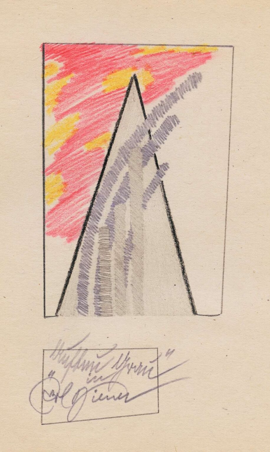
Karl Wiener’s 1923 drawing Structure in Gray offers a striking exploration of form, tonal variation, and compositional balance rendered in a monochromatic palette. At first glance, the piece appears deceptively simple: a large, sharply defined isosceles triangle rises from a rectangular frame, bisected by an irregular wash of gray shading, while a vibrant, textured field of red and yellow flickers behind its left flank. Yet this apparent austerity masks a richly layered inquiry into space, tension, and the interplay between geometry and gesture. Rather than presenting a literal scene or narrative, Wiener invites viewers to consider the very building blocks of pictorial construction—line, plane, and tone—arranged in dynamic equilibrium. In the sections that follow, we will examine the historical forces that shaped Wiener’s artistic trajectory, unpack the formal strategies that animate Structure in Gray, and contemplate its enduring resonance as a testament to modernist abstraction.
Historical Context
The year 1923 found Europe still grappling with the aftermath of World War I and the social, political, and cultural upheavals that followed. Vienna, Karl Wiener’s primary milieu, had transformed from the imperial capital of the Habsburg dynasty into the struggling center of a nascent republic. Artists and intellectuals sought new means of expression that could respond to this fractured reality. The city’s avant‑garde circles engaged with the Bauhaus ethos emerging in Germany, the De Stijl movement in the Netherlands, and the radical utopian visions of Russian Constructivism. Amid these fermenting dialogues, abstraction emerged as a powerful response to the dislocations of modern life, promising a universal language of form and color. Wiener’s decision to deploy a largely gray palette in Structure in Gray reflects both the austerity of the postwar climate and the modernist fascination with reduced means—an artistic ethos that prioritized fundamental formal relationships over decorative detail.
Artistic Influences
Although Karl Wiener’s name does not command the same recognition as some of his contemporaries, his work reveals clear affinities with major currents of early twentieth‑century abstraction. The geometric clarity of the triangular form aligns with the Neoplastic principles advocated by Piet Mondrian, in which verticals and horizontals—or, in this case, a diagonal triangle—establish visual harmony. Similarly, the vestigial red and yellow area behind the triangle recalls Kazimir Malevich’s Suprematist compositions, where bold color patches float against neutral grounds. The subtle wash of gray that bisects the triangle suggests a link to the tonal gradations explored by the Synchromists, who sought to treat color in a manner analogous to musical intervals. Furthermore, Wiener’s sparse yet expressive use of line bears traces of German Expressionist printmaking, in which artists like Erich Heckel and Emil Nolde combined minimal shapes with raw, gestural energy. In Structure in Gray, Wiener distills these diverse influences into a personal idiom that privileges the dynamics of tonal contrast and edge tension.
Composition and Spatial Arrangement
At the heart of Structure in Gray is the monumental triangle, its base aligned flush with the lower boundary of the rectangular frame and its apex nearly touching the upper edge. This bold geometric anchor divides the composition into two primary zones: left and right. On the left, the triangle’s edge meets an irregular field of red and yellow pencil strokes that extend beyond the triangle’s limits, suggesting an energetic field of light or atmospheric disturbance. On the right, the paper remains largely untouched, save for the pale gray wash that overlaps the triangle’s surface. This asymmetry—vibrant chromatic activity on one side and calming emptiness on the other—creates a dynamic equilibrium, prompting the viewer’s eye to oscillate between presence and absence. The gray wash that spills beyond the triangle’s strict boundaries further complicates spatial reading: it softens the edge, implying movement or dissolution where strict geometry would otherwise reign. By orchestrating these varied spatial cues, Wiener transforms a simple shape into a site of tension and interplay.
Tonal Variation and Texture
Although Structure in Gray relies on a restricted palette—primarily black pencil lines and gray wash—the piece achieves remarkable subtlety through its nuanced handling of tone and texture. The gray area within the triangle is not uniform; instead, it reveals gradations from pale translucent strokes near the apex to denser, almost opaque passages at the base. This variation suggests a three‑dimensional volume, as if the triangle were a solid form illuminated unevenly by an unseen light source. The handling of the red and yellow field departs from geometric precision: pencil strokes overlap and vary in pressure, creating a lively, speckled texture that contrasts with the smooth, disciplined shading of the gray wash. The paper’s natural tooth shows through in places, lending the composition material presence and grounding its abstract gestures in tactile reality. Through these tonal and textural strategies, Wiener achieves a rich interplay of surface qualities that belie the work’s minimal means.
Line and Edge Dynamics
In Structure in Gray, the artist’s lines perform multiple roles: they define shape, suggest movement, and articulate tension. The triangle’s edges are rendered with firm, unbroken strokes, establishing a visual boundary that commands attention. Yet these edges are not railroad‑straight; subtle variances in pressure give them a slightly human inflection, reminding viewers that the drawing is an act of hand. The horizontal and vertical outlines of the enclosing frame are lighter, more tentative—a deliberate choice that places emphasis on the triangle itself. Inside the gray wash, faint, residual pencil lines indicate the area once contained more precise geometry, hinting at the artist’s working process and the tension between careful planning and spontaneous gesture. The red and yellow strokes, in contrast, are applied quickly, with overt pencil rasp, imparting a sense of improvisation. Together, these contrasting line qualities—disciplined, hesitant, and energetic—generate a rhythm that animates the static composition.
Color as Conceptual Counterpoint
Although the title emphasizes “gray,” the small yet significant field of red and yellow serves as a vital conceptual counterpoint. Set against the neutral triangle, the warm hues evoke ideas of energy, passion, or even danger—qualities that stand in stark relief to the reserved, contemplative mood of the gray form. The color field does not sit neatly behind the triangle; it overlaps at points, bleeding through the edge, as though the energies behind the form cannot be fully contained. This interplay suggests that beneath even the most controlled structures lie unpredictable forces. By deliberately limiting chromatic intervention to one side of the composition, Wiener underscores the potency of negative space: the uncolored right side becomes a field of potential, awaiting activation. In this way, color functions not merely as decorative element but as a conceptual catalyst, prompting the viewer to consider the interplay between restraint and abandon, form and flux.
Symbolism and Interpretive Possibilities
While Structure in Gray resists overt narrative, its elemental forms invite myriad symbolic readings. The central triangle, with its sense of solidity and ascent, can be interpreted as an archetype of stability, aspiration, or spiritual elevation. The gray wash that penetrates this form suggests the inevitability of change, erosion, or internal uncertainty. The red and yellow flares may symbolize vitality emerging from constraint, or conversely, an eruptive impulse threatening to fracture order. The stark right-hand emptiness might represent calm introspection or, alternatively, a void—a space left for new possibilities. By refraining from prescribing a single meaning, Wiener leaves the work open to individual projection, enabling viewers to find personal resonance in its formal dialectic of presence and absence.
Technique and Material Considerations
Selecting pencil and wash on paper, Wiener embraces a medium that balances immediacy with subtlety. The pencil lines—both dense and tentative—record the artist’s hand movements directly, creating a visible archive of decisions and revisions. The gray wash, likely applied with diluted gouache or ink, demands careful control to achieve smooth gradations without blotches. Wiener’s mastery is evident in the wash’s uniform translucence and the seamless integration of shaded and unshaded areas. The choice of paper—a warm‑toned, lightly textured stock—contributes harmoniously to the piece’s overall mood. Its slight surface irregularities lend the drops of wash and clusters of pencil strokes a tactile appeal, reinforcing the tension between abstract geometry and material contingency. By combining drawing and wash, Wiener demonstrates an integrated technique that elevates a simple composition into a study of process and surface.
Emotional Resonance
Despite its rigorous formal structure, Structure in Gray evokes an emotional undercurrent through its contrasts and tensions. Viewers may feel a sense of calm order from the dominant triangle, tempered by a subtle unease introduced by the gray wash’s irregular edges and the vibrant color intrusion. The artwork’s silence—its absence of narrative detail—encourages introspection. One’s gaze moves from the ordered geometry to the expressive color flare, then to the untouched expanse, tracing a path of emotional fluctuation that mirrors human experience: certainty disrupted by surprise, stillness pierced by activity, clarity blurred by ambiguity. In this way, Wiener’s abstraction becomes a mirror to psychological states, suggesting that formal relationships on paper can resonate deeply with viewers’ inner landscapes.
Legacy and Impact
Although Karl Wiener remains underrecognized compared to some avant‑garde peers, Structure in Gray occupies an essential place in the annals of interwar abstraction. The drawing anticipates later minimalist inquiries into the power of reduction, where artists such as Agnes Martin and Ellsworth Kelly would further explore the transformative potential of singular forms on neutral grounds. Wiener’s nuanced handling of tone and texture also foreshadows mid‑century experiments in monochrome painting, where subtle variations within a single hue became sites of intense visual study. In recent years, curators and scholars have begun reassessing peripheral figures of early modernism, and Wiener’s work has emerged as a compelling example of how drawing and wash could serve as fully realized vehicles for abstraction. Structure in Gray thus illuminates an important strand of twentieth‑century art: the search for depth and drama within seemingly austere means.
Conclusion
In Structure in Gray, Karl Wiener demonstrates that abstraction need not dazzle with a kaleidoscope of colors or complex figuration; instead, through judicious control of form, tone, and gesture, a single triangle and a minimal field of color can yield profound visual and emotional impact. The drawing’s disciplined geometry, nuanced tonal modulation, and dynamic edge relationships invite sustained contemplation, transforming a modest composition into a luminous meditation on balance, tension, and the possibilities inherent in restrained means. Nearly a century after its creation, Structure in Gray continues to engage viewers with its subtle power and refined austerity, reaffirming the enduring potency of modernist abstraction to convey both formal innovation and resonant human feeling.
