Image source: artvee.com
Introduction
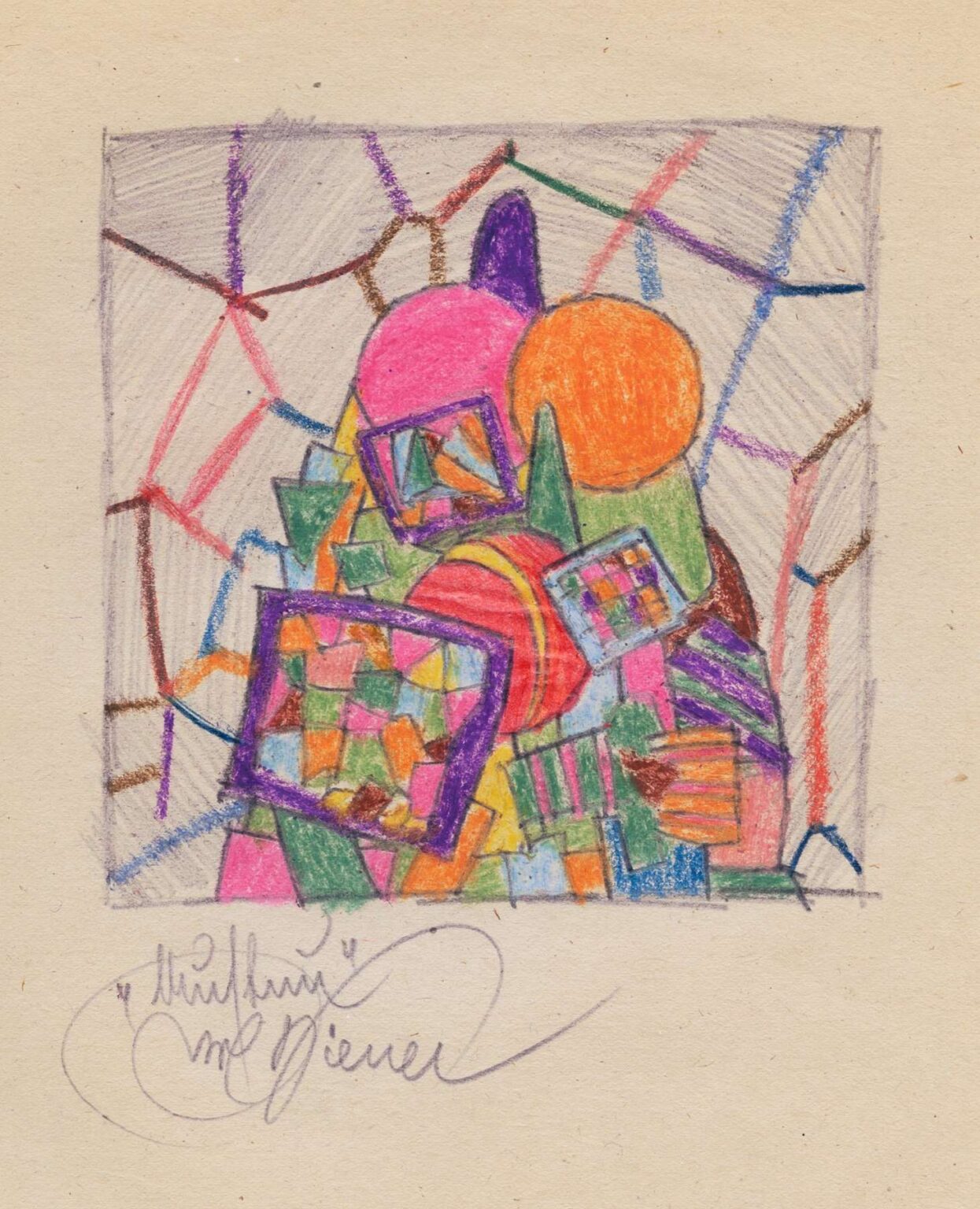
Karl Wiener’s 1923 composition Structure II presents a vivid celebration of geometric abstraction, weaving together circles, squares, and diagonal networks into a harmonious visual tapestry. Rendered in colored pencil on paper, the piece captivates with its bold chromatic choices—hot pinks, fiery oranges, lush greens, and deep purples—juxtaposed against a softly textured beige background. Rather than depicting recognizable objects, Structure II invites viewers to immerse themselves in the interplay of form, line, and color, where dynamic shapes collide and interlock as though part of an intricate mechanism. The title underscores the work’s preoccupation with underlying frameworks: beneath the apparent spontaneity lies a carefully balanced architecture of shapes. In this analysis, we delve into the historical milieu that shaped Wiener’s practice, explore the formal strategies that animate the piece, and consider the symbolic resonances that allow Structure II to transcend its era and speak to universal concerns of harmony, tension, and creative order.
Historical Context
Created in the early 1920s, Structure II emerges at a pivotal moment in European art history, when abstraction was rapidly gaining ground. The devastation of World War I had shattered traditional aesthetic certainties, and artists across the continent sought new visual languages to express an altered reality. In Vienna—Karl Wiener’s artistic milieu—intellectual circles bristled with ideas from the Bauhaus in Germany, the De Stijl movement in the Netherlands, and Russian Constructivism. All shared an interest in distilling art to its essential elements: line, shape, and color. Wiener’s choice of colored pencil, rather than oil paint or watercolor, reflects a desire for immediacy and a directness of gesture, as if sketching the very blueprints of abstraction. The piece can be read as part of a broader fascination with synesthesia and cross‑disciplinary theory, where music, mathematics, and visual art converged in a quest for universal harmony.
Artistic Influences
While Karl Wiener remains less widely studied than some of his contemporaries, hints of his influences ripple through Structure II. The planar geometry and emphasis on primary shapes recall Piet Mondrian’s exploration of horizontal and vertical axes, though Wiener eschews strict orthogonality in favor of diagonals and curves. The dynamic, interlocking forms evoke the Cubist experiments of Pablo Picasso and Georges Braque, where multiple perspectives coalesce into a fractured whole. At the same time, the rhythmic repetition of squares within squares suggests affinities with the Synchromist movement, which likened color relationships to musical chord progressions. Finally, the fine network of linear strokes framing the composition nods to the scientific drawings of the era, where diagrams and blueprints carried equal weight to fine art. By synthesizing these diverse currents, Wiener forges a distinct idiom that balances mathematical precision with painterly vitality.
Composition and Structure
At first glance, Structure II may appear as a spontaneous cluster of shapes, yet closer examination reveals a rigorous compositional logic. Wiener divides the picture plane into a loose grid of diagonal boundaries, within which geometric forms congregate. Two large circles—one hot pink, the other vivid orange—serve as focal anchors, overlapping at their edges to create a central zone of tension. From this nucleus, a cascade of smaller rectangles and squares descend toward the lower left corner, some outlined in deep violet to contain miniature checkerboard patterns. Triangular wedges and trapezoidal blocks jut outward, guiding the viewer’s gaze in multiple directions. A faint overlay of grey pencil strokes crisscrosses the entire surface, lending the piece a subtle sense of depth and spatial ambiguity. This network of lines demarcates compartments, yet it also unites the disparate shapes into a cohesive whole, much like a metal framework supporting a complex sculpture.
Color and Contrast
Color in Structure II operates as both an organizing principle and an emotional driver. Wiener deploys a palette dominated by warm tones—pinks, oranges, and yellows—balanced by cooler accents of green and purple. The juxtaposition of complementary hues heightens visual vibrancy: the vivid orange circle appears to glow against the cool green form behind it, while the pink orb pops against the pale background. Small patches of blue and turquoise, tucked between larger shapes, serve as visual punctuation marks, creating moments of respite from the surrounding intensity. The use of colored pencil allows for subtle variations in saturation, with some areas rendered in rich, solid color and others left lightly worked to reveal the paper’s texture. This layering technique imbues the forms with a tactile quality, as if the shapes were crafted from colored glass or fabric, folded and overlapped to catch the light differently at each turn.
Line and Gesture
Although geometric precision dominates, Structure II retains traces of the artist’s hand through varied line work. The boundaries of primary shapes are drawn with assured, even strokes, while the network of fine grey lines appears more spontaneous, as though sketched in a moment of intuitive connection. These lighter lines do not adhere to the rigid geometry of the colored shapes; instead, they drift across the surface, intersecting at oblique angles and creating a substructure that suggests motion. In places, Wiener allows the pencil to skip or break, leaving small gaps that remind viewers of the medium’s materiality. These gestural marks contrast with the solidity of the bounded forms, injecting an undercurrent of improvisation into an otherwise calculated design. The interplay of controlled and freer line work reinforces the tension between order and spontaneity—a hallmark of early modern abstraction.
Spatial Dynamics
Despite its flat graphic appearance, Structure II evokes a layered spatial field. Overlapping shapes imply depth: the orange circle rests in front of a pale green triangle, while translucent edges of adjacent forms allow glimpses of underlying colors. The tonal variations in the grey network further enhance this illusion, as darker pencil tones recede and lighter strokes advance. The cluster of rectangles at the center seems to float above a faintly sketched grid, while isolated shapes at the periphery hug the paper’s surface. This push‑and‑pull of planes creates a dynamic rhythm, activating the picture plane without resorting to traditional perspective. Viewers may experience a slight vertigo as their gaze shifts between foreground and background, yet the overall balance of forms ensures that the composition remains anchored and coherent.
Symbolism and Interpretation
While Structure II avoids literal narrative, its abstract forms can evoke metaphorical readings. The overlapping circles might symbolize moments of convergence—ideas meeting, energies merging, or individuals connecting within a larger community. The descending cascade of squares suggests accumulation or layering of experiences, as though memories were stacked and refracted through time. The grey network framing the shapes may allude to unseen forces—social structures, technological grids, or neural pathways—that both constrain and support individual elements. In this sense, Wiener’s title “Structure” becomes a lens through which to view the invisible scaffolding of human endeavor. Rather than prescribing a single meaning, Structure II offers viewers the freedom to project their own associations onto its forms, making the work perpetually open to reinterpretation.
Technique and Materiality
Choosing colored pencil as his primary medium, Wiener embraces an intimacy of scale and a directness of gesture that differ from large‑scale oil or gouache works. Pencil allows for both precise edges and subtle tonal gradations, and Wiener exploits these qualities fully. Areas of dense color are achieved through multiple layers of pigment, each stroke building depth until the form appears almost luminous. Lighter passages involve single passes of the pencil, letting the paper’s warm tone show through and softening the overall effect. The artist’s control over pressure is evident in the consistent outlines of primary shapes, while the grey network reveals a looser hand. These material decisions underscore the work’s hybrid nature: part diagram, part sketch, part painting. The sensitively chosen paper—a slightly textured, warm‐toned stock—further enhances the piece’s tactile appeal, inviting viewers to consider the interplay between pigment, pencil, and surface.
Rhythm and Movement
Although static on its surface, Structure II pulses with implied motion. The diagonal orientation of the framing lines creates a sense of shear across the plane, as though the entire assemblage were caught mid‐swing. The concentric overlap of the pink and orange circles suggests rotation or orbit, while the staggered arrangement of smaller squares implies a tumbling or cascading effect. These visual cues generate a rhythm akin to a musical composition: themes (shapes) recur in varied guises, refrains (checkerboard patterns) echo across the field, and accents (small blue or turquoise squares) mark moments of rest. Wiener’s manipulation of scale—juxtaposing large forms with minuscule elements—further contributes to a dynamic ebb and flow, ensuring that the viewer’s eye never settles for long in one area.
Emotional Resonance
Despite its intellectual rigor, Structure II communicates a distinctly emotional tenor. The warm color palette—dominated by pinks and oranges—evokes feelings of optimism, vitality, and creative exuberance. Yet the overlay of grey lines introduces a note of restraint, preventing the work from feeling overly celebratory. Instead, viewers may sense an undercurrent of contemplation, as if the artist were negotiating between exuberance and reflection. The harmonious balance of conflicting impulses—warmth and coolness, solidity and transparency, order and improvisation—mirrors the complexities of human emotion, making the piece resonate on more than just a visual level. The viewer is invited to share in the artist’s dynamic balancing act, to feel both energized by color and grounded by structure.
Legacy and Influence
While Karl Wiener did not achieve the renown of avant‑garde luminaries like Kandinsky or Mondrian, Structure II stands as a compelling testament to the era’s broader explorations of abstraction. The work anticipates mid‐century developments in geometric abstraction and minimalist painting, where the tension between form and void becomes a central concern. Its synthesis of diagrammatic networks and painterly gestures also foreshadows later experiments in conceptual art, where the demarcation between sketch and finished work blurs. For contemporary artists and scholars, Structure II offers a fascinating case study in how colored pencil—a medium often relegated to preparatory studies—can yield fully realized, resonant artworks. As curators reexamine peripheral figures in early modernism, Wiener’s contributions are poised for rediscovery, enriching our understanding of the period’s multifaceted innovations.
Conclusion
In Structure II, Karl Wiener achieves a remarkable fusion of geometric precision and expressive vitality. Through a masterful orchestration of circles, squares, and diagonal networks, he constructs a visual architecture that feels both meticulously planned and spontaneously alive. The work’s rich color harmonies, layered spatial dynamics, and subtle interplay of line and gesture invite sustained contemplation, rewarding viewers who explore its myriad relationships. More than a mere exercise in formalism, Structure II resonates as a poetic meditation on the unseen structures—social, technological, psychological—that shape human experience. Nearly a century after its creation, Wiener’s composition continues to captivate, offering fresh insights into the enduring power of abstraction to articulate both the order and mystery at the heart of visual expression.
