Image source: artvee.com
Introduction
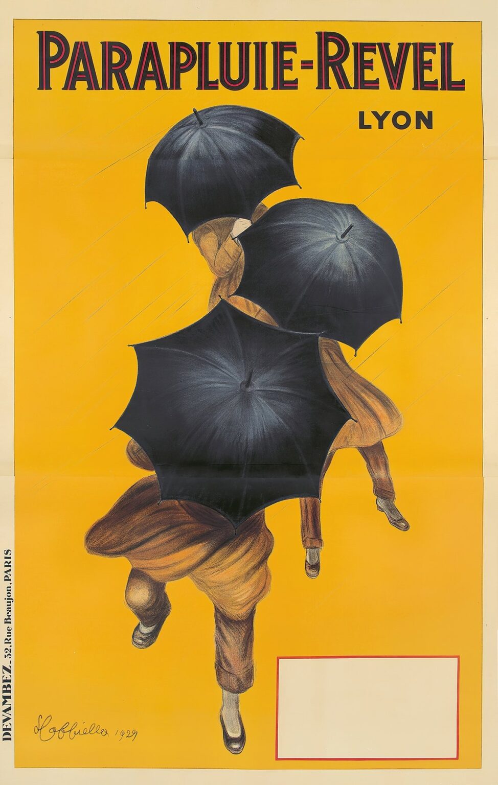
In 1929, Leonetto Cappiello designed the poster for Parapluie-Revel, an umbrella maker based in Lyon, France. This work exemplifies the artist’s mature style, marrying visual economy with dynamic storytelling. Rather than depicting a detailed scene, Cappiello distills action into a handful of powerful shapes: three black umbrellas and the partially visible figures who hold them. Set against a vivid yellow field streaked with rain, the composition captures both the practicality of shelter and the joyous resilience of those who carry Parapluie-Revel products. This analysis explores the historical context, design strategies, and enduring influence of Cappiello’s Parapluie-Revel poster, demonstrating how a minimalist image can resonate across generations.
Historical Context of Umbrella Advertising in the Early Twentieth Century
By the late 1920s, umbrellas had evolved from simple rain shields into fashion accessories and status symbols. European umbrella makers competed fiercely for visibility, commissioning celebrated poster artists to create memorable street-corner displays. In Paris, London, and Lyon, mass-produced chromolithographic posters transformed urban boulevards into vibrant showcases of consumer goods. Against this backdrop, Parapluie-Revel sought to distinguish its wares through an image that could be recognized at a glance. Cappiello’s poster arrived at a moment when graphic clarity ruled, and his use of flat color fields and stark silhouettes captured public attention more effectively than crowded, text-heavy designs.
Leonetto Cappiello and the Poster Revolution
Leonetto Cappiello (1875–1942) earned renown as the “father of modern advertising” for pioneering a break from the ornate compositions of nineteenth-century poster art. His credo—simplify to amplify—led him to isolate a single motif or figure, surround it with abundant negative space, and render it in bold, flat hues. By the 1920s, Cappiello had honed this approach across hundreds of campaigns, from liquor brands to confections. With Parapluie-Revel, he applies his signature economy to the everyday object of the umbrella, creating a visual metaphor for protection and upward momentum that remains strikingly modern nearly a century later.
The Parapluie-Revel Brand and Its Market Position
Founded in Lyon in the nineteenth century, Parapluie-Revel built its reputation on quality construction and stylish designs. By the 1920s, the company offered a range of umbrellas tailored to both urban professionals and style-conscious city dwellers. To cement its market presence, Parapluie-Revel needed an advertising image that conveyed reliability, elegance, and a spirit of adventure. Cappiello’s poster fulfills these aims by suggesting that, rain or shine, Revel umbrellas empower their users to stride confidently through life’s storms. The minimal text—only the brand name and city—underscores the product’s self-evident value.
Visual Composition and Diagonal Dynamics
At the heart of the poster lies a diagonal composition that propels the viewer’s eye from lower left to upper right. Three umbrella canopies overlap in a rising trajectory, echoing the forward motion of the partially revealed figures. Only the lower halves of the bodies are visible—legs clad in brown trousers and polished shoes—suggesting a carefree dance through the rain. The umbrellas themselves, rendered in deep charcoal with subtle highlights, serve as both shields and graphic anchors. This diagonal arrangement evokes ascent and optimism, implying that Parapluie-Revel umbrellas elevate the user above inclement weather.
The Striking Color Palette and Contrast
Cappiello employs a triadic palette to maximum effect: a luminous yellow background, inky black for the umbrellas, and warm brown for the figures’ attire. The yellow field—uncommon for rain-related imagery—speaks to sunlight breaking through clouds or the cheerful confidence a quality umbrella can instill. Black, the color of the canopies, conveys solidity and protection, while the brown tones ground the figures in everyday reality. Fine white streaks suggest rainfall, their delicate lines reinforcing the notion of movement without detracting from the bold simplicity of the central forms.
Typography and Brand Name Design
The poster’s title, “PARAPLUIE-REVEL,” crowns the composition in large, sans-serif letters outlined in red and filled with deep black. This two-tone treatment adds depth and ensures legibility against the bright background. The city name “LYON,” set in a more restrained black typeface, sits just beneath, anchoring the brand in its geographic origin. Cappiello omits any superfluous copy—no slogans, no product details—relying on his image to convey the umbrella’s virtues. His signature and the date, rendered in flowing script at the lower left, serve as discreet reminders of the artist’s hand and the poster’s provenance.
Representation of Rain and Movement
Though the umbrellas dominate visually, subtle diagonal streaks of pale white evoke falling rain. These lines, repeated across the yellow field, imbue the scene with atmosphere and reinforce the umbrellas’ protective function. The figures appear to be stepping or even dancing forward, suggested by bent knees and angled feet. This depiction of motion, paired with the umbrellas’ upward sweep, creates a narrative of joyful traversal—rain is acknowledged but not feared. Cappiello thus conveys both the practical benefit of shelter and the emotional uplift of maintaining one’s composure in adverse conditions.
The Umbrella as Symbol and Motif
Beyond its literal function, the umbrella in Cappiello’s poster becomes a universal symbol of protection, resilience, and personal style. By isolating the canopies against an otherwise empty backdrop, he elevates the umbrella to a graphic icon. The repetition of three overlapping forms suggests variety within the Parapluie-Revel line, hinting at multiple models or color options without illustrating them directly. This abstraction invites viewers to project their own preferences onto the shapes, making the image both specific to the brand and open to individual interpretation.
Use of Negative Space and Minimalist Approach
Cappiello’s hallmark minimalism is on full display: the empty yellow expanse surrounding the umbrellas and figures serves as negative space that amplifies the central motif. This deliberate sparseness ensures immediate readability from a distance—critical for posters encountered on busy streets. By eliminating extraneous elements, Cappiello draws attention to the form and function of the umbrella itself. The result is a composition that feels both modern and timeless, proving that sophisticated advertising need not be cluttered to be compelling.
Technical Execution and Chromolithography Craftsmanship
Parapluie-Revel was produced using chromolithography, a printing technique that allowed for rich, uniform blocks of color and precise registration of multiple plates. Each hue—the golden background, inky black, warm brown, and crisp white rain streaks—required its own stone or plate. Cappiello collaborated with the prestigious Devambez printing house in Paris to ensure that the inks were applied with consistent density and clarity. The choice of heavy, slightly textured paper stock preserved the vibrancy of the design when displayed in outdoor settings, where weathering and sun exposure threatened lesser prints.
Role of Devambez Printers in Paris
Devambez held a reputation for exceptional craftsmanship, serving many of the great poster artists of the Belle Époque and interwar period. Their technical expertise allowed Cappiello’s bold vision to translate seamlessly from sketch to lithographic stone. Precise alignment of the plates—especially critical for the overlapping umbrellas and stark text outlines—ensured that the final poster maintained sharp edges and vibrant contrasts. The Devambez imprint at the lower left corner stands as a mark of quality, reminding collectors and viewers of the collaborative effort behind great advertising art.
Cultural Reception and Impact in 1929
When Parapluie-Revel appeared on city walls, it quickly captured the public’s imagination. Passersby were struck by its vivid palette and the joyful sense of motion, a welcome sight amid gray European winters. Retailers reported increased inquiries about Revel umbrellas, attributing part of the surge to the poster’s memorability. Art critics hailed Cappiello’s design for its economy of means and emotional resonance. In an era teetering between Art Deco opulence and modernist austerity, the poster balanced luxury with everyday appeal, cementing Parapluie-Revel’s status as both a fashionable and utilitarian choice.
Influence on Subsequent Graphic Design
Cappiello’s approach to Parapluie-Revel—isolating a recurring motif against a bold monochrome field—would echo through decades of poster and logo design. The emphasis on simple shapes, dramatic contrast, and minimal text presaged the rise of corporate identity programs and brand iconography. Designers in the mid-twentieth century adopted similar strategies, using a single, memorable image to represent entire product lines. Today’s umbrella manufacturers and fashion houses continue to leverage this principle, underscoring Cappiello’s enduring impact on visual communication.
Preservation and Modern Appreciation
Original Parapluie-Revel posters are prized by museums and private collectors alike. Archival preservation focuses on stabilizing the yellow background, which can fade under prolonged light exposure. Exhibitions of early twentieth-century posters often highlight Cappiello’s work, showcasing Parapluie-Revel alongside his most iconic designs. Graphic design students study the poster for its mastery of composition, color theory, and narrative suggestion. Reproductions appear in design retrospectives and style guides, reminding contemporary audiences that even the simplest image—when executed with skill—can achieve an almost cinematic impact.
Conclusion
Leonetto Cappiello’s 1929 poster for Parapluie-Revel remains a milestone in advertising art. Through his minimalist yet dynamic composition, he embodies the dual promise of protection and joie de vivre that an umbrella can provide. The stark contrast between the radiant yellow background and the matte black canopies, the sense of upward motion, and the absence of extraneous detail all contribute to a timeless image that transcends its commercial purpose. More than an advertisement, Parapluie-Revel stands as a testament to the power of visual economy and the lasting legacy of one of poster art’s greatest innovators.
