Image source: artvee.co
Introduction to Cachou Lajaunie
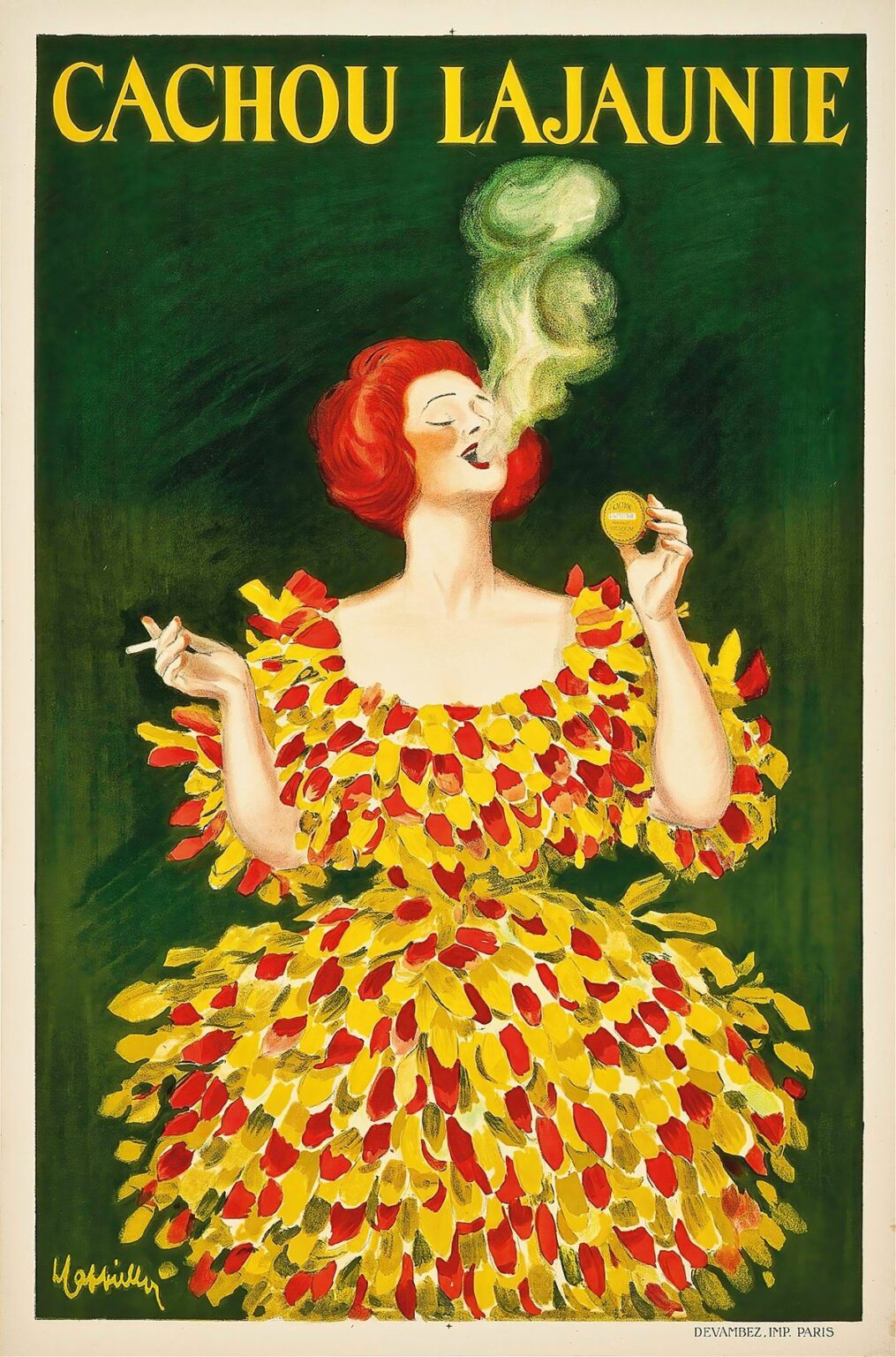
In 1920, Leonetto Cappiello crafted a memorable poster for Cachou Lajaunie, a brand of aromatic lozenges made from an extract of licorice root. Rather than depict a conventional medicinal scene, Cappiello chose to celebrate the sensory pleasure and social confidence his product promised. A vibrant red-haired woman takes center stage, her posture exuding poise and self-assurance as she delicately holds both a cigarette and a small circular tin of Cachou Lajaunie. Above her head, the brand name “CACHOU LAJAUNIE” appears in bold yellow letters against a deep green field. The contrast of sumptuous colors and the whimsical swirl of pale green smoke establish a visual narrative that transcends mere advertising—this poster becomes a proclamation of refined taste and modern elegance.
Historical Context of Early Twentieth-Century Confectionery Advertising
At the dawn of the 1920s, Europe was emerging from the upheaval of World War I into an era of renewed optimism and consumerism. Confectionery and medicinal lozenges enjoyed widespread popularity not only for their soothing properties but also as chic accessories carried in evening bags and pockets. Brands vied for attention through the burgeoning art of poster advertising, which transformed city streets into vibrant galleries. Cachou Lajaunie, long established in Parisian pharmacies and cafés, needed an image that would distinguish its lozenges from countless competitors. Cappiello’s poster arrived at this moment of cultural exuberance, promising both the practical benefit of fresh breath and an aura of sophistication for those who chose it.
Leonetto Cappiello’s Artistic Vision
Leonetto Cappiello (1875–1942) revolutionized poster art by rejecting overcrowded compositions and verbose copy in favor of single, bold motifs that could be recognized at a glance. Trained initially as a painter and caricaturist, he understood how to imbue simple shapes with surprising personality. Over his career, he created hundreds of posters featuring anthropomorphic figures—from devils to elegant women—that personified a brand’s essence. In Cachou Lajaunie, his red-haired heroine embodies both the product’s aromatic freshness and its capacity to elevate the user’s social poise. By isolating her figure against a flat background, Cappiello ensures that viewers immediately register the brand name, the product tin, and the promise of refreshing confidence.
Visual Composition and Spatial Dynamics
Cappiello arranges the composition with a mastery of spatial economy. The woman’s figure occupies the vertical center of the poster, her head just beneath the brand name and her voluminous dress extending downward toward the signature and printer’s imprint. The rounded tin in her right hand aligns with her shoulder, creating a subtle diagonal that guides the viewer’s eye from the product to her face and then to the smoke rising above. Negative space on either side of the figure reinforces her prominence and allows the eye to rest between vivid elements. The interplay of curves—from the swirling smoke to the rounded tin and the petal-like shapes of her dress—creates a rhythm that unifies the image into a harmonious whole.
Color Palette and Psychological Impact
Cappiello’s chromatic choices convey both warmth and freshness. The lush emerald-green background evokes natural vitality, nodding to the licorice root’s botanical origins. Against this field, the subject’s flaming red hair and the yellow-red petals of her dress leap forward, suggesting energy and exuberance. The tin’s gold-yellow hue echoes the text and dress accents, forging a visual link between brand identity and wearer. Pale green smoke wends upward from her lips, its soft hue signaling the cooling, mint-like sensation of Cachou Lajaunie’s formula. The result is a balanced palette of complementary and analogous colors that blend warmth and coolness to mirror the product’s dual promise: soothing relief and invigorating freshness.
The Central Female Figure as Brand Ambassador
Rather than show a pharmacist’s counter or a medicinal cabinet, Cappiello personifies the brand through his elegant model. Her confident pose—slightly tilted head, softly smiling lips, and poised wrist—invites viewers to associate Cachou Lajaunie with self-assured sociability. The cigarette she holds in her left hand reinforces the social milieu of cafés and salons, where discreet breath fresheners were valued. In grasping the tin as though it were a precious jewel, she elevates the lozenge to a luxury accessory. This figure does more than advertise a product; she encapsulates an aspirational lifestyle in which freshness and refinement go hand in hand.
Use of Smoke Imagery and Sensory Suggestion
One of the poster’s most striking features is the delicate plume of smoke rising from the woman’s parted lips. Rendered in soft, misty swirls of pale green, the smoke transforms into loose, cloud-like shapes that drift toward the title. This visual device serves multiple functions: it conveys the act of breathing out, suggests the lozenge’s soothing effect on the throat, and creates a direct link between the product and the sensation of refreshment. The choice of green for the smoke—rather than a neutral grey or white—underscores the idea of natural, herb-based relief. In uniting form and function, Cappiello makes fragrance and taste almost visible, inviting viewers to imagine the cool, minty exhalation themselves.
Dramatic Dress Design and Symbolism
The woman’s dress is composed entirely of brushstrokes that resemble petals or tongues of flame, alternating between bright yellow and ruby red. This unconventional treatment transforms fabric into a living, dynamic entity, as if the very gown were infused with vitality and heat. The petal-like shapes nod to natural ingredients, evoking blossoms or leaves steeped in herbal remedy. At the same time, the vibrant arrangement conveys movement and celebration, suggesting that the wearer is at ease and full of life. Cappiello’s choice to render the dress in such painterly strokes adds texture and depth, offsetting the flatness of the background and tenoning the figure firmly in the viewer’s gaze.
Typography and Brand Messaging
Text in Cachou Lajaunie is kept deliberately minimal. The brand name crowns the composition in a classic serif typeface, each letter rendered in a high-contrast yellow that glows against the dark green. This placement guarantees immediate recognition, even from a distance. No additional slogans or endorsements clutter the scene; the combination of brand name, iconic figure, and product tin suffice to communicate both identity and benefit. Cappiello’s restraint with words reflects his conviction that image alone—if executed with precision—can convey a brand’s message more powerfully than paragraphs of copy.
Materiality and Printing Techniques
Executed through chromolithography by Devambez in Paris, the poster benefits from rich, uniform fields of color and crisp delineation. Each hue—emerald green, flaming red, golden yellow, and soft green smoke—was applied via a separate lithographic stone, requiring meticulous registration. The texture of the paper absorbs the inks evenly, preserving the vibrancy of Cappiello’s palette even when displayed outdoors. The printer’s imprint at the bottom right, “DEVAMBEZ. IMP. PARIS,” attests to the collaboration between artist and craftsman. This technical prowess enhances the poster’s allure, ensuring that it remains visually striking decades after its creation.
Cultural Reception and Impact in 1920
Upon its release, the Cachou Lajaunie poster rapidly captured the public imagination. Parisians encountered it plastered on kiosks, tramcars, and storefronts, where its daring use of color and whimsical imagery stood out among more conventional medicinal ads. Patrons of cafés and theaters especially appreciated the nod to cigarette culture and breath fresheners—a daily ritual in social settings. Sales of Cachou Lajaunie saw an immediate uptick, with consumers drawn not only to the product’s reputed benefits but to the glamorous persona Cappiello had created. Critics of the day praised the poster for its elegance and its ability to transform a small tin of lozenges into an object of desire.
Influence on Subsequent Advertising Strategies
Cappiello’s work for Cachou Lajaunie reinforced the emerging paradigm of brand personification. Advertisers across Europe took note of how a single, memorable figure could embody a product’s attributes and elevate consumer perception. In the years that followed, other confectionery and pharmaceutical brands adopted similar strategies: commissioning artists to create striking characters or scenes that hinted at the sensory pleasure and social status their products conferred. Even as photographic imagery began to enter the advertising arena, the power of stylized illustration—pioneered by masters like Cappiello—remained a critical tool for cutting through visual clutter.
Preservation and Modern Appreciation
Original Cachou Lajaunie posters are today coveted by collectors and displayed in museums devoted to graphic design and advertising history. Conservation experts work to preserve the saturated greens and reds that define the image, carefully controlling light exposure to prevent fading. Retrospectives on Belle Époque and early twentieth-century poster art often feature Cappiello’s work prominently, positioning Cachou Lajaunie alongside his most iconic creations. Contemporary designers and art directors study this poster as a case study in effective branding: a testament to how color, gesture, and minimal text can combine to create an enduring symbol.
Conclusion
Leonetto Cappiello’s Cachou Lajaunie poster exemplifies the transformative potential of graphic art in brand communication. Through his confident use of color, his inventive composition, and his personification of the product, Cappiello elevated a simple breath-freshening lozenge into an emblem of style and modernity. The red-haired woman, her theatrical dress, and the swirling green smoke form a visual symphony that continues to resonate with viewers today. More than a marketing tool, the poster stands as a work of art that bridges commercial intent and aesthetic innovation—a lasting reminder that true creativity can make the mundane magical.
