Image source: artvee.com
Introduction to Agua de Vilajuïga
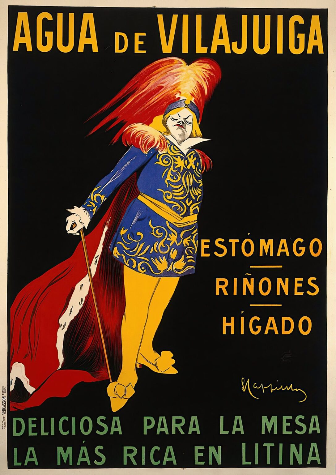
In 1912, Leonetto Cappiello created a poster for Agua de Vilajuïga that stands among his most celebrated works. At first glance, the image captivates through its bold interplay of color and form: a dignified, almost theatrical figure dominates a deep black field, drawing the viewer into a world of elegance and promise. Cappiello’s mastery of simplicity and visual impact transforms what might have been a straightforward beverage advertisement into a memorable piece of graphic art. By examining the cultural context, design strategies, and enduring influence of this poster, one can appreciate how Agua de Vilajuïga transcended mere promotion to become an icon of early twentieth-century advertising.
Historical Context of Spa Water Advertising
The turn of the century saw a surge of interest in mineral and spa waters across Europe. From the grand resorts of the Alps to the coastal springs of Catalonia, bottled waters were marketed not only for refreshment but for their purported health benefits. In France, where Cappiello worked, consumers were increasingly drawn to products promising digestive relief and vitality. Agua de Vilajuïga, sourced from a Catalan spring rich in lithia, tapped into this wellness trend. Cappiello’s poster arrived at a moment when lithographed posters lined boulevards and train stations, each vying for attention. Against this backdrop, he devised an image that cut through the visual cacophony with clarity and charisma.
Leonetto Cappiello and the Art of Poster Design
Leonetto Cappiello (1875–1942) revolutionized poster art by rejecting overcrowded compositions in favor of singular, evocative motifs. Trained as both a painter and caricaturist, he brought a keen eye for character and narrative to commercial work. Cappiello introduced anthropomorphic or theatrical figures to advertise everything from cognac to corsets, believing that a strong central image could lodge itself in the public consciousness. His designs relied on flat planes of vivid color, minimal text, and dynamic posing. In Agua de Vilajuïga, he embodied the product’s virtues within a noble persona, proving once again that a solitary, compelling figure could outperform elaborate storytelling.
Cultural Significance of Vilajuïga Mineral Water
Vilajuïga, a small Catalan town renowned for its lithia-rich spring, held a reputation for therapeutic waters recommended by physicians. By the early 1910s, bottles of Vilajuïga water reached tables in Parisian cafés and household pantries alike. The water’s mineral content was promoted for aiding digestion, supporting kidney function, and purifying the liver. These claims resonated with a clientele eager for both health and sophistication. Cappiello’s poster taps into that dual desire: the elegant costuming of the figure conveys refinement, while the textual callouts to “ESTÓMAGO,” “RIÑONES,” and “HÍGADO” speak directly to specific health benefits.
Visual Composition and Layout
Cappiello arranges the poster’s elements with masterful economy. The aristocratic figure is positioned slightly off-center to the left, his proud stance creating visual momentum. To the right, the three lines of benefit text stack vertically, balancing the figure’s presence without clutter. This asymmetry lends the composition a sense of spontaneity within a rigorous geometric framework. At the top, the brand name “AGUA DE VILAJUÏGA” spans the width in striking yellow capitals, anchoring the design. The green tagline at the bottom grounds the image while introducing a tertiary hue. Between these textual markers, the figure’s upward gaze and sweeping red plume guide the eye in a graceful arc.
Color Palette and Symbolic Meaning
The poster’s chromatic scheme revolves around four core colors: black, red, blue, and yellow, with green used sparingly for the tagline. The deep black field serves as a dramatic backdrop that heightens the brilliance of the other hues. Red—used for the feathered plume and flowing cape—evokes vigor and luxury, alluding to the water’s energizing qualities. The rich cobalt blue of the tunic, adorned with golden yellow filigree, suggests trustworthiness and tradition. Yellow text and ornamental details connect the figure to the messaging, reinforcing unity of design. Finally, the green tagline at the base hints at natural origins and freshness, subtly underlining the product’s source.
The Central Noble Figure as Brand Ambassador
Rather than depict a faceless glass or pastoral spring, Cappiello personifies Vilajuïga water through a noble character. Clad in a flamboyant ensemble reminiscent of Renaissance courtiers, complete with a high-collared tunic and plumed hat, the figure embodies authority and discernment. His upturned chin and narrowed eyes suggest both confidence and connoisseurship, as if he personally endorses the water’s virtues. The slender cane he carries further enhances his aristocratic air and posits him as a guide—leading consumers toward the promised benefits. In this way, the character functions as an ambassador: a singular persona through whom the product’s promise becomes relatable and memorable.
Typography and Textual Hierarchy
Text in the poster is purposefully minimal and highly legible. The brand name dominates the top, rendered in a bold, geometric sans serif that mirrors the poster’s modern spirit. Each letter stands evenly spaced, ensuring instant recognition even from a distance. The health claims—“ESTÓMAGO,” “RIÑONES,” “HÍGADO”—follow in the same typeface, smaller but still commanding space on the right side. Underlining each benefit subtly emphasizes its importance without adding visual clutter. The bottom slogan, “DELICIOSA PARA LA MESA / LA MÁS RICA EN LITINA,” shifts to a softer green and a slightly wider letterform, inviting a sense of natural abundance. This clear hierarchy leads the viewer from brand to benefits to tasting experience.
Medical Claims and Health Imagery
In the early 1900s, mineral waters were marketed as therapeutic agents, each spring boasting unique curative properties. Cappiello’s poster leverages this medical milieu by explicitly naming the digestive organs targeted by Vilajuïga water. By singling out the stomach, kidneys, and liver, he translates scientific language into everyday reassurance. The figure’s regal posture suggests mastery over these internal functions, implying that Vilajuïga water fortifies and harmonizes bodily processes. Although no medical paraphernalia appears in the imagery, the directness of the textual callouts effectively bridges art and health, giving consumers clear reasons to choose this brand.
Technical Execution and Printing Techniques
Agua de Vilajuïga was produced using chromolithography, a method that allowed for rich, solid fields of color and crisp outlines. Cappiello collaborated closely with Parisian printers to ensure precise color registration and ink consistency. Multiple stones or plates were prepared for each hue—black for the background, red for the plume and cape, blue for the tunic, yellow for ornamentation and text, and green for the slogan. The result is a seamless layering of pigments, free of visible brushwork or tonal gradation. The chosen paper stock was thick and slightly textured, preserving the vivid inks when displayed outdoors. These technical choices underscore the high production values behind early advertising art.
Reception and Impact in 1912
Upon its release, the Agua de Vilajuïga poster generated significant attention. Parisians encountered the image on walls, tramcars, and billboards, where its striking contrast and charismatic figure set it apart from competing ads. Retailers reported increased inquiries about the product’s health benefits, with many consumers recalling the poster’s memorable persona. Critics of the day praised Cappiello’s ability to combine elegance and wit, noting that the design captured both spirit and substance. The success of this campaign cemented Cappiello’s reputation as a leading poster artist and elevated Vilajuïga water in the public mind.
Influence on Beverage Advertising
The poster’s innovative use of character as brand advocate influenced subsequent beverage marketing across Europe. Advertisers recognized the value of a distinctive mascot to embody product qualities. Whether in bottled wine, beer, or soft drinks, the lesson of Agua de Vilajuïga endured: a single, well-designed figure could convey taste, tradition, and trust. Later campaigns for spirits and mineral waters adopted similar strategies, pairing bold typography with a central persona. Even today, the notion of a “brand character” traces its lineage back to early masters like Cappiello, whose work demonstrated that advertising art could blend aesthetic appeal with persuasive storytelling.
Preservation and Modern-Day Appreciation
Original prints of Agua de Vilajuïga are now prized by museums and collectors worldwide. Conservation efforts focus on stabilizing the vibrant inks and preventing paper degradation. Exhibitions devoted to Belle Époque poster art often feature this piece, highlighting its role in shaping modern graphic design. Reproductions appear in textbooks and design retrospectives, inspiring new generations to study the marriage of form and function. Its presence in contemporary galleries reminds viewers that commercial art can achieve timeless beauty, even as its message remains rooted in a specific historical context.
Conclusion
Leonetto Cappiello’s Agua de Vilajuïga poster exemplifies the power of clarity, character, and color in visual communication. By personifying mineral water through a regal figure, he created an image that resonated with early twentieth-century audiences and continues to captivate art enthusiasts today. The seamless interplay of bold hues, precise typography, and strategic composition demonstrates Cappiello’s mastery of chromolithography and his understanding of consumer psychology. More than a mere advertisement, Agua de Vilajuïga stands as a milestone in the evolution of graphic art, a testament to the enduring impact of simplicity and imagination in brand storytelling.
