Image source: artvee.com
Introduction to Lampe Osmine
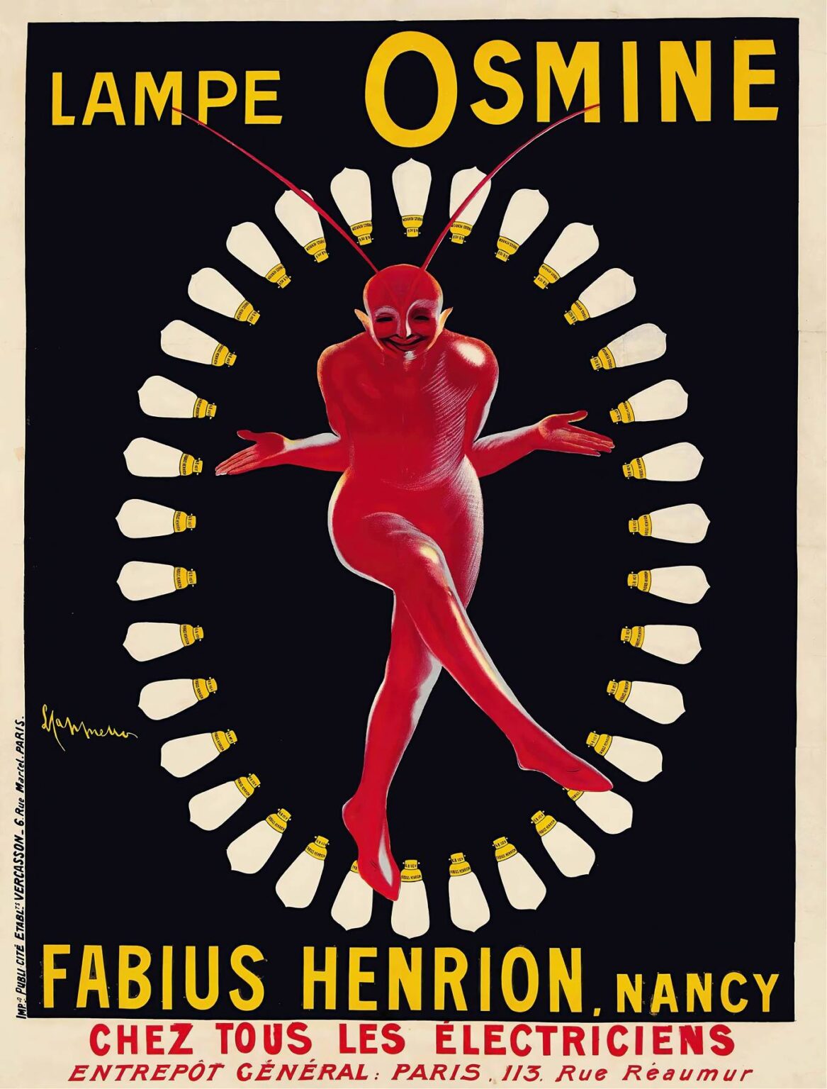
In 1910, Leonetto Cappiello, an Italian poster artist renowned for his bold visual language, created the poster for Lampe Osmine. This advertisement captures the attention through its striking central figure and radiating motif of lightbulbs. Far from a simple product showcase, the design embodies the intersection of art and commerce that defined the golden age of poster art in Paris. By pioneering a minimalist yet exuberant style, Cappiello broke from the detailed illustrative traditions of the nineteenth century and ushered in a new era of graphic communication. His work for Lampe Osmine stands as a testament to his ability to fuse playful imagery with persuasive advertising, making it a landmark piece in both art history and marketing.
Historical Context and the Birth of Modern Advertising
The early twentieth century was a time of rapid technological advancement and shifting social dynamics. Electric lighting emerged as a symbol of progress, illuminating both public spaces and private homes. In this climate, manufacturers of lightbulbs vied for consumer attention, seeking to distinguish their offerings through memorable branding. Cappiello’s poster arrived at a moment when lithographic printing technology had matured, enabling artists to reproduce vivid colors and sharp lines at scale. Printing firms in Paris were now capable of mass-producing large-format posters for street display, turning public thoroughfares into open-air galleries. Within this competitive milieu, Lampe Osmine needed an image that could cut through the visual noise. Cappiello provided precisely that: a daring figure rendered in pure red against a stark black field, surrounded by a halo of evenly spaced bulbs.
Leonetto Cappiello: The Innovator Behind the Poster
Leonetto Cappiello (1875–1942) earned the title “father of modern advertising” for his revolutionary approach to poster design. Unlike his contemporaries who favored ornate compositions, Cappiello embraced simplicity, isolating core imagery to maximum effect. Trained initially as a painter and caricaturist, he brought an artist’s sensibility to commercial work, prioritizing impact over decoration. His posters often featured anthropomorphic figures or surreal scenarios, delighting viewers while imprinting the brand name in their memories. In the case of Lampe Osmine, Cappiello’s mischievous red sprite exemplifies his flair for injecting humor and personality into product promotions. The artist’s signature appears discreetly at the edge of the composition, a subtle reminder of the creative mind behind the ingenious visual concept.
Visual Composition and Design Elements
At first glance, Lampe Osmine presents a mesmerizing circular arrangement. The radial symmetry of the bulbs draws the eye inward to the figure, creating a sense of rhythm and movement. Each lamp is rendered in clean, geometric form, its white body contrasting against the deep black background. This choice of negative space amplifies the luminance implied by the bulbs, even though they remain unlit in the depiction. The central character bridges the gap between playful fantasy and product demonstration. With limbs crossed and arms open in a welcoming gesture, the red figure suggests both dynamism and equilibrium. The two antennae-like extensions rising from the sprite’s head echo the curve of the bulb arrangement, reinforcing the harmony of the overall composition.
Use of Color and Contrast
Cappiello’s daring palette underscores the poster’s persuasive power. The dominant black field serves as a canvas for the vibrant red of the sprite, ensuring that the viewer’s attention is immediately captured. Red, historically associated with energy, excitement, and urgency, conveys the promise of bright illumination. The choice to render the bulbs in stark white further intensifies the contrast, evoking the clarity of electric light against darkness. A subtle yellow accent appears on each bulb’s metal socket, unifying the text and image through color repetition. This restrained chromatic scheme exemplifies Cappiello’s mastery of visual economy: with just three core hues—red, black, and yellow—he communicates both the product’s function and its emotional appeal.
The Central Figure: A Playful Demon Dancing Among Lamps
The figure at the heart of Lampe Osmine defies realistic depiction. Its exaggerated features—a wide grin, pointed ears, and elongated limbs—imbue it with a carnival-like presence. In folklore, imps and demons have long been associated with fire and light, making the sprite a fitting embodiment of electric brilliance. Yet Cappiello’s creature is inviting rather than ominous; its body language suggests celebration rather than menace. By anthropomorphizing the concept of illumination, the artist transforms a mundane household object into a source of wonder. This playful approach reflects the spirit of Belle Époque Paris, where entertainment and spectacle found expression in cabarets, theaters, and the burgeoning world of graphic arts.
Symbolism and Message in Lampe Osmine
Beyond its immediate visual charm, the poster conveys multiple layers of meaning. The circular array of lamps can be read as a halo, elevating the product to almost celestial status. The suggestion that light radiates outward from the central source speaks to the lamp’s efficiency and reach. Meanwhile, the sprite’s embrace of the bulbs implies a partnership between man (or creature) and machine, hinting at the harmonious coexistence of nature and technology. The absence of clutter—no background scene, no ancillary elements—reinforces the notion that Osmine lamps stand alone in quality and innovation. Cappiello’s design thus serves a dual purpose: it captivates viewers through striking visuals while communicating a clear product promise.
Typography and Text Integration
The textual elements of Lampe Osmine adhere to Cappiello’s principle of simplicity. The brand name “OSMINE” appears at the top in bold, sans-serif letters, each character rendered in bright yellow. This placement ensures immediate brand recognition, leveraging both color contrast and typography to anchor the composition. At the bottom, the manufacturer’s name, “FABIUS HENRION, NANCY,” spans the width of the poster in the same bold typeface, affirming the product’s provenance. Supporting text detailing distribution—“CHEZ TOUS LES ÉLECTRICIENS” and the Paris warehouse address—follows in red capitals. The hierarchy of information is clear: brand, maker, retailer. By limiting the textual content to essential details, Cappiello avoids overwhelming the viewer, allowing the visual narrative to communicate the product’s virtues.
Impact on Contemporary Advertising and Legacy
Cappiello’s Lampe Osmine exemplifies the shift toward visual shorthand in advertising, a trend that continues to influence graphic design today. His focus on a singular, memorable motif paved the way for modern logo-centric branding. The poster’s capacity to evoke intrigue and delight with minimal elements has inspired countless marketers and artists. In the decades following its debut, Lampe Osmine has been reprinted in retrospectives and exhibitions celebrating the Art Nouveau and Art Deco movements. Museums and design schools study it as a case study in effective communication, teaching students how to balance aesthetic appeal with marketing objectives. Even in an age dominated by digital media, the poster’s clarity and playfulness serve as a reminder of the lasting power of analog design.
Technical Aspects and Production Techniques
Reproduced through chromolithography, Lampe Osmine showcases the technical prowess of early twentieth-century print workshops. Chromolithography allowed for rich, flat fields of color without visible brushstrokes, lending the image a polished, graphic quality. The uniform application of red and black inks required precise stone or plate preparation, ensuring that the sprite and background remained cleanly separated. Registration marks, applied during the printing process, guided the layering of each color, culminating in the seamless final image. Paper choice also played a role: a heavy, slightly textured stock would have absorbed the inks in a way that resisted fading, preserving the poster’s vibrancy when displayed outdoors. These material considerations highlight the collaboration between artist and printer in realizing Cappiello’s vision.
The Influence of Lampe Osmine on Graphic Design
As a pioneer of bold simplicity, Cappiello influenced the trajectory of poster art well beyond France’s borders. Graphic designers in Germany, Britain, and the United States adopted his strategy of isolating a single, evocative figure or symbol to represent a brand. In the mid-century corporate boom, logos and trademarks assumed a similarly minimalist approach, tracing lineage back to Cappiello’s innovations. Contemporary advertising campaigns that center on a lone icon—whether a swoosh, an apple, or a stylized mascot—owe a debt to early masters like the creator of Lampe Osmine. The way this poster balances whimsy with clarity continues to inform approaches to character design in packaging, branding, and digital media.
Preservation and Cultural Significance
Original prints of Lampe Osmine are today prized by collectors and institutions. The poster not only captures the zeitgeist of its era but also documents the emergence of consumer culture in the modern age. Archival efforts aim to safeguard surviving copies from light damage and environmental factors. Restorers carefully remove surface grime and stabilize fading pigments, striving to present the image as Cappiello intended. Traveling exhibitions devoted to vintage posters often include Lampe Osmine as a highlight, contextualizing it alongside works by Toulouse-Lautrec and Mucha. Its enduring appeal lies in the way a fantastical creature can personify technological wonder, reminding viewers that effective communication can bridge the worlds of art and industry.
Conclusion
Leonetto Cappiello’s Lampe Osmine remains a milestone in the history of advertising art. Its audacious use of color, its playful central figure, and its unparalleled clarity of message illustrate the artist’s revolutionary approach to visual persuasion. By distilling the essence of electric illumination into a single, dance-like creature framed by glowing bulbs, Cappiello crafted an image that transcends its commercial purpose to become an enduring work of graphic art. A century after its creation, Lampe Osmine continues to teach and inspire designers, affirming the timeless value of creativity, simplicity, and strategic thinking in the realm of visual communication.
