Image source: artvee.com
Introduction: The Rise of Modern Poster Art in Postwar Europe
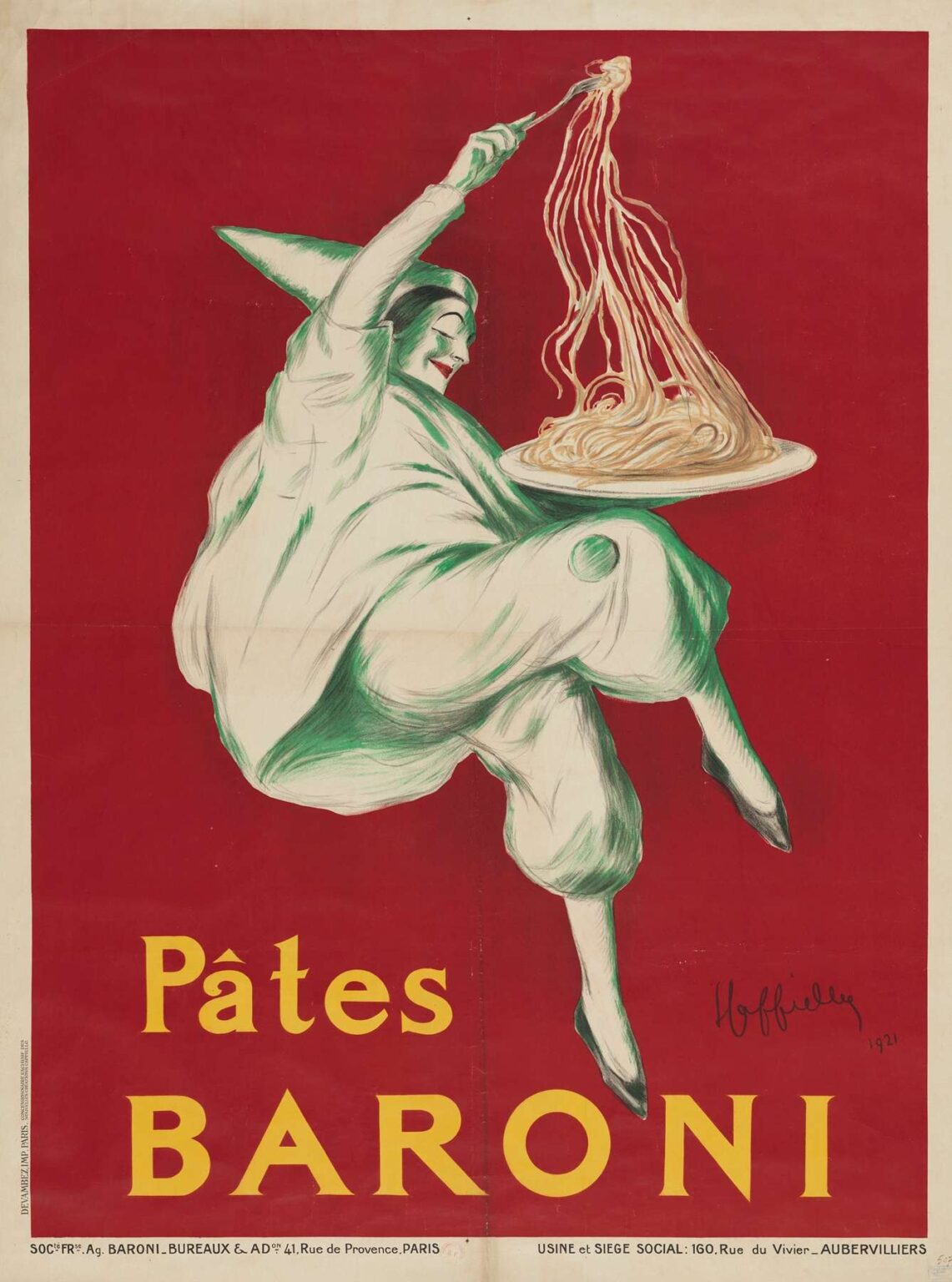
In 1921, Leonetto Cappiello created one of his most dynamic and memorable advertisements: the poster for “Pâtes Baroni.” At first glance, the viewer is confronted with a capering Pierrot‐like figure swathed in loose, billowing garments, leapfrogging across a field of vibrant red. In one hand he brandishes a plate heaped with long, twisting strands of pasta; in the other, a twirling fork suggests an imminent, exuberant feast. Below him, in bold yellow letters, the brand name “PÂTES BARONI” anchors the composition. Far from a static presentation of wares, Cappiello’s design embodies movement, joy, and a theatrical sense of abundance, capturing both the product’s essence and the spirit of a society eager to embrace pleasure after the privations of World War I. This analysis explores how “Pâtes Baroni” integrates cultural context, Cappiello’s evolving visual language, compositional balance, color psychology, typography, allegorical storytelling, technical execution, contemporary reception, and lasting influence to transform an everyday Italian staple—pasta—into a scene of modern graphic mastery.
Historical and Cultural Context: Italy’s Culinary Waves and Parisian Tastes
Emerging from the devastation of the Great War, Europe in 1921 faced economic challenges but also a renewed appetite for simple indulgences. Italian pasta producers sought to expand their markets beyond domestic borders, and Paris—still Europe’s cultural epicenter—offered fertile ground. Urban diners and café‐goers, eager for both novelty and comfort foods, welcomed imported specialties. The name “Baroni” conveyed noble lineage and artisanal quality, promising refinement through association with Italy’s storied gastronomic traditions. Meanwhile, French advertising was undergoing its own revolution: posters transitioned from ornate, text‐heavy announcements to concise, image‐driven messages. It was within this milieu that Cappiello, an Italian émigré with roots in caricature and revue art, fashioned a design that spoke simultaneously to Italian authenticity and modernist aesthetics, mirroring the cross‐cultural tastes of postwar Europe.
Leonetto Cappiello’s Evolution: From Satirical Sketches to Bold Brand Symbols
Leonetto Cappiello’s journey from early caricatures to heralded poster artist is essential to understanding “Pâtes Baroni.” Arriving in Paris at the turn of the century, he contributed to satirical journals, refining a loose, expressive line and sharp wit. By 1900, he pioneered a radically simplified poster format: a single figure or motif on a flat background, minimal text, and bold color. Landmark works like “Menschikoff Vodka” and “Amandines de Provence” crystallized this approach. Over two decades, Cappiello deepened his painterly techniques, introducing fluid brushwork and more elaborate allegories while retaining structural clarity. In “Pâtes Baroni,” these elements converge: his mastery of gesture, color contrasts, and typographic economy coalesce in an advertisement that is as much art as commerce, reflecting his belief that a powerful image alone could sear a brand into public consciousness.
Composition: Dance, Flight, and Feast
The poster’s composition is a study in dynamic tension. The central character—an impish figure with clownish cap and loose‐fitting costume—occupies a diagonal axis that propels him upward and forward, suggesting both levitation and frenetic dance. His right leg kicks back, left knee bent, as though caught mid‐pirouette; the swirling garment around him amplifies the sense of spinning motion. The plate of pasta hovers just above his head, the noodles depicted in capillary lines that trail behind like ribbons in the wind. A single fork rises from the plate, its tines clutching a luminous tuft of pasta, drawing the viewer’s eye upward. Beneath, the text “PÂTES BARONI” balances the movement above with geometric stability. The stark red ground, uninterrupted by horizon or setting, isolates the actor in a timeless stage space where the only reality is his joyous leap and the promise of gastronomic delight.
Color Psychology: Appetite, Warmth, and Whimsy
Color is central to the poster’s immediate appeal. Cappiello employs a vermilion red background that simultaneously evokes the color of ripe tomatoes, the richness of carnation, and the warmth of a welcoming hearth—each a subconscious prompt to appetite. The figure’s garments, portrayed in an emerald‐tinged white, stand in sharp contrast, heightening his visibility and suggesting the floury dust of durum wheat and the freshness of artisanal pasta. The pasta itself, rendered in creamy ivory with delicate ochre highlights, appears almost luminescent against the red field. Subtle green strokes across the figure’s clothing echo basil and fresh herbs, alluding to Italian culinary tradition. Finally, the cadmium yellow of the brand text adds a note of brightness and optimism, ensuring legibility while tying the viewer’s gaze back to the product name. In concert, these hues engage both the eye and the emotional centers of the brain, creating a visceral connection between color and craving.
Typography: Clarity, Contrast, and Brand Authority
Typography in “Pâtes Baroni” exemplifies Cappiello’s minimalist philosophy. The uppercase sans‐serif letters are evenly weighted, their clean lines evoking modernity and functional reliability. The acute accent in “PÂTES” is carefully preserved, honoring the French language and ensuring correct pronunciation. Beneath, “BARONI” appears in slightly larger characters, aligning with the Italian family name’s primacy in brand identity. The letters maintain generous spacing (tracking) that allows the red background to breathe through, preventing any sense of heaviness. Placed at the bottom third of the poster, the text counterbalances the dynamic swirl above, establishing a visual hierarchy: first, the action of pasta in flight; second, the brand that promises such delight. By eliminating ornamental flourishes or secondary copy, Cappiello distilled brand communication to its purest essence: name recognition.
Allegorical Resonance: Pasta as Performance
Beyond literal depiction, “Pâtes Baroni” weaves rich allegory. The central figure resembles Pierrot, the classic commedia dell’arte clown, here recast as a pasta‐wielding jester. His dance becomes a metaphor for the theatricality of Italian dining rituals, where pasta is not simply sustenance but a performative act of communal pleasure. The leap suggests the buoyancy one feels after a satisfying meal, while the twirling fork evokes swirling conversation in candlelit trattorias. The absence of any other props—no dining table, no background architecture—frees the scene to operate symbolically, implying that wherever you enjoy Baroni pasta, a personal festival of flavor awaits. Cappiello’s design thus reframes a humble kitchen staple as the centerpiece of joy and artistry.
Technical Mastery: Lithographic Flourishes and Brushwork Illusions
Cappiello’s technique in “Pâtes Baroni” marries painterly flair with the demands of lithographic printing. Each primary color—red, green, cream, and yellow—required its own stone and careful registration. The red background was laid down with a uniform, opaque layer to maximize impact. Over it, the figure’s contours were drawn in bold green and white strokes that mimic brush and chalk, creating the illusion of freehand drawing on a printed surface. The pasta strands, with their sinuous line quality, demanded meticulous fine‐mesh halftones to preserve subtle thickness variations. The brand text, block‐printed in opaque yellow, was applied last to ensure crisp edges. This interplay of broad painterly gestures and precise typographic overlays exemplifies Cappiello’s technical prowess and deep collaboration with Parisian press operators.
Reception and Influence: A Poster for the Ages
Immediately upon release, “Pâtes Baroni” garnered acclaim in design circles for its modern aesthetic and emotional directness. Café owners in Paris competed to display the poster; Italian importers reported increased bookings at fine grocery shops. In retrospect, historians credit it with shaping public expectations for food advertising, demonstrating that culinary products could be marketed with the same high art sensibility once reserved for luxury goods or theatrical performances. Students of graphic design dissect the poster’s economy of means and maximal expressive impact, while contemporary advertisers look to Cappiello’s work as a blueprint for brand storytelling that balances cultural specificity with universal appeal.
Legacy: Lessons for Modern Brand Communication
More than a century on, “Pâtes Baroni” endures as a masterclass in visual persuasion. Its core lessons remain relevant: distill your narrative to a single, unforgettable image; leverage color contrasts that resonate emotionally with the product; integrate typography seamlessly into the overall design; and embed symbolic depth that speaks to both heritage and aspiration. In an age of digital media overload, Cappiello’s economy of imagery offers a counterpoint: that clarity and creativity trump verbosity, and that a well‐crafted poster can still engage audiences in a world saturated with advertisements.
Conclusion: Dance, Dine, and Delight
Leonetto Cappiello’s “Pâtes Baroni” transcends its status as a mere commercial artifact to become a celebration of culinary ritual and modern graphic art. Through bold composition, resonant color choices, precise typography, and layered symbolism, Cappiello transformed an everyday product into an emblem of joy and sophistication. As viewers then and now, we are invited not just to purchase pasta but to partake in a festive performance—an invitation to leap, to twirl, and above all, to savor life’s simple pleasures with Baroni at the table.
