Image source: artvee.com
Introduction: The Dawn of Modern Advertising
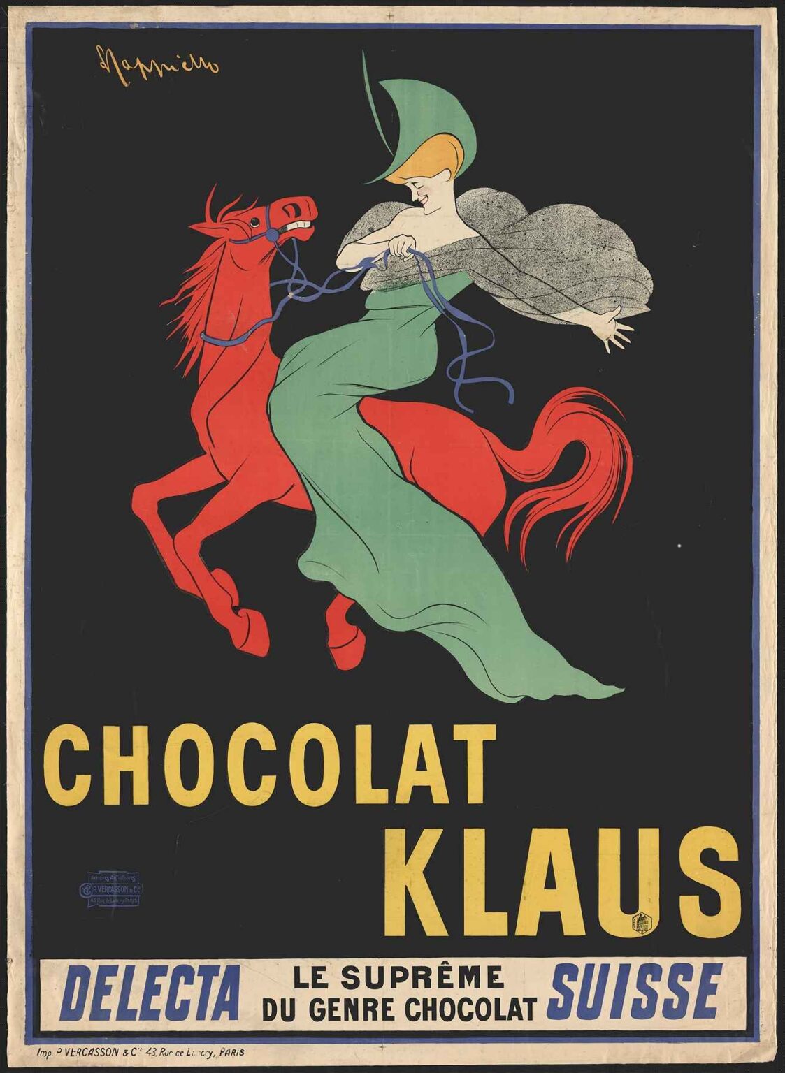
In 1903, Leonetto Cappiello revolutionized poster design with his “Chocolat Klaus” commission. Rejecting the overly detailed, text‐heavy advertisements of the nineteenth century, he introduced a single, arresting image against a flat background, minimal copy, and bold typography. In this poster, a woman in a sweeping green gown and veil bestrides a fiery red horse as though she were a mythic rider heralding the arrival of Swiss chocolate. Surrounding them is a stark black field, punctuated only by the striking yellow letters spelling out the brand name. Beneath, a white band declares “DELECTA SUISSE le suprême du genre chocolat.” Cappiello’s work not only transformed how products were sold but also how visual culture itself could captivate and persuade. Over the course of this analysis, we will explore the historical milieu surrounding its creation, Cappiello’s stylistic evolution, compositional strategies, chromatic choices, typographic innovations, symbolic resonance, technical execution, contemporary reception, and enduring influence on graphic design.
Historical Context: Switzerland’s Chocolatiers and the Parisian Market
At the turn of the twentieth century, Switzerland reigned as Europe’s chocolate capital. Innovations in conching and tempering produced confections far smoother and more reliable than their continental rivals. Swiss brands sought to penetrate the lucrative Parisian market, where fine chocolate had become a marker of taste and social standing. Advertising in daily newspapers reached only a fraction of potential buyers, whereas large‐scale posters on kiosks and boulevards offered mass visibility. Into this world entered Leonetto Cappiello, an Italian expatriate whose poster work for French clients was already reshaping urban visual landscapes. When the Chocolat Klaus company commissioned him, they sought not a portrait of cocoa pods or elaborate factory scenes but a symbol that would ignite curiosity and brand recognition among passersby. The result would become a touchstone in the evolution of commercial art.
Cappiello’s Stylistic Evolution: Toward the Single‐Image Ideal
Cappiello began his career as a caricaturist for Le Rire and La Vie Parisienne, honing a flair for distilling character into simple, expressive lines. By 1900, he had translated that talent into poster design, pioneering a style defined by a central motif on a monochrome field with succinct type. Early successes like “Menschikoff Vodka” (1900) and “Amandines de Provence” (1902) established his reputation for visual immediacy. With “Chocolat Klaus,” Cappiello reached full maturity: his brushwork grew more painterly, his compositions more daring, and his color palette more adventurous. The poster’s mythic, almost theatrical energy marked a decisive step away from literal representation toward allegorical impact. In doing so, Cappiello set the standard for modern advertising: that a single, powerful image could speak directly to the consumer’s imagination, transcending language and social barriers.
Composition: Dynamic Heroism on Horseback
The composition of “Chocolat Klaus” is immediately dramatic. A red horse rears up on its hind legs in mid‐stride, its mane whipping back in a jagged flame of motion. Atop it sits a woman whose draped green gown billows behind her like a banner. Her right hand reaches forward, fingers splayed as though offering the viewer some wondrous gift, while her left grips the reins—thin blue ribbons that crisscross the black background. The interaction between rider and steed creates a sense of heroic forward momentum. Despite the absence of horizon lines or environmental cues, the pair appears to surge outward from the poster’s depths, inviting the eye to follow them. Cappiello contrasts the freeform curves of fabric and smoke‐like cloak with the horse’s angular musculature, underscoring energy and poise in equal measure. The brand name, set in two levels beneath them, provides a visual anchor that balances motion with typographic solidity.
Color Strategy: Contrast and Symbolic Resonance
Color in “Chocolat Klaus” operates on multiple levels. The onyx black field isolates the central figures, maximizing the impact of adjacent hues. The horse’s vermilion red stands for passion, vitality, and the exotic promise of chocolate sourced from distant cacao plantations. The rider’s emerald green gown signifies freshness, luxury, and the pastoral roots of dairy—integral to Swiss milk chocolate’s appeal. A lighter gray cloak echoes swirling cocoa aromas, uniting green and red in a sibilant spiral. The sapphire blue reins add an unexpected accent, drawing attention to the subtle graphic interplay. Finally, the cadmium yellow lettering cuts across the bottom like a beam of spotlight, ensuring instant legibility. This high‐contrast palette not only commands attention but also embeds emotional undercurrents: red for appetite, green for purity, yellow for optimism.
Typography: Authority Through Simplicity
True to his minimal‐text philosophy, Cappiello confined copy to the essentials: the product name and a concise slogan. The uppercase “CHOCOLAT KLAUS” is set in a robust sans‐serif, its even strokes and generous spacing conveying modernity and confidence. The sub‐line “DELECTA SUISSE” appears in italicized blue at left, while “le suprême du genre chocolat” runs in black serif at center—an elegant nod to Swiss precision and qualitative superiority. By varying weight, style, and color in a narrow typographic palette, Cappiello established hierarchy without clutter. The result is a layout that feels both commanding and refined, seamlessly integrated with the imagery above.
Symbolism and Allegory: Riding Toward Indulgence
Beyond mere theatrics, the horseback motif offers multiple allegorical readings. The rider evokes a herald or muse, galloping in to announce the arrival of a supreme delight—Swiss chocolate. Her gesture, arm outstretched, operates like a classical or Renaissance annunciation, transfusing everyday indulgence with heroic significance. The contrast between the domestic connotation of chocolate and the mythic scale of the scene suggests that Chocolat Klaus transcends ordinary confectionery. It is less a food than an experience, an act of liberation from the quotidian into realms of opulence and adventure. In this way, Cappiello’s poster proclaims not just a product but a promise: that a single taste will carry the consumer into realms of delight worthy of epic poetry.
Technical Execution: Lithography Meets Painterly Flourish
Cappiello’s signature style—painterly mark‐making rendered through lithography—finds full expression in “Chocolat Klaus.” Each bold hue emerged from separate limestone plates, requiring meticulous registration to align horse, rider, and reins against the black ground. The red and green surfaces display subtle tonal variations achieved through stippling and graded inking, lending a sense of volume to otherwise flat shapes. The cloak’s gray wash, applied in broad, swirling strokes, imitates washbrush techniques from fine art, while the reins’ crisp lines demonstrate the lithographer’s command of sharp, unbroken contours. Finally, the typefaces required exacting stonework to ensure that the yellow letters remained uniformly solid, with no bleed into the black margins. This sophisticated interplay of painterly gesture and graphic precision attests to both Cappiello’s artistic vision and the technical prowess of early twentieth‐century Parisian ateliers.
Contemporary Reception: A Poster That Redefined Confectionery Ads
Upon its release, “Chocolat Klaus” galvanized public imagination. Critics in La Gazette des Beaux‐Arts lauded its fusion of artistic boldness and commercial function. Retailers reported increased foot traffic at chocolateries that displayed the poster, and sales figures for Chocolat Klaus rose markedly over the winter season. European competitors scrambled to hire leading poster artists, but few could replicate Cappiello’s singular combination of allegory and immediacy. The poster was reproduced in promotional brochures and even inspired stage designs for variety shows, cementing its status as an icon of both consumer culture and visual modernism.
Enduring Legacy: Lessons for Twenty‐First‐Century Designers
More than a century later, “Chocolat Klaus” remains a centerpiece in graphic design curricula. Its lessons resonate for today’s marketers: distill your message to a single, unforgettable motif; harness high‐contrast color for maximum impact; use typography sparingly but strategically; and embed your product in a narrative that transcends mere utility. Contemporary brands—from luxury automobiles to craft spirits—revisit Cappiello’s playbook, commissioning single‐image billboards that prioritize emotional resonance over informational overload. Museums worldwide, including the Musée de l’Affiche in Paris and the Poster House in New York, exhibit original lithographs of “Chocolat Klaus,” preserving both its vibrant hues and the spirit of early poster innovation for future generations.
Conclusion: The Rider and the Revolution in Advertising
Leonetto Cappiello’s “Chocolat Klaus” stands at the confluence of art, commerce, and cultural transformation. By summoning mythic energy and painterly confidence into a commercial setting, he elevated a simple confectionery advertisement to the status of modern icon. The poster’s dynamic composition, daring palette, and rich allegory exemplify the power of graphic design to shape not only consumer choices but also collective imagination. In celebrating a Swiss chocolate brand, Cappiello also celebrated the dawn of a new visual era—one in which clarity, emotion, and bold simplicity would reign supreme. Today, as brands navigate crowded digital landscapes, “Chocolat Klaus” offers a timeless reminder: that a single, brilliantly conceived image can still outshine entire campaigns of words.
