Image source: artvee.com
Introduction: The Fusion of Art and Advertising in Early 20th‐Century Paris
In the early decades of the twentieth century, Paris emerged as the beating heart of commercial poster art. Advances in color lithography transformed walls and kiosks across the city into sprawling galleries of bold graphics. Advertisers recognized that a striking image could arrest the attention of pedestrians and carriage passengers alike far more effectively than dense copy or ornate borders. Among the pioneers of this revolution stood Leonetto Cappiello, an Italian‐born artist whose work combined the wit of caricature with the immediacy of modern graphic design. His 1911 poster for Vodka Relskys, 1° Kumel exemplifies his mature style: a single, memorable motif set against a flat color field, minimal text, and a perfect marriage of Art Nouveau elegance and early modernist restraint. Far more than a simple advertisement for vodka, this poster became an icon of its age, demonstrating how commercial art could transcend mere product promotion to become a potent form of visual storytelling.
Leonetto Cappiello’s Artistic Trajectory and Innovative Poster Style
Leonetto Cappiello was born in Livorno, Italy, in 1875, but he made his professional home in Paris from the early 1890s onward. He first gained recognition as a caricaturist for leading periodicals such as Le Rire and La Vie Parisienne. In those publications, he refined an economy of line and an eye for exaggeration that distilled character in just a few strokes. Around the turn of the century, Cappiello shifted his focus to commercial posters, sensing that the rapidly modernizing metropolis required a new visual approach. Rejecting the overly decorative styles of the nineteenth century, he distilled each campaign to one central image against a flat background, accompanied by minimal text—often only the brand name. Early successes like “Amandines de Provence” (1902) and “Angelus” (1902) demonstrated his flair for combining humor with clarity. By 1911, with dozens of major ads under his belt, Cappiello’s hand was at its most confident. The “Vodka Relskys, 1° Kumel” poster marks a turning point, introducing a darker palette, a more enigmatic central figure, and painterly shading that hinted at Expressionist influences just emerging in Parisian salons.
Historical Context: Vodka and Aperitifs in the Belle Époque
While cognac, wines, and absinthe dominated much of French beverage advertising in the Belle Époque, the early twentieth century saw a growing appetite for distilled spirits from Eastern Europe. Vodka, distilled from potatoes or grains, arrived in Paris via Russian émigrés and aristocratic circles before trickling down to broader audiences. At the same time, apéritifs and digestifs such as kumel—an herbal liqueur derived from caraway and fennel—found favor among connoisseurs seeking novel tastes. Producer houses across Europe sought to position their products as both exotic and sophisticated, leveraging the cosmopolitan allure of foreign spirits. It was within this milieu that Vodka Relskys partnered with Kumel to present a dual offering: a crisp, clear spirit for cocktails and a warming herbal liqueur. Cappiello’s assignment was to create a single, arresting image that encapsulated the brand’s dual identity: the purity of vodka and the aromatic richness of kumel.
Brand Heritage: Relskys Vodka and 1° Kumel Partnership
The Relskys brand claimed distinguished roots in the imperial distilleries of Eastern Europe, where small‐batch vodka had been produced for centuries to high standards of clarity and smoothness. The fledgling French arm of the company emphasized scientific methods—multiple distillations, charcoal filtration—to assure purity in an era when adulteration was common. Simultaneously, the 1° Kumel label had its lineage in traditional herbal apéritifs, reputed to aid digestion and stimulate the appetite. By 1911, Relskys and Kumel sought to co‐market their complementary strengths under one evocative visual identity. Cappiello’s poster needed to signal both the vodka’s crystalline quality and the kumel’s botanical character without resorting to the conventional images of fruit or distillation apparatus common in spirit advertising. Instead, the artist conjured a single, enigmatic figure whose very form embodied the fusion of clarity and warmth.
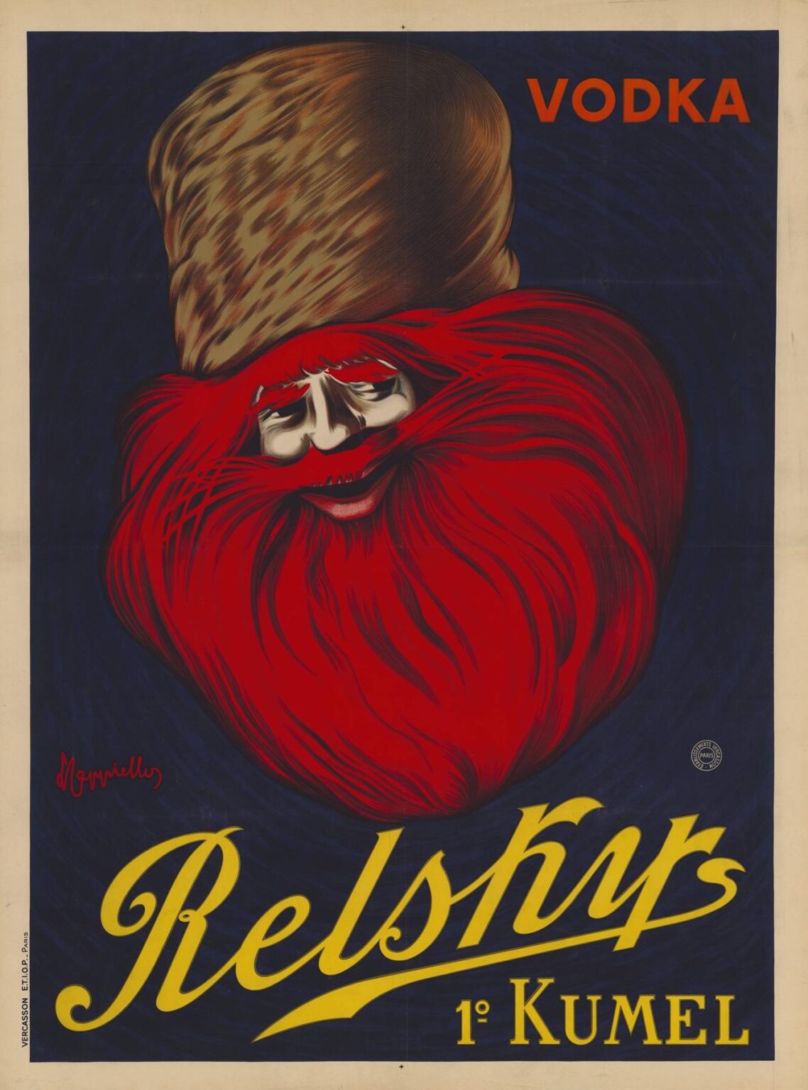
Composition and Central Imagery: The Enigmatic Red Bearded Figure
The poster’s most striking feature is a stylized male visage whose features emerge from a vast swirling beard painted in vibrant crimson. The man’s eyes glimmer with a knowing half‐smile, and his lips curl in an almost surreal grin. His beard and lower face morph into an abstract, heart‐shaped mass that dominates the lower two‐thirds of the composition. Atop his head sits a fur hat rendered in warm browns with textured highlights, suggesting Eastern European origins. The entire figure floats against a deep navy‐blue backdrop, which intensifies the vivid red of his beard and the subtle shades of brown in his hat. Above, the text “VODKA” appears in uppercase vermilion letters at the top right, while at the bottom, the sweeping cursive “Relskys” and the small “1° Kumel” nestle in bold yellow. Cappiello’s composition is both minimal and hypnotic: the viewer cannot look away from the face, from the swirl of hair, and from the stark juxtaposition of colors.
Color Palette and Emotional Resonance
In “Vodka Relskys, 1° Kumel,” color is wielded like a character in its own right. The intense crimson of the beard conveys warmth, spice, and vitality—qualities associated with kumel’s aromatic profile. The flesh tones of the face, rendered in pale creams and pinkish shadows, suggest the crisp purity prized in fine vodka. The umbral navy blue background establishes a night‐like void, evoking mystery and the alluring depth of a clear spirit poured into a glass. The earthy brown of the hat provides a textural counterpoint, grounding the otherwise ethereal visage and signaling heritage. Yellow type at the bottom adds a final spark of warmth, ensuring the brand name stands out clearly. This carefully calibrated palette engages the viewer’s senses: the red excites the appetite, the blue soothes with coolness, and the overall contrast commands attention from across the street.
Typography: Bold Declaration and Art Deco Flourish
Text in the poster is minimal but deliberate. The uppercase “VODKA” sits alone in the top right corner, its simple sans-serif letters painted in a pure vermilion that ties back to the beard’s hue. This immediate identification of the product category is followed by the brand signature “Relskys” in sweeping yellow cursive at the bottom, a style reminiscent of early Art Deco calligraphy. The flourish of the tail on the “y” echoes the swirling locks of hair, creating a visual harmony. Finally, the small “1° Kumel” in block capitals anchors the partnership, suggesting a first‐degree or top‐quality kumel. By limiting text to these three discrete elements, Cappiello ensured that the viewer spends nearly all of their attention on the central image, with typography serving only to clarify brand and product without distracting from the visual impact.
Symbolism and Cultural Narrative
At a symbolic level, the poster conveys multiple layers of meaning. The floating head with a vast, swirling beard suggests both a spirit and a living entity—an embodiment of the distilled vodka and kumel themselves. The fur hat evokes Russian or Eastern European tradition, lending the brand an air of exotic authenticity. The swirling beard resembles both the frothy head of a poured spirit and the intricate patterns of botanical distillation. The figure’s faint smile hints at the pleasure and conviviality the drinks promise. This rich symbolism resonates with an audience curious about foreign flavors yet accustomed to Parisian taste for sophistication. In this way, Cappiello crafted an allegory of spiritual uplift: just as the figure emerges from the void, so too does the consumer rise from the mundane by indulging in Relskys vodka or 1° Kumel.
Spatial Dynamics and Visual Flow
Despite the poster’s bold simplicity, Cappiello manipulates spatial tension and flow masterfully. The halo of beard sweeps outward in graceful curves, guiding the eye from the center of the face to the edges of the composition and back. The upward diagonal of the fur hat draws the gaze to the “VODKA” text, while the downward left tail of the cursive “Relskys” leads the viewer back into the swirling form. The uniform blue background functions as negative space that isolates the figure, ensuring no external elements compete for attention. This dynamic interplay of positive shapes and negative void creates both depth and movement, making a static poster feel alive and animated.
Technical Mastery in Lithographic Printing
The 1911 production of “Vodka Relskys, 1° Kumel” relied on state‐of‐the‐art color lithography at Imp. Vercasson & Cie in Paris. Each hue required a separate lithographic stone: crimson for the beard, cream and pink for the flesh tones, brown for the hat, blue for the background, and yellow and vermilion for the text. Precision in stone carving and inking was essential to maintain crisp edges in the swirling beard and the delicate highlights that model the face. Large‐format press runs demanded exact registration to avoid any misalignment across the complex curves. The final prints, often exceeding one meter in height, displayed remarkable color fidelity and line clarity, allowing Cappiello’s vision to leap off the streets of Paris in vibrant detail.
Cultural Reception and Market Impact
Upon its release, “Vodka Relskys, 1° Kumel” quickly dominated the visual landscape of Paris’s cafés, brasseries, and tram shelters. The public was captivated by its enigmatic central figure—neither wholly human nor entirely abstract—and pressed to inquire about the unusual product pairing. Sales reports from the Relskys distillery indicate a notable surge in vodka orders in locales where the poster was displayed, suggesting that Cappiello’s design succeeded in both reinforcing brand identity and piquing consumer curiosity. Critics of the day praised the poster’s painterly quality and sophisticated use of minimal copy, contrasting it with more formulaic spirit advertisements. The campaign’s success prompted rival houses to commission similarly bold posters, accelerating the evolution of graphic advertising across Europe.
Legacy and Influence on Graphic Design
More than a century after its creation, Leonetto Cappiello’s “Vodka Relskys, 1° Kumel” remains a cornerstone in the canon of poster art. Its combination of minimal text, high‐contrast color, and symbolic allegory continues to inform contemporary branding strategies—from corporate logos that rely on single iconic shapes to social media campaigns that favor strong, singular images. The poster is studied in design schools for its exemplary use of hierarchy, color theory, and visual narrative. Major museums, including the Musée des Arts Décoratifs in Paris and the Bibliothèque Forney, display original lithographs in permanent collections. Collectors prize early prints for their rarity and the unparalleled condition of their pigments, which retain startling vibrancy even after decades of exposure.
Conclusion: The Timeless Power of Visual Metaphor
Leonetto Cappiello’s 1911 poster “Vodka Relskys, 1° Kumel” stands as an enduring testament to the potential of commercial art to transcend mere product promotion and attain aesthetic resonance. By conjuring a mythic Eastern European visage that fuses human features, botanical distillation, and distilled spirit, he created a work that speaks to the imagination as much as to the appetite. Technically impeccable and thematically rich, the poster demonstrates that clarity of vision, emotional symbolism, and color mastery can unite to produce an image of lasting power. Over a century later, Cappiello’s creation still captivates viewers, reminding us that the most effective advertising is rooted in artistry and the universal language of metaphor.
