Image source: artvee.com
Introduction
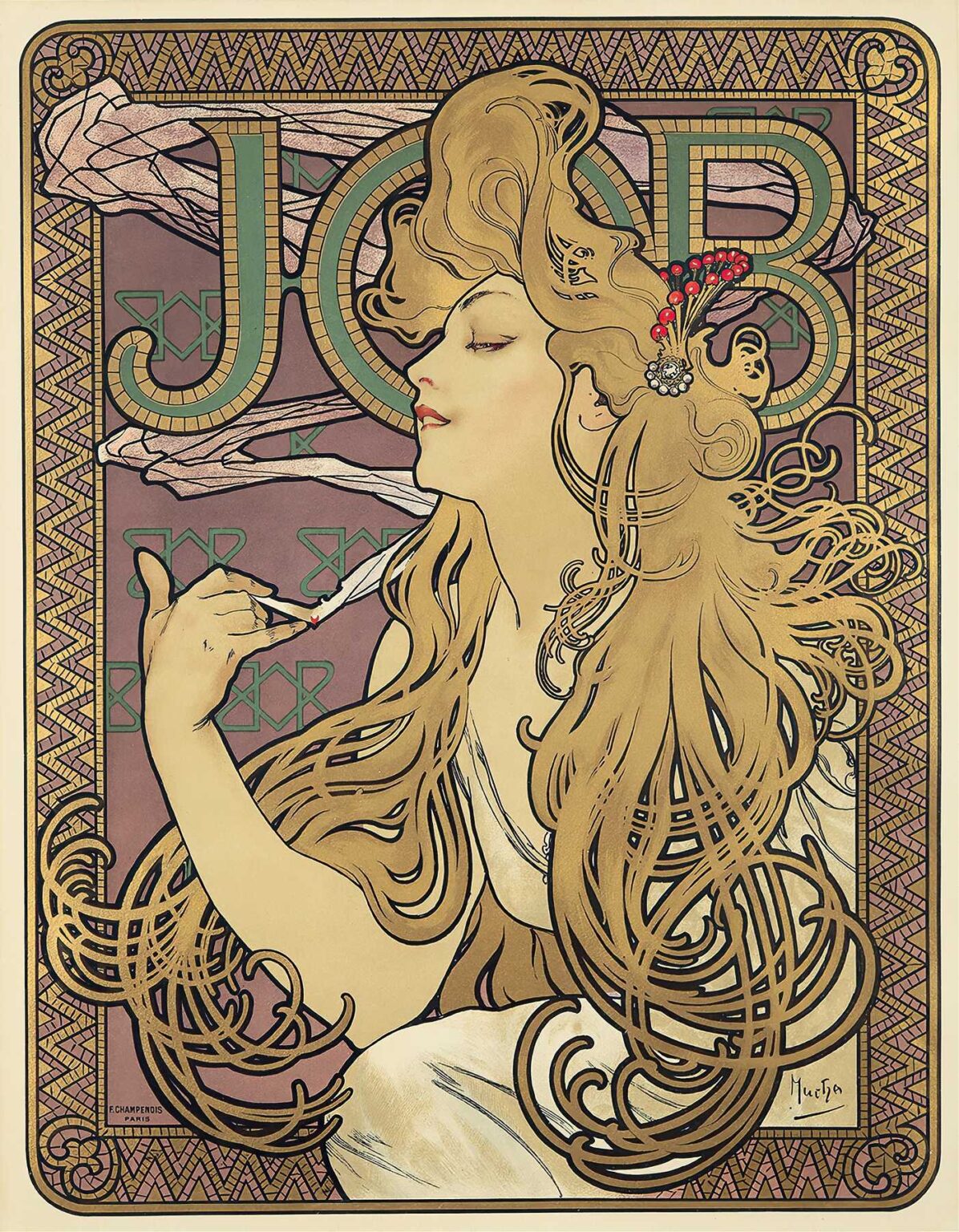
Alphonse Mucha’s 1896 lithograph Job stands as one of the quintessential icons of the Art Nouveau movement. Commissioned to advertise the “JOB” brand of rolling papers, this poster does far more than merely promote a product: it elevates commercial art to the level of fine art. Measuring roughly 120 by 80 centimeters in its original billposting format, the image captures a languid, elegantly attired woman in profile, enveloped by sinuous lines, ornate patterning, and a rich color palette that has since become synonymous with Mucha’s style. Across its decorative borders and stylized figure, Job encapsulates the ideals of harmony between decorative beauty and mass communication. In this comprehensive analysis, we will explore the poster’s historical context, Mucha’s evolving technique, its compositional brilliance, symbolic layers, and enduring influence on graphic design and visual culture.
Historical Context of Late-19th Century Advertising
The late 19th century witnessed profound shifts in both consumer culture and graphic reproduction technologies. Advances in chromolithography enabled the mass production of richly colored posters, which transformed Parisian boulevards into open-air galleries. Companies recognized the power of visual appeal to entice customers, leading to a proliferation of eye-catching advertisements for everything from railways to tobacco. Within this milieu, the JOB cigarette paper brand—established in 1838—sought a fresh visual identity that would stand out amid competing wares. Mucha’s commission occurred at a pivotal moment: the Belle Époque’s optimism, the rise of café culture, and the public’s appetite for decorative modernism converged to make posters not just announcements but objects of desire in their own right. Job thus emerges as both product and emblem of an era when advertising became an art form.
Alphonse Mucha’s Artistic Evolution
Born in 1860 in Moravia (then part of the Austro-Hungarian Empire), Alphonse Mucha arrived in Paris in 1887 after studying in Munich. His early work included theater set design and magazine illustrations, but his encounter with actress Sarah Bernhardt in 1894 catalyzed his fame. That year’s poster for Gismonda helped define his visual vocabulary: elongated female figures, elaborate halos, and botanical arabesques. By 1896, when he designed Job, Mucha had refined his approach to multi-stone lithography, mastering subtle color gradations and precise linework. While his Sarah Bernhardt posters announced his arrival, Job signaled his full flowering: an image that balances classical poise and modern decorative exuberance. Mucha’s stylistic signature in Job—the “whiplash” curves, the integration of figure and frame, and the jewel-like palette—would exert influence across Europe and into the 20th century.
Commission and Marketing Purpose of “Job”
The JOB rolling paper company aimed to revitalize its brand image by appealing to a younger, cosmopolitan clientele. By engaging Mucha, the firm entrusted its visual identity to an artist at the vanguard of contemporary style. Rather than feature overt product shots, Mucha’s conception for Job centers on the ritual of rolling and smoking, conveyed through a sensuous portrait of a woman in an introspective moment. The elegant figure, her long hair swirling around her, holds a lit cigarette delicately between her fingers. The monumental lettering of “JOB” overhead asserts brand presence without disrupting the poster’s aesthetic unity. In this way, Mucha accomplished a subtle form of branding: the product becomes inseparable from the pleasure of beauty and leisure portrayed in the image.
Composition and Formal Structure
At first glance, Job reads as a study in curves and contours. The woman’s elongated profile—the nose, chin, and neckline—echoes the sweeping arcs of her cascading tresses. Arranged in an almost serpentine cascade, her hair forms both decorative filigree and a visual rhythm that guides the viewer’s eye throughout the composition. The backdrop consists of tessellated mosaic patterns interwoven with geometric forms, providing textural contrast to the organic figure. A rectangular border, embellished with stylized triangles and spirals, encloses the scene, framing it like a medieval tapestry. The juxtaposition of strict geometry and fluid natural forms creates dynamic tension and harmony—core tenets of Art Nouveau’s decorative program.
Use of Line and Contour
Line serves as Mucha’s principal expressive tool in Job. Every curve is deliberately weight-shifted: thick for primary contours, delicate for ornamental details. The hair, outlined in sinuous strokes, becomes an almost independent entity, coiling around the figure and reiterating the poster’s circular motifs. The woman’s elegant neckline, shoulders, and arm are delineated with sweeping arcs that suggest both classical ideal and contemporary stylization. Within the decorative border, parallel lines and cross-hatching add depth and pattern without detracting from the central figure. Through modulation of line thickness and continuity, Mucha imbues the static lithograph with a sense of flowing movement and graceful languor.
Color Palette and Light
Mucha’s color choices in Job exemplify his subtle mastery of tone. Creamy flesh hues for the woman’s skin contrast gently with the muted purples and lavenders of the background. Her hair, rendered in golden ochre, resonates with warm metallic inks that catch the light. Accents of teal and emerald in the lettering and patterning provide cool counterpoints, while minimal touches of red—most notably the burning ember of the cigarette—draw instant attention to the act of smoking. The overall effect is one of subdued luxe: a harmonious ensemble of pastel harmonies enlivened by jewel-like details. Mucha’s use of metallic inks and precise layering of translucent colors creates depth and luminosity, qualities that cannot be fully captured in reproductions, underscoring the poster’s sensory richness.
Typography and Brand Integration
At the top of the poster, the bold word “JOB” is integrated seamlessly into the decorative field. Each letter is constructed from tiled rectangles, alternating between green and gold, and outlined in dark bands that echo the hair’s contours. Rather than appearing as an afterthought, the lettering participates in the visual patterning, echoing the mosaic-like motifs that frame the composition. The brand name thus becomes part of the decorative schema, reinforcing Mucha’s principle that type should be as ornamental as the imagery it accompanies. Below the woman’s arm, near the bottom border, Mucha includes his signature and the printer’s credit—“E. Champenois / Paris”—in small, unobtrusive text, ensuring that corporate and artistic authorship coexist discreetly within the design.
Ornamental Borders and Pattern Motifs
The framing devices in Job reveal Mucha’s deep engagement with historical ornament. The upper and lower borders feature a zigzag motif reminiscent of Byzantine textiles, while the side borders display meandering linear patterns that suggest stylized vines or labyrinthine pathways. In the rectangular field behind the figure, repeated geometrics—lozenges and crossbars—evoke mosaic floors in medieval churches. These historical references are abstracted and recombined into a modern decorative language that celebrates surface beauty. Mucha’s borders do more than contain; they amplify the central image by creating resonant echoes of its curves and colors, resulting in a cohesive decorative ensemble.
Symbolism and Thematic Resonances
While ostensibly an advertisement for rolling papers, Job also engages with thematic layers of sensuality, leisure, and modern female autonomy. The woman’s upward gaze and closed eyes suggest introspection or rapture, as though she is lost in the smoke’s ephemeral patterns. The act of smoking—a modern social ritual associated with cafés and salons—becomes a moment of personal reverie. Mucha, a frequent observer of Parisian café culture, transforms a routine act into a near-mystical experience. The luminous halo formed by her hair echoes traditional religious iconography, subtly equating the brand ritual with transcendence. In doing so, Mucha harnesses the power of symbolism to elevate commercial appeal to poetic heights.
Lithographic Technique and Production
Creating Job required meticulous execution across multiple lithographic stones—likely seven to ten—each corresponding to a specific color layer. Mucha would have begun with a full-scale drawing, transferred onto limestone plates using greasy crayons and tusche washes. Printers then applied inks in successive passes, carefully registering each plate to maintain crisp alignment. The choice of heavy, slightly textured paper amplified the tactile quality of the inks, while metallic gold and bronze highlights added material depth. Given the poster’s public display, print runs numbered in the hundreds, demanding strict quality control. The surviving proofs and early impressions exhibit slight variations in color saturation, testifying to the challenges of consistent ink mixing in the pre-digital era.
Reception and Cultural Impact
When Job appeared on the streets of Paris in 1896, it immediately distinguished itself from more pedestrian advertisements. Critics and passersby admired its decorative intricacy and the sense of refined leisure it conveyed. The image’s success prompted JOB to commission additional posters from Mucha and other Art Nouveau artists, cementing the brand’s association with aesthetic sophistication. More broadly, Job helped define the golden age of the poster in Europe, inspiring contemporaries such as Georges de Feure and Eugène Grasset. Its blend of commercial function and artistic innovation influenced visual culture well into the 20th century, as advertisers learned to appreciate the transformative power of integrated design.
Legacy and Influence on Graphic Design
Over a century later, Job remains a touchstone for designers exploring the integration of image, type, and ornament. Its principles—holistic composition, harmonious palette, and stylized figures—continue to inform branding, editorial illustration, and digital interfaces. The poster’s value extends beyond its immediate commercial context to its status as a masterwork of decorative art. Museum collections worldwide, including the Musée d’Orsay and the Victoria & Albert Museum, preserve original prints and lithographic stones, studying them as exemplars of turn-of-the-century craftsmanship. In design education, Job serves as a case study in the power of visual coherence and the enduring appeal of hand-crafted ornamentation in an increasingly automated world.
Conclusion
Alphonse Mucha’s Job poster transcends its role as an advertisement to become an icon of Art Nouveau’s union of beauty and commerce. Through masterful composition, sinuous linework, a nuanced color palette, and integrated typography, Mucha crafted an image that resonates with both aesthetic pleasure and brand identity. Its depiction of a woman in a moment of reverie transforms a mundane act into a rite of sensory delight, embodying the era’s aspirations toward elegance, modernity, and poetic expression. More than a century after its creation, Job continues to captivate audiences and inspire designers, affirming Alphonse Mucha’s legacy as a pioneer who proved that commercial art can—and should—be art of the highest order.
