Image source: artvee.com
Introduction
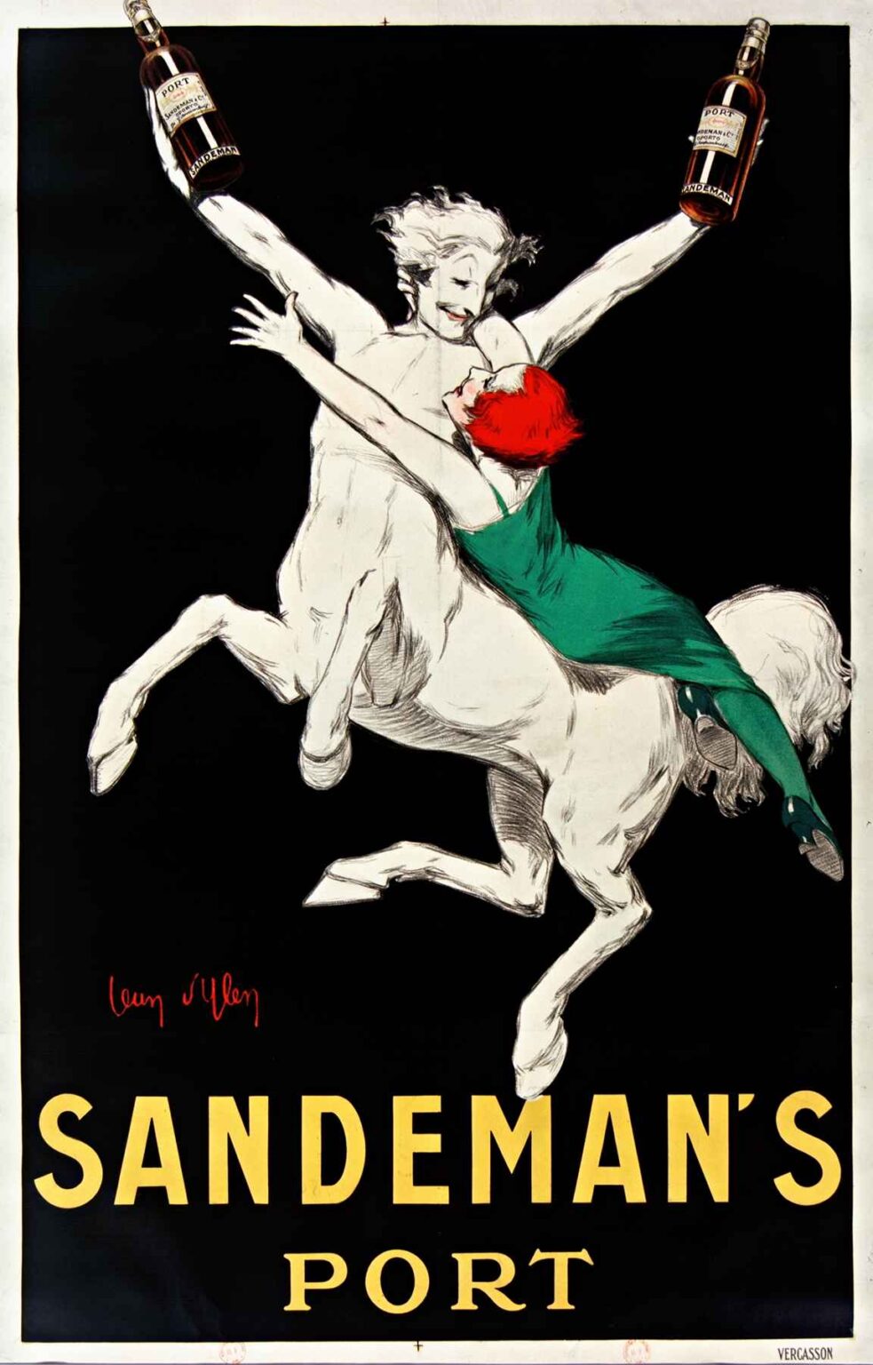
In 1930, French poster artist Jean d’Ylen created “Sandeman’s Port,” an iconic advertisement that has endured as a paragon of bold graphic design and visual wit. Far more than a commercial poster, d’Ylen’s work encapsulates the Art Deco era’s fascination with simplified form, vibrant contrasts, and dynamic movement. Against a deep black ground, a spirited white centaur—half-man, half-horse—rears skyward, cradling two bottles of Sandeman’s Port in outstretched arms. Clad in crystalline white and shadowed with fine charcoal strokes, the figure exudes energy and elegance, while a vivacious red-haired maiden in emerald green clings to his back, her flowing dress capturing the viewer’s eye. Beneath the central image, the bold golden typeface proclaims “SANDEMAN’S” above the deceptively modest word “PORT.” In this exploration, we will examine the historical and artistic context of interwar Europe, Jean d’Ylen’s personal trajectory and influences, the poster’s compositional mastery, its daring use of color and contrast, the symbolism and narrative layers embedded in the centaur motif, d’Ylen’s technical approach to lithographic printing, and the enduring legacy of “Sandeman’s Port” as a marketing and design milestone.
Historical and Artistic Context
The late 1920s and early 1930s in Europe were marked by the efflorescence of Art Deco, a movement characterized by streamlined geometry, lavish ornamentation, and a spirit of modernity. Though emerging in the wake of World War I’s devastation, Art Deco embraced luxury, exuberant color, and a forward-looking optimism. Paris, the cultural heart of Europe, drew painters, architects, and graphic artists who celebrated mechanical progress—skyscrapers, automobiles, and airplanes—as much as exotic archaeological discoveries in Egypt and Mesopotamia. Simultaneously, the printing industry witnessed innovations in chromolithography, allowing posters to become mass-produced works of art. Allied to this milieu, Jean d’Ylen specialized in commercial art that married fine-art sensibilities with marketing savvy. His work for Sandeman’s Port in 1930 typified the era’s glamorous ethos: a bold, minimalist design that spoke to the consumer’s desire for elegance and exhilaration.
The Artist: Jean d’Ylen
Born in 1886 as Jean Pochon in southwestern France, Jean d’Ylen adopted his nom de plume as he embarked on a career in graphic arts. A student of the École des Beaux-Arts in Bordeaux and later at the Académie Julian in Paris, he was steeped in classical training yet drawn to avant-garde currents. Influenced by the poster pioneers Jules Chéret and Henri de Toulouse-Lautrec, d’Ylen also absorbed Cubist and Futurist ideas, especially the emphasis on dynamic lines and fragmentation of form. By the 1920s, he had turned almost entirely to commercial poster design, working for luxury brands, travel agencies, and alcoholic beverages. D’Ylen’s hallmark was his ability to distill complex narratives into single, arresting images that functioned equally as fine art and persuasive advertisement. “Sandeman’s Port” represents the apex of his poster work: the confident use of negative space, the audacious anthropomorphic centaur, and the harmonious union of typography and illustration.
Composition and Visual Dynamics
Central to “Sandeman’s Port” is d’Ylen’s masterful compositional scheme, which relies on a powerful diagonal thrust. The centaur’s hind legs dig into the lower left corner while his forelegs and the maiden’s outstretched form propel toward the upper right, creating a sweeping sense of motion. This diagonal axis is reinforced by the elongated silhouette of the labels on the port bottles, which mirror the centaur’s muscular arms. The figures occupy the majority of the vertical space, their white bodies popping against the pitch-black background, ensuring immediate visual arrest. Why such stark contrast? By reducing the image to three primary colors—white, red, and green—d’Ylen eliminates extraneous detail, forcing the viewer’s focus onto the sensual interaction between the figures and the product. The golden-yellow letters at the bottom anchor the composition, their warmth counterbalancing the cool brilliance of the central forms. Through this dynamic, the viewer’s eye is guided in a continuous loop: from the type, up the titan-like centaur, across into the viridian folds of the maiden’s dress, back to the glistening port bottles, and finally to the typographic signature.
Color Contrast and Symbolic Resonance
Color in “Sandeman’s Port” functions on both an aesthetic and symbolic level. The centaur’s pristine white evokes purity and classical beauty, conjuring images of Greek myth where centaurs represent untamed vitality. In this commercial context, the whiteness suggests the clarity and high quality of Sandeman’s Port. The maiden’s vivid red hair and emerald green dress inject sensuality and allure, signaling passion and opulence—traits the brand wished to associate with its product. Against the enveloping blackness, these three hues stand in high relief, creating an optical vibration that captures attention even from a distance. The golden typeface evokes the amber glow of aged port, reinforcing the viewer’s association between the color scheme and the drink’s warm, honeyed notes. By limiting the palette yet maximizing contrast, d’Ylen demonstrates an acute understanding of color psychology and the mechanics of visual persuasion.
Mythic Symbolism and Narrative Layers
Beyond mere decoration, the centaur-maiden tableau in “Sandeman’s Port” carries rich symbolic undertones. In classical myth, centaurs are hybrids of man and beast, representing the intersection of civilized rationality and primal instinct. Here, the centaur holds aloft two bottles of port as if presenting ambrosia to mortals, while the maiden—clad in modern attire yet clinging to a mythic creature—embodies the intoxicating allure of the wine itself. Her red hair, reminiscent of Bacchantes who accompanied Dionysus, further underlines the theme of revelry. The two bottles perched on the centaur’s wrists suggest balance and duality: port is both a serious, time-honored libation and a playful indulgence. This layering of mythic resonance and modern consumer desire invites the viewer to imagine partaking in an elevated sensory experience that transcends ordinary reality.
Typography Integration and Brand Messaging
The typography in d’Ylen’s poster is far from incidental. The uppercase sans-serif letters of “SANDEMAN’S” are spaced generously, evoking confidence and clarity. Placed low on the poster, they anchor the image and provide a visual resting point after the eye traverses the energetic diagonal of the figures. The narrower word “PORT,” set in a classical serif, shifts the mood subtly, invoking a sense of tradition and refinement. This typographic interplay echoes the brand’s dual identity: bold and modern, yet steeped in centuries-old winemaking heritage. The choice of a golden hue for the text not only harmonizes with the poster’s palette but directly references the color of Port wine itself, reinforcing the sensory connection.
Technical Mastery in Lithographic Printing
Jean d’Ylen’s design was realized through chromolithography, a printmaking method that enabled vivid, saturated color reproduction. Unlike traditional oil painting techniques, lithography required the artist to conceive the image in discrete color layers, each drawn on a separate stone and printed in sequence. D’Ylen’s ability to plan exact color registration—ensuring that the white of the centaur did not bleed into the black background or the red hair—demonstrates his technical precision. The fine charcoal-like strokes that define musculature and drapery folds were rendered through delicate etching on the lithographic stone, preserving the expressiveness of hand drawing. The poster’s large-format printing allowed for minimal pixilation of line edges, resulting in an image that maintained crispness even when viewed up close. This technical rigor ensured that “Sandeman’s Port” retained its impact across different display contexts, from shop windows to busy urban boulevards.
Reception and Impact in Advertising
Upon its release in 1930, “Sandeman’s Port” quickly gained acclaim among graphic designers and advertising professionals for its audacious imagery and streamlined messaging. Where many contemporaneous posters remained cluttered with text and decorative flourishes, d’Ylen’s work championed reductive design, predating later modernist manifestos that championed “less is more.” Critics lauded the poster’s ability to convey both product information and emotional ambiance in a single, unforgettable tableau. Beyond the design community, the general public responded enthusiastically: reproductions of the centaur-maiden scene found their way onto menus, coasters, and promotional calendars. The poster became inseparable from the Sandeman’s brand identity, elevating the company above competitors who relied on more traditional vineyard imagery. Decades later, “Sandeman’s Port” remains in corporate archives and museum collections as a milestone in the history of commercial art.
Legacy and Enduring Influence
Nearly a century after its creation, “Sandeman’s Port” endures as an exemplar of graphic design excellence. Its bold use of negative space, dynamic diagonal composition, and mythic narrative continue to inspire contemporary designers and marketers. Exhibitions on Art Deco and advertising history regularly include d’Ylen’s poster as a touchstone, noting how its principles anticipated the minimalist and narrative-driven approaches of later 20th-century poster art. Sandeman’s port itself continues to incorporate centaur imagery in modern labeling and promotional materials—a testament to the poster’s deep-rooted cultural resonance. Beyond the realm of advertising, “Sandeman’s Port” has influenced fine-art prints, theater posters, and even album covers, demonstrating the power of a well-conceived commercial image to transcend its original purpose and become a lasting icon in visual culture.
Conclusion
Jean d’Ylen’s “Sandeman’s Port” poster of 1930 stands as a masterwork of Art Deco commercial art. Through a potent fusion of mythic symbolism, pared-down composition, expressive color contrasts, and technical printmaking prowess, d’Ylen created an image that both seduces the eye and communicates brand values with crystalline clarity. His centaur and maiden tableau invites viewers into a world where the primal and the refined unite in spirited celebration—mirroring the dual identity of Sandeman’s Port as both a venerable tradition and a modern indulgence. More than merely advertising a product, “Sandeman’s Port” captures the zeitgeist of its era, offering an enduring example of how graphic design can elevate commerce into lasting cultural achievement.
