Image source: artvee.com
Louis Glackens’s illustrated poster for Will Rogers in Lightnin’ stands as a landmark of early twentieth-century theatrical advertising, combining caricature, bold typography, and dynamic composition to capture both the effervescent persona of Will Rogers and the spirit of the play. Created in the mid-1920s to promote Rogers’s starring role opposite Louise Dresser, Joel McCrea, and Helen Cohan, this lithograph exemplifies the intersection of celebrity culture, print technology, and graphic art during the Jazz Age. A close examination of the poster reveals how Glackens harnessed color, line, and layout to celebrate Rogers’s folksy wit, while also pioneering techniques that would shape modern poster design for decades to come.
Historical and Cultural Context
By the 1920s, Will Rogers had become one of America’s most beloved entertainers—part cowboy, part humorist, and all-American philosopher. His rope tricks, quick quips, and charming stage presence resonated with a nation recovering from World War I and navigating Prohibition. Lightnin’, a rural comedy set in a small western town, offered Rogers an ideal vehicle to showcase his trademark homespun humor and relatable persona. The play’s success on Broadway and in subsequent road productions demanded eye-catching promotional material, and hand-tinted lithographic posters were the dominant medium.
During this era, lithography had matured into a vibrant, cost-effective method for mass-produced color posters. Art Deco and emerging modernist trends influenced graphic artists to experiment with stylized figures, geometric patterns, and flat planes of color. Yet popular theater posters often retained a connection to earlier caricature traditions, especially when depicting comedic performers. Glackens, working within this transitional moment, synthesized the caricaturist’s flair for exaggeration with the sleek aesthetics of the 1920s, making his Will Rogers poster both timely and visually compelling.
Louis Glackens: Life and Artistic Development
Louis M. Glackens (1866–1933) came of age in Philadelphia and studied at the Pennsylvania Academy of Fine Arts before relocating to New York. Alongside his brother William, he contributed illustrations to Puck, Judge, and other illustrated weeklies, honing a satirical style rich in fluid line work. By the 1910s, Glackens had established himself as a leading poster artist, crafting jazz-age advertisements for theaters, department stores, and consumer goods. His work combined a cartoonist’s spontaneity with an illustrator’s command of composition and color.
When commissioned to create the Will Rogers in Lightnin’ poster, Glackens drew upon his extensive experience in capturing public figures with a light touch. His caricatures emphasized essential features—Rogers’s rakish smile, tousled hair, and casual demeanor—while the surrounding typography and geometric motifs signaled modern design sensibilities. Glackens’s willingness to push the boundaries of both caricature and poster art contributed to his reputation as an innovator in commercial illustration.
Subject and Narrative Focus
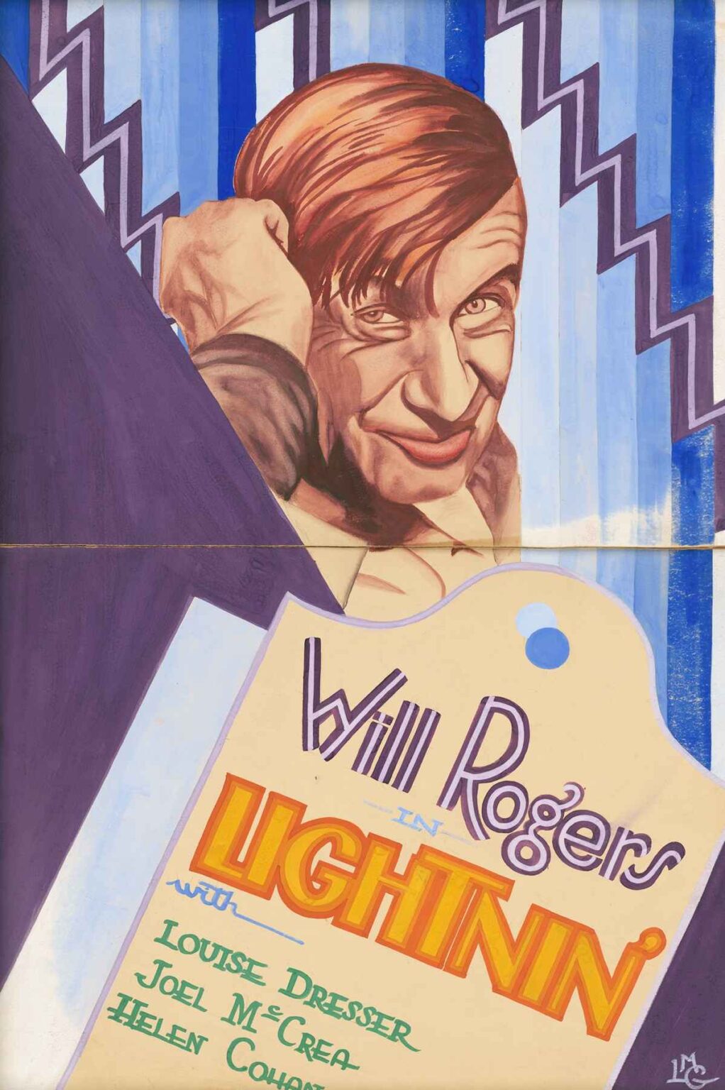
At the heart of Glackens’s poster is a half-length portrait of Will Rogers, rendered in warm flesh tones and outlined with deft, rhythmic strokes. Rogers peers over his shoulder, scratching the back of his head with a mischievous grin that promises laughter and good cheer. This pose succinctly conveys his approachable, self-deprecating humor—he looks directly at the viewer as if caught in a candid moment between wisecracks. Beneath his likeness, the play’s title, Lightnin’, leaps forward in bold, sunlit yellow letters edged with red, evoking both the play’s title and Rogers’s own lightning-fast wit.
To one side, Louise Dresser’s name appears in a more restrained yet complementary hand-lettered script, followed by the supporting cast. This careful hierarchy of text allows Rogers’s name and image to dominate the visual field, underscoring his star power. Yet the inclusion of other principal actors signals that Lightnin’ was a full ensemble production, inviting audiences who admired any of the performers. In this way, Glackens balanced celebrity focus and theatrical reality, ensuring the poster functioned effectively as both marketing tool and piece of popular art.
Composition and Spatial Design
Glackens’s layout hinges on a bold diagonal division that separates Rogers’s portrait from the typographic block. A deep purple triangular field frames Rogers on the left, while the lighter area on the right showcases the show’s title and cast information. This diagonal axis energizes the composition, guiding the viewer’s eye from Rogers’s face down to the lettering. Vertical stripes in shades of blue and lavender flank the typographic panel, interrupted by zigzag patterns that echo the jagged ascenders and descenders of the word Lightnin’. These stylized lightning bolts reinforce the play’s title literally and visually, while also nodding to Art Deco’s fascination with geometric forms.
By offsetting the organic curves of Rogers’s features against the precise lines of the background patterns, Glackens creates a dynamic tension. The angled typography panel appears to tilt forward, as though rallying the poster’s promotional message directly at the audience. Meanwhile, the portrait seems to emerge from behind this graphic curtain, as if Rogers himself were stepping onto the stage. This sense of theatrical reveal aligns perfectly with the excitement a theatergoer might feel upon seeing the advertisement.
Color Palette and Emotional Impact
Glackens chose a limited yet vibrant palette to maximize impact in the crowded streets of New York and other playbills throughout the touring circuit. Warm apricot and ochre flesh tones for Rogers’s face and hands contrast sharply with the cool indigos and purples of his jacket and the background fields. The bold yellow-orange of Lightnin’ serves as an exclamation point, drawing attention immediately. Secondary accents of turquoise and mint green appear in small ornamental dots and in the supporting cast names, adding freshness without distracting from the central image.
This interplay of warm and cool creates both harmony and focal emphasis. The viewer’s eye is naturally drawn first to the vivid title, then to Rogers’s expressive visage, and finally to the softer information beneath. In outdoor poster halls, where dozens of posters competed for attention, Glackens’s judicious use of color ensured that the Will Rogers poster would stand out at a glance, beckoning prospective theatergoers with its energetic optimism.
Typography and Lettering as Design Elements
Glackens did not rely on pre-set fonts; instead, he personally hand-lettered each component, adapting letterforms to suit the poster’s overall rhythm. The name “Will Rogers” wears a playful, slightly irregular script with subtle serifs that mirror the humor in Rogers’s persona. The word Lightnin’ is rendered in a chunky, condensed capitals style with sharp angles reminiscent of lightning bolts themselves. Its letters stand nearly shoulder-to-shoulder, creating a compact block that glows like embers against the pale backdrop.
Below, the cast names appear in an upright serif style with a touch of Art Deco flourish in the curled terminals of letters like “R” and “C.” This hierarchy of type styles—handwriting-evoking names above, bold show title at mid-level, supporting text below—establishes a clear information architecture. At the same time, each typographic choice reflects a different aspect of the production: Rogers’s warmth and wit, the play’s dynamic energy, and the supporting cast’s refined professionalism.
Line Work and Painterly Technique
Although the poster is a lithograph, the illusion of painted brushstrokes remains strong. Glackens’s portrait of Rogers shows subtle gradations of tone achieved through lithographic crayon work and multiple passes of color. The hair, for instance, is built up through layered strokes that give each strand dimension, while the forehead’s highlights appear as soft, irregular shapes that convey the sheen of skin. The jacket’s folds are indicated by deep plum and ultramarine shadows, with razor-sharp edges that demonstrate Glackens’s command of both line and wash.
In the background stripes, his painterly approach emerges in the slight imperfections of each band of blue—slight streaks and variations that evoke a hand-painted mural rather than a mechanical print. These painterly touches add vitality and prevent the graphic elements from feeling too static or cold.
Theatrical Marketing and Celebrity Branding
The Will Rogers poster is more than mere illustration; it represents an early form of celebrity branding. Rogers was not just an actor but a nationally recognized personality, thanks to his newspaper columns and later radio broadcasts. By featuring his portrait so prominently, Glackens helped cement the practice of leveraging a star’s image to sell tickets. The poster builds on Rogers’s reputation for friendly relatability: his half-turned pose and easy smile create the feeling that he is personally inviting each passerby to the theater.
This strategy proved immensely successful: audiences flocked to see Rogers live, and road companies traveled with the same posters to maintain visual consistency. In effect, Glackens’s design became part of Rogers’s public persona, linking the entertainer’s personal brand with the theatrical production itself.
Printing Process and Material Considerations
Lithographic posters in the 1920s were typically printed on heavy stock using multiple color stones. Each hue in the Will Rogers poster would have required a separate stone, carefully registered to align shapes and lines. Glackens’s original artwork needed to anticipate this process, limiting extremely fine details that might blur in printing and choosing color separations that aligned with available lithographic inks. The poster’s demonstrated success suggests Glackens’s deep familiarity with print constraints, balancing artistic ambition with practical reproducibility.
In the field, the posters were pasted onto wooden billboards or displayed in glass-protected kiosks. The high-contrast colors and large, clear lettering ensured legibility even at a distance or in poor weather. The choice of archival pigments—rather than fugitive dyes—meant that many examples remain remarkably vivid today, a testament to the craftsmanship of both the artist and the printers.
Cultural Significance and Legacy
The Will Rogers poster by Louis Glackens captures a unique moment in American entertainment history: the fusion of vaudeville-style humor with Broadway spectacle, mediated through cutting-edge graphic design. It stands at the crossroads of popular culture, print technology, and early celebrity marketing. For Rogers, who would go on to become a film star and radio commentator, the poster helped transition his persona from regional stage favorite to national icon.
Glackens’s fusion of caricature and modernist ornament also influenced later poster artists, including those working in jazz club promotions and early film publicity. The seamless integration of image and type—where text is as much a visual element as the portrait—became a staple of 20th-century advertising. Today, collectors and design historians cite the Will Rogers poster as a prime example of how graphic art can both inform and delight, transcending its immediate marketing function to become a lasting work of art.
Conclusion
Louis Glackens’s Will Rogers poster achieves a rare balance: it is at once an accurate likeness, a vibrant piece of graphic design, and an effective marketing tool. Through skillful composition, a dynamic color palette, inventive typography, and painterly lithographic techniques, Glackens distilled the essence of Will Rogers’s humor and charm into a single image that could command attention on bustling city streets. More than ninety years later, the poster remains a testament to the power of illustrated advertising and the enduring appeal of a warm, inviting personality like Rogers’s. As both historical document and visual feast, it exemplifies the creative synergy between artist and entertainer that defined an era.
