Image source: artvee.com
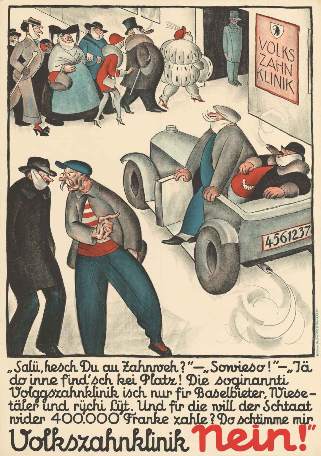
Otto Plattner’s Volkszahnklinik Nein! (1928) is far more than a visual curiosity or a vintage poster—it’s a powerful artifact of Swiss political history and a provocative example of satirical propaganda art in interwar Europe. Designed during a public referendum on funding a people’s dental clinic in Basel, the artwork reflects the class tensions, populist anxieties, and growing visual sophistication of early 20th-century political communication.
With its exaggerated characters, pointed messaging, and stylized composition, Volkszahnklinik Nein! combines visual wit with political punch. This analysis explores the historical context of the piece, the graphic strategies employed by Plattner, the symbolic coding of class and privilege, and the painting’s enduring relevance as an example of persuasive political design.
The Artist: Otto Plattner and Political Illustration
Otto Plattner (1898–1962) was a Swiss painter, illustrator, and caricaturist known for his sharp wit and satirical style. He was active during a time when posters were not only popular media but also powerful tools for shaping public opinion. Artists like Plattner merged traditional draftsmanship with the punchiness of caricature, contributing to the visual language of democracy and dissent.
In Volkszahnklinik Nein!, Plattner demonstrates both artistic skill and political shrewdness. His cartoonish yet calculated figures, expressive linework, and use of dialect all serve to communicate a clear ideological stance in a way that is immediately legible to the general public.
Historical Context: 1928 and the Basel Dental Clinic Referendum
The poster was created as part of a campaign during the 1928 referendum in Basel-Stadt, Switzerland. The issue at stake was whether or not to approve public funding—specifically 400,000 Swiss Francs—for the establishment of a dental clinic that would serve the people (Volkszahnklinik, or “People’s Dental Clinic”).
Supporters saw the proposal as a progressive step toward accessible healthcare. Opponents, including the creators of this poster, viewed it as a misuse of taxpayer funds that would disproportionately benefit wealthy neighboring regions (notably the Baselbiet, Wiesental, and other areas perceived as rural or affluent) while excluding the working class of Basel proper.
Plattner’s poster, commissioned by those opposing the clinic, captures the populist critique: that the proposed clinic would cater to the rich while excluding the poor who were meant to benefit.
Visual Composition and Layout
The poster is divided into two primary scenes stacked vertically:
Upper Section – A queue of well-dressed, affluent-looking individuals—dandies, bourgeois women, even an exaggeratedly rotund fashion figure—line up outside the entrance to the “Volkszahnklinik.” The visual irony is immediate: this supposed “people’s” clinic is full of the elite.
Lower Section – Two scruffier, working-class men converse near an older car. One gestures dismissively while the other smokes and listens. Their disheveled clothing and hunched posture suggest exclusion and resentment.
At the bottom of the poster, large red and black script reads:
“Volkszahnklinik Nein!”
The typography is hand-rendered, emphasizing immediacy and urgency.
The juxtaposition between the two tiers—the affluent above and the poor below—drives home the message of injustice and betrayal. The composition leads the eye downward, from the critique of the elite to the call for political action.
Satire and Caricature: Stylization as Protest
Plattner’s figures are drawn with deliberate distortion—a hallmark of political satire. Each person is rendered with exaggerated features that signal social class, personality, and moral standing. The wealthy woman in the top scene, for instance, sports a lavish dress and an inflated body, possibly a nod to vanity and overconsumption. The men wear top hats and carry canes, emblems of outdated aristocratic privilege.
The working-class men below, by contrast, are shown with unkempt hair, patched clothing, and slouched posture. They are clearly not welcome in the clinic above them. This contrast is not subtle—it is the crux of the argument: the clinic is a sham that masquerades as egalitarian while serving the elite.
By leaning into caricature, Plattner makes his point not only legible but memorable. His style borrows from expressionism, German Dada, and even elements of silent film comedy—visual traditions that allowed moral critique to be wrapped in absurdity.
Language and Dialect: A Voice of the People
The dialogue written in Swiss German dialect is a critical component of the poster’s populist appeal. It reads:
“Sali, hesch Du au Zahweh?” — “Sowieso!” — “Jä, do inne find’sch kei Platz! Die sogenannti Volkszahnklinik isch nur für Baselbieter, Wiesetäler und rychi Lüüt. Und für die will der Staat nüder 400.000 Franke zahle? Do stimme mir Volkszahnklinik Nein!”
Translated:
“Hi there, got a toothache too?”
“Of course!”
“Well, there’s no room for you in there! That so-called people’s dental clinic is just for the folks from Baselbiet, Wiesental, and the rich. And the state wants to pay 400,000 francs for them? I’m voting NO to the people’s dental clinic!”
The choice of dialect instead of High German strengthens the feeling that this message comes from the street, from ordinary voters. It signals authenticity and solidarity among the lower classes, emphasizing that this policy is being imposed from above, not created from within.
Typography and Color
The text Volkszahnklinik Nein! is hand-lettered in a bold, curving script. The black of “Volkszahnklinik” gives way to the urgent red of “Nein!”—the word that must be remembered. The lettering is expressive and almost confrontational, reinforcing the poster’s emotional tone.
Plattner’s use of color is minimal but strategic. Muted greys and dusty blues dominate the clothing, evoking a sense of drab conformity among the upper class. The flash of red—a hat, a mouth, the final word “Nein!”—punctuates the visual field and guides the viewer’s emotional response. Red is the color of warning, urgency, and protest.
Ideological Messaging: Who Is the “Volk”?
One of the most interesting aspects of Volkszahnklinik Nein! is its manipulation of the concept of “the people.” On the surface, the clinic is branded as a public good—the Volkszahnklinik—yet the poster argues that this is a falsehood. The real people, according to the poster, are being excluded.
This is a classic populist maneuver: claiming to defend the common folk against an elite masquerading as their saviors. The upper-class beneficiaries of the clinic are portrayed as invaders or frauds, exploiting public funds meant for “us.”
The implication is clear: vote “No” not because you oppose healthcare, but because this particular proposal is corrupt. The poster encourages distrust of institutions, government spending, and urban elites—all themes that resonate across eras and borders.
Reception and Legacy
While the referendum ultimately passed and the dental clinic was established, Volkszahnklinik Nein! remains a striking example of early 20th-century visual propaganda. Its success lies not in the policy outcome, but in the clarity and effectiveness of its message. Even today, its emotional appeal, graphic power, and linguistic directness remain vivid.
This poster has since been preserved in several museum collections and continues to be studied as a milestone in Swiss political art. It also provides insight into how public health, class, and visual media intersected in the turbulent interwar years.
Cultural and Artistic Influences
Volkszahnklinik Nein! can be situated within a broader European tradition of political poster art, especially that of the 1920s and 30s. Similar approaches were used in Germany by George Grosz and Käthe Kollwitz, in Soviet Russia by El Lissitzky, and in France by artists responding to the rise of socialism and fascism.
The poster also reflects the era’s emphasis on mass communication. Newspapers, posters, and broadsides were the primary means of shaping public sentiment. Plattner’s design anticipates later forms of political cartooning and street art, such as those seen in 1968 Paris or even contemporary protest movements.
Enduring Relevance
In an era where misinformation, public distrust, and populist rhetoric are once again on the rise, Volkszahnklinik Nein! feels strikingly contemporary. Its visual language—juxtaposition, satire, simplified narrative—remains standard fare in memes, editorial cartoons, and digital infographics.
More broadly, the poster serves as a case study in how art can engage with civic life. It demonstrates that design and illustration are not mere decoration, but potent instruments of persuasion.
Conclusion: Satire with Teeth
Otto Plattner’s Volkszahnklinik Nein! is a sharp-toothed satire that distills complex socio-political tensions into a single, striking image. Through its clever use of caricature, dialect, and visual contrast, the poster argues not just against a public clinic, but against perceived class hypocrisy and the misallocation of public funds.
Whether one agrees with its message or not, the poster succeeds as a piece of visual rhetoric. It simplifies, amplifies, and humanizes its argument—all within the confines of a sheet of paper. As both historical artifact and work of art, it reminds us that even a toothache can become a battleground for identity, justice, and political power.
