Image source: artvee.com
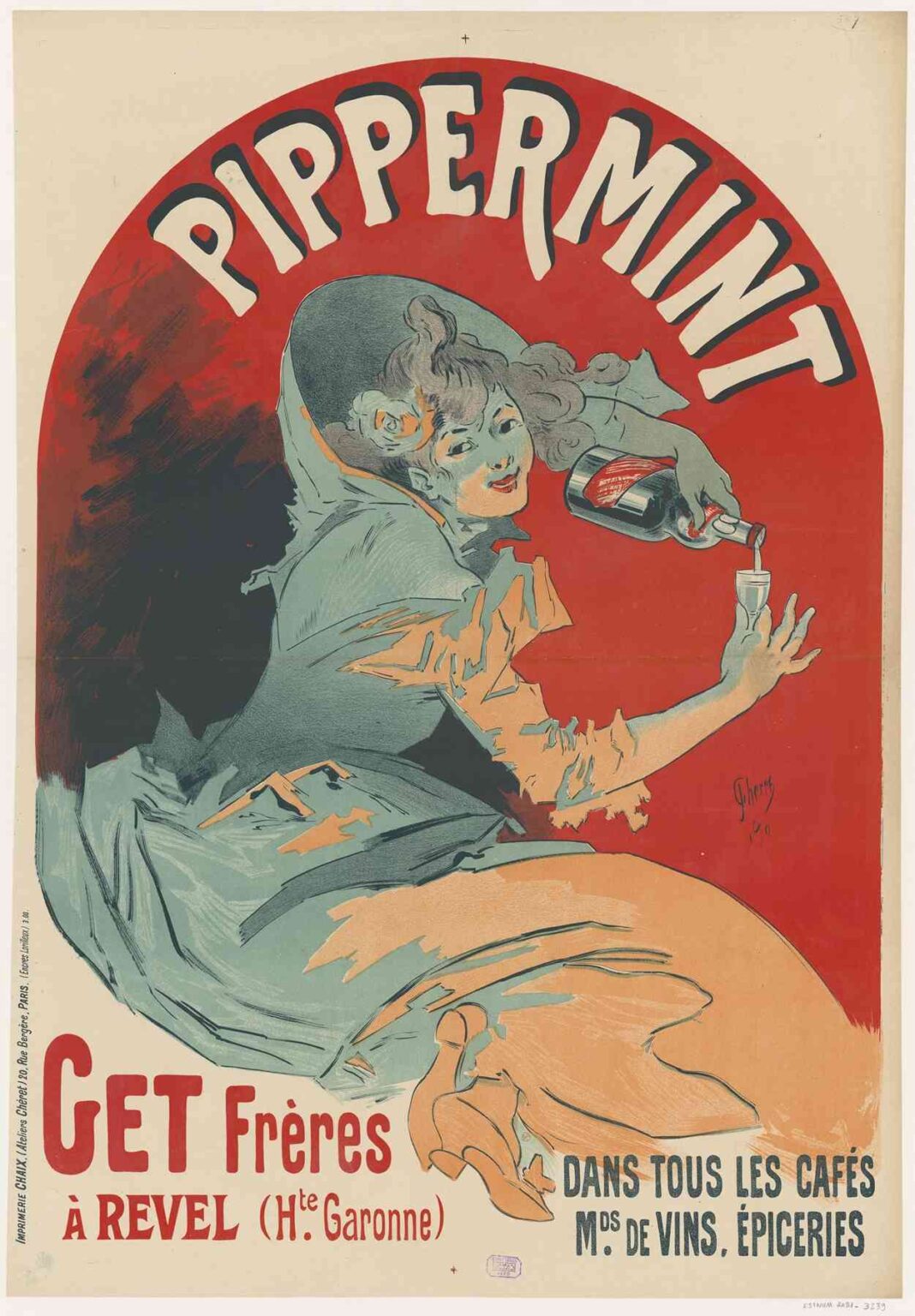
Jules Chéret’s 1900 lithographic poster Pippermint. Get Frères à Revel is a vibrant and energetic advertisement that not only promotes a product—Get Frères’ mint liqueur—but also epitomizes the artistic innovation and cultural dynamism of the Belle Époque in France. Renowned as the father of the modern poster, Chéret revolutionized commercial art with his dazzling use of color, theatrical compositions, and lively characters. In this poster, he merges the joy of consumption with the visual excitement of Art Nouveau design, encapsulating both a product and a lifestyle.
This analysis explores the historical context, visual composition, printing techniques, stylistic features, and symbolic dimensions of Pippermint. Get Frères à Revel. It demonstrates how Chéret transformed a commercial advertisement into a collectible artwork, influencing generations of graphic designers and redefining the relationship between art and commerce.
Historical Context: The Belle Époque and the Rise of the Poster
At the turn of the 20th century, France was enjoying a period of economic prosperity and cultural exuberance known as the Belle Époque (c. 1871–1914). It was a time of technological innovation, urban development, and artistic flourishing. Paris, in particular, became a global center for fashion, nightlife, and visual experimentation.
One of the most significant developments in visual culture during this period was the rise of the color lithographic poster. Thanks to advances in printing techniques, colorful images could now be produced cheaply and in large quantities. Posters were no longer just informational—they were aesthetic statements that adorned buildings, boulevards, and cafés, transforming the city into an open-air gallery.
Jules Chéret (1836–1932), a Parisian-born lithographer, illustrator, and designer, was at the forefront of this transformation. He trained in London and brought back to France a modern sensibility informed by British advertising and printmaking. Throughout his career, Chéret produced over 1,000 posters for a range of clients—perfume houses, theatres, and alcoholic beverages—becoming a household name in the process.
Pippermint. Get Frères à Revel exemplifies Chéret’s ability to combine commercial appeal with aesthetic sophistication. It advertises a mint liqueur produced by the Get brothers in Revel, Haute-Garonne, a region of southwestern France known for its distilleries. The product itself—refreshing, indulgent, and slightly exotic—is matched by the poster’s spirited composition and seductive mood.
Composition and Figure Design: The Chérette Archetype
The poster’s central figure is a young woman with a playful expression, reclining backward as she pours a glass of peppermint liqueur. Her body curves dynamically across the red circular backdrop, creating a sweeping diagonal motion that infuses the image with vitality. Her flowing dress, rendered in cool tones of blue and peach, wraps around her in stylized folds, echoing the organic forms of Art Nouveau.
This woman is a classic example of what became known as a “Chérette.” Chéret’s female figures were not passive muses or decorous symbols; they were active, joyous, and liberated. Unlike the melancholic or ethereal women depicted in the Symbolist art of the same era, Chérettes exude charm, agency, and erotic autonomy. They are fashionable yet approachable, sensual but celebratory.
In Pippermint, the Chérette does more than model a lifestyle—she animates it. Her outstretched arm, tilting the bottle with a flourish, invites the viewer to imagine the pleasure of mint liqueur with the same spirited exuberance. Her smile is mischievous and warm, aligning the product with conviviality and personal delight.
Color and Typography: Visual Impact and Brand Recognition
One of the most striking aspects of the poster is its use of bold, contrasting colors. The dominant background is a vivid red circle framed by a black outer arc, creating a spotlight effect that instantly draws attention to the central figure. Red is a strategic choice—it conveys passion, energy, and appetite, perfectly suited for an advertisement for a flavored liqueur.
Against this red backdrop, the figure is dressed in muted greens and blues, creating visual depth and contrast. The coolness of her clothing suggests the refreshing quality of peppermint, reinforcing the product’s sensory appeal. Her peach-toned underskirt and creamy skin tones provide warm highlights that balance the palette.
Typography is seamlessly integrated into the composition. The word “Pippermint” arches boldly over the top in exaggerated white letters with black shadows, ensuring high visibility from a distance. This stylized lettering not only identifies the product but contributes to the poster’s visual rhythm. Below, the company’s name “Get Frères à Revel (Hte Garonne)” appears in red, anchoring the composition and reinforcing the geographic authenticity of the brand.
Additional text in blue on the right—“Dans tous les cafés, Mds de vins, épiceries”—(“In all cafés, wine shops, and groceries”) assures the viewer of the product’s widespread availability. These marketing cues are not intrusive but woven elegantly into the design.
Technique and Innovation: Lithography as Art Form
Chéret was a master of color lithography, a technique that involved printing from multiple stones or plates to achieve a range of colors. By the late 19th century, he had refined this process to produce vibrant, high-resolution images that could be printed on a mass scale.
Pippermint. Get Frères à Revel reflects this technical expertise. The gradient hues, soft shadows, and dynamic lines are all hallmarks of Chéret’s lithographic prowess. He often used three stones—one for red, one for blue, and one for yellow—and then layered tones through skillful inking and alignment.
His posters were not only printed materials but visual experiences. They used lithography not simply to duplicate images but to craft mood, depth, and movement. This print, though created for a commercial product, stands as an artistic object in its own right—testament to how Chéret elevated advertising into a fine art.
Symbolism and Cultural Messaging
While Pippermint functions primarily as a product advertisement, it also communicates deeper cultural messages. At the fin de siècle, alcohol advertisements were not just about drink—they were about identity, leisure, and modernity.
The Chérette’s posture and expression suggest a break from Victorian restraint. She lounges with pleasure, enjoying a moment of self-indulgence. There is no male figure present, no sense of propriety or moralizing gaze. This is a woman who drinks for herself, in her own space, and on her own terms. In this sense, the poster both reflects and participates in the slow transformation of gender norms during the Belle Époque.
Moreover, the product itself—peppermint liqueur—embodies France’s regional richness and artisanal pride. By highlighting the town of Revel and its distillers (Get Frères), the poster appeals to national identity and craftsmanship, much like modern brands use “locally sourced” or “small batch” today.
The glass being filled is a small cordial—meant to be sipped, not chugged—emphasizing sophistication and moderation. This isn’t a depiction of drunken excess but of refined pleasure. Chéret’s posters consistently offered this vision: fun without vulgarity, indulgence without shame.
Influence on Art and Advertising
Chéret’s influence on both commercial art and fine art cannot be overstated. He paved the way for poster artists like Alphonse Mucha, Henri de Toulouse-Lautrec, and Théophile Steinlen. His style influenced the Art Nouveau movement and helped establish visual advertising as a serious cultural force.
He also transformed how the public interacted with art. By bringing beauty to the streets through his posters, Chéret democratized aesthetics. He believed art should not be confined to galleries but should enhance everyday life. His posters were collected, framed, and admired not just as advertisements but as objects of artistic value.
The figure of the Chérette also helped redefine feminine imagery in visual culture. These women were not mythic goddesses or passive subjects; they were lively, modern, and vividly real. They became icons of the Parisian spirit—bold, flirtatious, and stylish.
Conclusion: A Celebration of Joy, Design, and Modern Life
Pippermint. Get Frères à Revel by Jules Chéret is more than an advertisement—it is a vibrant celebration of taste, vitality, and the art of living. Through his dazzling use of color, fluid lines, and animated figures, Chéret transforms a simple promotional image into a work that radiates optimism and elegance.
The poster distills many of the ideals of the Belle Époque: sensual enjoyment, social liberation, regional pride, and visual experimentation. It also marks a key moment in the evolution of graphic design, where commercial imperatives and artistic innovation converged.
For contemporary viewers and collectors, this poster remains a luminous example of how design can elevate the ordinary. It reminds us that joy can be found in simplicity, that beauty belongs to the public realm, and that even a glass of mint liqueur can be an invitation to artful living.
